
Typography in Context
Letters and signs are a fundamental part of communication and make it possible to transport information. It extends on the spoken words by enabling shifts in time. The information is conserved to some extend and can be transported.
Writing dominates the urban landscape and there are plates of information everywhere. This form of extended communication can be very visual and is therefore preferably used over any other sort of information method. Nevertheless it is a very intellectual form of communicaiton and not at all intuitive or natural.
Since letters can be found everywhere one could accidentally stumble over some typographic symbols in the built environment. Lisa Rienermann found the whole alphabet in the streets of New York, somewhere between the roof line and the sky.

Image by Lisa Rienermann / Project Type the Sky – A photographic Alphabet Awarded by the TDC New York 2007 and :output foundation 2008
Another great source for spotting things of course are aerial images and Google Earth is the tool of choice for typography spotters. Darren Dub has found the all over the world. He says: “Alphabet collection using google earth. This was made for my typography class. I found all of these letters after countless hours of searching google earth.” The music is “Where is my mind?” by the Pixies. Some of the locations include: Munich, Madrid, Seattle, SF Bay Area, Prague, Miami, Beijing, Rome, Amsterdam, Tokyo and more.
More letters on Google Earth spotted by Rhett Dashwood in the state of Victoria, Australia between 2008 and 2009. This is the way to get to know your backyard a little better by looking for something in detail and you’ll discover a lot of other things accidentally. Dashwood has put online a map with the alphabet marked and it is possible to click through and discover Victoria by the letter.

Image taken from Rhett Dashwood / Over the course of several months beginning October 2008 to April 2009 I’ve spent some of my spare time between commercial projects searching Google Maps hoping to discover land formations or buildings resembling letter forms.
The artist Christopher LaBrooy has picked up on this sort of spotting and taken it further, speculating about the typography of famous architects and their trademark style. As a speculation he developed his favourite architects name spelt out as built letters.
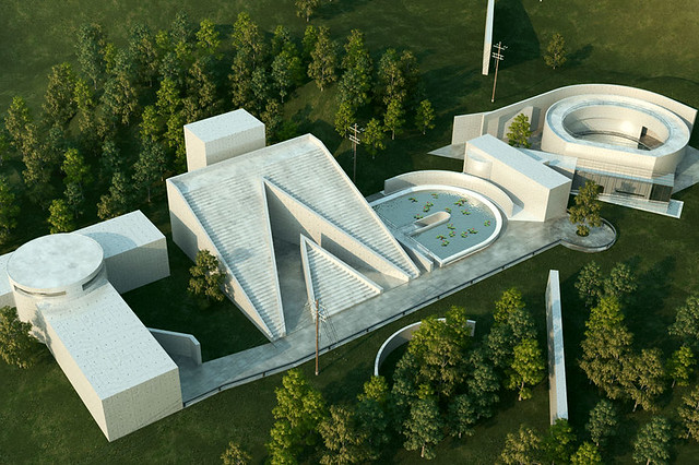
Image taken from Christopher LaBrooy / Typography design based on the architecture of Tadao Ando. I picked out my favourite buildings as a basis for developing some expressive letter forms. Included are : Chikatsu Asuka historical museum – Water temple – Naoshima contemporary art museum annexe.
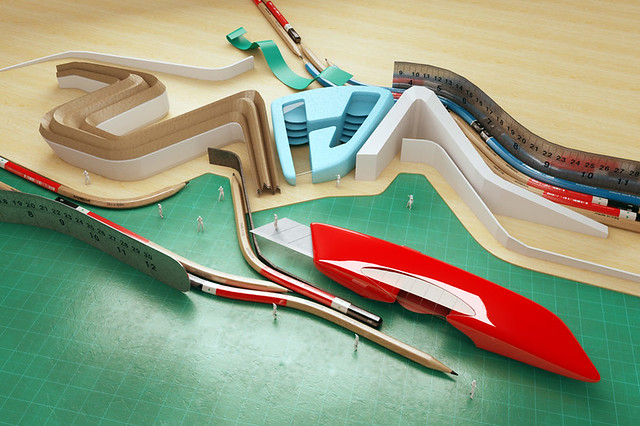
Image taken from Christopher LaBrooy / Typography design based on the architecture of zaha hadid. With this piece I focused on capturing zaha’s formal language rather than reference specific buildings because i am very interested in her drawings and paintings from the eighties.
Via WebUrbanist and Gizmodo.