
Trendsmap Paints Twitter Maps
Twitter data is becoming a new rawmaterial for representing cities. Visualisations are being produced frequently. The latest addition comes from Trendsmap the online platform visualising emerging Twitter trends.
The guys have produced visualisations for a number of cities from around the world plotting locations of georeferenced tweets. The series is called Paint a City by Numbers and so far covers only a doyen places, but is poised to grow with Trendsmap having access to a lot of Twitter data through heir service.
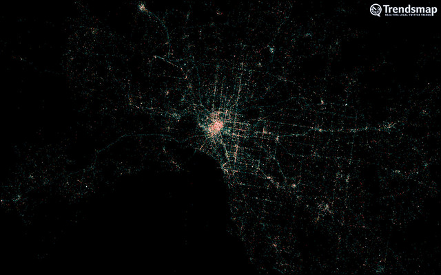
Image taken from trendsmap / Painting the city of Melburne using geolocated tweets.
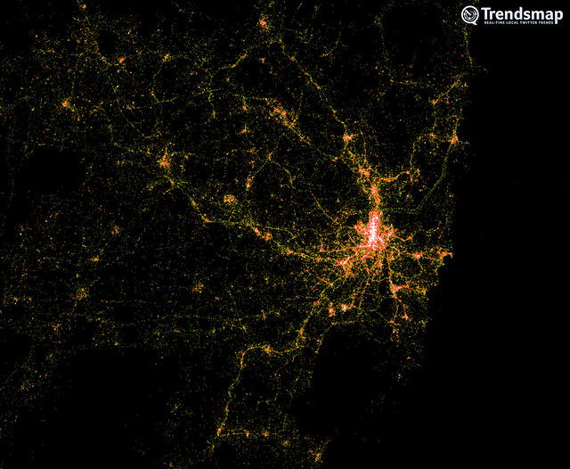
Image taken from trendsmap / Painting the city of Sydney using geolocated tweets.
These sort of maps we have seen already for examples in the work of Eric Fischer. Still it is always amazing as to how much detail the maps actually contain with streets completely covered. For example in the map painted of the area around Amsterdam in this example HERE, the main roads draw out in amazing detail.
However Trensdmap have added also specific features. One of the fascinating ones is the airport. Here on urbanTick we have pointed out a number of times how different urban features draw out specifically in the city fabric and the airports are definitely a special case.
The Trendsmap guys have plotted data for the area around the Atlanta International Airport and the resulting creepy crawly bug structure is amazing.
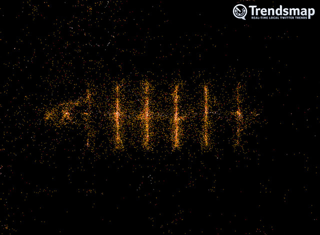
Image taken from trendsmap / Redrawing the airport of Atlanta ATL, actually the busiest airport in the world in 2011.
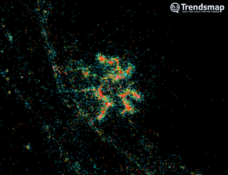
Image taken from trendsmap / Redrawing the international airport of San Francisco resembling the shape of a spider using geolocated Tweets.