Copenhagen and Hong Kong: Mapping Global Leaders in Green Transport
Cities that achieve social and economic success without high car use generally have three things in common: high densities, good urban design, and successful planning frameworks that integrate land-use with public transport, walking and cycling networks. I’ve been working on an LSE Cities project that investigated two leading global cities in green transport- Copenhagen and Hong Kong- to better understand how their leading positions were reached. You can read the final Going Green report here.
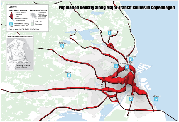
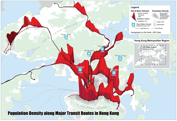
The project required visualising the level of integration between public transport and urban density in these cities. We developed a technique where the rail network is shown as a transect through a 3D population density surface. This shows how the density of jobs and residents in these cities is clustered around major public transport nodes.
Copenhagen has a classic radial pattern, based on the famous ‘Finger Plan‘ developed over 60 years ago, where linear urban features are separated by thin green wedges. This is quite distinct to the UK greenbelt approach. Current expansion is focussed to the south of the city centre along the Orestad corridor served by the more recently developed metro links. This area sites the airport and transport links to Sweden, continuing the cross-border integration between Copenhagen and Malmö.
Hong Kong makes a very interesting comparison. It is on average 8 times(!) higher density than Copenhagen, and peak densities are around four times higher at nearly 150,000 jobs & residents per square kilometre. This is due firstly to the natural boundaries and country park designations that prevent suburban development, and secondly to the unique ‘Rail plus Property’ planning model run by the government and MTR, where extremely high development densities are pursued at rail station sites, and land value gains captured to fund public transport. The result is a polycentric pattern of jagged nodal development.
Another way to consider this relationship is to measure typical distances to rail & metro stations for these cities. As can be seen below, Copenhagen and Hong Kong compare favourably to other leading global cities like London and New York.
It would be interesting to pursue this analysis further for London. You can see that London scores relatively lower for the population within 500 metres of stations. Intensification policies at public transport nodes are a recent policy change for London. Accessibility figures are likely to change over time with several major intensification projects under way at rail stations in Inner London.
(Above figure based on metropolitan regions. Defined as Outer Met Area for London and 100 km by 100 km square centred on Manhattan for NYC).


