

Subway Maps and Visualising Social Equality
Most government statistics are mapped according to official geographical units. Whilst such units are essential for data analysis and making decisions about, for example, government spending, they are hard for many people to relate to and they don’t particularly stand out on a map. This is why I tried a new method back in July 2012 to show life expectancy statistics in a fresh light by mapping them on to London Tube stations. The resulting ”Lives on the Line” map has been really popular with many people surprised at the extent of the variations in the data across London and also grateful for the way that it makes seemingly abstract statistics more easily accessible. To find out how I did it (and read some of the feedback) you can see here.
About the same time Mark Green, a PhD student from the University of Sheffield, had a similar idea to map levels of deprivation in London using an adaptation of Beck’s design. This map may be more familiar to people than the geographically accurate version we used for Lives on the Line, and by using the size of the station circles you can see the extent to which levels of deprivation in London vary as you move along each line. Mark hasn’t managed to squeeze on any station labels so you may need to compare the map to the real thing to get a better idea of what’s going on. Mark’s map nicely illustrates some of the differences between inner and outer London (bigger circles are more deprived areas) and also, to some extent, differences between east and west. To read more about the map see here (££).
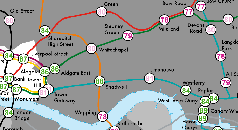
Here is a small section of Mark’s map (I can’t show a better version as TfL will be unhappy):

In the past few months there have been a number of other visualisations of the variations in demographics along transport networks- mainly the London Tube. Danny Dorling’s latest book that walks readers along the 32 stops of the Central Line in London, exploring the lifestyles of those along it as portrayed by population data.

Although they aren’t quite maps, Rentonomy have produced graphs that show the average rents along each of the London Underground Lines. Whilst the information on these graphs is a fairly simplistic representation of some fairly complex patterns on the ground they are a quick and easy way of getting a rough idea of the sorts of places you can afford to rent in London.
Taking inspiration (I assume!) from what we have been doing for London, the New Yorker has done an interactive graphic showing “Inequality and New York’s Subway“. 
It would have been nice to see the values on the map, nonetheless the graphic has proved extremely popular and may prompt some more in North America. The power of subway maps lies in the ways that people can easily relate to them, and so I think they offer a great tool for showing the headlines of social (in)equality in our cities.
A lot of the above has been x-posted from mappinglondon.
And finally…thanks to Moacir for alerting me to his version based on median income along the Chicago Subway:
