Kindle Maps and E Ink properties
CHI 2013 and GeoHCI workshop highlighted to me the importance of understanding media for maps. During CHI, the ‘Paper Tab’ demonstration used E-Ink displays to demonstrate multiple displays interaction. I found the interactions non-intuitive and not mapping very well to what you would expect to do with paper, so a source for confusion – especially when they will eventually be mixed with papers on a desk. Anyhow, it is an interesting exploration.
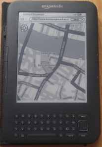
E Ink displays are very interesting in terms of the potential use for mapping. The image below shows one of the early prototypes of maps that are designed specifically for the Kindle, or, more accurately, to the E Ink technology that is at heart of the Kindle. From a point of view of usability of geographical information technologies, the E Ink is especially interesting. There are several reasons for that.
First, the resolution of the Kindle display is especially high (close to 170 Pixels Per Inch) when the size of screen is considered. The Apple Retina display provide even better resolution and in colour and that makes maps on the iPad also interesting, as they are starting to get closer to the resolution that we are familiar with from paper maps (which is usually between 600 and 1200 Dot Per Inch). The reason that resolution matter especially when displaying maps, because the users need to see the context of the location that they are exploring. Think of the physiology of scanning the map, and the fact that capturing more information in one screen can help in understanding the relationships of different features. Notice that when the resolution is high but the screen area is limited (for example the screen of a smartphone) the limitations on the area that is displayed are quite severe and that reduce the usability of the map – scrolling require you to maintain in your memory where you came from.
Secondly, E Ink can be easily read even in direct sunlight because they are reflective and do not use backlight. This make them very useful for outdoor use, while other displays don’t do that very well.
Thirdly, they use less energy and can be used for long term display of the map while using it as a reference, whereas with most active displays (e.g. smartphone) continuous use will cause a rapid battery drain.
On the downside, E Ink refresh rates are slow, and they are more suitable for static display and not for dynamic and interactive display.
During the summer of 2011 and 2012, several MSc students at UCL explore the potential of E Ink for mapping in detail. Nat Evatt (who’s map is shown above) worked on the cartographic representation and shown that it is possible to create highly detailed and readable maps even with the limitation of 16 levels of grey that are available. The surprising aspects that he found is that while some maps are available in the Amazon Kindle store (the most likely place for e-book maps), it looks like the maps where just converted to shades of grey without careful attention to the device, which reduce their usability.
The work of Bing Cui and Xiaoyan Yu (in a case of collaboration between MSc students at UCLIC and GIScience) included survey in the field (luckily on a fairly sunny day near the Tower of London) and they explored which scales work best in terms of navigation and readability. The work shows that maps at scale of 1:4000 are effective – and considering that with E Ink the best user experience is when the number of refreshes are minimised that could be a useful guideline for e-book map designers.

