Bike webs
The paper we published in PLOS ONE last week covers bike share schemes from five cities: the large ones in London and Washington, DC, and smaller ones in Boston, Minneapolis, and Denver. It might seem odd that we’ve chosen these cities, but they’re chosen on the availability of data more than for any other reason. A number of cities provide or tacitly allow access to real-time feeds of their bike data, and this makes it possible up see how many bikes and spaces there are in their docking stations. To do analysis on travel patterns, you need journey data – and few cities offer that. Other people have looked at Paris and Lyon, for example, but this was under private arrangements with those schemes. All of the data we use has been published openly on the Internet: for TFL data, you do technically need a developer login, but that’s free. The only exception to this is Denver, who shared their data with us thanks to the kindness of their hearts and Ollie’s notoriety in the cycling community.
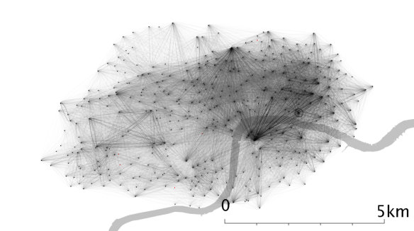
The visualisations we produced were a first step, but we wanted to understand a little more about what makes these schemes tick. We created some summary graphs to show how far people travel, and how long for, and then we took the source-destination journey frequencies and converted that to a matrix (well, a big source-destination lookup table), and then to a network. The webs you see below represents the start and end points of bike journeys, with the weight of each “strand” determined by how many bikes had taken that journey.
There are defined techniques in network analysis which detect “communities” within networks. If you imagine the network of your Facebook friends, you may well be distantly connected to Kevin Bacon or whoever, but there will likely be big interconnected groups around people you work with, know from school, play sports with, your family, and so on. Within these groups everyone knows each other, but you may be the only common link between your work and your family, for example†. Spatial systems may have similar communities, but in this case it represents a part of the city that tends to “keep to itself more than it connects with the rest of the city”. In London, at lunchtimes and weekends, Hyde Park is like this – people cycle around within this region more than they enter or leave it.
With spatial systems, testing whether these communities are real or significant is a bit different. You might expect things which are close together and busy to interact a lot, because if there are a lot of people leaving Waterloo, say, and lots of people in London want to go to the London Eye, say, those two facts combined with how close these two locations are pretty much guarantees that lots of people will go from Waterloo to the London Eye. On the other hand, fewer people will cycle from Waterloo to Regent’s Park, because it’s much further, and not many people will go from Waterloo to Elephant and Castle, because although they are close, Elephant is not as popular as the London Eye. Well, I suppose it depends who you ask, but for the cyclists we looked at, it’s certainly true.
This is all a long-winded way of saying that it’s very easy to create an analysis that tells you that busy routes occur between popular things that are close to one another, but if you’re expecting this you can see which routes are used more than you’d expect just based on popularity and proximity. For example, in London, routes from Waterloo to the financial district are more busy than you expect, presumably because people who work in the financial district live in parts of the UK which are served by trains which arrive at Waterloo. It’s key that these factors have nothing to do with our null model, namely: routes are used in proportion to the popularity of the start and end locations and the inverse* of their proximity.
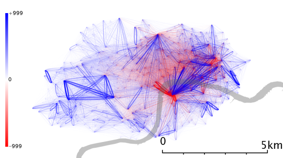
This approach was led by Paul Expert and others in a paper they wrote on a Belgian telecommunications network, and by downplaying this spatial component, they were able to detect communities which clustered on the basis of which language was spoken – and not just on how close together and populous different towns and cities were. I’ve taken a slightly different tack, which is to show the residuals – what remains when you subtract this null model from the real data. It’s mathematically the same approach, but this visualisation highlights flows above and beyond the proximity/popularity model (here, blue flows are bigger than you’d expect and red flows are smaller than you’d expect).
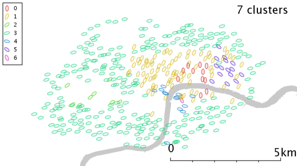
If you apply community detection to this, it partitions London into a set of communities as below (in reading this, it’s worth noting that Group 3 might just be “everything else” – i.e. not a meaningful cluster). You can hopefully see Hyde Park in the west, the City of London in the east, and a couple of other clusters with a less obvious meaning.
I usually get asked two questions about the work we’ve done on bikeshares. The first is “What did you discover?”, and, being honest, I think the main drawback of the paper for me is that there’s no “shazam” moment. It’s raised a lot of questions for me, around whether we can get more insight by looking at the time-varying networks. The rush hour network will look very different from the weekend network, or by season – what you see above is an amalgamation of months of data from different times of day. Secondly, I would like to do more work on whether the communities we detect are robust (as in, how much do they change based on the time of year, day, etc and how much of that is a methodological issue vs how much these communities actually change). In terms of results, the things I learned about the spatial and temporal uses of the scheme in London seemed pretty intuitive to me. Commuter stations are popular, rush hour is busy, and Hyde Park is more popular at the weekend and lunchtime – most of the results simply support and quantify these things. For other cities, I wish I had more insight into their geographies, and while a group of friends and colleagues helped to give me a little insight, I still feel I lacked some of the qualitative context.
The second question I’m usually asked is whether this is useful for operational planning – moving bikes around, and suchlike. At the moment, I think the answer is no, because to fully account for user choice you need to deal with those situations where users can’t get a bike, or find a space, and that requires something a bit more like an agent-based model. Something where the consequence of a full or empty dock can propogate through the network in a causal and time-sensitive way. If TFL or any other bikeshare schemes are interested in data visualisations or analyses, we’re very happy to work with external partners, and find ways to model and develop it further.
The full citation for the paper is:
And Ollie O’Brien and other co-authors will be at ECCS in Barcelona next week presenting a poster on this work – please do say hello. If you have any questions or comments, feel free to go below the line, or tweet me @sociablephysics.
†unless you work for News International or a cosy family business of another kind
*technically, it’s more complex than a simple inverse relationship and a semi-empirical function is used based on stand proximity for this paper. Other options include journey duration or routed distance, but those have their own drawbacks.You’ll have to read the paper.


