MRes Visualisation projects
June is an exciting time in CASA, as our MRes students will be turning in their group visualisation projects, which never fail to dazzle and impress. Our students learn from Andy Hudson-Smith’s 3D skills, Adam Dennett’s GIS know-how, and my Processing datavis chops (such as they are), so the resulting projects are like a giant datavis mecha with all of our powers combined, and the students’ own experience and imagination spicing up the mix (and frequently going well beyond what we’ve taught them).
We won’t see their final projects until next week, but I already have some glimpses of the work they’ve done in response to the various small briefs* they had throughout the term. I thought I would show a few of these off in anticipation of the main event…
Groups
The cohort teamed up into their project groups at the start of the year: Group 1 (Lock, Blaik, Zeno Cortes and Brok), Group 2 (Gliozzo, Simons, Skroumpelou and Tsaparas) and Group 3 (Elliot, Nikolaou, Nayebi and Pournaras). I suggested they come up with aspirational group names based on mythical animals but then didn’t seem keen for some reason.
Transport Data
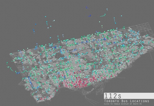
It is the Year of The Bus, so in our classes on Visualising Point Data, we focussed on a dataset of bus locations in Toronto, gathered earlier this year. This was the first exercise of term, but groups were already finding new challenges beyond the basic task of getting animation geolocated data on the screen, and adding their own, more sophisticated approaches. Group 2 delivered the above – using colouration to identify routes, a basemap, a 3D view and a font which improved the look of the animation.
APIs
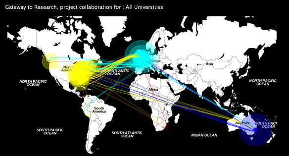
I taught APIs for the first time this year, mainly because 1) they are useful, and 2) I only started using them for the first time this year. This year was big for academia, with the launch of Gateway to Research (GTR). GTR carries funding information for Research Council UK and the Technology Strategy Board projects over the last five years – and while featuring arms manufacturers in pride of place for their case studies seemed an odd choice**, on the technical side, it has an API*** which allows for fairly versatile querying. Olly Lock was able to dig out data from a number of UK Universities, linking them geographically to the locations of their research collaborators. The below shows the visualisation for all UK universities, but it’s possible to filter and look at specific institutions in his original piece of software.
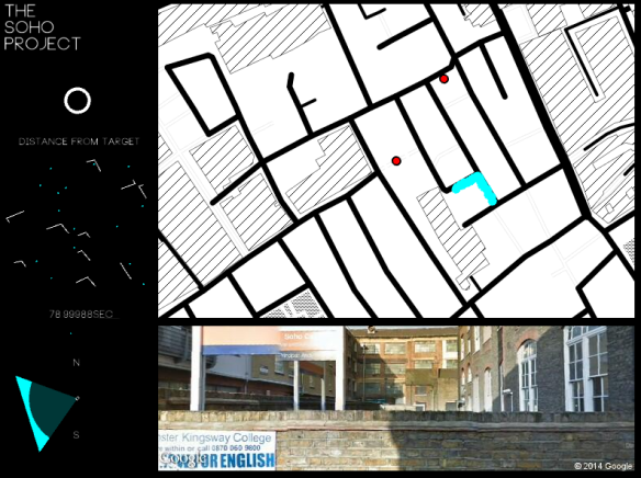
PhD student Panos Mavros has been working on a series of studies to explore the neurological basis for navigation and spatial preference with researchers from SpiersLab. Visualising the orientation and goal-finding variables that change as the study routes pass through Soho provided a visualisation challenge for the MRes groups that had useful outputs for their research projects.
Group 1‘s animation (above) integrated appealing maps with a dataset that covered multiple study routes. Group 3 (below) used video frames alongside geodata and displays on orientation, goal distance and so on for a more “dashboard”-like interface.
CA and ABM
At this point in the course, we usually start to move away from the visualisation of existing data and into the generation of visualisations based on models or simulations. Cellular Automata (CA) or Agent Based Models (ABMs) are good for this because they’re discussed in the Spatial Modelling and Simulation module, and have strong visual outputs. Group 2 created a nice implementation of the Forest Fire CA, for example, a model where it’s tricky to balance the spread of fire with the growth of vegetation:
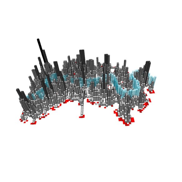
In starting to think about their final project, Group 3 built a CA with a 3D fluorish: a growth model of London, nucleated around the Thames, where a bar chart implementation of cell “population” creates a “skyscraper” effect.
This year’s project theme is “The Active City”, and so most of the work that we’ll see the teams present next week will be somewhat different from these development pieces. From what I’ve seen so far, our students have done a good job of building on these skills and taking them in new directions, geared towards their visions for their own version of “the active city”. And I’ve not even touched on the 3D work they’ve been doing in Unity, 3DMax and Blender with Andy Hudson-Smith, a more immersive (and in some cases more photorealistic) complement to the datavis and modelling-focussed 2D tools.
You can apply to study the MRes ASAV starting in September. We will accept full-time applications until August 1st 2014. If you would like to take modules part-time or at your own pace, and are from the EU or UK, you can apply up until September 4th. If you’re interested in the course, feel free to drop me an email (m.austwick@ucl.ac.uk) or tweet me.
* not like that
** well, that’s one word for it
** well, technically it has several APIs


