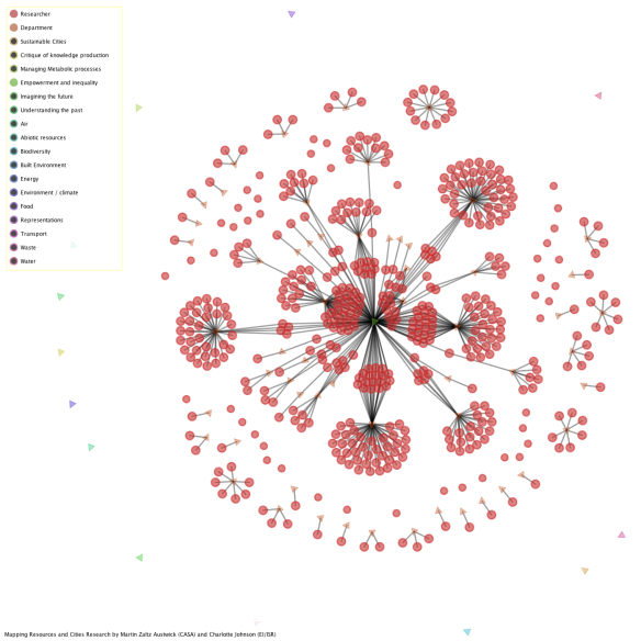
PICKS
I’m apparently now in the Sustainability field (which is rather exciting): the first paper with my name on it was published in Sustainability: The Journal of Record this month. Anthropologist Charlotte Johnson is first author (I’m the second, and final, author), so that makes me partly sustainable, I suppose. It’s called PICKS: Exploring Post-Disciplinary Knowledge in a University’s Urban Sustainability Research Landscape but it’s really much friendlier than the title suggests. And it’s open access, so you can go ahead and read it (nb: this page plays more nicely with Zotero bookmarks).
The paper illuminates a landscape of research into sustainability at UCL – who researches it, what departments they sit in, what resources they study. This has a couple of goals: firstly for the research manager or disinterested observer (or external group looking for consultancy links, or community groups looking for the right academics to engage with, or similar) to get a sense of what “sustainability” means at UCL, who does it, and what it means to them. Secondly, it allows researchers to see where they fit into this landscape, who their peers are in other departments, and who they might want to collaborate with. Finally, Charlotte has derived Environmental Justice Classifiers to understand what aspect of sustainability a researchers is engaging with; for example, are they creating and imagining new technologies, applying and developing old ones, taking a historic view of sustainability, dealing with issues of social injustice that arise from climate change, or critiquing the way research is framed and carried out (as we are in some sense). Charlotte’s categories add a theoretical framing which allows social scientists who want to get to grips with this field some handle onto what sort of researchers engage with sustainability, and why.
The data is derived from questionnaires, text from researchers’ self-declared research interests, along with categorisations from IRIS, the UCL research database. So far so abstract, but this is where I come in, with the PICKS visualisation tool. PICKS is a development of some fairly standard force graphing techniques I’ve been applying to abstract relationships for a couple of years – starting with a visualisation of UCL Institutional Structure and then Tube Maps I made in Processing and whisky flavours in d3, and developed through this project, the UCL Public Art Mapping project (sorry, UCL password required at the moment) and similar work I’ve been doing to map projects funded by the UCL Public Engagement Unit (watch this space!). PICKS is an acronym I’m unduly proud of, encapsulating, as it does, Charlotte’s original description of the output as a “Post dIsCiplinary Knowledge Space”. I like that we have a handy acronym that won’t scare the physical scientists with all that frightening relativism and that*.
The tool displays all of the researchers who identified as relating to sustainability; other nodes identify resources, themes, or classifiers, and a link between a researcher and one of these nodes indicates an affinity for that entity. So, a researcher in “CASA” working on “Air” under a “Sustainable Cities” agenda will have links to all three of those nodes. The utility comes in the fact that you can show only the nodes you’re interested in – if you display all of the nodes a researcher connects to it gets very busy and difficult to understand. So it’s possible, for example, to look at all the researchers who study “air”, and show departmental groupings – this indicates which departments devote a greater proportion of their sustainability research activity to “air”, or how they position themselves.  Hm, not a popular topic. A few engineers and not much else. Another way to to use the tool is to look for the intersection of research topics – who in the college studies “air” and “Sustainable Cities”, for example?
  Well, there’s only one person doing that. If there’s a research collaboration around Sustainable Cities that needs someone who knows about air, we know who to ask… and you can double-click on a researcher’s node (circle) to open their UCL IRIS page and get in touch with them.
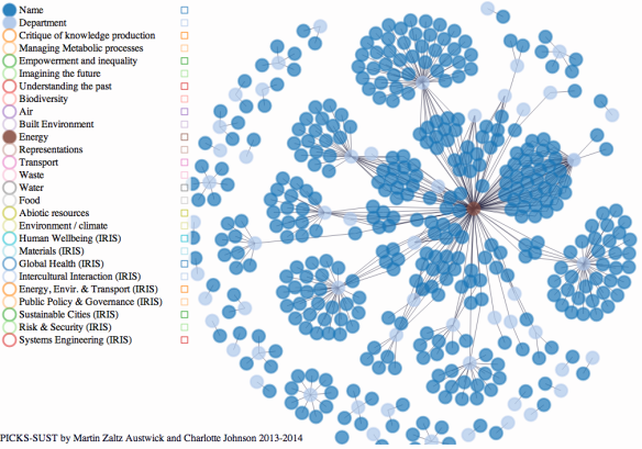
More generally, of course, topics will be busier! So, we could a look a “Energy” and see a lot more activity – unsurprisingly from physical scientists and the UCL Energy Institute:
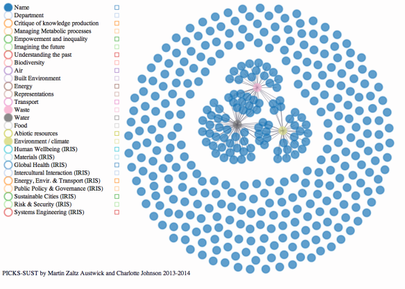
Or, we see a lot of bipartite activity around “Waste”, “Water”, and “Environment/Climate”, but interestingly not the intersection of all three:
I would encourage you to explore the visualisation yourself – other versions also allowed filtering by geographical region of study, but this one currently does not, sadly.
This paragraph is for the coders: normal people can safely skip to the next paragraph. Still here? Great. So, I wanted to put this online, because as fast and nice as the original Processing code is, I can’t help but feel that requiring users to download an app or Processing code created a series of barriers to use. Processing is not web-ready, and a force graph in Processing.js really starts to suffer when you have more than, say, 50 nodes (the browser is rarely as fast as the desktop). Try as I might, I cannot make my force graph as fast as Mike Bostock‘s, and unless I make a quantum leap in my implementation of a Barnes-Hut quadtree, that will likely always be true. So, that means using d3, and js, and css, and a bunch of other web stuff that I know very little about. D3 is a real pain for a Java hacker-arounder like me. It’s also super powerful, and by only instantiating the nodes which are visible, I was able to show all the researchers all at once. The data follows a bi-(or multi-) partite model: researchers are primary entities, sending out links to secondary entity types (departments, themes, resources, EJ classifiers). It seemed to make sense that researchers form the common link.
If you want to see the fully fledged version with dropdown menus, Chrome on a non-mobile device is your best bet. As with many pieces of work, I conceived this as a visualisation project; we haven’t done much on evaluating user experiences in a structured way, and there’s no quantitative analysis on the networks created; in part, because I haven’t decided on the best way to treat a multipartite network like this. Biglan’s [Biglan73] might provide some hints, but he took a MDS rather than a network approach; however, a clustering analysis will pretty much pop out network communities, so I might see how far that gets me.
In any case the paper is here and the visualisation is here, and Charlotte has a rather good introductory video on the topic here. If you have questions, feel free to tweet (@sociablephysics and @charloJohnson) or email us, or comment below.
[Biglan73] Biglan, A., 1973. The characteristics of subject matter in different academic areas. Journal of Applied Psychology, 57(3), pp.195–203.
*I jest. I am a physical scientist and I’m terrified by relativism. All those tensor derivatives! Unless I mean relativity.


