Even more fishing about architecture

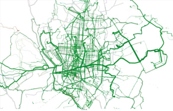
GPS bike tracks visualisation in Madrid (work in progress) – Martin Zaltz Austwick and Gustavo Romanillous
I’ve written in the past (and here) about how difficult I’ve found it to get my hands on a book about visualisation that’s a real page turner – this must be a problem that greater minds than I have struggled with for at least a century or two, but I find the writing about design I see curiously unsatisfying. Like travel writing, I’d rather be doing the thing than reading about it. Which is as fine a way as any to learn, but a bit solipsistic.
Most* visualisation books seem to place themselves between the two camps of Very Shiny Art and Rather Matte Science**. The former category offers portfolios of visualisation work – inspiring, interesting, educational, but rarely something you read from cover to cover. In the science camp, writers might bring in more technical content related to visual perception and theory of design. As science, I don’t usually find these revelations very exciting, and I can’t always understand the way different insights are applied across the design world. I mean to say that information designers are frequently not all that scientific, and their work is often the better for it.
Some books manage this tension better than others. Alberto Cairo’s The Functional Art is a good example, and by focussing on journalism, provides a specific lens. Last year, Isabelle Mereilles Design For Information covered similar ground, but in greater depth and without the framing of journalistic storytelling. The book deals with both general principles of design and visual perception, treating these in some detail; and drills into lots of specific examples, explaining the implementation and function of interactive a well as static visualisations. One of the useful concepts for relative design beginners like me is that of preattention – what information your brain gets from the visual impression before the bits of your brain that “do” language and numbers and reasoning read the key and the colour scale and the legend. It’s an imperfect analogy, but I think about it as dumping some of the processing onto the Graphics Card and making life a bit easier for the CPU. Of course, getting a broad snapshot overview before our more conscious processes kick in is perfectly attuned to the paradigm of visualisation – where we try to discern broad patterns before drilling down and exploring the nuances of the data.
Joel Katz’s Designing Information is a more general book on information design – so as well as covering cartography and datavis, it talks about more everyday aspects of the subject such as pedestrian signage, anatomical diagrams and questionnaire design. Katz’s style is light and irreverent at times, and he’s not afraid to offer real critique of some of the more prominent and iconic pieces in the field, whether it’s a hand-drawn map of the USA or Minard‘s now-ubiquitous Napoleonic March. Of the latter, he says a map that takes fifteen minute to understand is no better than reading the 1,000 words it purports to paint – a provocative statement that nevertheless encourages the reader to be critical of visuals which are data-rich at the expense of the preattentive advantage.
This, and the tension between art and science in data visualisation, seem to me to be the central tensions of digital visualisation, and – for all I know, and I’m no designer – design in general. For example: Science tells us that people aren’t necessarily very good at discriminating continuous colour scales, so when cartographers make maps they will often bin data into discrete categories, and if they use a binning method like Jenks’, these categories will be organised so that entities having a similar colour corresponds to them belonging to the same group or cluster of data, i.e. not over equal intervals. Here, the data is undergoing a cluster analysis without the viewer ever knowing, in order to be more readily understandable by the viewer. That seems pretty weird to me, but ok – let’s say we’re more interested in the way people understand the data than the “accuracy” of the way we represent the data – there’s no point in being accurate if people misperceive the data.
Let’s take another scenario, though: you’re creating a map and using circles to represent the magnitude of some quantity at some location. Science tells us that people are bad at assessing area but good at assessing length. So what if we use the radius of the circle to represent the number, rather than the area? But that barely ever happens, because it’s considered that people will assume that area represents the quantity, even as they’re busy perceiving it badly – this would be said by most designers to be highly misleading, emphasising larger circles unduly. So here “accuracy” or “fidelity” take precedence over perceptibility or at least comparability.
Others may not perceive this as the contradiction I do; perhaps these examples can be seen as different sides of the same discussion of what we represent as datavis people and what the viewer emphasizes (whether we, or they, like it or not). And there are certainly people using rainbow scales and pie charts and everything Uncle Tufte said nice boys and girls don’t do. I suspect that for almost any cast iron “to do” or “don’t do”, there will be numerous counterexamples of talented designers breaking these rules and creating good work. It’s difficult to be scientific about what is good art – and I can’t help feeling the same about information design, despite (or perhaps because of) its amenability to the science of visual perception.
—–
*I’m going to leave aside the third category, the code cookbook, which is invaluable but often doesn’t incorporate general principle, and can date rapidly.
*Matt Science is my stage name
——-
Katz, J., 2012. Designing Information: Human Factors and Common Sense in Information Design 1 edition., Hoboken, New Jersey: John Wiley & Sons.
