
Understanding Household Energy Use in England & Wales
Household energy use is a key indicator for understanding urban sustainability and fuel poverty, and is a timely topic now that winter has arrived. The LuminoCity3D site maps domestic energy use in England and Wales at 1km2 scale using data from DECC. This map has also just been published as a featured graphic in Regional Studies Regional Science. The household energy use distribution is really fascinating, with large scale regional variation and fine scale intra-urban patterns identifiable-

Average domestic energy use 2012, click to view interactive map
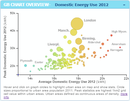
The lowest energy use per-household is found in cities and towns in the South-West region such as Plymouth and Exeter, and also along the South coast. While the highest energy use per-household is found in commuter belt towns around London. The variation within city-regions is very high, with for example London and Manchester averages varying by up to a factor of 5, from a mere 8kWh to over 40kWh per year.
The main drivers of energy use are generally housing type (more exposed walls=more energy use; larger house=more energy use), household size, wealth and climate. Often these factors are correlated at household and neighbourhood levels- so for example wealthier households in England and Wales are more likely to live in large detached houses, and these households tend to be clustered together. These trends produce the high energy use pattern seen in London’s commuter belt, as well as in the wealthier suburbs of other large cities like Birmingham, Manchester and Leeds. South West England on the other hand benefits from the mildest climate in the UK, has a relatively high proportions of flats and generally lower average household sizes, thus resulting in the lowest energy use.
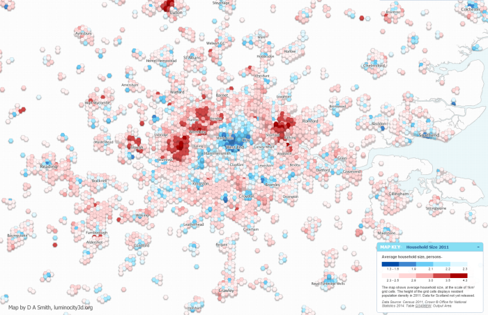
We can see how these factors play out for London in the map below. The height of the hexagons shows density, with higher density areas clearly using less energy. City centre households have considerably lower energy use, with a strong bias towards Inner East London where incomes are lower.

London average domestic energy use 2012, click to view interactive map
Energy use areas correlate strongly with the most prevalent housing type map (also on the LuminoCity3D site), with flats and terraced housing the lowest energy users, and detached and semi-detached areas the highest.

London most prevalent housing type 2011, click to view interactive map
The relationship with household size is less clear cut, but it can be seen that average household sizes are smaller in the city centre. On the other hand, areas with high average household sizes such as Stratford and Wembley, do not have particularly high average energy use.
London average household size 2011, click to view interactive map
Overall domestic energy use patterns tend to mirror transport sustainability, in that higher density city centre areas perform more efficiently compared to low density suburbs. On the other hand the link to city size (which tends to be strong in transport sustainability relationships, with bigger cities reducing car use) is much weaker, and the most efficient locations are often small and medium sized towns and cities. It is not clear in this analysis whether more recent green policies (such as improved insulation or CHP schemes) are having much effect, but several cities with green reputations like Brighton and Bristol are amongst the best performing cities.

![]()