
Britain’s Fracturing Political Geography
The imminent UK General Election is fascinating for a host of reasons, not least because of the challenge to the long established dominance of the two main parties, Conservatives and Labour. Their share of the vote has been steadily in decline for over 50 years, from a high of 97% in 1951 to 65% in 2010-
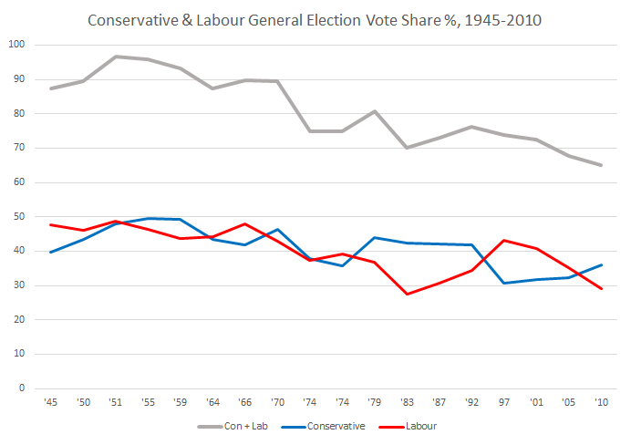 Polls for 2015 indicate that the two main parties are tied at around 33-34%. But the difference in 2015 is that the rise of the smaller parties is going to translate into winning seats, most spectacularly in Scotland with the SNP set to wipe the floor and become the third biggest party in the UK with 50+ seats. There are also likely to be gains for the right wing party UKIP, and possibly for the Welsh nationalists Plaid Cymru and the left wing Green Party. The political map of Great Britain will look very different and increasingly fractured, with a coalition or minority government inevitable and essentially becoming the new normal-

2015 General Election predictions from May2015.com (left) and Guardian (right) in cartogram format.
How can we understand this changing political geography? There is a strong tendency towards spatial clustering of similar voting patterns, with votes for minor parties higher further away from the economic and political core of London. This relates to the nations of Scotland, Wales and Northern Ireland but also to regions like South West England and coastal towns where UKIP and the Greens could pick up seats. There is also a strong geographical element to the division between Labour and Conservative seats, with Labour strongly urban and northern while Conservatives are dominant in more rural areas and in the South East.
In research at CASA we have been using percolation as a method of exploring urban regions at multiple scales, and have a new paper applying percolation to understanding Britain’s political geography (paper by Carlos Molinero, Elsa Arcaute, Mike Batty and myself). The paper proposes that voting patterns are fracturing along long-standing historic national and regional divisions in Great Britain, and seeks to test this proposition using percolation analysis. The percolation method defines regions by building clusters of road junctions according to a threshold distance, with the road network used as a proxy of population settlement and connectivity. At a threshold distance of 5km Great Britain is one giant cluster-
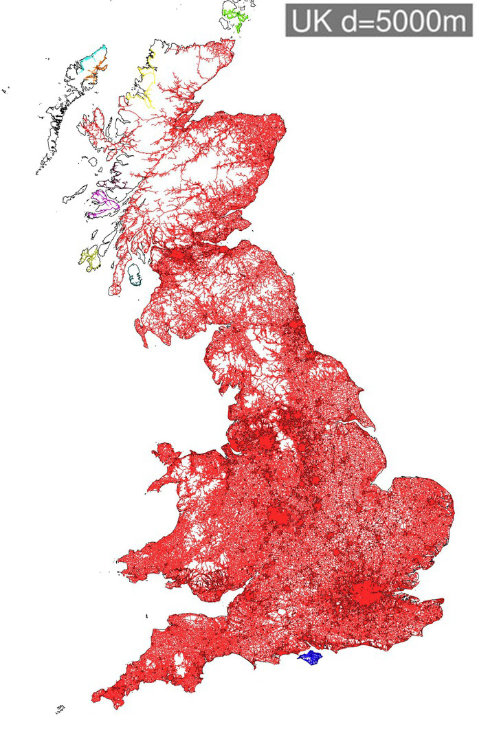 We can then reduce this threshold distance to see how Great Britain fractures. At a threshold distance of 1.4km Scotland fractures from England & Wales (although interestingly some of the Scottish borders remain part of the England & Wales cluster). Then at a distance of 900m the North and South of England split, as does the North East of England and North East of Scotland-

By 800m South Wales splits off from England, and the South West and East Anglia become separate regions. Finally at a distance of 500m, we are left with the core of large urban conurbations-

These various levels of percolation clusters can be viewed as a tree (below).
 Our question is then, do these regions generated through percolation analysis bear any relationship to voting patterns? We can test this by classifying parliamentary constituencies according to the composition of percolation clusters that fall within each constituency. Each of the parliamentary constituency groups is assigned an ‘average voting behaviour’ from the real voting behaviour in 2010, in terms of a vector of percentage votes for each of the parties. The average voting behaviour of each group can be compared to the real voting behaviour in terms of the percentage error. We can compared the percolation clustering outcomes against results using different datasets. Clusters created using the real voting data naturally produce the lowest error. It is interesting however that the percolation based results outperform clusters produced using common socio-economic data such as socio-economic class, age and education level.

Making Predictions for 2015
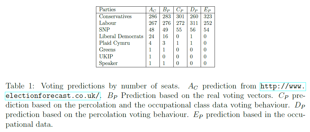
Finally the percolation clusters can also be used to try to make predictions about the forthcoming election using a universal swing method on the 2015 data (for full details see the paper). In the series of maps below we have (from left to right) the prediction using the real 2010 data and latest polls; the prediction using percolation clusters and occupational class data; the prediction using only percolation clusters; and the prediction using only socio-economic class data. The percolation based results appear relatively close to the prediction based directly on the real data. The percolation method is highly clustered spatially, leading to an exaggeration of regional divisions in the UK-

In terms of the total seats predicted, the results are not too far off current polling predictions. The percolation based method tends to exaggerate Labour’s predicted number of seats, as Labour benefit from a strong clustering of their vote in northern city-regions.
Overall the percolation method is very a promising approach for understanding regional divisions in the UK, and we continue this line of inquiry in further research. It remains to be seen whether the political geography of the UK will continue to fracture further along these regional lines. A key factor will be whether the rise of smaller parties raises the pressure for voting reform, as the First Past the Post System is becoming increasingly misrepresentative of the UK’s voting patterns and is failing to deliver the single party majority that is supposed to be the FPTP system’s main asset.
![]()