London Connections: A Geographic Tube Map
The Transport for London (TfL) tube map, with its straight lines, 45-degree rounded corners and simple, clear cartography, is a design classic. The map dispenses with other features such as parks, roads and urban extents – because you don’t need those if you are getting from A to B on the tube network. Similarly, real-life wiggles and curves on the network are straightened – they’re not important, because they don’t affect your journey. It also means the complex central section can be shown at a larger scale than the rest of the network, while still connected to it. The London Rail & Tube services map extends the concept to show all London railways in the same way, the increased complexity making it a bit harder to read, but still adhering to the same design principles.
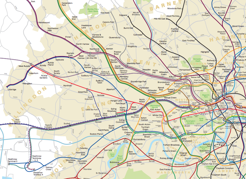
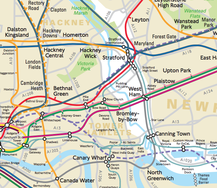
But did you know that TfL produce another version of the map – one where roads, parks and neighbourhoods are included? One which shows the real-life wiggles of the network, and where distances between links can be directly compared, and journey lengths estimated? (Chalfont & Latimer to Chesham is actually a journey of several kilometres, but looks shorter than a 200m one-stop journey in central London, on the regular map.)
It’s the TfL London Connections map and it’s not made generally available to the public, however this Freedom of Information request reveals its existence.
While I can understand TfL’s reluctance to crowd the public narrative with multiple, different looking maps of its network, it’s a shame that this one is accordingly given a relatively low profile, as it’s really rather nice, combining a level of geographical utility (with the major parks and rivers in/near London, borough names, and the capital’s built-up extent) with the familiar tube line colours. Mainline rail colours are also included, buffered in black. There is the tube-map style spacing between lines on the same track, and the familiar connectivity blobs show links between different lines at a single station. The Thames Barrier also makes a cameo appearance in the connectivity blob style.
The lines are simplified, with the smallest wiggles removed and quirks like the White City line split omitted. The forthcoming Crossrail lines are included, as are the connections to them. One quirk is the mix of fonts – with TfL stations shown in the familiar New Johnston font and National Rail stations shown in a narrower font – both at a variety of sizes depending on the closeness to central London and the type of station.
The map isn’t quite up to date – it’s from May 2014, so the recent Overground expansion is still shown as pending, with the old operator’s lines present. An inset shows central London at a larger scale, as the major problem with a geographical map of the tube network has always been the high density of stations here. Considering the complexity here, I think the cartographer has done an excellent job and, if it wasn’t for the popularity and utility of the existing tube map, this map would be not a bad substitute at all. It has a minimal presence on the web, but, apart from the FOI version, I did find an old (2006) version of the map, via the London Transport Museum shop.
Found via a Reddit (hello /r/London!) link to the Freedom of Information request.