Changes in Deprivation in England, 2010-15
I’ve just now published a number of maps on the CDRC Maps platform which uses the DataShine mapping style (more about DataShine) to show demographic data relating to consumer and other datasets. The maps relate to the Indices of Deprivation 2015, small-areas measure of deprivation in England, which were compiled and published at the end of September by OCSI on behalf of the UK Government.
The Indices of Deprivation (IoD) for England split the nation into around 32000 areas (“LSOAs”), each containing a typical population of 1500. Each area is scored for several components, which are then combined (with different weights) to produce an overall score of deprivation for the area. Note that areas with little deprivation may be mainly compared of people who are not “wealthy” but just not deprived, and therefore rank the same as areas mainly populated by extremely affluent people. IoD is a measure of deprivation, not affluence.
- Index of Multiple Deprivation 2015 (Overall rank, split by decile)
- Index of Multiple Deprivation 2010 (Overall rank, split by decile)
The look of these maps, with their Red-Yellow-Green colour ramp, is intentionally similar to my New Booth map of the 2010 IMD deciles which was my first “colour the houses” map and the precursor to DataShine and therefore CDRC Maps.
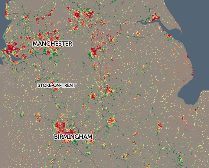
These scores cannot be directly compared with those from previous exercises (2010, 2007 and 2004 are the recent ones) due to slight methodological alterations, however we can rank each area based on the overall score – this is the Index of Multiple Deprivation – and then compare ranking changes between the years. It should be noted that a decrease in rank (i.e. an increase in deprivation measure compared with other areas) does not mean that an area has become more deprived in absolute terms – it may be just becoming less deprived at a slower rate. I have mapped the overall rank change from 2010 to 2015, and also the rank change of the component which measures the effects of crime on deprivation, as this shows some particularly interesting spatial characteristics.
Looking at the overall changes, London’s pattern is striking:
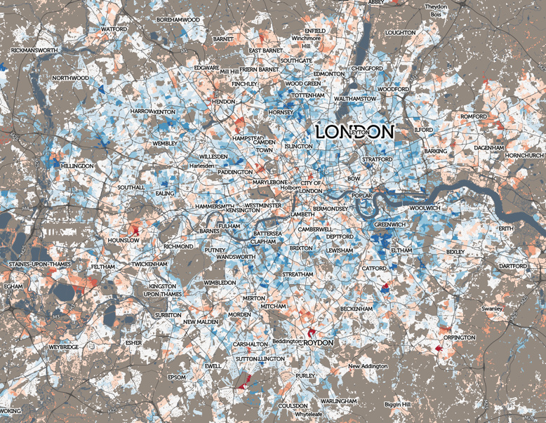
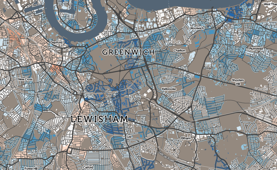
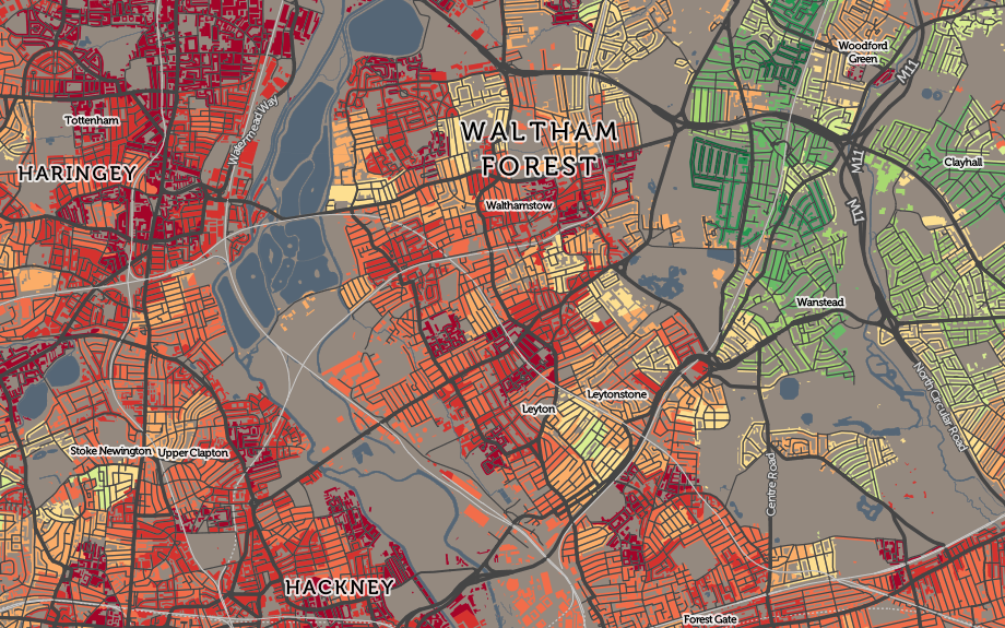
London’s inner city areas – Zones 2-4 – have becoming significantly less deprived in the last year. Indeed London, in general, has done very well recently relative to the rest of England, with only a few areas (St John’s Wood, Thornton Heath, Mill Hill, East Barnet and Hounslow) showing a significant increase in relative deprivation levels. Again, this may mean that they are still becoming less deprived, just at a slower rate. By comparison, Blackheath, Ealing, Upton, North Wembley and Crouch End have become dramatically less deprived since 2010. There are smaller pockets throughout the city who are are also showing marked moves in both directions – see the interactive map. I use a different (Red-White-Blue) colour ramp for these maps, to emphasise that they are showing changes.
- Change in Overall rank for IMD from 2010 to 2015 (Split by equal rank divergence)
- Change in Crime rank for IMD from 2010 to 2015 (Split by equal rank divergence)
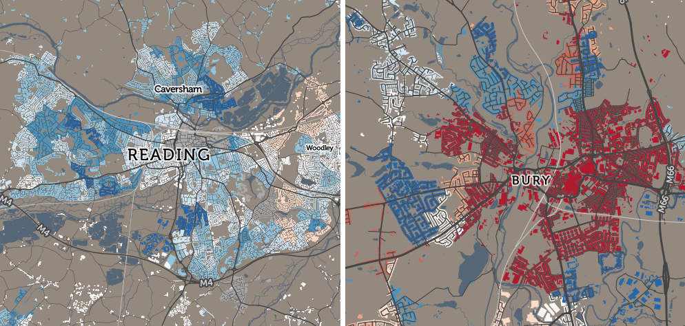
Some of the more notable results for changes in the crime component ranking of the IMD are in Reading (where the impact of crime on deprivation has significantly reduced) and Bury (where it has had a significantly greater impact). In both towns (see above, presented at different scales) however, other components have acted in the opposite direction, such as the deprivation ranking of these two places, with respect to the rest of England, has not significantly changed in five years. Bury, was, and still is, already significantly more deprived than Reading, the difference between the two has increased.
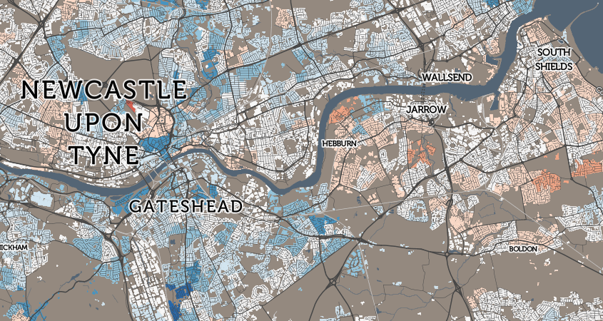
Another example: comparing Gateshead with nearby South Shields. The former up, the latter down:
The components are income, employment, education, health, crime, barriers to housing and services, and living environment. Their weights are summarised in this nice infographic from gov.uk.
See these maps and various geodemographic classifications at CDRC Maps.