

The Age of Buildings
We don’t have open individual building age data in the UK, unlike in some other countries (the data has been used to great effect in New York City and Amsterdam) but the Valuation Office Agency, which amongst other things decides council tax bandings for residential properties in England and Wales, has published some interesting data on how old houses are in the UK – it’s their “dwelling ages” dataset. A separate governmental organisation, the ONS, publishes house prices summaries, at a relatively small-area* scale, on a quarterly basis for the previous year. I have combined both these datasets into a record on CDRC Data. I’ve mapped both the prices and ages data on CDRC Maps.
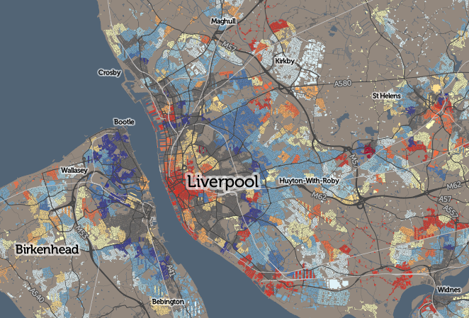
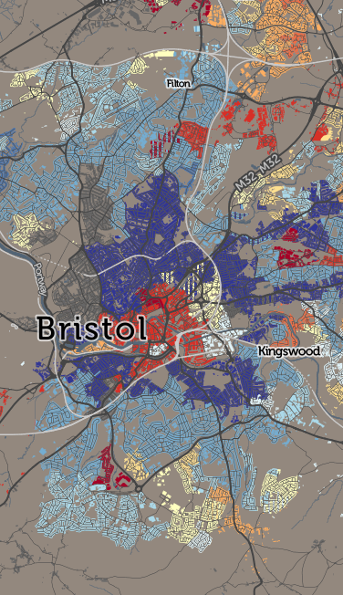 The dwelling age data is grouped into approximately 10-year age bands (+ a Pre-1900 catch-all) and a count of the number of houses in each band, for each small area (LSOA) in England/Wales, is made available. I’ve found the modal band, i.e. the band with the most number of houses in it, and mapped only that**. In some cases, houses were steadily built in an area throughout the 20th century, so that the band assigned to that area is not actually very representative of the houses there – check the classification % metric which appears on the right.
Many UK cities show a pattern of Pre-1900 inner-city (dark grey on the map), with early 20th century houses out towards the edge (lightening blues). The “Green Belts” of the 1940s stopped this radial outward development, so, some old housing was instead overhauled to build 1960s-70s housing estates (shown in yellow) and more recently, the city centres have seen much of the recent housebuilding activity. This shows up on the map as an area of red in the centre of many cities. There are some exceptions – Milton Keynes is a large, and new, town, its map showing mainly yellows and reds.
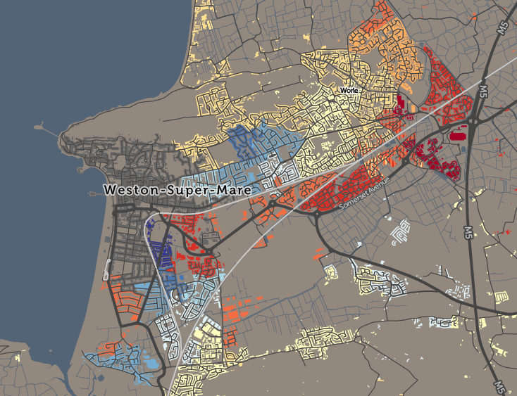
Not all areas are constrained by Green Belts but some have other, physical constraints, such as the sea. Weston-super-Mare, for example, has steadily expanded westwards over the last 150 years:
A second map concentrates just on post-WW2 (1945+) building, showing the proportion of such houses in each area. Hello, riverside east London:
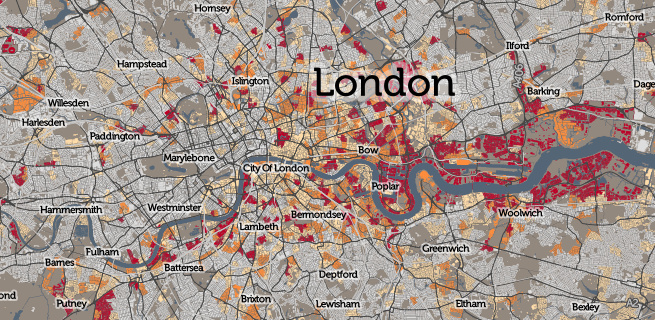
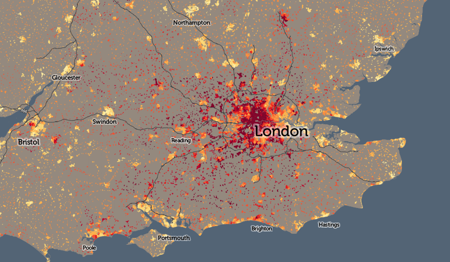
The house price pattern in England/Wales is quite familiar to many people – basically London is eye-wateringly expensive, particularly in the central and west, along with some satellite towns and cities (e.g. Oxford and Cambridge) but not others (e.g. Luton and Harlow). I’ve mapped the median house prices for each small-area as I think this better provides an indicator of a typical price paid. 50% of properties sold in the previous 12 months, in each area, sold for less than this amount, and 50% for more. As only a few houses in an area typically get sold in a year (I have included this number in the metric data) it is worth noting that the values can jump around a lot.
Explore the interactive maps:
- Dwellings – Modal Age
- Dwellings – Proportion Built after 1945
- House Prices (Median for Q2 2015, 1 Year Rolling)
* There is separately individual house transactions (with prices) released regularly by a third organisation, the Land Registry, however I have not mapped this at this time.
** Where an area is fairly equally split between two bands, I’ve included the “runner up” band as well, shown thinner vertical stripes. This only appears where the runner up housing count is 90% of the modal band, and the two bands account for more than half of the total housing. (Technical note: I’m using Mapnik compositing operations to get the vertical stripes, rather than a very long and repetitive stylesheet.)