What if There Were No Cars?
Here’s a map of the top method of travel to work, for people aged 16-74 and in employment, at the time of the 2011 Census:
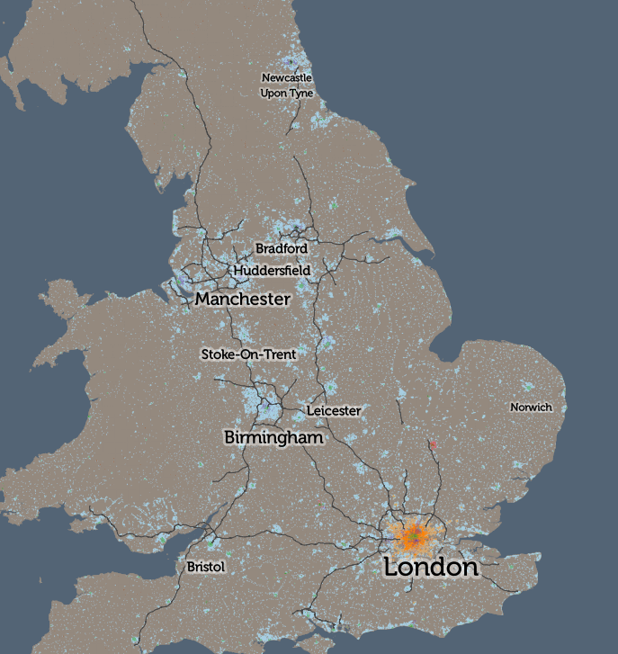
The pattern is, fairly evenly, that car use (light blue) dominates except for people living in the very centre of cities, where walking to work (green) is the most popular methods. The two big exceptions are London, where rail/metro travel dominates for the inner city zone, separating the walking core and car-driving outer London ring; and Cambridge, where the cyclists really are king. There are some other interesting results in small areas, but overall, the map doesn’t tell you much more than that. See the interactive version.
So, I’ve considered what the map would look like if we removed cars from the calculations – what form of transport is used by the people that need to work but don’t own or otherwise have access to cars, either as a driver or passenger? How does the UK commute, without cars, right now – and what might the UK landscape look like without the great rush-hour traffic jam? Here is the interactive map of the top carless commute across Britain.
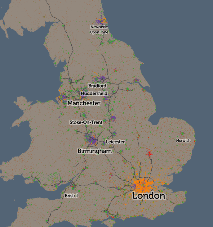
Suddenly, all sorts of interesting trends emerge. In rural areas, working from home dominates – with no public transport, and motorbikes being an uncommon form of transport in the UK, this is the only option. In towns and villages, and in city centres, walking to work dominations. Both are obvious – the interesting results appear if you zoom in:
- In London, the central walking-to-work area (green) coincides almost perfectly with the congestion charge zone. Other walking areas include Hillingdon, Croydon, Kingston and Stamford Hill.
- Rail/metro (orange) dominates throughout Zones 2-6 London and beyond.
- London has four major areas of bus dominance (purple) – Burgess Park in the south, Hackney in the north-east, the western Lea Valley in the north and a huge zone surrounding Heathrow Airport in the west. Three of these not surprisingly coincide with areas of poor rail/metro provision, but the western Lea Valley result is interesting – there are two rail lines down through this area with stopping services. However, notably, this area’s most popular employment type is cleaning – cleaners typically have to work nights, where the bus is the only public transport option.
- York versus Leeds – both have a similarly sized walking core, but then the rest of Leeds has bus users, while York’s outskirts are dominated by cyclists (red). The flatter nature of York is likely the major reason.
- Buses are pretty crucial in the Birmingham conurbation.
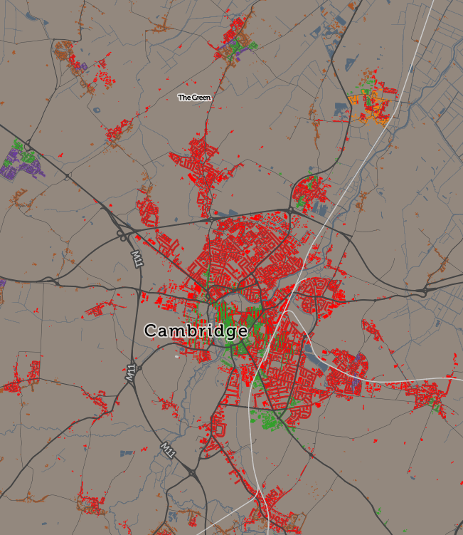
- Cycling dominates in almost every part of Cambridge but less so in the other famous cycling city, Oxford.
- Stoke-on-Trent has a very large walking core, larger than for the larger cities, covering the whole area almost, rather than being surrounded by bus/cycling/train commuters as normally happens. Stoke-on-Trent is actually a conurbation of six towns, with employment scattered throughout rather than concentrated in the normal core. Alternatively this could be due to poor bus provision or a dominance of driving.
- Ilkley and Bingley like their trains – nearby Keighley and Skipton, on the same network, don’t.
- The very richest areas have a high proportion of people working at home (brown) – live in help, aka domestic servants? See Knightsbridge and Hampstead Garden Suburb in London, or Sutton Park near Birmingham, are two examples.
- The new towns in central Scotland seems to have a greater proportion of working-at-home than equivalent new-town areas in England.
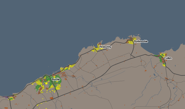
- Fishing communities (yellow – other) are obvious in north-east Scotland.
The technique of mapping only the most dominant mode of transport has a serious flaw, in that, depending on how you merge or split other transport modes, you can significantly influence which appears “top”. I have merged some modes together (driver+car passenger, train+metro+tram, and taxi+motorbike+other, e.g. boat), hopefully in a meaningful way that shows interesting results without hiding a bigger picture. Another mitigating factor is that, where a second mode of transport has nearly as much use as the first, I include its colour too, in narrow vertical banding, and highlight this in the interactive “area information” panel.
All the maps in this article use the CDRC Maps platform to map small-area consumer and other demographic data for the UK. Because I am using Census data, I am able to map for the whole of the UK (including Scotland and Northern Ireland), as, for the Census at least, the activity is coordinated across the nations, and while the outputs are arranged differently, they are sufficiently similar to combine and use together with care.