

TubeHeartbeat
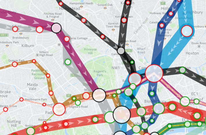
TubeHeartbeat is a interactive map that I recently built as part of a commission by HERE, using the HERE JavaScript API. It visualises a fascinating dataset that TfL makes available sporadically – the RODS (Rolling Origin Destination Survey) – which reveals the movements of people on the London Underground network in amazing detail.
The data includes, in fifteen-minute intervals throughout a weekday, the volume of tube passengers moving between every adjacent pair of stations on the entire tube network – 762 links across the 11 lines. It also includes numbers entering, exiting and transferring within each of the 268* tube stations, again at a 15 minute interval from 5am in the morning, right through to 2am. It has an origin/destination matrix too, again at fine-grained time intervals. The data is modelled, based on samples of how and where passengers are travelling, during a specimen week in the autumn – a period not affected either by summer holidays or Christmas shopping. The size of the sample, and the careful processing applied, means that we can be confident that the data is an accurate representation of how the system is used. The data is published every few years – as well as the most recent dataset, I have included an older one from 2012, to allow for an easy comparison.
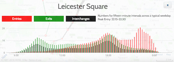
As well as the animation of the data, showing the heartbeat of London as the the lines pulse with passengers squeezing along them, I’ve including graphs for each station and each link. These show all sorts of interesting stats. For example, Leicester Square has a huge evening peak, when the theatre-goers head for home:
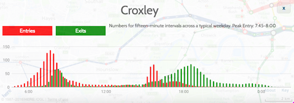
Or Croxley, in suburban north-west London, with a very curious set of peaks, possibly relating to the condensed school day:
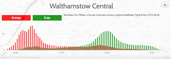
Walthamstow (along with some other east London stations) has two morning rush-hours with a slight lull between them:
Check the later panels in the Story Map, the intro which appears when first viewing TubeHeartbeat, for more examples of local quirks.
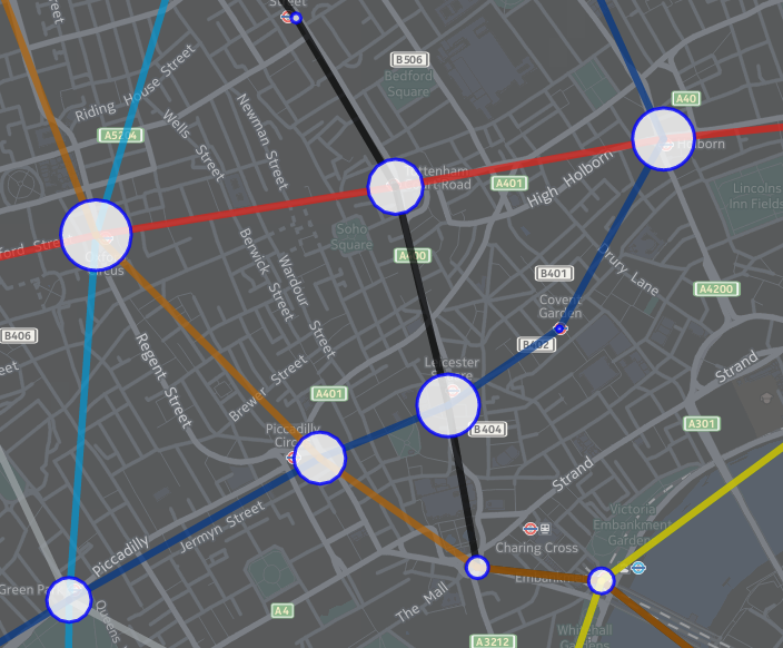
This is my first interactive web map produced using the HERE JavaScript API – in the past, I have extensively used the OpenLayers, as well as, a long while back, Google Maps API. The API was quick to pick up, thanks to good examples and documentation, and while it isn’t quite as full-featured as OpenLayers in terms of the cartography, it does include a number of extra features, such as being quickly able to implement direction arrows along lines, and access to a wide variety of HERE map image tiles. I’m using two of these – a subdued gray/green background map for the daytime, and an equivalent darker one for the evening data. You’ll see the map transition between the two in the early evening, when you “play” the animation or scrub the slider forwards.
Additionally, I’ve overlayed a translucent light grey rectangle across the map, which acts to further diffuse the background map and highlight the tube data on top. The “killer” feature of HERE JavaScript API, for me, is that it’s super fast – much faster than OpenLayers for displaying complex vector-based data on a map, on both computer and smartphone. Being part of the HERE infrastructure makes access to the wide range of HERE map tiles, with their distinctive design, easy, and gives the maps a distinctive look. I have previously used HERE mapping for some cities in the Bike Share Map (& another example), initially where the OpenStreetMap base data was low in detail for certain cities, but now for all new cities I “onboard” to the map. The attractive cartography works well at providing context for the bikeshare station data there, and the tube flow data here.
There is some further information about the project on the HERE 360 blog, and I am looking to publish a more deatiled blogpost soon about some of the technical aspects of putting together TubeHeartbeat.
Stats
| Number of stations | Number of lines | Number of line links between stations |
|---|---|---|
| 268* | 11 | 762 |
Highest flows of people in 15 minutes, for the four peaks:
| Between stations (all are on Central line) | |||
|---|---|---|---|
| Morning | 8208 | 0845-0900 | Bethnal Green to Liverpool Street |
| Lunchtime | 2570 | 1230-1245 | Chancery Lane to Holborn |
| Afternoon | 7166 | 1745-1800 | Bank/Monument to Liverpool Street |
| Evening | 2365 | 2230-2245 | St Paul’s to Bank/Monument |
| Station entries | |||
| Morning | 7715 | 0830-0845 | Waterloo |
| Lunchtime | 1798 | 1130-1145 | Victoria |
| Afternoon | 5825 | 1730-1745 | Bank/Monument |
| Evening | 2095 | 1015-1030 | Leicester Square |
| Station interchanges | |||
| Morning | 5881 | 0830-0845 | Oxford Circus |
| Lunchtime | 2060 | 1330-1345 | Oxford Circus |
| Afternoon | 5043 | 1745-1800 | Oxford Circus |
| Evening | 1109** | 2215-2230 | Green Park |
| Station exits | |||
| Morning | 6923 | 0845-0900 | Bank/Monument |
| Lunchtime | 2357 | 1145-1200 | Oxford Circus |
| Afternoon | 7013 | 1745-1800 | Waterloo |
| Evening | 1203 | 1015-1030 | Waterloo |
* Bank/Monument treated as one station, as are the two Paddington stations.
** Other stations have higher flows at this time but as a decline from previous peak.
I’m hoping to also, as time permits, extend TubeHeartbeat to other cities which make similar datasets available. At the time of writing, I have found no other city urban transport authority that publishes data quite as detailed as London does, but San Francisco’s BART system is publishes origin/destination data on an hourly basis, there is turnstyle entry/exit data from New York’s MET subway, although only at a four-hour granularity, and Washington DC’s metro also publishes a range of usage data. I’ve not found an equivalent dataset elsewhere in Europe, or in Asia, if you know of one please do let me know below.
The data represented in TubeHeartbeat is Crown copyright & database right, Transport for London 2016. Background mapping imagery is copyright HERE.