InSAR Ground Deformation Map
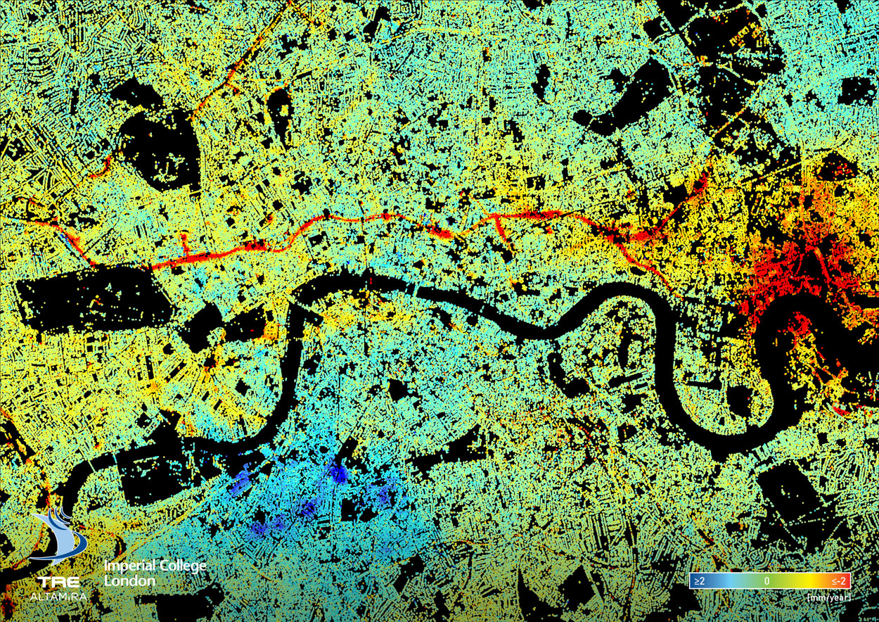
Here’s a fascinating data map of ground deformation (subsidence, upswelling) in central London, based on data from 2011-2017 and recalibrated to show the average annual change – be it rising (blue = 2mm/year upwards) or sinking (red = 2mm/year downwards). The data was obtained from 150 remote sensing images captured by TerraSAR-X and other InSAR (Interferometric Synthetic Aperture Radar) sources. It was processed using at TRE ALTIMIRA in Milan, Italy, using a technique called Permanent Scatterer Interferometry.
All sorts of interesting patterns appear from the map. The most obvious is the red line running across the middle – the Crossrail tunnels across central London. The project has likely resulted in the slight drop in levels seen, although extensive compensation grouting has aimed to minimise the changes. Other red lines show electrical ducting projects and other utilities/infrastructure projects. Conversely, a large blue area near the south edge of the map might be early premptive groundwork on the Northern line Underground extension to Battersea Power Station, and the extensive residential works at Battersea Power Station (which is right at river/sea level) and the Vauxhall area in general. The specific reason however is not known.
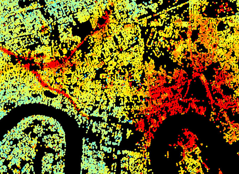
The large red area to the east could be two projects – various residential and other construction around the O2 Arena in North Greenwich, and the various works on the north bank opposite – London City Island, Limmo Peninsula shaft for Crossrail tunnelling works, and general residential tower development at Canning Town. This area has the River Lea running through it with dramatic meanders. The dewatering of deep chalk aquifer here, necessary to stabilise the ground, has seen a significant drop. Also, crucially, there were no buildings here before, so ground level changes have not needed to be carefully controlled as they need to be when working near existing structures.
Some other stories are a little harder to spot – new trees being planted in West Ham Park, or events being held here that have caused the ground to change level? Presenting as a map like this with a simple spectral colour ramp is an effective and clear way of communicating data in a way that tells a story, even if all the patterns cannot immediately be explained.
Thank you to Christine Bischoff at Imperial College for preparing and supplying the map and technical information.