

GISRUK 2015
The week before last I was at GISRUK, the long-running annual conference for early (and not-so-early) career researchers in GI Science in the UK, Ireland and further afield. This year’s conference was in Leeds and attracted a record number of 200+ delegates. I presented a poster at a meeting the day before the main conference, but otherwise had no presentation to give this year, which means I was able to relax and focus on getting to the most interesting sessions. This year we had some great keynotes, including two great visual talks from Google’s Ed Parsons and MIT’s Sarah Williams, opening and closing the conference respectively. Outside of the keynotes, there were three main streams running simultaneously, but with the theme regularly changing after each group of talks, which meant for plenty of room swapping.
Five of my favourite talks:
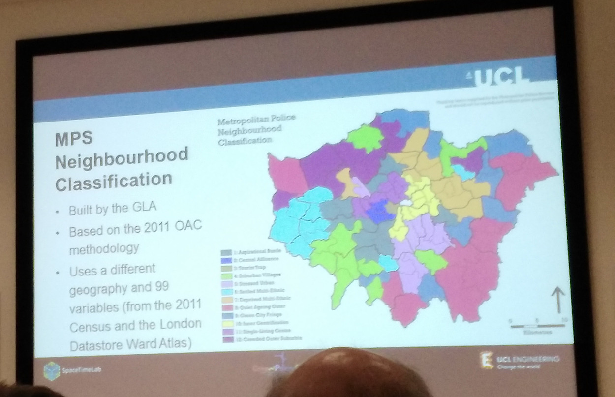 With a large UCL attendance, there were plenty of talks on geodemographics and socioeconomic mapping. One of my favourites was from Monsuru Adepeju of the UCL Crime, Policing and Citizenship project, the talk looed at a new way of detecting crime hotspots. The presentaiton included the above map of a crime-weighted geodemographic map of London.
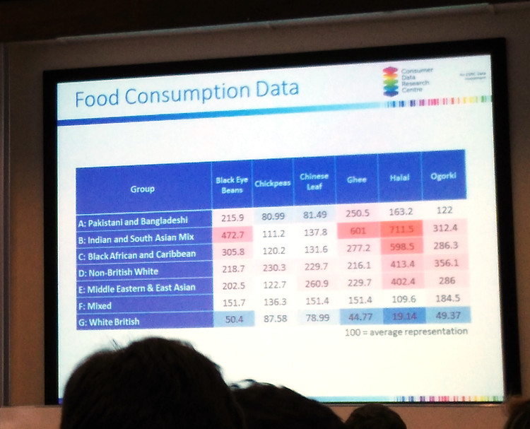 Staying with UCL and geodemographics, but going from crime to food, this classification, developed alongside a major food retailer in the UK, was presented by Guy Lansley of the UCL Consumer Data Research Centre, the work linked ethnic-weighted classifications with the popularity of certain food types, to simplify the task of providing particular food-types popular with one or more major ethnic groups in the UK, as the country’s population demographic continues to change and move.
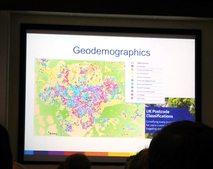 Staying with the geodemographic theme, Mark Birkin of Leeds gave an overview of geodemographics research in the era of big data, where ever increasing amounts of data allow ever more sophisticated analysis to be performed. The above image shows a slide from a presentation presenting a very detailed geodemographic map – right down to postcode (typically 50 homes) level.
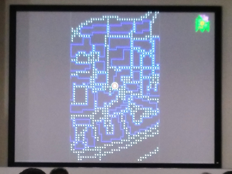 Away from geodemographics and to cartography: Jonny Huck of Lancaster presented the results of a study into creating a number of map types that encouraged good interaction with the map itself – the aim making maps for mobile devices that were engaging and encouraged people to look at the screen frequently when navigating – but not being so difficult to interpret that they were frustrating. Four styles of map, of the Lancaster University campus, were created from a Google Maps base, and participants were asked to navigate around the campus. The style that proved to be most effective in terms of engagement, while being fun to use, was the “PacMap”, a screenshot of which is shown above. Ironically Google released an unrelated PacMap for the whole world, as part of this year’s “April Fool” Google Maps hack.
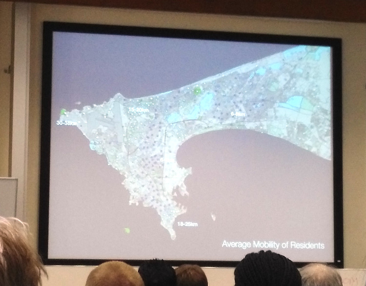 Ed Manley of UCL showed some results of using mobile phone data to derive patterns of mobility through certain parts of an urban area, showing that different communities experience their cities in different ways.
- I didn’t see the presentation by Robin Lovelace (Leeds) on his work-in-progress on creating an R/Shiny-based tool for visualising current inter-neighbourhood cycling flows, and predicting future flows based on several scenarios, but I did get a demo of the tool, which is looking impressive, and will be a powerful way to communicate a complex dataset.
- Some other highlights included TransportOAC (Nick Bearman, Liverpool) which is a geodemographic map focused on who people move around the UK. The classification is relatively “noisy” spatially, and London’s unique transport system (compared with the rest of the UK) means it gets a number of classification groups to itself. I also enjoyed Nilufer Aslam’s talk about linking metro smartcard data (from TfL’s Oyster Card) with journey and usage information of bikeshare systems, to see whether they indeed formed a “last mile” option for commuters, and how availability patterns affected this.
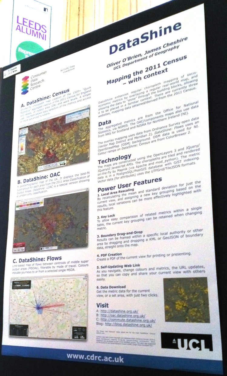 I presented a poster, above, on DataShine, at the poster session for a meeting immediately prior to GISRUK. The poster summarises the three websites that are my principal output thus far, from the BODMAS project.
So, an excellent conference, full of interesting talks on geodemographics and various other GIS-related research. Thanks to the organisers for their hard work in staging a smoothly-run and successful three days.