

Railway Station Numbers
The ORR publishes station entry/exit numbers on an annual basis, on a “best guess” basis, using ticket sales, gate information and modelling. The data is split by ticket type – full fare, reduced fare (off-peak tickets, tickets bought with railcards, advance tickets, child tickets etc) and season tickets. They make this data available as an Excel spreadsheet, so I’ve crunched it and have produced a couple of maps based on this data.
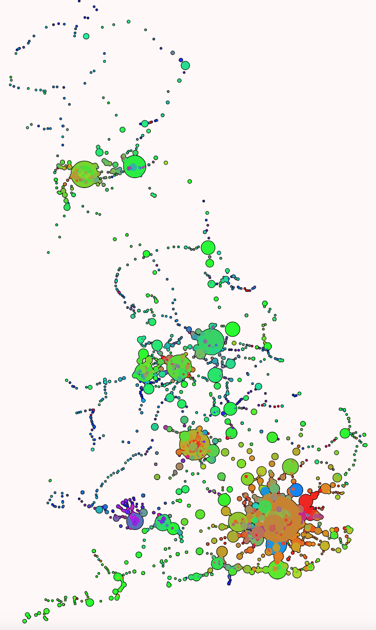
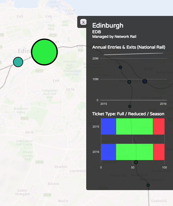
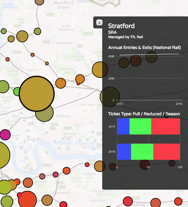
The first shows the total numbers of entries/exits across the last year that the data is available for (2016-7), with a blended colour composed of the numbers for season tickets (red), full fare (blue) and reduced fare (green). The area of the circle is proportional to the total numbers starting/finishing their National Rail journey at that station. I’m using a minimum circle size, as otherwise some stations would be practically invisible map, as they can see days go by without any passengers – or trains.
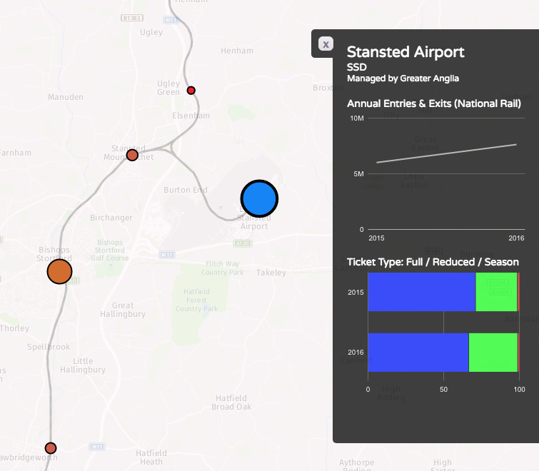
Some interesting patterns – blues for the airport stations, where off peak tickets generally aren’t available, such as Stansted:
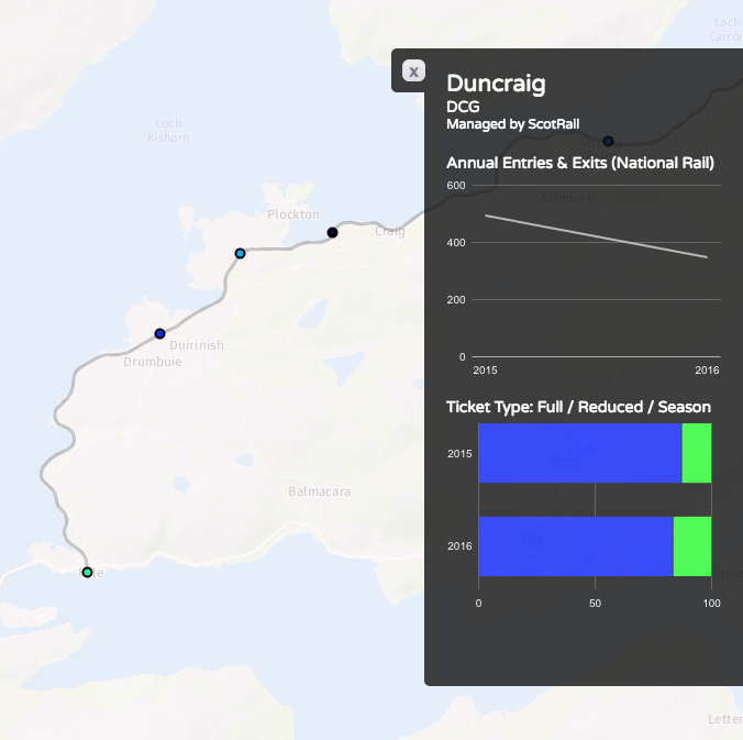
…and almost no-one pays full fare for some of the remotest stations:
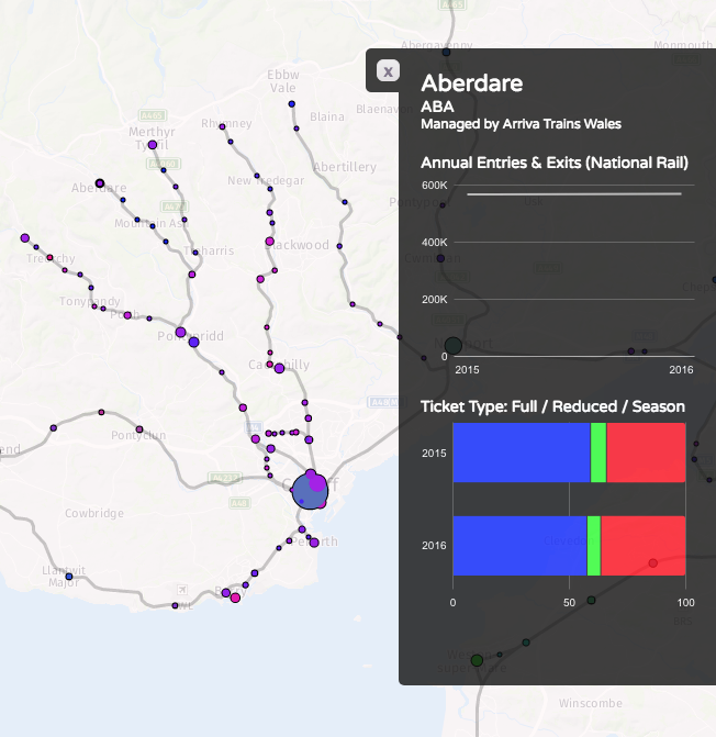
Purples on the Welsh valleys lines, showing mainly commuters and peak time users:
Bright greens for stations serving major destinations where advance tickets are readily available, such Newcastle-upon-Tyne:
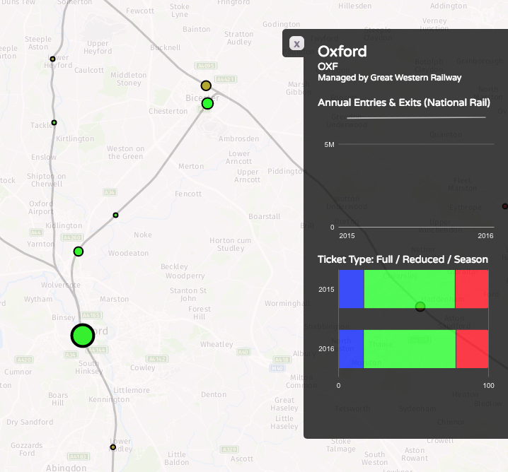
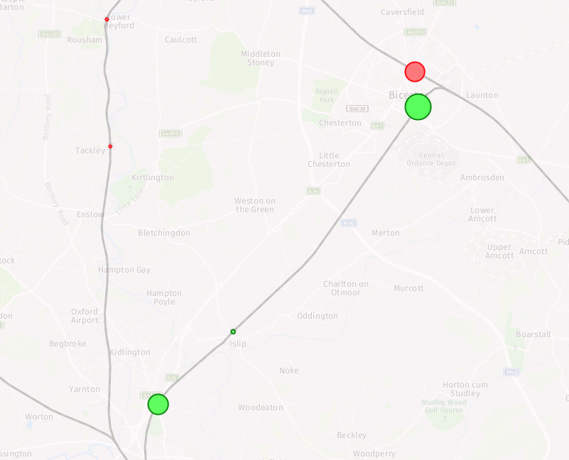
…popular tourist places, where many people will be visiting outside of the rush hours and at weekends, such as Oxford and Bicester Village retail outlet:
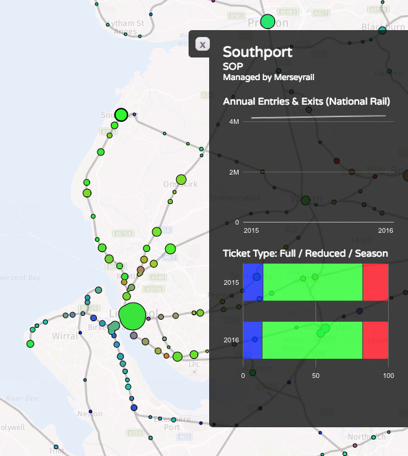
…and areas well covered by discounted travelcards, like Liverpool’s Merseyrail:
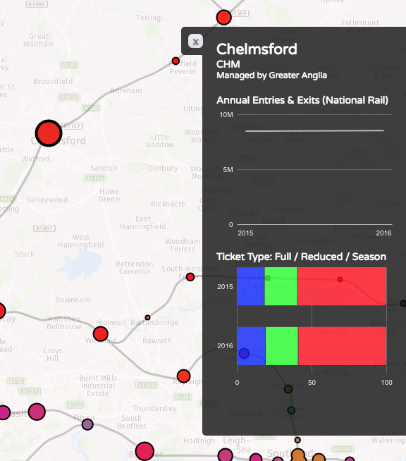
Reds where the season ticket holders dominate, such as Chelmsford and Colchester to the north-east of London:
Browns showing an “urban mix” of season ticket commuters and travelcard local journey makers, like in Straford, London:
See this map on TubeCreature.
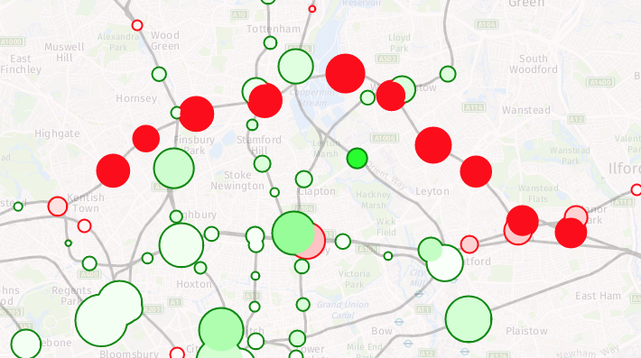
The second map looks at the change in numbers between 2015/6 and 2016/7 (a major methodological change means I cannot use data from earlier years, for a more complete time series). You can view the absolute numbers for both years, but what is of more interest is looking at the changes. The circle fill colour is the % change (with 100% green for a doubling of numbers and 100% for a halving of numbers). The area of the circle represents the absolute change in numbers. The border colour emphasises whether the change is an increase or decrease. Stations with little change will show up as small circles. The biggest trends are the new lines to Oxford via Bicester, and from Edinburgh to Tweedbank. In both cases, the lines were only open for part of the first year, so an increase would be expected even if the day-by-day numbers were flat:
Big drops show in parts London – the Goblin line having been closed for much of 2016/7 due to a bungled overhead line installation, and Kensington Olympia’s big drop due to a methodological change – i.e. it may not have actually been a big drop after all:
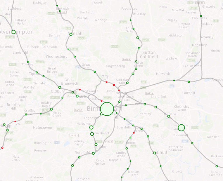
Most parts of the country see a steady increase (light greens):
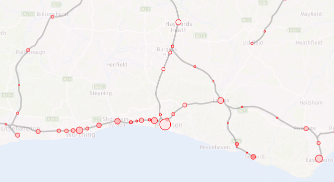
The big exception being area served by Southern trains – with them being on strike for much of the second year, the fall in numbers in this region is almost universal:
See this map on TubeCreature.