London’s Incendiary House Prices
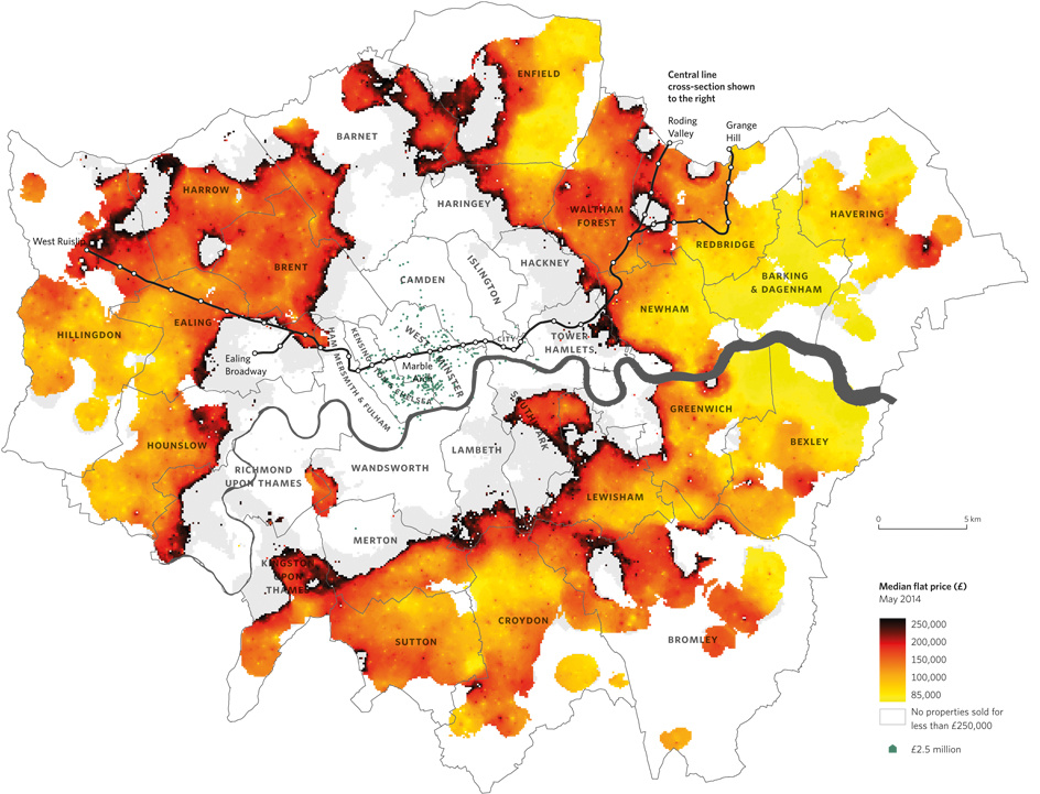
Above is a map from Mapping London co-editor Dr Cheshire’s new book The Information Capital that appeared in this week’s Time Out.
It dramatically shows how unaffordable large parts of London have become – areas where the median houseprice (i.e as many houses above this price locally as below it) is over £250,000 have completely burnt away. As the local level approaches that threshold, the colours get increasingly firey, suggesting that, if houseprices continue to rise, the burnt edge will continue to expand.
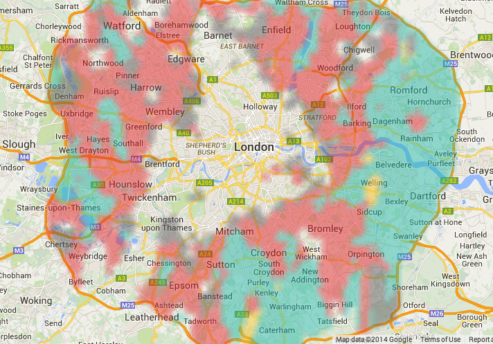
On a similar theme, Splittable uses similar colours to show where you are really going to have to share if you are looking to rent, and where you can live on your own – for £130/week budget, the yellow colours in the excerpt below show that there is only a small pocket in south-east London where such a place is unaffordable.
These two maps may be alarming to look at if you are setting to buy or rent, but remember they are just the median – there are plenty of places in “good” areas for a lot less than the values shown – you’ll probably have to compromise on something else though…