Big Feed Tidyup

At the end of each year (normally between Christmas and New Year), there’s a lot to tidyup across Bike Share Map (BSM), the Meddin Bike-Sharing World Map (BSWM) and the UK Shared Micromobility Dashboard. This year, I’m aiming to document all the changes needed, roughly around the time that I make the changes. Monday:

Continue reading »

Zag Daily

You may be wondering why it’s been so quiet on Bikesharp, the last couple of years… well the reason is that I have been a data journalist on this topic for Zag Daily, an online magazine focusing on shared electric micromobility, particularly in Europe and especially in the UK. So I’ve been writing about the […]

Continue reading »

A Chronological Map of Walthamstow

This attractive map of the housing and infrastructure history of Walthamstow and Leyton in north-east London has been created by Scott Davies. Scott used QGIS and OpenStreetMap data to create an attractive, vintage-style basemap and then shaded residential areas with different colours indicating when each block was developed. Older areas are shown in blues, while […]

Continue reading »

HERE Urban Mobility Index

The HERE Urban Mobility Index profiles 30 cities around the world, looking at how connected, sustainable, affordable and innovative they are, relating to urban mobility – the options that people have to move around the city area. London is one of the cities and scores first place for its public transport efficiency and low emission […]

Continue reading »

3D Map of Nitrogen Dioxide Pollution

Air pollution has long been a problem in London, and the current mayor has identified pollution as one of his major goals to highlight and tackle polluion, and improve the capital’s air quality during his time in charge. This map, of the modelled 2020 annual pollution levels of NO2, has been produced by Parallel, using […]

Continue reading »

InSAR Ground Deformation Map

Here’s a fascinating data map of ground deformation (subsidence, upswelling) in central London, based on data from 2011-2017 and recalibrated to show the average annual change – be it rising (blue = 2mm/year upwards) or sinking (red = 2mm/year downwards). The data was obtained from 150 remote sensing images captured by TerraSAR-X and other InSAR […]

Continue reading »

Strava Labs Heatmap of Runners

This stunning map reveals the athletic footprint of London. Strava have taken their huge volume of movement data, recorded by runners, cyclists and other data-enabled fitness peeps and created a heatmap of London (and indeed, the world). Many people use Strava to record their cycle to work, whereas running to work is much rarer, so […]

Continue reading »

Tranquil Pavement

Tranquil Pavement is an online map recently launched by the Tranquil City project based in London, in association with the Outlandish Cooperative and funded by Organicity. It aims to highlight tranquil places to visit, if the hustle and bustle of city life gets too much, by plotting “crowdsourced “locations – referenced in an Instagram feed […]

Continue reading »

London National Park City Map

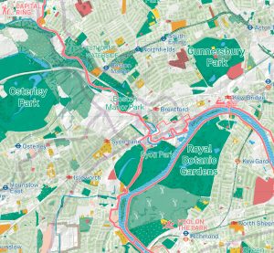
Urban Good, a new community interest company created by Charlie Peel, have this month published the first edition of their London National Park City Map. This huge, folded paper map covering the whole of London, was created through a crowdfunding campaign, and is available from Urban Good’s web store for just a payment of a […]

Continue reading »

London Bay

It’s a typical August day in London today, with the rain falling pretty heavily and at least one tube station closed due to flooding. London’s greatest long-term flooding threat, though, is from isothermal expansion of the world’s water (i.e. it needs slightly more space as it heats) due to climate change. The above map was […]

Continue reading »

Traffic Counts

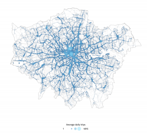
My latest London data visualisation crunches an interesting dataset from the Department of Transport. The data is available across England, although I’ve chosen London in particular because of its more interesting (i.e. not just car dominated) traffic mix. I’ve also focused on just the data for 8am to 9am, to examine the height of the […]

Continue reading »

London’s Street Trees

Following a data release of Southwark’s publically maintained trees a couple of years back, the Greater London Authority recently published a map which shows street trees (trees along roads and public paths, and trees in public open spaces, such as small parks and other minor green areas). Each borough has its own tree database and […]

Continue reading »

Christmas List 2016

Welcome to the Mapping London Christmas List 2016! Not long now until Christmas Day – if you are having a last minute present crisis, our list includes direct links, so you can browse, order, sit back and relax in the knowledge that the present selections for your London map geek friends (or yourself!) are all […]

Continue reading »

Review: London, The Information Capital

londonpacman

Mapping London’s co-founder and “Editor at Large” Dr James Cheshire co-produced “London: The Information Capital” with Oliver Uberti in 2014. We mentioned the book on its initial release. The book has this month has now been published in a softback edition by Penguin, with some minor corrections applied. If you missed out on the book […]

Continue reading »

The Full Stack: Tools & Processes for Urban Data Scientists

Recently, I was asked to give talks at both UCL’s CASA and the ETH Future Cities Lab in Singapore for students and staff new to ‘urban data science’ and the sorts of workflows involved in collecting, processing, analysing, and reporting on … Continue reading 

Continue reading »

Understanding Cities through Individual-Level Data – Opportunities and Challenges

As it’s been a while since I last posted, I thought I’d put up something I prepared for a Royal Society Smart Cities and Transportation workshop next week. I’ve focussed on data collected at the individual-level, and the opportunities the data present for better understanding cities, and the challenges the maximisation of these resources face. There are no …
Read more

Continue reading »

London’s Exodus

londonexodus

Time Out London, the venerable London free magazine, have spotted that everyone in London loves maps, and so have launched a regular London Mapped feature in their City Life section & blog. This week’s map is rather interesting and not one I’ve seen before. It shows ONS 2015 data on net migration between London’s boroughs […]

Continue reading »

O/D Map of London Commuting

This map shows the cross-borough London commuting flows in a different way to the conventional approach of drawing lines between the start and end of each commute (as shown here. It’s a large map of London boroughs, which each borough itself containing a small map of London. The intensity of the colour in each of […]

Continue reading »

TubeHeartbeat

tubeheartbeat2

TubeHeartbeat visualises one of Transport for London’s most interesting and detailed open dataset, RODS. This has data on the approximate weekday volume of passengers between each pair of stations on the network, and entering/exiting the stations, at 15-minute intervals. Mapping this, as TubeHeartbeat does, shows a distinctive pulse, or heartbeat, as commuters surge in and […]

Continue reading »
1 2 3