A publication is no longer just a publication. It can be many things and what we see is only the beginning. A book can be a magazine, an ebook a website or a comic. Different medias are being mixed to play with ways of presentation. New technology plays here are good part and enables some very new concepts to be tested.
The eReader platforms and especially the iPad promise new ways of publishing. Only last week Apple has announced, as part of the app ibooks 2, the publication of text books. Here they put the emphasis more than before on the integration of additional media like video for tutorials and explanations, interactive graphics (like the newly released E. O. Wilson’s Life on Earth) and of course web links and so on. The animated and augmented book is only catching on a the moment. If you’re looking to purchase an iPad try out these Promotional Codes and save some money on this expensive technology!
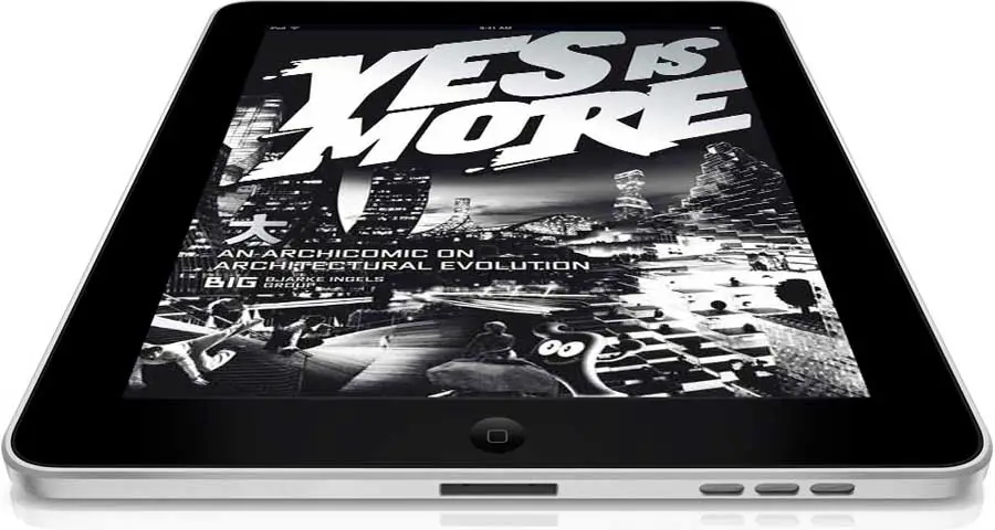
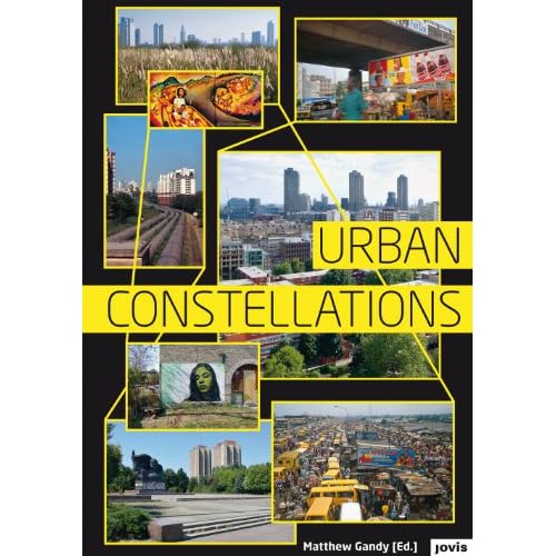
Image taken from earchitect / Yes is More on the iPad.
The architectural monagraphy is a rather unlikely candidate to put forward such an interactive publication. One would expect it to be a heavy piece with nicely photoshopped images and and a thick cover. This is however a way of presentation for the old garde and if BIG represents the new generation of architects such an interactive option of presentation is the way to go. BIG has always been very much about telling a good story and producing a good show. The show of course is very subjective and this subject is two fold its the facts about the design and Bjarke Ingels the head of the Bjarke Ingels Group (This is what BIG stands for).
Their Yes is More: An archicomic on architectural evolution was originally published back in 2009 by Taschen and as such already wasn’t the architectural monograph one might buy if it was Norman Foster or Richard Meier. BIG presented their work in a sort of comic they branded archicomic. It was however mostly well received even though few probably understood what Bjarke actually meant by Yes is more.
The one architectural monography ambitious architecture practices have to top if they really want to set a mark and the book that has dominated the style of architecture book for the last decades is S,M,L,XL by Rem Koolhass’s OMA and AMO’s Bruce Mau. It was published in 1995 by Monacelli Press.
BIG had a go at this with the comic. It was well received, but not quite enough to land in the hall of fame. It certainly did stir things a little and it fitted well with the self image Bjarke is building around his practice and the delivered projects. The advancing technology however meant new opportunities are opening up. BIG has been working more and more with new media, testing animation, 3d as well as augmented reality.
Now in 2011 the original book has been transformed into an app for the iPad as Yes is more! An Archicomic on Architectural Evolution by BIG. It is published by Taschen again and available on itunes. It is not exactly an ebook since it is as a comic mainly imagery based and now also integrated animations and movies. The comic comes to live with clips that play within the grid of images or in full screen mode. It’s clear from the start that this format fits the stile. The publication really thrives with the media in this case.

Image taken from the app / Page spread 218-219 in landscape mode and page 219 in portrait mode. Both show at the bottom the navigation bar.

The app works both in portrait and in landscape mode. With the swipe of a finger one browses through the sequence of images learning about reasons and effects, but also a lot about Bjarke. Where he lives and what the view of his balcony looks like. Details can be zoomed in on, just like you are getting used to on your touch screen. A youtube like triangle symbolises clips and a click opens these additional medias in a small window or plays them at full screen at rather good resolution. Quality is ver good through out even if zoomed in on details.
Navigation is organised in a bar at the bottom that appears with a tab. To choose or jump to a new topic one can either use a slider of miniature pages or a selector roll. Of course individual pages can also be found by page number. However, the layout does not show any page numbers. They have been removed. In this sense the app is not at all a pure digital version of the paper based publication.
The app also offers a search box for key word search or a separate listing of all the clips if only moving images are of interest. The app offers the option to put bookmarks. There is no note option though, something a lot of ebook users probably have come to like from other platforms.
The experience the app offers is very good even though they have chosen not to the mimicked turn the page effect. It runs smooth the displayed material is qualitative very good with nice colours and sharp contours. Its what you get from other ebooks.
THe feel of the app has very little to do with a book any longer. The turn the page effect is missing, which to be fair, is a stupid thing, an purely visual imitation, but it comes the closest to turning a page and with it imitating the book. Then also the page numbers are missing, a very distinct design element of a paper based publication. This is not so much about the actual number but about orientation and progress. How far have I read and how many pages ago did the lead character last smile? Here we have no page numbers unless we choose to look at it in the bottom bar by tapping to activate it every time. There is however, a tiny bar appearing with each swipe of the page at the bottom indicating the position in the book, assuming the whole length of the screen is the entire book. This is very neat and practical. It would be nice if this little feature could also be draged and enable a sort of quick flip.
Currently there is no way to quickly flip through the book. the swipe response is quite slow and three quick swipes result in only one page shift. Similar the page numbers don’t move you through the pages that quickly. If now this little bar could do such a thing, maybe even in combination with the thumbnail page preview it would make for a great navigation.
The sequence of pages are presented in linear fashion. There are for example no links within the book. The last chapter BIG City provides an overview of the BIG project grouping similar projects together to city districts. It would be nice if clickable and acting as hyperlinks to jump to the details. Or maybe select one of the groups and look at all these projects together. It being programmed as an independent app such options would be possible enabling more browser like handling with back and forth or even history options, where the linearity of the paper based publication would be unlocked. With out this and it feels a bit like a slide presentation and in terms of the linearity would represent a power point against a prezi.

Image taken from klatmagazine / Yes is More on the iPad.
To sum it up, navigation and experience are working fine. Every function you would need is there. Its just that most things have the feel of a computer based click with your mouse here sort of solution. At the same time the app designer have not really let go of the book and present it in a purely linear fashion. It remins a hybrid, and is as sort of ebook with its own app not quite defining a new category of interactive, reader driven, content platforms.
As it being an independent app there are is the downside that it does not link up with other publications. The thing about ebooks is that they still, at least in the term, link up and the same software is playing for all of them. Notes are taken across books, so are markings. This publication is a standalone thing and plays at most with the collection of apps, but not necessarily the books or ebooks in this case. This is more from a collectors perspective a point, but then if you are into architecture you want a whole bunch of similar publications to cover your entire field of interest. One single item doesn’t really satisfy this and remains the odd one out. Bjarke doesn’t mind to be the odd one out as long as he’s being talked about.
Nevertheless its an interesting publication and an impressive one. Its not just a few swipes long, something you have swiped through in under five minutes. This is your proper comic you can read on the tube and the bus for an entire week of commuting. It comes along happily on you iPad and pops upen where you left it. It is currently priced at £6.99 which is nearly the price of the actual print, on amazon for £11.66 (on the Taschen website it is priced at £ 17.99, here the app a bit less than half). You can buy the app from HERE on itunes and the book from Taschen or amazon .
.
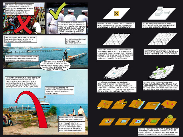
Image taken from the Yes is More app / Spread showing the project with the very poignant title Swept under the carpet. It is not a particularly famous BIG project, but it is one that summarises a lot about the approach. (click image to read the details) The introduction of the publication shows Bjarke with his feet on the table proclaiming his architecture paradigme is to say YES to everything. He claims that architecture can incorporate everything and still be progressive. In this very particular project, Swept under the carpet, he literally sweeps the pollution, this very project is built on a piece of land with polluted soil and the competition asked for solutions to deal with this fact, under the carpet with the argument: “Instead of cleaning up the mess we just cover it. We can spend the money required for cleaning the soil on my project and cover up.” He in fact says NO, in this case to the environment and a longterm solution. Much rather, he lets the polluted soil continue to contamine the water around the community and sailing centre and lets the kids swim in the dirty waters, but everything is nicely covered up. Even though BIG claims for their working attitude to be about process the reflection stage is missing in their project. No critical questions are asked, there is often little attitude or actual opinion on things. Even though BIG is subjectivated and purely focused on the person of Bjarke Ingels it is a brand and not a person.
The comic style fits well with the experiment of a ebook hybrid. There isn’t much to loose by putting it in an rather experimental form and it thrives on it. However the comic style dose not add anything to the content. It is however playful option to publish a book base don figure notes. Yes is More is a graphic novel taking the communication of architecture in visual terms to the extreme by not even attempting to talk about architecture in text form. The comic here is interpreted as annotated pictures and this fits perfectly with the way BIG explain projects, in simple steps explaining what is happening as if it were a DiY manual.
For BIG it’s all about the presentation. They way the projects are presented makes the projects directly ind simply accessible, see video below. The media used are engaging, playful and fitting. The explanations are very simple making every move easily understandable even for a layperson. Interesting however is more how arguments are made and here BIG’s background shines through. Everything is very much the famous and with this publication very much targeted form follows function. Following this paradigma the entire project is presented, throwing in here and there a few clever references and options, but essentially argumentation is very much founded on functionality.
Ingels, B., 2010. Yes is More: An Archicomic on Architectural Evolution, iPad App., Cologne: Taschen GmbH.
Continue reading »