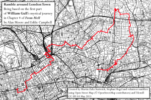
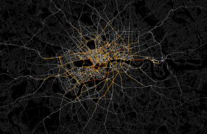
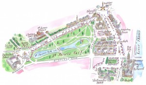
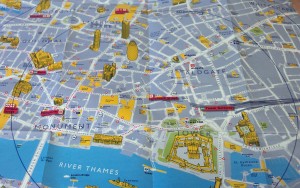
The Ultimate Gift List for Map Lovers

Here’s my 2017/2018 Ultimate Gift List for Map Lovers! All the recommendations are for products I own – or have seen – and can genuinely endorse. I’ve listed them under broad categories of people you might want to buy them for. Hopefully they cater for a range of map-related interests and budgets. Enjoy! For those who […]

Continue reading »

Population Lines: How and Why I Created It

Thanks to the power of Reddit the “Population Lines” print (buy here) I created back in 2013 has attracted a huge amount of interest in the past week or so (a Europe only version made by Henrik Lindberg made the Reddit front page). There’s been lots of subsequent discussion about it’s inspiration, effectiveness as a form of […]

Continue reading »

Mapping 5,000 Years of City Growth

I recently stumbled upon a great dataset. It’s the first to provide comprehensive data for world city sizes as far back as 3700BC. The authors (Meredith Reba, Femke Reitsma & Karen Seto) write: How were cities distributed globally in the past? How many people lived in these cities? How did cities influence their local and regional […]

Continue reading »

Kindle Maps and E Ink properties

CHI 2013 and GeoHCI workshop highlighted to me the importance of understanding media for maps. During CHI, the ‘Paper Tab’ demonstration used E-Ink displays to demonstrate multiple displays interaction. I found the interactions non-intuitive and not mapping very well to what you would expect to do with paper, so a source for confusion – especially […]

Continue reading »

Mapped: British, Spanish and Dutch Shipping 1750-1800

I recently stumbled upon a fascinating dataset which contains digitised information from the log books of ships (mostly from Britain, France, Spain and The Netherlands) sailing between 1750 and 1850. The creation of this dataset was completed as part of the Climatological Database for the World’s Oceans 1750-1850 (CLIWOC) project. The routes are plotted from the …

Continue reading »

Fast Thinking and Slow Thinking Visualisation

Last week I attended the Association of American Geographers Annual Conference and heard a talk by Robert Groves, Director of the US Census Bureau. Aside the impressiveness of the bureau’s work I was struck by how Groves conceived of visualisations as requiring either fast thinking or slow thinking. Fast thinking data visualisations offer a clear message without the need …

Continue reading »

Deceptive in their Beauty?

  Finding ways to effectively map population data is a big issue in spatial data visualization.  The standard practice uses choropleth maps that simply colour administrative units based on the combined characteristics of the people that live there (see below). These maps are popular with cartographers for a couple of reasons. You get a clear sense that the …

Continue reading »

The Best of 2011

As 2011 draws to a close it is worth reflecting on what, I think, has been a defining year for mapping and spatial analysis. Geographic data have become open, big, and widely available, leading to the production of new and interesting maps on an almost daily basis. The increasing utilisation of technology such as Google Fusion Tables has …

Continue reading »
1 2