
World City Population Map Update with the New World Urbanization Prospects 2025
The interactive map of world city populations – https://luminocity3d.org/WorldCity/ – has been updated with the newest release of the UN World Urbanization Prospects (WUP), the leading dataset for understanding global urban dynamics. The new UN WUP 2025 release supersedes the 2018 version. It’s a major revision with updated demographic data a new harmonised methodology for … Continue reading World City Population Map Update with the New World Urbanization Prospects 2025
Continue reading »
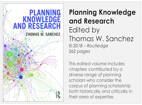 Here is a useful and interesting book on the nature of planning knowledge and research. My own contribution – click here to get the original PDF – is about scientific method and how theory and models pertain to the field …
 In November 1986 I visited SunYatSen University and gave a public lecture about Urban Modelling. China was a very different world then, no cars, no computers, no email, barely functioning electricity. And of course it was before laptops, networks, hand-held …

