Book – Informotion

Infographics are everywhere and a lot of development both in therms of technology and style has gone into the representation of information in the last few years. It is however an old topic and through out the past century aspects of graphics, design and technology in regards to the presentation of data and information were developed.

The Gestalt Theory (Detailed article in the German Wikipedia) was developed in the early 20s of the last century or Tufte (earlier on urbanTick) wrote his much influential books in the 80s and 90s to name two.

Image taken from the189.com / Informotion project by Bryan Ku docuemnting the final game in the 122nd edition of the Wimbeldon Championship Men’s Final between tennis giants Rafael Nadal and Roger Federer. See the animated version HERE.

The reason for some more recent development in information design and especially and especially handling is connected to technological and practical changes, but also the increased availability of raw data and details to be turned into information graphics.

Often however the subject to the data is temporal or process based with need for background or lead in, change of place or frequent change of perspective. For these cases animated inforgraphics can be a great way to communicate knowledge. Besides who doesn’t like to look at motion pictures? It really fits in with the whole TV consuming sort of urban lifestyle.

Its pretty save to say, that for the first time the book Informotion: Animated Infographics by Gestalten bring together a selection of the best motion picture graphics communicating knowledge. All of the examples are very recent projects and most can be found on either vimeo or youtube of course. However the interesting bit on the book is the context the examples are being put in. The editors Tim Finke and Sebastian Manger put great emphasis on contextual details in a wider sense. Where publications like the recent Taschen Infographics are a mere selection of great examples the Informotion book includes the theoretical and practical aspects too.

This of course makes the book heavier to read, it’s also but not only to look at, but you get a lot more out of it for your practice. Besides inspiration the book provides a refresh and update on the graphic, visual and design theories as well as the technical details of animation production such as software, storyboards or size, resolution or format.

Image taken from binalogue.com / Images showing the page spread design. The example shown here is an animated infographic by binalogue showing the CANAL Isabel II water cycle. See video below for the original animation.

There is also one of the aNCL (animated New City Landscape) informmotion graphics included as anexample in the book (p.188-189). It is the animation produced in collaboration between urbanTick and Anders Johansson on the Twitter landscape in the area arond the city of Zuerich in Switzerland. The original post on the animation can be found here, the animation is below.

Of course there is something awkward about a printed book about animated examples. However the content lives up to the expectations and whilst the animations can not be shown in the book the story can still be told. Even more so that the examples are discussed in detail and help to illustrate the theoretical elements of the book. In this sense there is literally more to the book than just the pictures and lines of text there is actual information in there plus Gestalten have a website where readers can get additional info and links to the animations. The list of examples can be found HERE.

Image taken from Gestalten / Book cover.

Finke, T. & Manger, S. eds., 2012. Informotion: Animated Infographics, Berlin: Gestalten.

Continue reading »

Book – Information Graphics

Information graphics are the subject to a brand new Taschen publication Information Graphics that is bringing complicated data made understandable through brilliant designs to a strong coffee table near you. The book is colourful with strong visual guidance, large, very large and heavy, some 480 pages heavy. As this outline shows, its a bold publication that doesn’t hide behind all the various examples of graphic design, but provides a tasteful framework to showcase the many awesome examples of data narratives.

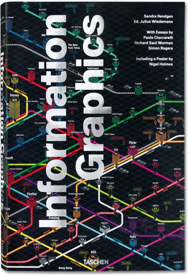
Cover Information Graphics
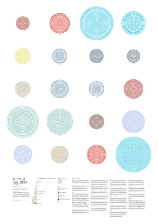
Image taken from aestheticsofjoy by Stephanie Posavec / Writing without words exploring possibilities to visually represent text.

Of course info graphics are currently trending and one of the most talked and specially passed around topic, not only online but more recently also in the media. All the large media houses have a special information design group and the publication showcases a number of these examples. In this context the book is not the first such collection of good designed information, but certainly one of the boldest in a positive sense.
The publication is edited by Julius Wiedemann und features contributions by Sandra Rendgen, Richard Saul Wurman, Simon Rogers from the Guardian Data Blog and Paolo Ciuccarelli. This is a very interesting team Taschen has put together for this publication with, whilst still being information specialists, covering a broad spectrum of perspectives and expertise.

NYT Historic Shift NYT Historic Shift
Image taken from dynamicdiagrams by NYT / Interactive visualisation showing the changes in election results over the period 2006-2010. Find the interactive version at NYT

Where other publications, for examples Data Flow by Gestalten, Otto Neurat by NAi or indeed Edward Tufte focus on the context of the graphics, the theoretical background of narrating information as well as the actual teaching of how to present information the Taschen publication is a showcase. It is foremost about showing great examples from a variety of sources on how to visualise data sets graphically in mainly 2D. There are a few web based, animated or interactive examples too though. This takes into account that complexity showing in these graphics is continually rising.

Husevaag Escape Routes Husevaag Escape Routes
Image by Torgeir Husevaag / Escape Routes, 2010-2011. A series of drawing studying possibilities of spatial movement under given time constraints. On the left the map and on the right a detail of some of the blue shaded location sixth path details

Showcasing such a large collection of examples is tricky in that the ordering system as to how the examples are organised becomes very prominent and therefore important. Here the editor has decided to go with a very low number of groups to arrange the info graphics. Where other publications make an exercise out of inventing a whole new system to clarify and characterise the examples this one takes the simple approach. This both refreshingly straight forward and annoyingly rough. What do the chosen terms Location, Time, Category and Hierarchy actually describe, or more importantly how are they distinguished?
The questions remain unanswered however, this does not stand in the way to enjoy the great quality and variety this collection shows. Its a book to brows, jump and flip, a publication you will keep in reach for a long time and always go back to to enjoy or indeed recharge your design batteries.

Cover Information Graphics
Image by Taschen / Book cover Information Graphics.

Rendgen, S., 2012. Information Graphics J. Wiedemann, ed., Köln: Taschen GmbH.

Continue reading »

Book – Four to Start into the New Year

From sustainability to the new beauty in the following four books are put forward to start into 2012. The topics all address some of the concerns raised about cities in the past year or so and all contribute to the current discussion around changes in social and spatial organisation at large. With globalisation and technology social structures are changing requiring urban environments to be adapted. This will not happen tomorrow, nor is it a case of restarting in building it new from scratch. The only option is to keep transforming and by testing and engaging with the presented new thoughts and aspects we might take a step into this direction.

Not all cities are mega cities. In fact most of the cities are small to mid sized. According to the work Mike Batty had done together with Martin Austwick and Oliver O’Brian on Rank Clocks plotting city sizes in the US, only about 10% of the cities are mega or large. The rest of the cities are under 1 million in population size.

In terms of sustainability potential these large numbers of smaller cities could actually play a major role and this is what Catherine Tumber put forward in her publication Small, Gritty, and Green: The Promise of America’s Smaller Industrial Cities in a Low-Carbon World published by MIT Press.

There are so many problems the smaller cities face. From long terms decline due to the faltering of industries, massive transport infrastructures slicing them into non workable urban islands and social struggles related to working poor and general poverty reminiscent of postcolonial squalor. The biggest struggle however is the fact that they are excluded from the general debate of urban planning and theoretical thinking. They all practice urban planning and development, but with only little recognition and background.

Tumber argues that due to the smaller sized, shorter distances and proximity to farmland and recreation these smaller cities have a lot of potential to implement sustainable concepts and start integrating those in everyday urban practice. Tumber especially points to renewable energies, such a wind, food production and local agriculture as well as manufacturing skills. Its all about producing and consuming locally.

These ideas are not new and sort of resonate with early garden cities ideas, especially in the praise of size and population density. This is not at all a negative association, but more a practical application. Since here it is not about setting up a new place to live, which can in itself not be sustainable, but about reprogramming an existing one sustainability is given an additional dimension.

Small, Gritty, and Green Book cover
Image taken from archpaper / Small, Gritty, and Green, book cover, part.

Does a city posses its very own spirit and identity? Daniel A. Bell and Avner de-Shalit argue in their new book The Spirit of Cities: Why the Identity of a City Matters in a Global Age published by Princeton University Press that actually they do. The authors draw on the ancient Greek concept of city spirit and argue for the rediscovery of the local urban spirits around the world especially in connection to todays globalisation.

Earlier publications have picked up on this topic and characterised cities in such a manner as to work out distinct identities. Saskia Sassen in Cities in a World Economy and more recently Martina Löw in Soziologie der Städte
(sociology of cities). THe concept of the citiy spirit is, as Löw points out, closely entangled with the city marketing that has been very popular in the past fifteen years as a tool to distinguish, present and attract.

Bell and de-Shalit look specifically at nine modern cities: Jerusalem (religion), Montreal (language), Singapore (nation building), Hong Kong (materialism), Beijing (political power), Oxford (learning), Berlin (tolerance and intolerance), Paris (romance) and New York (ambition). Of course soe of them sound like external concepts. Especially Paris and the age old topic of romance, hey but never mind it shapes the place in a certain way and this identity hold the potential to develop something specific and relevant.

Each city is portrait in a lot of detail making good use of story telling as well as combining theoretical aspects with practical experience. A good read for travellers of thought.

The Spirit of Cities Book cover
Image taken from the Atlantic / The Spirit of Cities, book cover.

“We have to find our way back to beauty!” Lars Spuybroek argues in his new book The Sympathy of Things: Ruskin and the Ecology of Design, published by V2_publishing, for a revised approach to design culture moving away from the technological practice of modernism towards a more romantic notion of art in the sense that beauty always combines variations, imperfection and fragility. Spuybroek bases his arguments on John Ruskin‘s aesthetics. Overall the book is a project to wrest these topics out of the Victorian era into the present. This is achieved by combining the five central themes of Ruskin: the Gothic and work, ornament and matter, sympathy and abstraction, the picturesque and time and ecology and design in combination with more recent thoughts on aesthetics by philosophers such as William James and Bruno Latour.

It becomes a projection of a world of feeling and beauty in such a way as it completely does a way with the fundamentalism and absolutism of modernist conception of design.

The Sympathy of Things Book cover
Image taken from il giornale dell architettura / The Sympathy of Things, book cover.

Graphical representation of information are in every case an abstract representation. Often to represent a point of view or a standpoint is required and depending on this the representation is biased. In Picturing the Uncertain World: How to Understand, Communicate, and Control Uncertainty through Graphical Display published by Princeton University Press, Howard Wainer is looking at the phenomenon of information display of statistical data and the possible complications.

The book is less about graphics than numbers, although graphics do play an important role. Similar to Dona M. Wong’s Guide to Information Graphics and also like Tufte’s Books The Visual Display of Information and Envisioning Information the correct representation is at the heart of the text. However, Wainer focuses more on the conditions and the explanations than the design.

Wainer is a longtime expert in statistical graphics who works as a research scientist for the National Board of Medical Examiners and as an adjunct professor of statistics at the Wharton School of the University of Pennsylvania.

The examples are discussed in detail in order to really get the reader to understand the points Wainer is to make. This has the advantage that for a number of the examples the reader also comes to finally understand the actual meaning of the graph probably well known to him. The book draws from a great range of examples including Charls Joseph Minard’s plot of Napoleons Russian Campaign, Florence Nightingale’s Diagram of Mortality and William Playfair’s Wheat Prices graph to name a few.

The book is written in a very accessble language and takes time to explain the details as well as linking it with current facts and events that enlighten the presented problem further. Definitely a great read for data enthusiasts.

Picturing the Uncertain World Book cover
Image taken from Borders / Picturing the Uncertain World, book cover.

Wainer, H., 2009. Picturing the Uncertain World: How to Understand, Communicate, and Control Uncertainty through Graphical Display, Princeton, N.J.: Princeton University Press.

Bell, D.A. & de-Shalit, A., 2011. The Spirit of Cities: Why the Identity of a City Matters in a Global Age, Princeton, N.J.: Princeton University Press.

Spuybroek, L., 2011. The Sympathy of Things: Ruskin and the Ecology of Design, Rotterdam: V2_Publishing.

Tumber, C., 2011. Small, Gritty, and Green: The Promise of America’s Smaller Industrial Cities in a Low-Carbon World, Boston, MA: MIT Press.

Continue reading »