The second lecture of GIS comprised mainly three parts, the examples of practical research by using GIS, GIS software and the way to gain relevant data for the research.
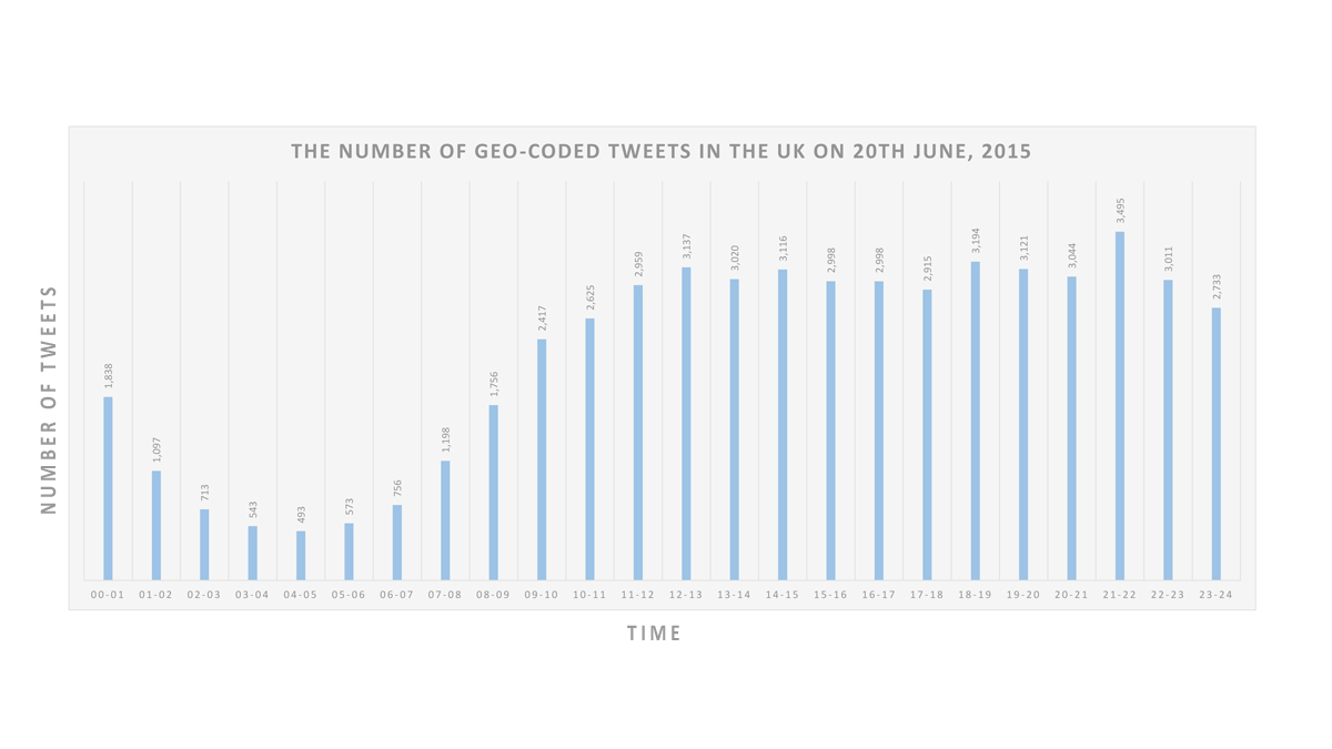
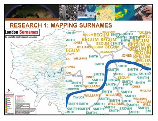
In the beginning, Dr. Adam Dennett, the lecturer of CASA, informed the aim of the lecture to understand the basic elements of social science research using GIS and the diverse analytical approaches with it. He showed several example maps, which are related to population, crime, deprivation, health care, flooding, and education, and the way how to read economic, social and physical characteristics from the maps and its meaning in the projects. (Image 1)
 |
| Image 1 |
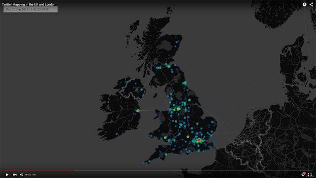
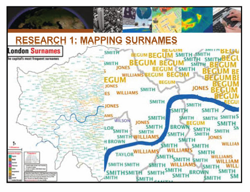
And then, he moved to GIS software industry which has been significantly growing. As interest and the utilisation of GIS are increasing, GIS software market is expanding almost 10% every year and now it is used in all industries and public sectors such as business, public safety, military and education. The popular GIS tools: Arc GIS, MAP Info, Quantum GIS, Pythonand R, and specific points of each tool were introduced. Also, small description of GIS cloud and online GIS tools was following. (Image 2)
 |
| Image 2 |
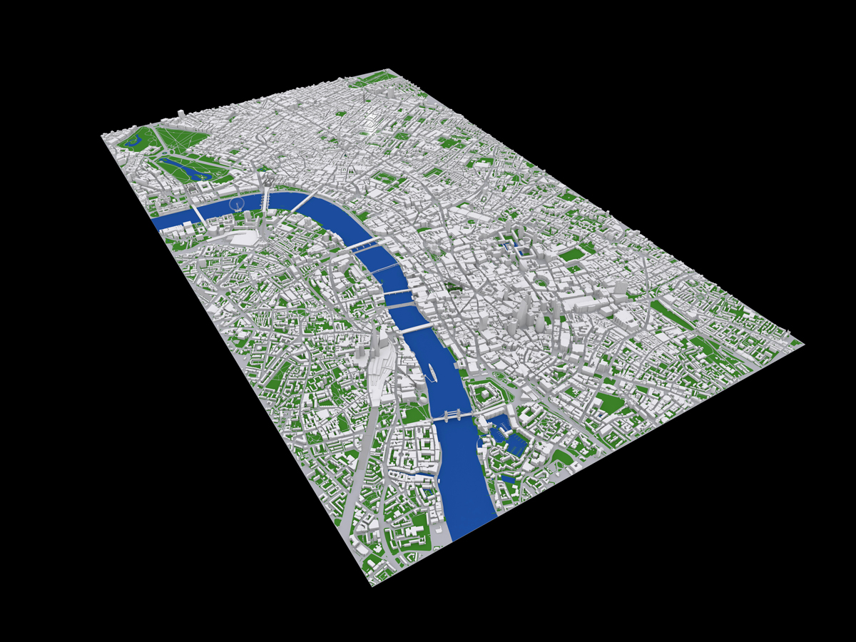
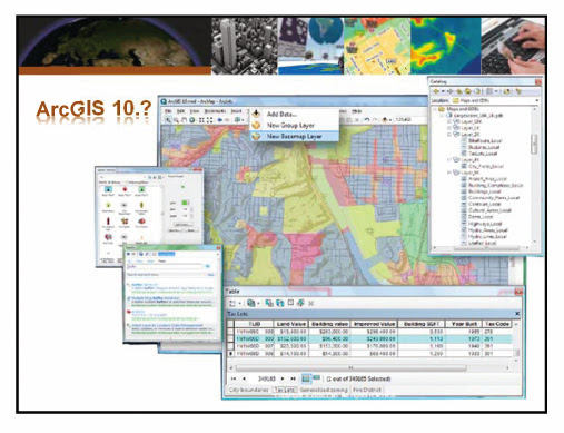
In the last part, he said of various kinds of the data and the way of gathering the data which is the key element to proceed the research. Easily, we can classify the data according to the way of gathering. On the one hand, we can use the open data, which are provided by public sectors and other organisations. On the other hand, we need to collect the data through participation and measuring by ourselves. Some websites of the UK, which contain the open data or shapefiles, and the characteristics of each website were mentioned. As we can see Image 3, some other methods like WebScarping and Volunteered Geographic Information were shown as alternative ways to collect the data by ourselves, when the given data are unclear, and the goal of the research needs the specific data.
 |
| Image 3 |
The lecture was finished with the emphasis on caution when using the open data and the mapping with it. Much of the data are made with inadequate formats like pdf, or do not include any spatial reference, so we need to be careful to collect and use the data. When it came to the mapping with the data, he insisted that it is necessary to make analytical and meaningful maps rather than something fancy or colourful. In addition, it is essential to acknowledge that some errors could be made by way of ‘generalisation’ in the process of research, therefore, setting up the range and the level of the research will enrich the quality of it.
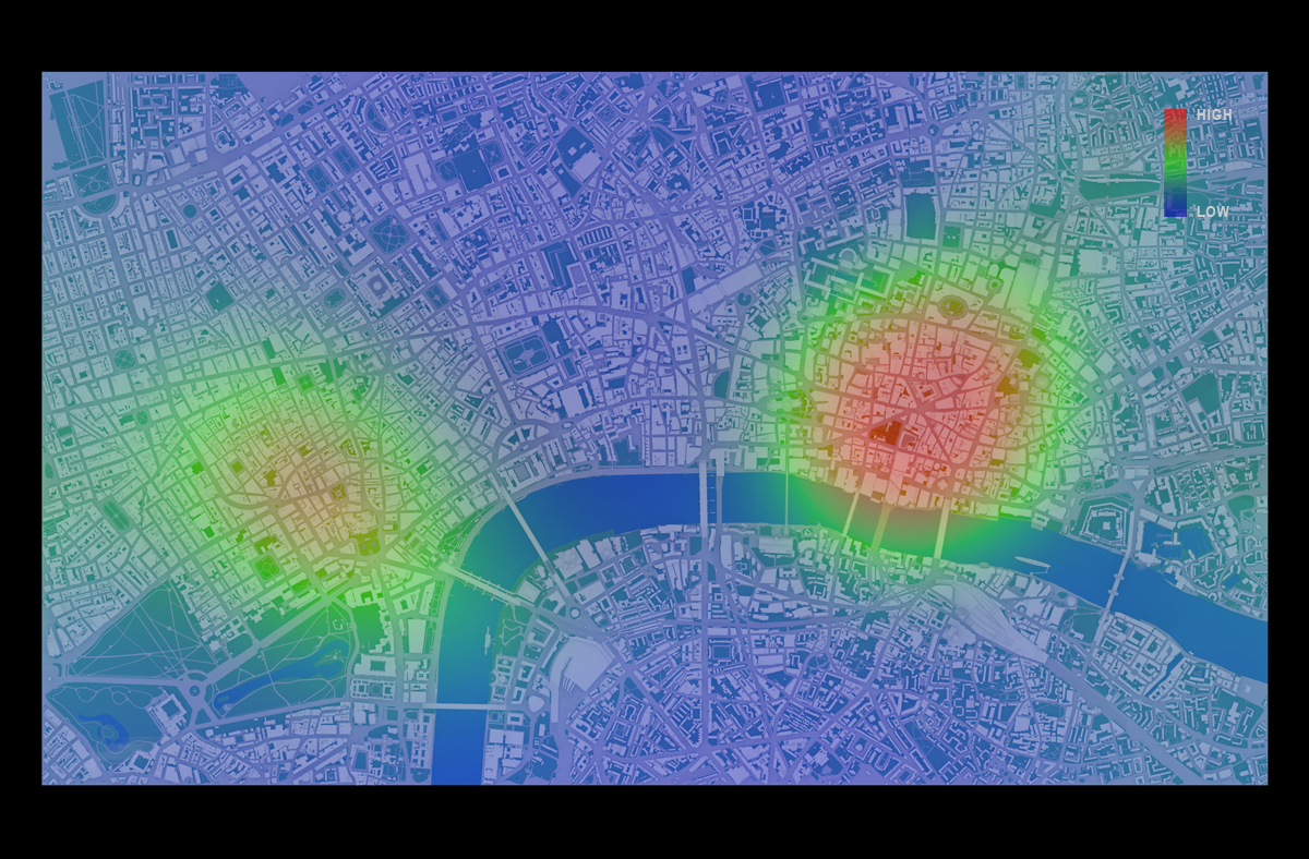
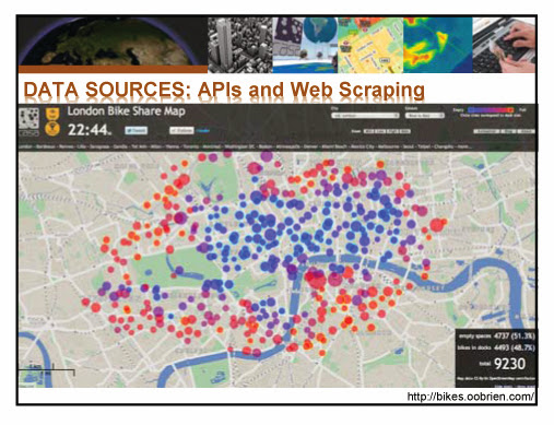
After one hour lecture, students had a training session that mapping population data on the map of London Borough with R. (Image 4)
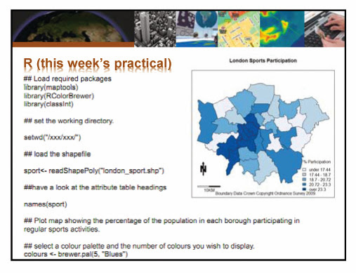 |
| Image 4 |
Continue reading »