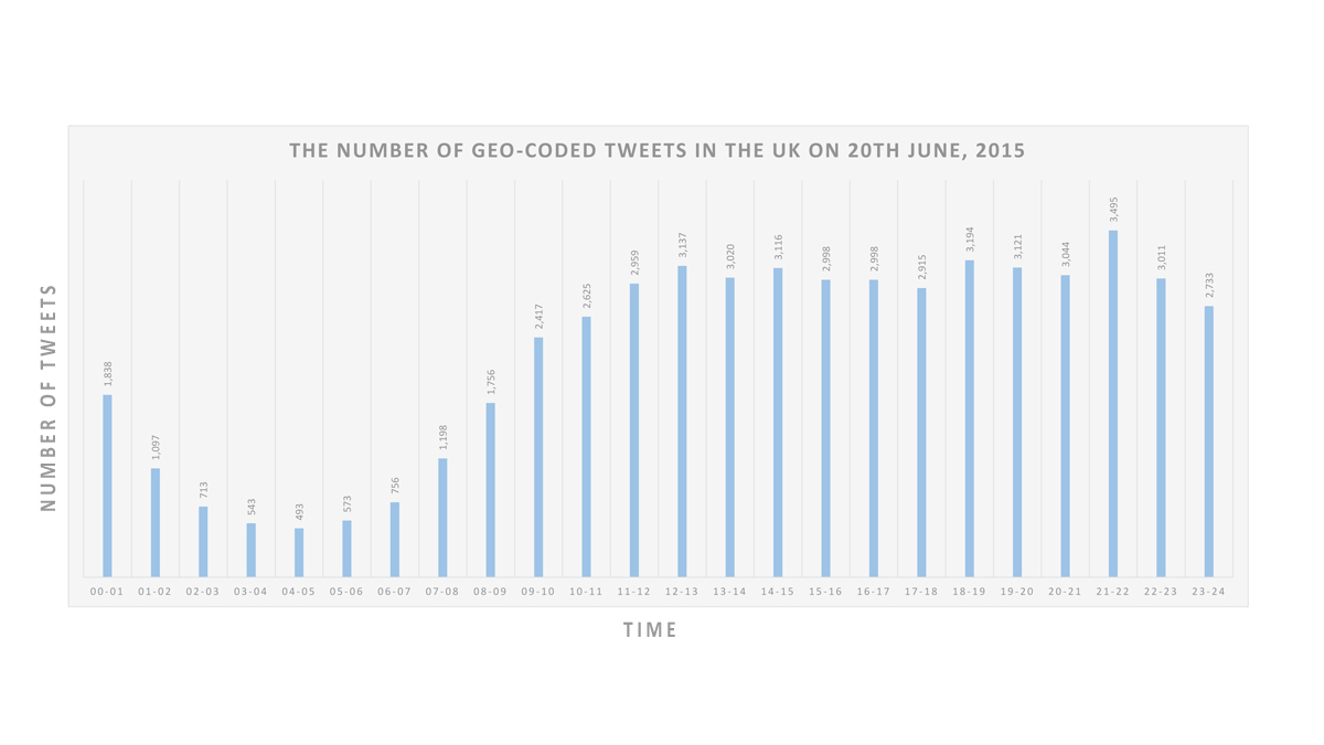
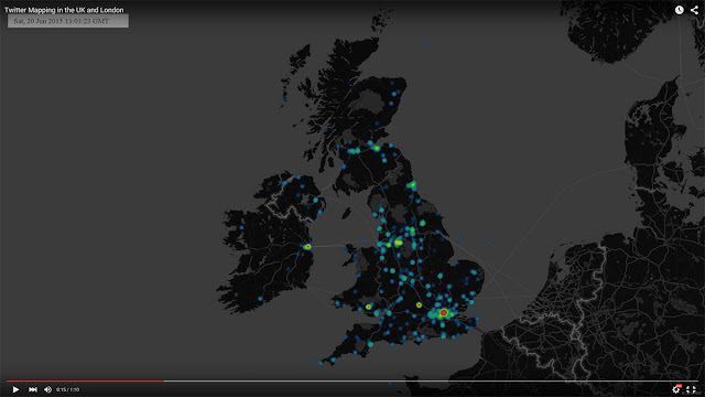
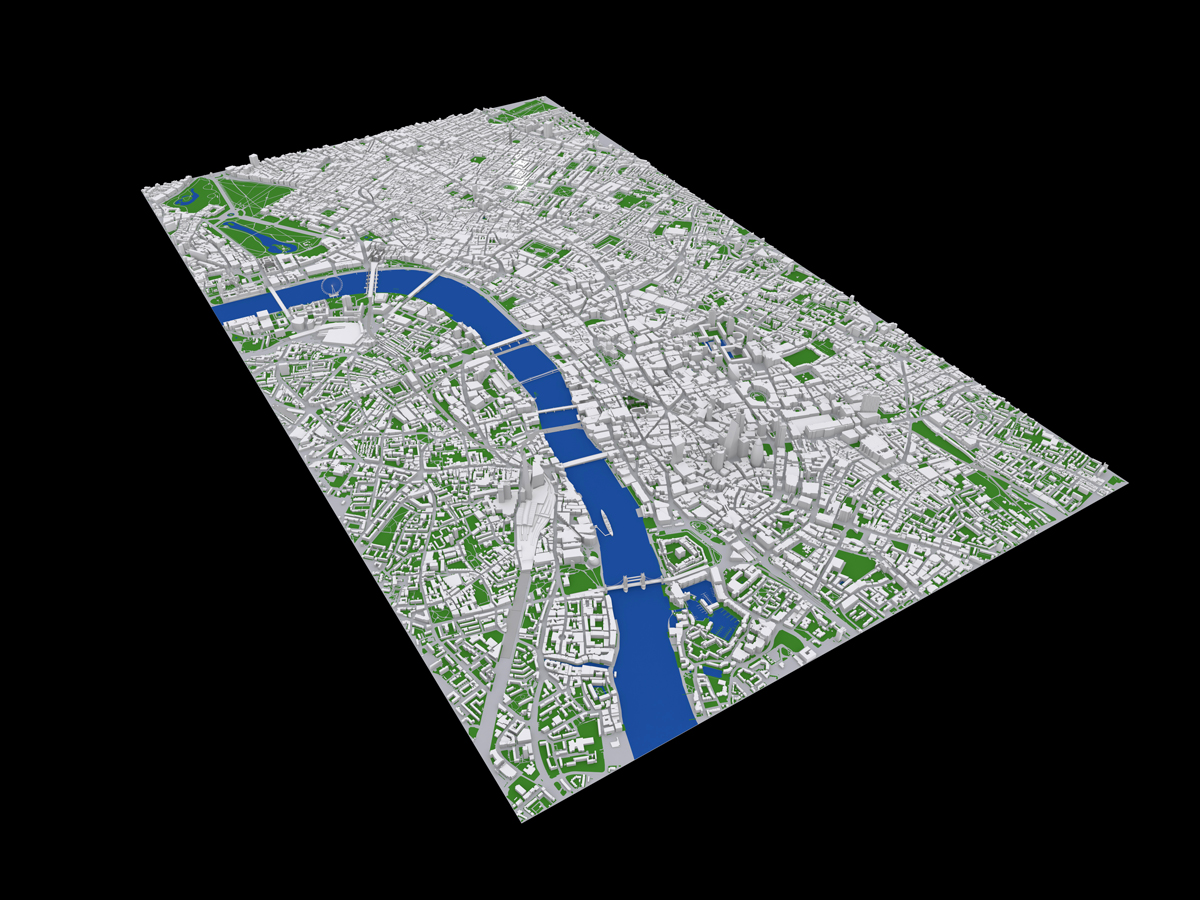
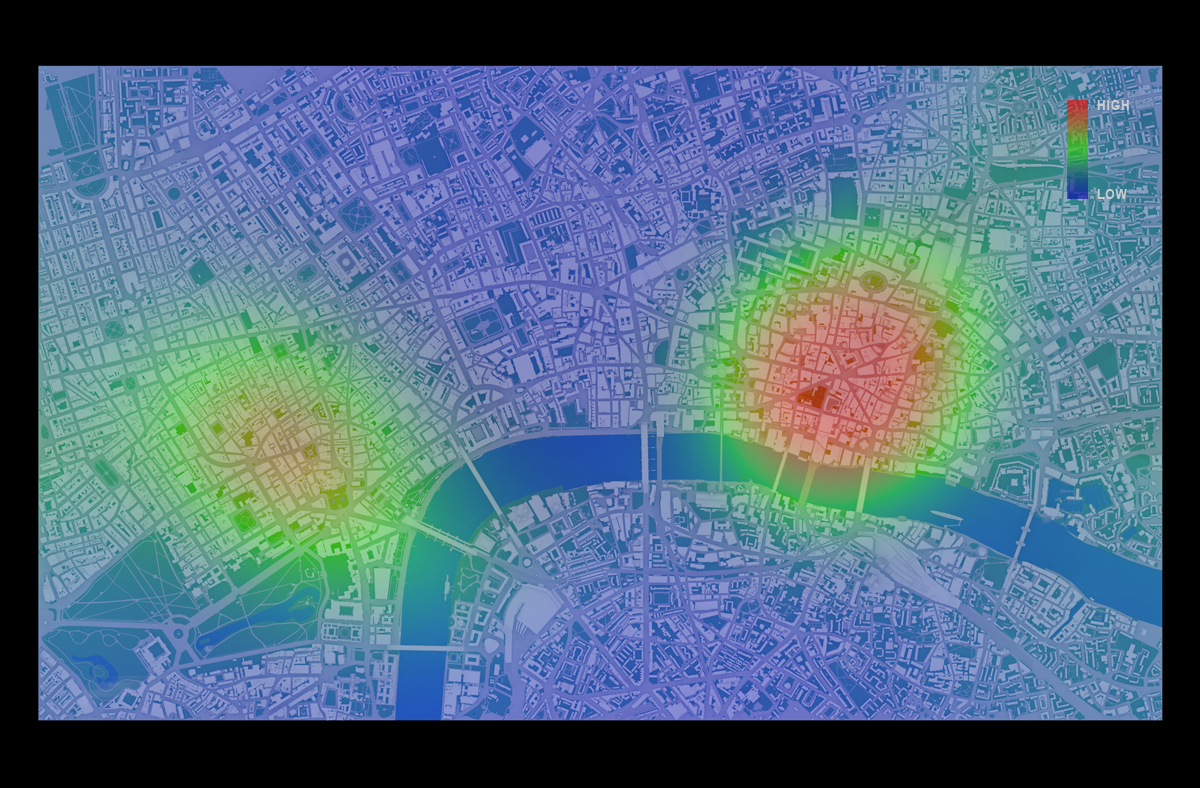
Mapping Protest in 3D with Twitter Data
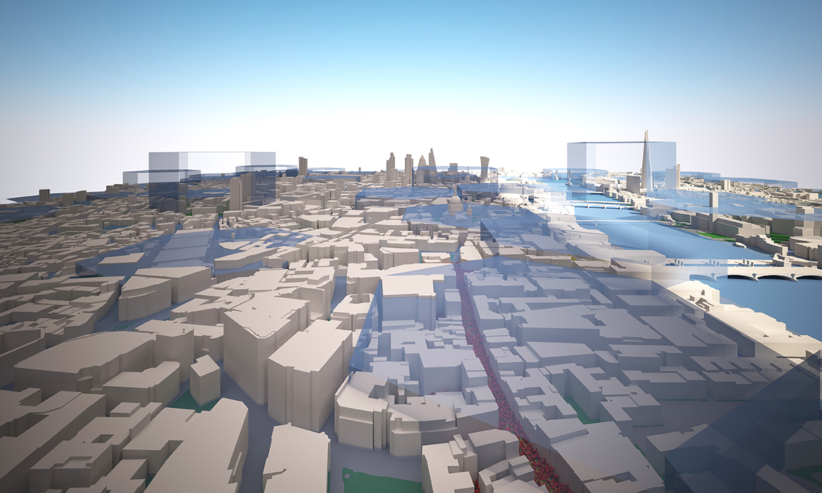
As one part of my docotoral thesis, I have made the video that shows the relationship between ‘London End Austerity Now’ Protest on 20thJune 2015 and the Twitter acitivity on that day.
The video gives you some details about the protest, the data and 3D visualisation.
If the following YouTube video is not displayed on your device, please use this link.