Journal of Urban Technology, Volume 19, Issue 2, 2012Designing for the situated and public visualisation of urban databy Andrew Vande Moere & Dan Hill
THE authors point out recent urban data visualisation still remains on the stage of simply providing statistical data, and it is ineffective to make better understanding about the interaction of the massive and complex urban data. They argue public policy should be changed to open more public data, which are including local characteristics, to raise public awareness and encourage actionable public participation.
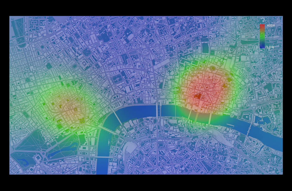
Through five main parts; theoretical part (data and public visualisation) – Recent projects – Student projects – characteristics of urban visualisation – conclusion, this article draws the question and tries to answer against how we can visualise the complex and continuously changing condition of cities, where have different problems by particular factors in different parts within a city, and how we can expect the unpredictable condition in the information age.
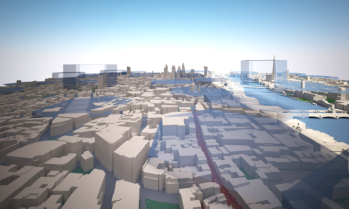
The authors premise that the character of place has been formulated by economic and cultural patterns based on the rock of physical and geographical aspects, and these patterns adversely facilitate the physical change. In the past, the production of the place represented the specific character of the place, and it had coupled with the regional change. However, since cities have transformed their industry from material based to knowledge based, they have been showing the movement of hominization. This paper argues that the character of the city in this era can be revealed by the data, which are endlessly producing in the city, and we can find the difference between cities by the analysis of the data. Therefore, the urban data is not an indicator of urban activities but also the driving force leading qualitative changing of the urban environment.
Particularly, previous data unilaterally delivered statistical data of urban areas, but recent the urban data stimulate active participation of citizen by well-developed mobile devices and illustrate what feedbacks are creating by the citizen. And the authors emphasize the following elements are essential to visualise the urban data.
1) Situated : contextual, local, social
2) Informative: feedback, insightful, consistent
3) Functional: medium, participate, opportunistic, aesthetic, trustworthy, persuasive
Despite a lot of attractive contents, the most impressive point in the article is the well-organised logical flow of what they use; Neo-industrial city (production of data) – open data (role of public data) – social visualisation (impact of data) – urban computing (technological integration) – urban scene (combination of data & urban environment), to explain the meaning of data in this period, its social role and the combination with the physical environment. When we consider the vague use and weak logical connection of the concepts surrounding the data and urban areas, it is a profound approach. This article reminds us to make a coherent structure and clear correlation is an critical issue to set up the base of opinion and to insist it by writing.
To cite this article: Andrew Vande Moere & Dan Hill (2012) Designing for the Situated and Public Visualization of Urban Data, Journal of Urban Technology, 19:2, 25-46
Continue reading »