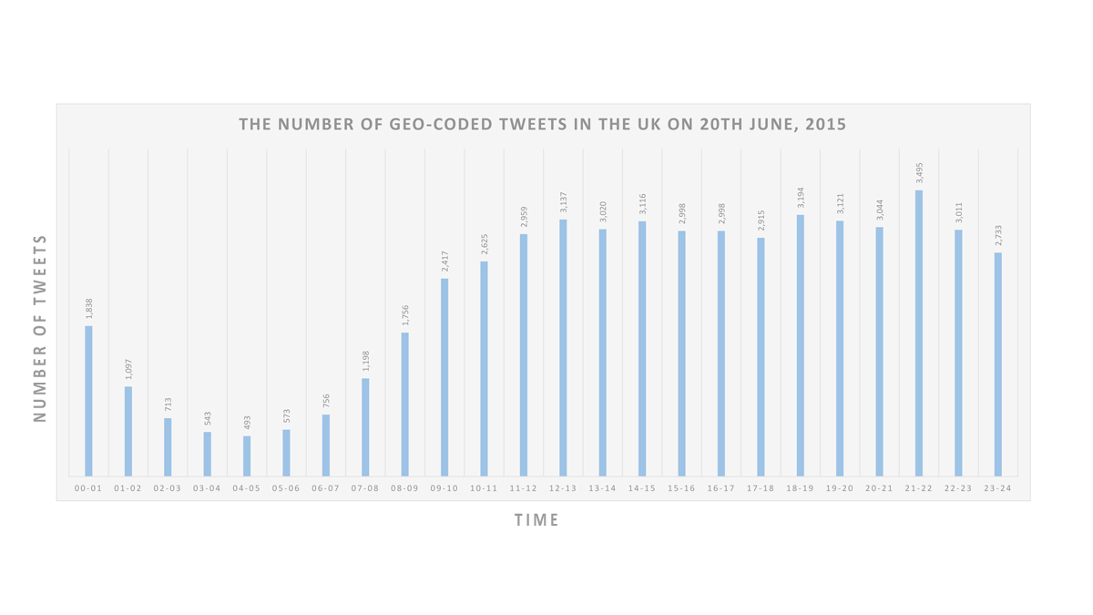
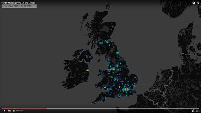
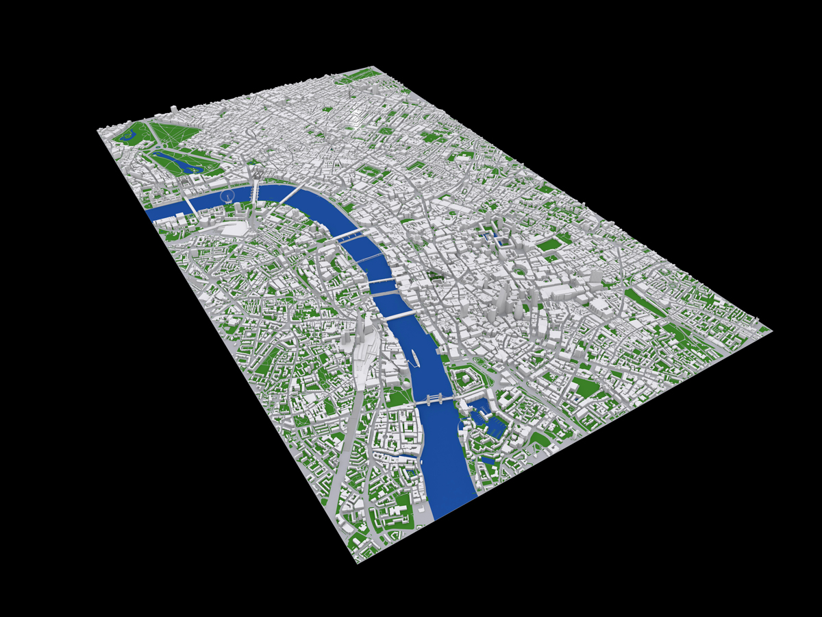
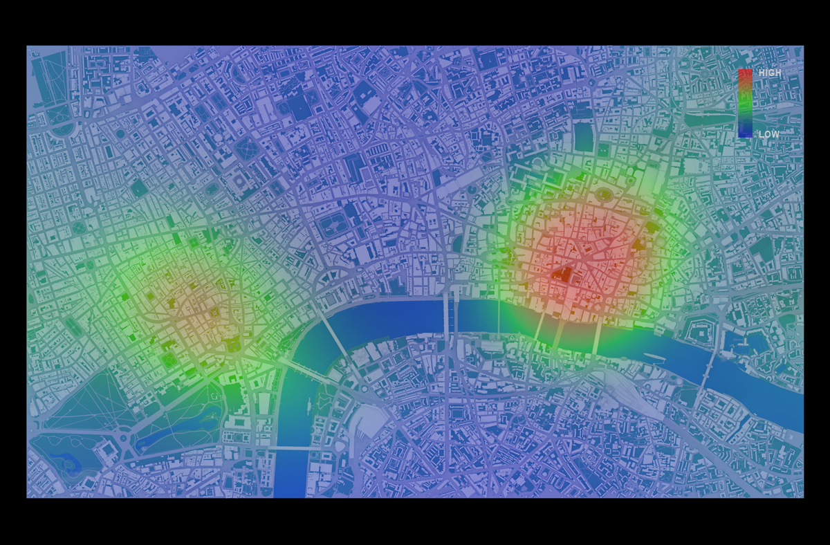
|
Image1. The cover image of ‘City Sense – Shaping our environment with real-time data’
|
Since 2005, the Institute for Advanced Architecture of Catalonia in Barcelona, which is a provocative architectural school and research institution, has opened architectural competition once in every two years. This competition seeks new types of architectural experiments in the fast changing urban environment and is gaining an international reputation over the world. The most recent competition was held in 2011, and 275 groups participated in from 98 countries. The themes of the competition have expected ideal projections in the future rather than current urban situations; therefore, it is a bit harder to articulate architectural ideas of the themes than other competitions.
The book “City Sense – Shaping our environment with real-time data”, which was published by ACTAR, is the outcome of the competition in 2011 and the title of the book is the same as it of the competition.
High speed information and communication technologies have created more possibilities of diversity, mobility and change in the city that comparatively the speed of change is lower than the speed of the technologies by its physical nature. Therefore, urban design and urban planning in the future would claim not traditional approaches for physical urban structure but more and more concerns of immaterial and invisible urban factors based on the development of the technology. In the preface of City Sense, Manuel Gausa, Dean of IAAC, argues that new urban dynamics will emerge from interactive, synchronous and integrated information in multi-level of urban areas, not physical characteristics any more. He explains the purpose of this competition was to find innovative ways of urban design for increasing civic participation, interactive response with the urban environment and real-time information.
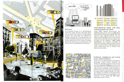 |
Image 2. page 76-77. Honourable Mention- THE DATA-CITIZEN DRIVEN CITY
|
 |
Image 3. Second prize winner- THE CYBORG LANDSCAPE
|
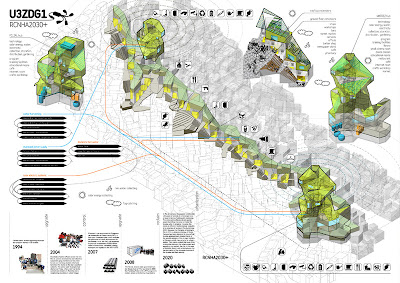 |
| Image 4. Third prize winner- RCNHA 2030+ |
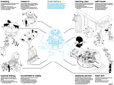 |
Image 5. Honourable Mention- 0kWhcity
|
The publisher divided competition entry works into six categories: Sensors & Data, Adaptive & Reactive, Behavioural systems, Parametric technology, Social & Collaborative and Theories & Strategies. There are many fresh and fascinating ideas to show various approaches to architectural and urban design. For example, enhancing digital networks in urban areas by social media and applying to urban management, reducing the rate of risky incidences of Chicago through making 1/25 scale testing model of Chicago, creating on-offline network for exchanging second-hand goods and suggestion for architectural system to checking environmental pollution in the site of landfill.
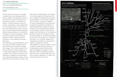
Among lots of entertaining works, Francisco’s work, which is the first prize winner, is outstanding. Francisco Castillo Navarro is an architect and interactive designer. After he graduated from ETSAS and UPF, he set up his own research group: Responsive Environments and has been doing several research projects focus on the urban environment changes.
 |
|
Image 6. pp.82-83. First prize winner– CITY DATA SENSING
|
 |
Image 7. Panel image of CITY DATA SENSING
|
His idea is to collect invisible but influential data for urban life such as the flows of energy, transportation and economic, and to provide these data with citizen based on real-time. It leads the change of citizen activities and then new information are generated by these changes, as the result, the citizen and the information in urban endlessly foster the interaction between them.
The most participants are bound in physical architectural suggestions as the outcome of the competition; however, Francisco illustrates that integrated system for real-time information, which would stimulate sustainable interactive actions of citizen, could become an aggressive outcome of urban design in the digital era. Unlike other entry works which started from architectural ideas, his approach began from the other fields such as collecting real-time data, visualisation of big data and urban modelling. His final images for the competition could be understood as pretending to describe multiple urban data; however, his actual final work is a movie file to display collecting urban information on tidal system and visualising it. As the result, other participants demonstrate images and systems at the moment; however, Francisco’s work suggests that the tidal changes of urban information and the visualising structure of real operating situation. Please check his movie image here. On his blog pages, there are nice information of 3d printing and robotic fabrication as well as his works. Blog1 and Blog2.
The new book of ACTAR is too full of suggestions to regard just the outcome of idea competition. Above all, this book clearly points out that new urban environment based on the rapid developing technologies pushes architects need to collaborate with other fields more than before. It reminds us to consider how the urban environment will be changed by integrated set of information from individuals and institutions, and how new technologies impact on architecture.
Secondly, all winning projects of the competition propose specific own urban system connecting with all urban area not separate buildings. Traditional design approach, which means the sequence of analysing site, finding similar cases, making concept idea, developing mass and building up 3d model, cannot be available anymore for new urban design that needs to understand and develop urban networks and its system.
Of course, there are some disappointing parts.
All participants submitted three panel images through the internet, but it is doubtful whether traditional panel images would be applicable to explain invisible flow of data in urban areas or not. As we regard that the real outcome of the first prize winner is a movie image, IAAC needs to revise the format of the submission. On the one hand, there are many fresh ideas and well finished projects. On the other hand, I think the most projects are not far away from pre-existing design methods and are rooted in technical optimism that the city could be effectively controlled by one system. Also, the size of the book is relatively small. It is convenient to carry, but uncomfortable to look at images.
But it is obvious to allow this book as a good reference to designate the influence of the technologies on the city and alternative ways of urban design in digital era.
The detailed contents and the entry works of last competitions are well arranged on the homepage of IAAC. Please visit there.
3rd competition- THE SELF-SUFFICIENT CITY: Envisioning the habitat of the future, 2009http://bit.ly/13zxrgk
4th competition- THE SELF-SUFFICIENT CITY: Envisioning the habitat of the future, 2011http://bit.ly/Crab7
Basic outcome is below.
Paperback: 368 pages
Publisher: ACTAR / Institut d’Arquitectura Avançada de Catalunya (IAAC)
(2 Jan 2013)
Language: English
ISBN-10: 8415391293
ISBN-13: 978-8415391296
Product Dimensions: 16 x 12.2 x 2.3
Continue reading »