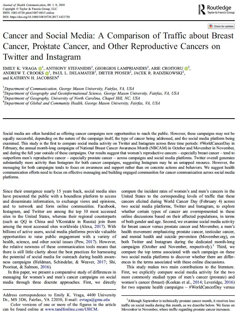
In the paper we explored how health narratives and event storylines pertaining to the recent Zika outbreak emerged in social media and how it related to news stories and actual events.
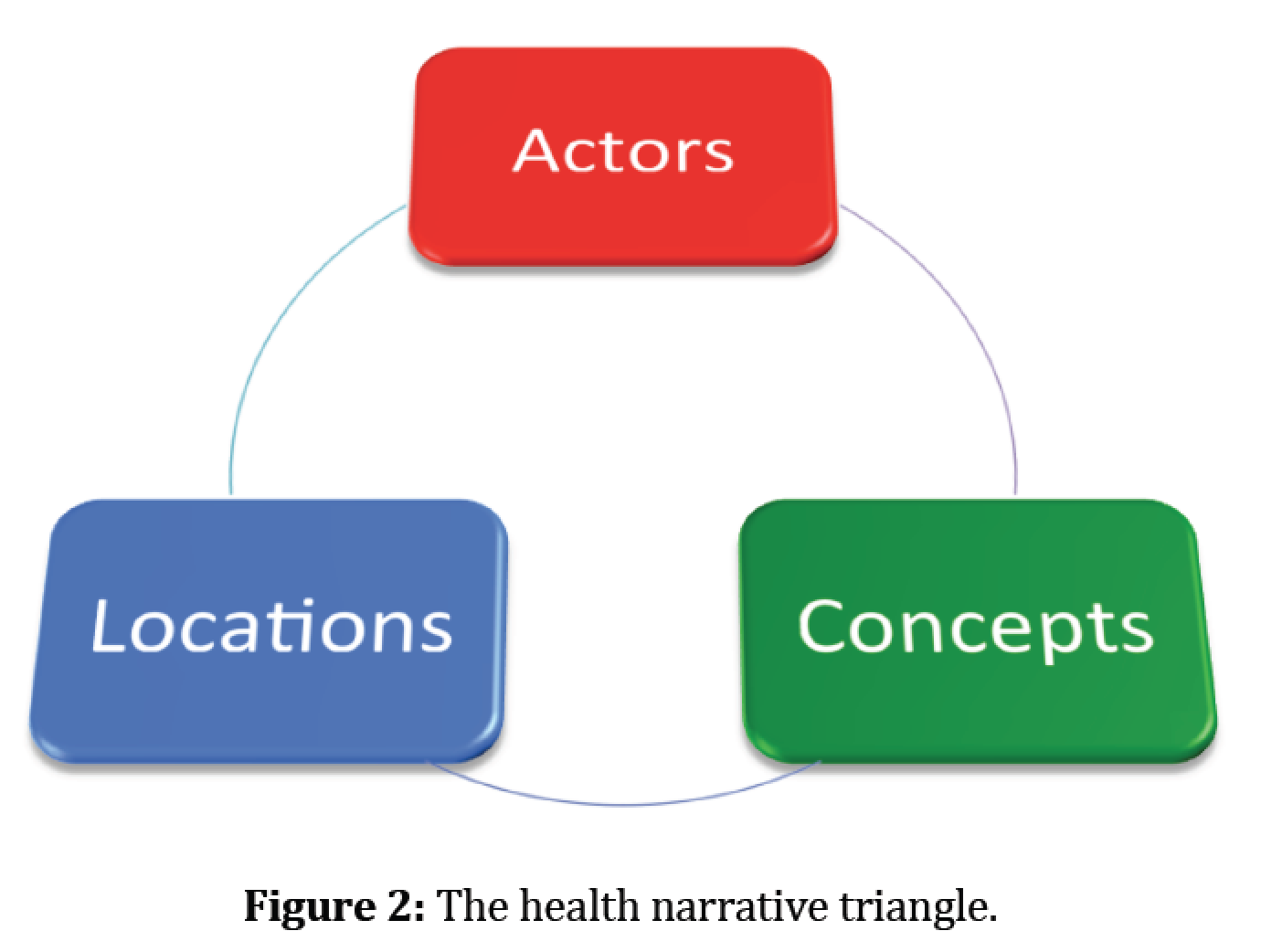
Specifically we combined actors (e.g. twitter uses), locations (e.g. where the tweets originated) and concepts (e.g. emerging narratives such as pregnancy) to gain insights on the mechanisms that drive participation, contributions, and interactions on social media during a disease outbreak. Below you can read a summary of our paper along with some of the figures which highlight our methodology and findings.
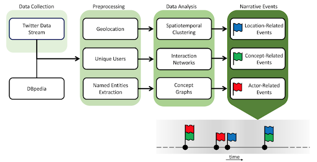 |
| An overview of the Twitter narrative analysis approach, starting with data collection, and proceeding with preprocessing and data analysis to identify narrative events, which can be used to build an event storyline. |
Abstract:
Background: The recent Zika outbreak witnessed the disease evolving from a regional health concern to a global epidemic. During this process, different communities across the globe became involved in Twitter, discussing the disease and key issues associated with it. This paper presents a study of this discussion in Twitter, at the nexus of location, actors, and concepts.
Objective: Our objective in this study was to demonstrate the significance of 3 types of events: location related, actor related, and concept- related for understanding how a public health emergency of international concern plays out in social media, and Twitter in particular. Accordingly, the study contributes to research efforts toward gaining insights on the mechanisms that drive participation, contributions, and interaction in this social media platform during a disease outbreak.
Methods: We collected 6,249,626 tweets referring to the Zika outbreak over a period of 12 weeks early in the outbreak (December 2015 through March 2016). We analyzed this data corpus in terms of its geographical footprint, the actors participating in the discourse, and emerging concepts associated with the issue. Data were visualized and evaluated with spatiotemporal and network analysis tools to capture the evolution of interest on the topic and to reveal connections between locations, actors, and concepts in the form of interaction networks.
Results: The spatiotemporal analysis of Twitter contributions reflects the spread of interest in Zika from its original hotspot in South America to North America and then across the globe. The Centers for Disease Control and World Health Organization had a prominent presence in social media discussions. Tweets about pregnancy and abortion increased as more information about this emerging infectious disease was presented to the public and public figures became involved in this.
Conclusions: The results of this study show the utility of analyzing temporal variations in the analytic triad of locations, actors, and concepts. This contributes to advancing our understanding of social media discourse during a public health emergency of international concern.
Keywords: Zika Virus; Social Media; Twitter Messaging; Geographic Information Systems.
 |
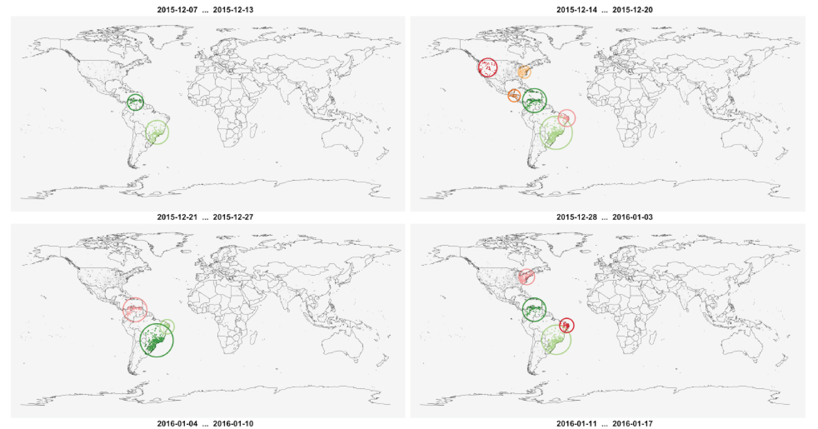
| Spatiotemporal participation patterns and identifiable clusters over 4 of our twelve week study. The top left panel shows the data during the first week, and time progresses from left to right and from top to bottom towards . |
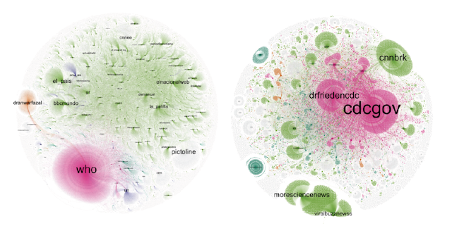 |
| Subsets of the full retweet network pertaining to the WHO (left) and CDC (right), and clusters identified within them. Magenta clusters are centered upon health entities, green upon news organizations, orange upon political entities. |
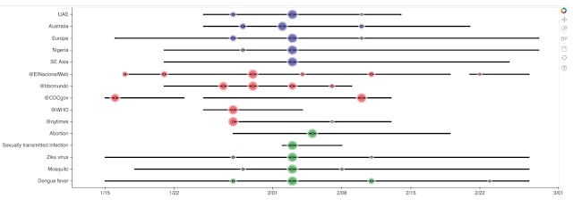 |
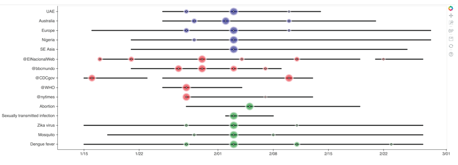
| Visualizing a narrative storyline across locations (blue), actors (red), and concepts (green). |
Full Reference:
Stefanidis, A., Vraga, E., Lamprianidis, G., Radzikowski, J., Delamater, P.L., Jacobsen, K.H., Pfoser, D., Croitoru, A. and Crooks, A.T. (2017). “Zika in Twitter: Temporal Variations of Locations, Actors, and Concepts”, JMIR Public Health and Surveillance, 3 (2): e22. (pdf)
As normal, any feedback or comments are most welcome.
Continue reading »