Book – Infrastructure as Architecture

Infrastructure projects have grown into an important role in the public realm taking more and more responsibility in a social context. Over the past arguably hundred years more and more emphasis has be put in to infrastructure, being it transport services and facilities.

As a modernists take on the city technology was to be placed as the driving force behind planning and this of course shall also include infrastructural project. In fact especially here technology could be implemented with the help of additional arguments. Today, infrastructure is running as flag ship projects in many cases being put forward as statements both public and design wise.

Infrastructure as architecture
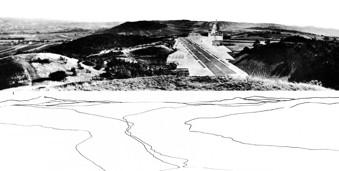
Image taken from dpr-barcelona / Hans Hollein Aircraft carrier city in landscape, project. Aerial perspective.

The Jovis publication Infrastructure as Architecture: Designing Composite Networks, edited by Katrina Stoll and Scott Lloyd takes a detailed look at this position infrastructure has grown into and how architecture relates to it, thus implying that design has to learn from both in order to support a new take on projects.

The publication discusses the matter in essays organised in five topics. These are: Infrastructure Economy, Infrastructure Ecology, Infrastructure Culture, Infrastructure Politics and Infrastructure Space/Networks. Contributors include for example Dana Cuff from UCLA, LateralOffice, UrbanLAB, Alexander D’Hooghe and MVRDV.

The essays cover a range of topics and reach from the presentation of practical projects, built and planned to theoretical essays of the discussion. Thus there is a wealth of different views that are, as the editors argue: ‘providing a framework for understanding the union of infrastructure and architecture’.

Of course it is on one hand a secret claim to but architects in the position to take on and reclaim design agency over infrastructure projects, but more importantly to discuss the dualities of presence and identity of building projects regardless of their function.

It is superbly interesting how this publication argues for a new take on infrastructure and how the argumentation might actually be point out what practice has already incorporated. Whilst the discussions around the relationships infrastructure is bedded into in the urban system is not new, there is a new approach being argued for. Modernists have taken it on at the beginning of the last century and in the 60s the Smithsons and Team X proposed a new take. More and more it grew into a systemic approach and whilst before it was always one or the other it is now being argued for as both, one and the other.

Appleyard and Lynch in A view from the Road already note that the road is producing scenery for the driver and the passengers it is at the same time dominating the landscape as a static bulky object. Alexander D’Hoogh is especially arguing for this in his essay contribution o the publication: The Objectification of Infrastructure: The cultural project of suburban infrastructure design.
This dualism of producing and being is the new aspect in this publication, but probably could in fact reach beyond. Testing this against current trends might revel a deeper interest of our times in this dualism and the fact that problems could have more than one state.

Infrastructure as architecture
Image taken from jonathandsolomon.com / Book cover. A preview of the publication is available from Jovis HERE. The Essay by Jonathan Solomon is available HERE.

Stoll, K. & Lloyd, S., 2010. Infrastructure as Architecture: Designing Composite Networks, Berlin: Jovis Verlag.

Continue reading »

Book – Housing Design

Housing design is the one field of architecture arguably being the most accepted core activity of architects. Building houses is architecture as such. The recent NAi publisher book Housing Design: A Manual by Bernhard Leupen and Harald Mooij is published in a second English edition. It picks up on the is core and very traditional architecture activity of building a house and presents designs across a wide range of types in a cultural context.

HousingDesign04
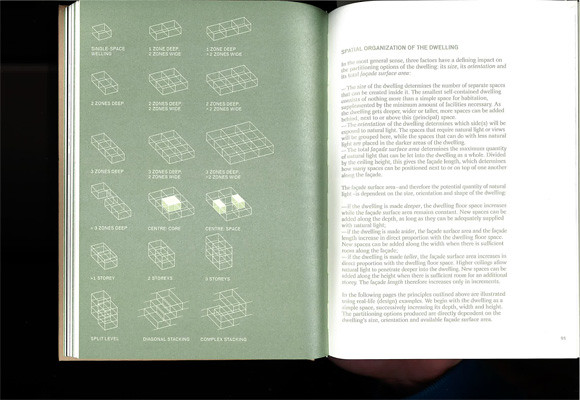
Image by urbanTick / Book spread showing the chapter introductino nad a summary of the discussed elements.Housing Design – A Manual.

The new publication is a revised English-Language edition and is based on the first Dutch edition published as Het ontwerpen van woningen in 2008. The new edition is extended in its content and, being translated to English, definitely open up to a wider audience worldwide.

In a series of eight chapters the publication develops a clear presentation of housing projects, of both built and some unbuilt examples. The chapters organise the projects in several categories. Other than most books on the same subject however, Housing Design does not try to press the examples into descriptive categories. The authors have chosen to group them into programatic categories characterising the process and the context rather than the project itself.

HousingDesign05
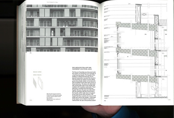
Image by urbanTick / Book spread Housing Design – A Manual. The example here is by DKV Architects, Kop van Havendiep (Lelystad, 2004) with detailed sectional drawing.

With this the presentation is more relaxed and less arbitrary in a range of different contexts. Where the descriptive categories often seem out of place the here used programatic categories support the reading of each examples in a wider context.

This is at the same time where the specific strength of this publication lies. It is not just a design manual, but a design reader. The examples are not just standing on their own as a separate entity. Each project is set in a wider context linking it in with a theoretical and practical background.

The book is therefore also great reading material. It is by no means a picture book or a flip book, but presents a systematical approach to the presentation of a range of housing projects in the context of architecture history and practice. In this the publication goes into great detail with the presentation and answering of problems drawing from a great source of architectural history examples. Under the subtitle belly for examples, the problem of the underside of a house if rised on piloties or has an underpass is discussed using Le Corbusier’s Unité d’habitation and MVRDV’s WOZOCO as examples. Similar the topic scenery and the design of interior spaces draws on Haussmann and Adolf Loos’s Haus Moller and Das Prinzip der Bekleidung (The Principle of Cladding).

HousingDesign06
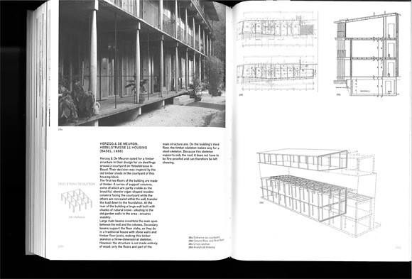
Image by urbanTick / Book spread Housing Design – A Manual. The example here is by Herzog de Meuron, Hebelstrasse 11 Housing (Basel 1988) as an example of a skeleton construction.

Each chapter starts with a theoretical introduction and presents a series of examples. Each with photo plans and drawings. Often this includes construction drawings such as sections. This allows the publication to go in to a lot of detail beyond just the floor layout, discussing construction problems in line with design and questions of aesthetics.

The book concludes in the chapter The Design Process in which three examples are presented as case studies. The discussed aspects are ‘applied’ or revisited as to how they accompany the different design stages of a project. With this the authors demonstrate that housing design is not simply about finding the right typology and developing a floor plan layout. They make the point very clear that architecture and specifically housing design is a contextual process.

HousingDesign02
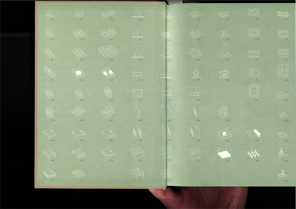
Image by urbanTick / Book endsheet showing the different elements and parts of a house that are discussed in details. There are storys, core space, gallery, staircase, street infill and diagonal stacking amongst many others. The pictograms summarise the characteristics of each element very neatly and allow for quick reference and finding.Housing Design – A Manual.

It is a very beautiful publications. It feels good to touch and it is in its design quite complexe without overloading. Actually it looks plain, but with its use of metallic colours and specific fonts for different types of text it is rather playful in a supporting kind of way. The photographs are all black and white and so are the plans and drawings. Despite this no information the information is very clear and readable.

To summ up, this is definitely one of the great publications on housing design and worth having, not only if you are a first year undergrad architecture student. In fact it might be even too complicated for beginners. It might be even more insightful and interesting if you already know about architecture. With its many references and examples across architecture history it is a great reference as well as reading book.

HousingDesign01
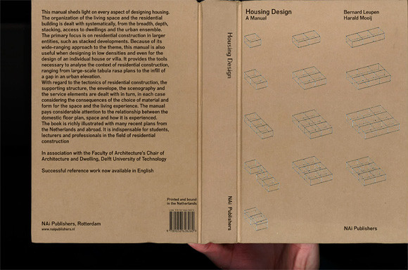
Image by urbanTick / Book cover Housing Design – A Manual.

Mooij, H. & Leupen, B., 2011. Housing Design – A Manual, Rotterdam: NAI Publishers.

Continue reading »

Book – Designing for Civil Defense

The Cold War years are usually presented in terms of the military force and an ever expanding resource of military equipment. This of course includes foremost the nuclear weapons both sides the West lead by the U.S. and the NATO and the Communist East lead by Russia.

Architecture however, played an important role in cicvil defence and the preparation for a potential third world war. There was far less attention payed to the fact that all nations had programs running to prepare their societies for the case of escalation. Tensions there were enough.

Nuclear war was the ultimate danger and with images and evidence form Hiroshima and Nagasaki preparation was part of civil defence programs also in the U.S. In a new book Fallout Shelter: Designing for Civil Defence in the Cold War published by University of Minnesota Press, David Monteyne presents these U.S. programs from an architectural perspective. This detailed investigation ranges from the propaganda to built examples and examines closely the role of the architect as the middle man between government and civil society implementing a plan that is further reaching than simply the provision of shelter. Find Fallout Shelter: Designing for Civil Defence in the Cold War for great prices with these Amazon Promo Codes.

DIY shelter
Image taken from etsy / DIY fallout shelter for your back garden.

As Monteyne points out in his introduction it effectively is a contract between citizens and government exchanging provision for shelter and quality of live for cooperative behaviour. He refers to Foucaults biopower as a political relationship. Essentially building shelters was and in some cases still is, as we’ll discuss further on, the physical implementation of goals and powers of the welfare state.

The book explores in seven chapters the background, the planning, the implementation and the potential influence of shelter provision programs in the U.S. The programs were mostly about information and education but of course also aiming to build shelter provision. For this the architects were a key alley and the American Institute of Architects (AIA) launched a series of design competitions together with the Office for Civil Defense (OCD). The aim was to promote good planning and preparation for shelter provision. A series of designs were presented as winners, both built and as projects.

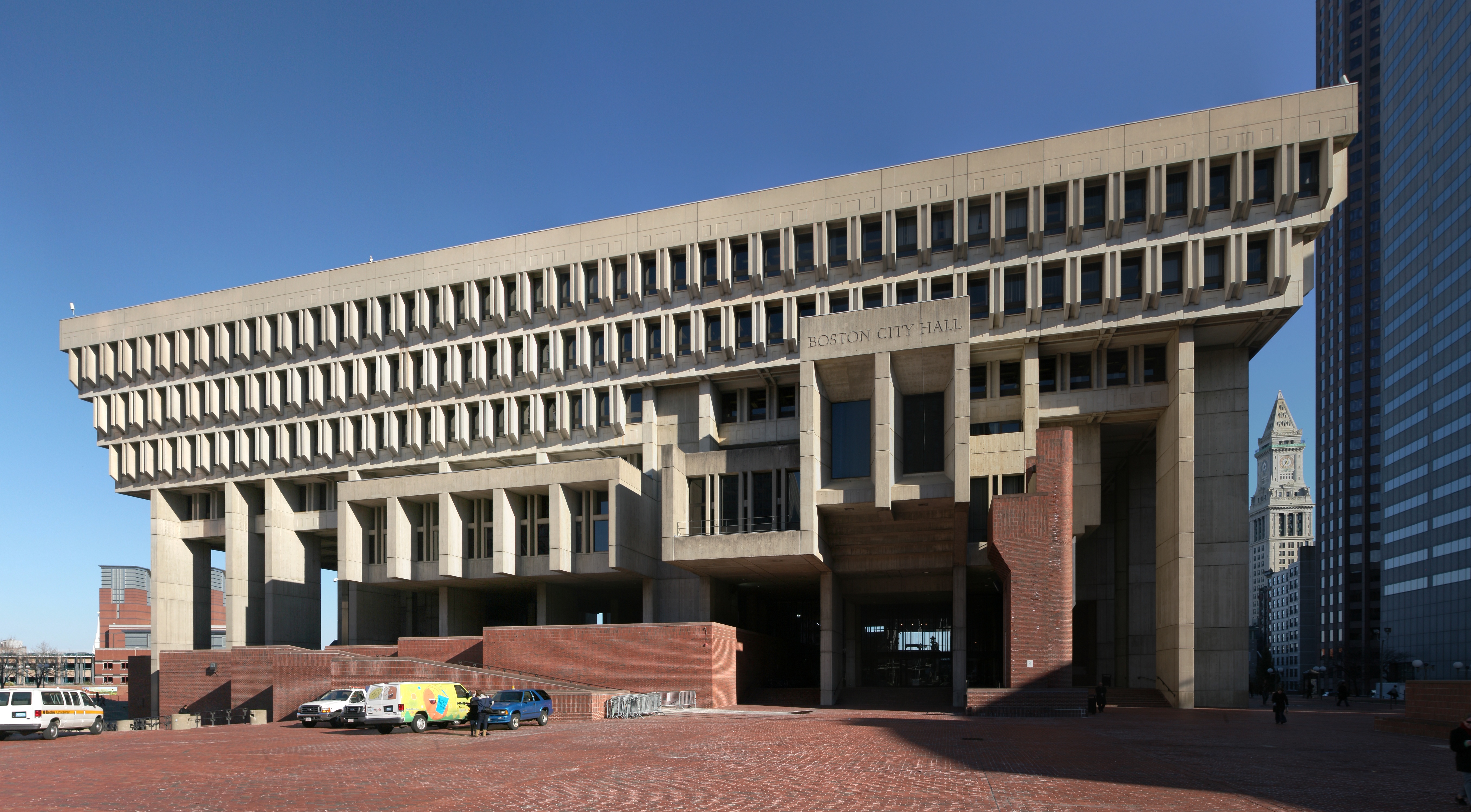
In the last chapter Monteyner goes a step further and applies his observations and investigations as an interpretation of an architectural style. He goes as far as arguing that this focus on shelter and bunker design has effectively led to an specific style, not a new one, but Brutalism?! Well thats something new and of course he has some evidence, the famous Boston City Hall. The basic argument is that Brutalist architecture looks a bit like bunk architecture so the origin of Brutalism is to be found in these government programs during the early Cold War times having shaped a whole generations concusses.

Boston City Hall
http://en.wikipedia.org/wiki/Brutalism
Image taken from Wikipedia / The Boston City Hall that serves as an example as to how bunker design has lead to the Brutalism movement.

Boston City Hall is at this point is the famous and widely debated example in the U.S. and serves well since it has implemented to some extend the requirements for fallout shelter. Interestingly the term Burtalism however is claimed to be coined by the Smithsons from the United Kingdom based on Le Corbusier in the context of CIAM. So not really an American connection there and all in all a bit too early for these programs that were run in the fifties and sixties mainly.

Reading the shelter guides these cold war programs produced and the resulting designs one can not help but smile. It amazing how naive the designs are and how improvised. For example there are guides on how to build a wooden shelter in your backyard and even the Boston City Hall project, the famous bunker style building has implemented shelter space on the eights floor?

It seemed to work and to some degree the American officials seemed to gain some sense of preparednes from these exercises. To everyone else these plans must immediately seem strange. If all you need to withstand a nuclear war is to build the entrance of a house not in line with the corridor to prevent fallout from penetrating deep into the house we ar all save.

American architecture is not generally well known for going deep underground and if possible basements are avoided at any cost. Very much so in terms of shelter and fall protection provision. Not even these programs have seriously considered building bunker underground, as the Boston City Hall projects demonstrates. Shelter can happily be provided on the eighth floor?!

The way this infrastructure of bunkers and shelters is described in the publication does echo practices for example in Switzerland. The small country in the heart of Europe is well known for its specific bunker infrastructure. On the military end this infrastructure was designed to guarantee the independence creating a réduit in the alps. On the civil side planning for large scale shelter infrastructure started a early as the 1930s. These efforts were geared towards the provision of shelter everyone in the country. Doring the 1980s this was achieved, making Switzerland arguably the leading provider of shelters.

It is a general requirement in Switzerland to built a shelter as part of every housing project ranging from a single family house to an entire block. Depending on the size of the project and number of inhabitants the shelter has to provide a certain capacity. Currently there are, according to the Swiss Federal Office for Civil Protection FOCP, about 360’000 individual shelters built as part of buildings and in addition some 2300 communal shelters. Hereby a shelter in general is a sort of mini bunker in the basement of every building constructed after 1963.

shelter details section
Image taken from Kanton Schwyz / Detailed section drawing showing the emergency exit from a standard single family house shelter space. Requirements including distances and dimensioning are based on standards applicable through out Switzerland. Note also the shown solution in case of high ground water.

There are clear guide lines for the construction of the shelter, the provisions and the equipment necessary. Every opening has to have a massive concrete door to completely seal the space. There is ventilation equipment required, designed to withstand gas and fall out. In addition there are simple bunk bed constructions and basic facilities such as dry toilets required.

Larger buildings such as community centres provide shelter for a larger number of people ranging from 30 to a few hundred. All are real bunkers constructed in full concrete, at least 25 cm in thickness with completely sealable openings, basic infrastructure equipment, toilets, beds and cooking facilities.

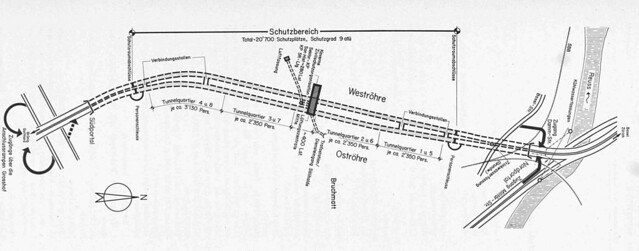
In addition infrastructure projects sometimes have been used to extend capacity of shelter place capacity. For examples the highway tunnel ‘Sonnenbergtunnel‘ in Luzern was build with the capacity to transform into a massive bunker if required. It would have provided places for about 20’000 people. This includes sanitary facilities including a small hospital unit, large kitchens, ventilation infrastructure and bunk beds and so on. In case of emergency each tunnel entrance would be closed with a specially designed massive concrete gates to seal the entrance. The entire length of the tunnel be used for cubicles with bunk beds. It was calculated for 1m2 of floorspace per person.

Sonnenberg tunnel gates
Image taken from Luzernerzeitung / The large gates of the Sonnenbergtunnel shelter in Switzerland were last closed in 1987. The gate is constructed on sight and is curved to withstand great pressure.

Sonnenberg tunnel is since 2005 no longer in operation as a shelter unit. It can still be visited with a guided tour though. The city of Luzern has in connection to the complete renovation of the highway A2 developed a new Civil Defence concept and provides the capacity in shelter places elsewhere. However, through out switzerland a number of other such invisible underground civi defence infrastructure buildings are still being maintained in order to provide shelter in case of war or nuclear fall out.

Switzerland has in many ways optimised and multiplied the implementation of shelter provision for the civil population. Reading it under the aspects David Monteyne presents in the introduction to his publication the outreach of the state to discipline the population to good behaviour in exchange for welfare did work and still works very well. It can be argued that the Swiss population and the architects as the implementers of these outreach programs cooperate well. However, the implementation of the shelter infrastructure is taken much more serious in its mechanics in Switzerland than according to Monteyne it was in the US. And from a Swiss perspective to speak of a specific bunker style (believed to be brutalism) to emerge from the state requirements for shelter seems absurd. This is mainly dueto the fact that Swiss planners have always decided that shelter or bunker facilities only really make sense if they are implemented in the basement and never tried to somehow fit it in above ground. As such the shelter has never been visible and therefore did not influence the ascetics of the aboveground appearance necessarily.

Die Zivilschutzanlage Sonnenbergtunnel in Luzern
Details taken from: Heierli, W., Jundt, L. & Kessler, E., 1976. Die Zivilschutzanlage Sonnenbergtunnel in Luzern. Schweizerische Bauzeitung, 94(46), pp.689-699.
/ Map of the Sonnenberg highway tunnel near Luzern in Switzerland showing the location of the built shelter. The bunke was designed to provided space for 20’000 civilians in the case of war. Constructed between 1971 and 1976. The shelter was finally closed in 2005.
Details taken from: Heierli, W., Jundt, L. & Kessler, E., 1976. Die Zivilschutzanlage Sonnenbergtunnel in Luzern. Schweizerische Bauzeitung, 94(46), pp.689-699.

Building shelters underground could be an explanation why the required provision of shelter had and still has a much higher acceptance through out the civil population. Without it being constantly present in the everyday environment it is much more a background infrastructure than an style and other functions are not overloaded by the required provision of shelter but extended.

Nevertheless the book presents a very distinct characteristic of the last century and the period between 1950 and 1980. Whether it lead to a distinct architectural style can be debated. What is of specific interest is to compare the different approaches to the provision of shelter as well as what these approaches tell about how the civil society deals with chaos and order, the manipulation of the collective and the individual and the role of planning and architecture in a wider society context.

Fallout shelter design Book cover
Image taken from amazon / Book cover.

Monteyne, D., 2011. Fallout Shelter: Designing for Civil Defense in the Cold War, University of Minnesota Press.

Continue reading »

Book – Urban Constellations and the Struggle of a Discipline

The UCL Urban Laboratory brings out a publication under the title Urban Constellations, summarising five years of work since the LAB was established in 2005. The LAB was set up as an interdisciplinary work group within UCL bringing together architecture, engineering, anthropology and film studies with a focus on urban. With urban Mattheew Gandy the Director of the urbanLAB and also editor of the publication sees encompassed far more than in the bounded term city. This is then also what the publications aims to achieve, drawing out and identifying critical themes and opening a discussion around them.

The collection explores themes such as new forms of political mobilisation, the effects of economic instability, the political ecology of urban nature and the presence of collective memory. The section Excursions documents artistic interventions in the urban context by 5 artists.

urban constellations cover
Image taken from othersights / Installation The Games are Open, with materials recycled from the 2010 Olympic & Paralympic Winter Games Athletes’ Village, by Köbberling & Kaltwasser, 2010.

The other four parts of the publication are Urban Lexicon outlining popular topics in the urban discurse, Crisis and Perturbations depicting strong influential shaping process, Places and Spaces as a showcase of concrete examples of urban studies and Projections linking the theoretical discussion to other fields such as art. A preview of sample page can be found on the publisher JOVIS website as a HERE.

Each essay, of which there area total of 42, is intentionally short. As Gandy outlines in his introduction, the aim was to create little vignettes of aspects. With this linking it to Sigfrid Kracauer’s work and use of the term urban vignettes. Similarly is the link established to Walter Benjamin via the book title Urban Constellations which link to the use of constellations by Benjamin. With this Gandy aims to underpin a close attention to detail of everyday life.

The essays are written by a selection of mostly well known scholars. In most cases they are related to the context of UCL with for examples Jane Rendell and Ian Borden form the Bartlett School of Architecture.

The essays are of very good quality and interesting to read although as mentioned very short, at most four pages. However, the main aspect of the publication is how it highlights the current state of the urban discussion. And this is if there is one, but more likely there are many. As Gandy himself already summarises in the introduction the essays draw form the remains of the modernist planning umbrella to examine how the urban context managed to cope, both with the domination of a religious planning doctrine based on technology and the decline thereof.

Further more it highlights the shift in approaches with the disappearance of bullet-point lists and the replacement of solutions with possibilities. The field seems all very vague and there are very few topics or even cornerstones the community can take for granted.

This is a very tricky position for the professionals to be in as with a lack of operational directions of development other disciplines are threatening to take over urban planning. Of course it is once more technology and the quantitative sciences promising anything they can even think of under a new umbrella of Smart Cities. It is of course no coincidence that here again the terms city is pushed as it represents exactly what Gandy described as too restrictive.

Qualitative research into urban environments in general is currently mainly exploring the boundaries of structuring aspects of dogmas and predefinitions. This is of course essential to understand more about the nature and the complexity of the urban context. On the other hand it would be healthy to start directing these efforts towards a more applied and pragmatic practice. As such the publications makes an effort to actually apply such a practice and combine the dismantling of modernist’s remains with a application of findings. Things can be taken from there.

urban constellations cover
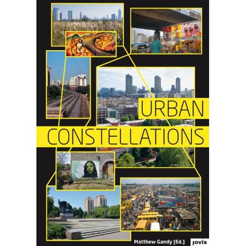
Image taken from amazon / Urban Constellations book cover.

Gandy, M. ed., 2011. Urban Constellations, Berlin: JOVIS Verlag.

Continue reading »

Book – Yes is More or the iPad is the Medium

A publication is no longer just a publication. It can be many things and what we see is only the beginning. A book can be a magazine, an ebook a website or a comic. Different medias are being mixed to play with ways of presentation. New technology plays here are good part and enables some very new concepts to be tested.

The eReader platforms and especially the iPad promise new ways of publishing. Only last week Apple has announced, as part of the app ibooks 2, the publication of text books. Here they put the emphasis more than before on the integration of additional media like video for tutorials and explanations, interactive graphics (like the newly released E. O. Wilson’s Life on Earth) and of course web links and so on. The animated and augmented book is only catching on a the moment. If you’re looking to purchase an iPad try out these Promotional Codes and save some money on this expensive technology!
Yes is more ipad
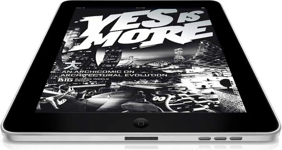
Image taken from earchitect / Yes is More on the iPad.

The architectural monagraphy is a rather unlikely candidate to put forward such an interactive publication. One would expect it to be a heavy piece with nicely photoshopped images and and a thick cover. This is however a way of presentation for the old garde and if BIG represents the new generation of architects such an interactive option of presentation is the way to go. BIG has always been very much about telling a good story and producing a good show. The show of course is very subjective and this subject is two fold its the facts about the design and Bjarke Ingels the head of the Bjarke Ingels Group (This is what BIG stands for).

Their Yes is More: An archicomic on architectural evolution was originally published back in 2009 by Taschen and as such already wasn’t the architectural monograph one might buy if it was Norman Foster or Richard Meier. BIG presented their work in a sort of comic they branded archicomic. It was however mostly well received even though few probably understood what Bjarke actually meant by Yes is more.

The one architectural monography ambitious architecture practices have to top if they really want to set a mark and the book that has dominated the style of architecture book for the last decades is S,M,L,XL by Rem Koolhass’s OMA and AMO’s Bruce Mau. It was published in 1995 by Monacelli Press.

BIG had a go at this with the comic. It was well received, but not quite enough to land in the hall of fame. It certainly did stir things a little and it fitted well with the self image Bjarke is building around his practice and the delivered projects. The advancing technology however meant new opportunities are opening up. BIG has been working more and more with new media, testing animation, 3d as well as augmented reality.

Now in 2011 the original book has been transformed into an app for the iPad as Yes is more! An Archicomic on Architectural Evolution by BIG. It is published by Taschen again and available on itunes. It is not exactly an ebook since it is as a comic mainly imagery based and now also integrated animations and movies. The comic comes to live with clips that play within the grid of images or in full screen mode. It’s clear from the start that this format fits the stile. The publication really thrives with the media in this case.

YesIsMore01
Image taken from the app / Page spread 218-219 in landscape mode and page 219 in portrait mode. Both show at the bottom the navigation bar.

Yes is more! An Archicomic on Architectural Evolution by BIG - TASCHEN GmbH

The app works both in portrait and in landscape mode. With the swipe of a finger one browses through the sequence of images learning about reasons and effects, but also a lot about Bjarke. Where he lives and what the view of his balcony looks like. Details can be zoomed in on, just like you are getting used to on your touch screen. A youtube like triangle symbolises clips and a click opens these additional medias in a small window or plays them at full screen at rather good resolution. Quality is ver good through out even if zoomed in on details.

Navigation is organised in a bar at the bottom that appears with a tab. To choose or jump to a new topic one can either use a slider of miniature pages or a selector roll. Of course individual pages can also be found by page number. However, the layout does not show any page numbers. They have been removed. In this sense the app is not at all a pure digital version of the paper based publication.

The app also offers a search box for key word search or a separate listing of all the clips if only moving images are of interest. The app offers the option to put bookmarks. There is no note option though, something a lot of ebook users probably have come to like from other platforms.

The experience the app offers is very good even though they have chosen not to the mimicked turn the page effect. It runs smooth the displayed material is qualitative very good with nice colours and sharp contours. Its what you get from other ebooks.

THe feel of the app has very little to do with a book any longer. The turn the page effect is missing, which to be fair, is a stupid thing, an purely visual imitation, but it comes the closest to turning a page and with it imitating the book. Then also the page numbers are missing, a very distinct design element of a paper based publication. This is not so much about the actual number but about orientation and progress. How far have I read and how many pages ago did the lead character last smile? Here we have no page numbers unless we choose to look at it in the bottom bar by tapping to activate it every time. There is however, a tiny bar appearing with each swipe of the page at the bottom indicating the position in the book, assuming the whole length of the screen is the entire book. This is very neat and practical. It would be nice if this little feature could also be draged and enable a sort of quick flip.

Currently there is no way to quickly flip through the book. the swipe response is quite slow and three quick swipes result in only one page shift. Similar the page numbers don’t move you through the pages that quickly. If now this little bar could do such a thing, maybe even in combination with the thumbnail page preview it would make for a great navigation.

The sequence of pages are presented in linear fashion. There are for example no links within the book. The last chapter BIG City provides an overview of the BIG project grouping similar projects together to city districts. It would be nice if clickable and acting as hyperlinks to jump to the details. Or maybe select one of the groups and look at all these projects together. It being programmed as an independent app such options would be possible enabling more browser like handling with back and forth or even history options, where the linearity of the paper based publication would be unlocked. With out this and it feels a bit like a slide presentation and in terms of the linearity would represent a power point against a prezi.

Yes is more ipad
Image taken from klatmagazine / Yes is More on the iPad.

To sum it up, navigation and experience are working fine. Every function you would need is there. Its just that most things have the feel of a computer based click with your mouse here sort of solution. At the same time the app designer have not really let go of the book and present it in a purely linear fashion. It remins a hybrid, and is as sort of ebook with its own app not quite defining a new category of interactive, reader driven, content platforms.

As it being an independent app there are is the downside that it does not link up with other publications. The thing about ebooks is that they still, at least in the term, link up and the same software is playing for all of them. Notes are taken across books, so are markings. This publication is a standalone thing and plays at most with the collection of apps, but not necessarily the books or ebooks in this case. This is more from a collectors perspective a point, but then if you are into architecture you want a whole bunch of similar publications to cover your entire field of interest. One single item doesn’t really satisfy this and remains the odd one out. Bjarke doesn’t mind to be the odd one out as long as he’s being talked about.

Nevertheless its an interesting publication and an impressive one. Its not just a few swipes long, something you have swiped through in under five minutes. This is your proper comic you can read on the tube and the bus for an entire week of commuting. It comes along happily on you iPad and pops upen where you left it. It is currently priced at £6.99 which is nearly the price of the actual print, on amazon for £11.66 (on the Taschen website it is priced at £ 17.99, here the app a bit less than half). You can buy the app from HERE on itunes and the book from Taschen or amazon.

YesIsMore02
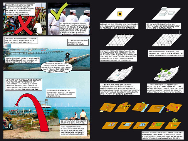
Image taken from the Yes is More app / Spread showing the project with the very poignant title Swept under the carpet. It is not a particularly famous BIG project, but it is one that summarises a lot about the approach. (click image to read the details) The introduction of the publication shows Bjarke with his feet on the table proclaiming his architecture paradigme is to say YES to everything. He claims that architecture can incorporate everything and still be progressive. In this very particular project, Swept under the carpet, he literally sweeps the pollution, this very project is built on a piece of land with polluted soil and the competition asked for solutions to deal with this fact, under the carpet with the argument: “Instead of cleaning up the mess we just cover it. We can spend the money required for cleaning the soil on my project and cover up.” He in fact says NO, in this case to the environment and a longterm solution. Much rather, he lets the polluted soil continue to contamine the water around the community and sailing centre and lets the kids swim in the dirty waters, but everything is nicely covered up. Even though BIG claims for their working attitude to be about process the reflection stage is missing in their project. No critical questions are asked, there is often little attitude or actual opinion on things. Even though BIG is subjectivated and purely focused on the person of Bjarke Ingels it is a brand and not a person.

The comic style fits well with the experiment of a ebook hybrid. There isn’t much to loose by putting it in an rather experimental form and it thrives on it. However the comic style dose not add anything to the content. It is however playful option to publish a book base don figure notes. Yes is More is a graphic novel taking the communication of architecture in visual terms to the extreme by not even attempting to talk about architecture in text form. The comic here is interpreted as annotated pictures and this fits perfectly with the way BIG explain projects, in simple steps explaining what is happening as if it were a DiY manual.

For BIG it’s all about the presentation. They way the projects are presented makes the projects directly ind simply accessible, see video below. The media used are engaging, playful and fitting. The explanations are very simple making every move easily understandable even for a layperson. Interesting however is more how arguments are made and here BIG’s background shines through. Everything is very much the famous and with this publication very much targeted form follows function. Following this paradigma the entire project is presented, throwing in here and there a few clever references and options, but essentially argumentation is very much founded on functionality.

Yes is more! An Archicomic on Architectural Evolution by BIG - TASCHEN GmbH

Ingels, B., 2010. Yes is More: An Archicomic on Architectural Evolution, iPad App., Cologne: Taschen GmbH.

Continue reading »
Book – Yes is More or the iPad is the Medium

A publication is no longer just a publication. It can be many things and what we see is only the beginning. A book can be a magazine, an ebook a website or a comic. Different medias are being mixed to play with ways of presentation. New technology plays here are good part and enables some very new concepts to be tested.

The eReader platforms and especially the iPad promise new ways of publishing. Only last week Apple has announced, as part of the app ibooks 2, the publication of text books. Here they put the emphasis more than before on the integration of additional media like video for tutorials and explanations, interactive graphics (like the newly released E. O. Wilson’s Life on Earth) and of course web links and so on. The animated and augmented book is only catching on a the moment. If you’re looking to purchase an iPad try out these Promotional Codes and save some money on this expensive technology!

Yes is more ipad
Image taken from earchitect / Yes is More on the iPad.

The architectural monagraphy is a rather unlikely candidate to put forward such an interactive publication. One would expect it to be a heavy piece with nicely photoshopped images and and a thick cover. This is however a way of presentation for the old garde and if BIG represents the new generation of architects such an interactive option of presentation is the way to go. BIG has always been very much about telling a good story and producing a good show. The show of course is very subjective and this subject is two fold its the facts about the design and Bjarke Ingels the head of the Bjarke Ingels Group (This is what BIG stands for).

Their Yes is More: An archicomic on architectural evolution was originally published back in 2009 by Taschen and as such already wasn’t the architectural monograph one might buy if it was Norman Foster or Richard Meier. BIG presented their work in a sort of comic they branded archicomic. It was however mostly well received even though few probably understood what Bjarke actually meant by Yes is more.

The one architectural monography ambitious architecture practices have to top if they really want to set a mark and the book that has dominated the style of architecture book for the last decades is S,M,L,XL by Rem Koolhass’s OMA and AMO’s Bruce Mau. It was published in 1995 by Monacelli Press.

BIG had a go at this with the comic. It was well received, but not quite enough to land in the hall of fame. It certainly did stir things a little and it fitted well with the self image Bjarke is building around his practice and the delivered projects. The advancing technology however meant new opportunities are opening up. BIG has been working more and more with new media, testing animation, 3d as well as augmented reality.

Now in 2011 the original book has been transformed into an app for the iPad as Yes is more! An Archicomic on Architectural Evolution by BIG. It is published by Taschen again and available on itunes. It is not exactly an ebook since it is as a comic mainly imagery based and now also integrated animations and movies. The comic comes to live with clips that play within the grid of images or in full screen mode. It’s clear from the start that this format fits the stile. The publication really thrives with the media in this case.

YesIsMore01
Image taken from the app / Page spread 218-219 in landscape mode and page 219 in portrait mode. Both show at the bottom the navigation bar.

Yes is more! An Archicomic on Architectural Evolution by BIG - TASCHEN GmbH

The app works both in portrait and in landscape mode. With the swipe of a finger one browses through the sequence of images learning about reasons and effects, but also a lot about Bjarke. Where he lives and what the view of his balcony looks like. Details can be zoomed in on, just like you are getting used to on your touch screen. A youtube like triangle symbolises clips and a click opens these additional medias in a small window or plays them at full screen at rather good resolution. Quality is ver good through out even if zoomed in on details.

Navigation is organised in a bar at the bottom that appears with a tab. To choose or jump to a new topic one can either use a slider of miniature pages or a selector roll. Of course individual pages can also be found by page number. However, the layout does not show any page numbers. They have been removed. In this sense the app is not at all a pure digital version of the paper based publication.

The app also offers a search box for key word search or a separate listing of all the clips if only moving images are of interest. The app offers the option to put bookmarks. There is no note option though, something a lot of ebook users probably have come to like from other platforms.

The experience the app offers is very good even though they have chosen not to the mimicked turn the page effect. It runs smooth the displayed material is qualitative very good with nice colours and sharp contours. Its what you get from other ebooks.

THe feel of the app has very little to do with a book any longer. The turn the page effect is missing, which to be fair, is a stupid thing, an purely visual imitation, but it comes the closest to turning a page and with it imitating the book. Then also the page numbers are missing, a very distinct design element of a paper based publication. This is not so much about the actual number but about orientation and progress. How far have I read and how many pages ago did the lead character last smile? Here we have no page numbers unless we choose to look at it in the bottom bar by tapping to activate it every time. There is however, a tiny bar appearing with each swipe of the page at the bottom indicating the position in the book, assuming the whole length of the screen is the entire book. This is very neat and practical. It would be nice if this little feature could also be draged and enable a sort of quick flip.

Currently there is no way to quickly flip through the book. the swipe response is quite slow and three quick swipes result in only one page shift. Similar the page numbers don’t move you through the pages that quickly. If now this little bar could do such a thing, maybe even in combination with the thumbnail page preview it would make for a great navigation.

The sequence of pages are presented in linear fashion. There are for example no links within the book. The last chapter BIG City provides an overview of the BIG project grouping similar projects together to city districts. It would be nice if clickable and acting as hyperlinks to jump to the details. Or maybe select one of the groups and look at all these projects together. It being programmed as an independent app such options would be possible enabling more browser like handling with back and forth or even history options, where the linearity of the paper based publication would be unlocked. With out this and it feels a bit like a slide presentation and in terms of the linearity would represent a power point against a prezi.

Yes is more ipad
Image taken from klatmagazine / Yes is More on the iPad.

To sum it up, navigation and experience are working fine. Every function you would need is there. Its just that most things have the feel of a computer based click with your mouse here sort of solution. At the same time the app designer have not really let go of the book and present it in a purely linear fashion. It remins a hybrid, and is as sort of ebook with its own app not quite defining a new category of interactive, reader driven, content platforms.

As it being an independent app there are is the downside that it does not link up with other publications. The thing about ebooks is that they still, at least in the term, link up and the same software is playing for all of them. Notes are taken across books, so are markings. This publication is a standalone thing and plays at most with the collection of apps, but not necessarily the books or ebooks in this case. This is more from a collectors perspective a point, but then if you are into architecture you want a whole bunch of similar publications to cover your entire field of interest. One single item doesn’t really satisfy this and remains the odd one out. Bjarke doesn’t mind to be the odd one out as long as he’s being talked about.

Nevertheless its an interesting publication and an impressive one. Its not just a few swipes long, something you have swiped through in under five minutes. This is your proper comic you can read on the tube and the bus for an entire week of commuting. It comes along happily on you iPad and pops upen where you left it. It is currently priced at £6.99 which is nearly the price of the actual print, on amazon for £11.66 (on the Taschen website it is priced at £ 17.99, here the app a bit less than half). You can buy the app from HERE on itunes and the book from Taschen or amazon.

YesIsMore02
Image taken from the Yes is More app / Spread showing the project with the very poignant title Swept under the carpet. It is not a particularly famous BIG project, but it is one that summarises a lot about the approach. (click image to read the details) The introduction of the publication shows Bjarke with his feet on the table proclaiming his architecture paradigme is to say YES to everything. He claims that architecture can incorporate everything and still be progressive. In this very particular project, Swept under the carpet, he literally sweeps the pollution, this very project is built on a piece of land with polluted soil and the competition asked for solutions to deal with this fact, under the carpet with the argument: “Instead of cleaning up the mess we just cover it. We can spend the money required for cleaning the soil on my project and cover up.” He in fact says NO, in this case to the environment and a longterm solution. Much rather, he lets the polluted soil continue to contamine the water around the community and sailing centre and lets the kids swim in the dirty waters, but everything is nicely covered up. Even though BIG claims for their working attitude to be about process the reflection stage is missing in their project. No critical questions are asked, there is often little attitude or actual opinion on things. Even though BIG is subjectivated and purely focused on the person of Bjarke Ingels it is a brand and not a person.

The comic style fits well with the experiment of a ebook hybrid. There isn’t much to loose by putting it in an rather experimental form and it thrives on it. However the comic style dose not add anything to the content. It is however playful option to publish a book base don figure notes. Yes is More is a graphic novel taking the communication of architecture in visual terms to the extreme by not even attempting to talk about architecture in text form. The comic here is interpreted as annotated pictures and this fits perfectly with the way BIG explain projects, in simple steps explaining what is happening as if it were a DiY manual.

For BIG it’s all about the presentation. They way the projects are presented makes the projects directly ind simply accessible, see video below. The media used are engaging, playful and fitting. The explanations are very simple making every move easily understandable even for a layperson. Interesting however is more how arguments are made and here BIG’s background shines through. Everything is very much the famous and with this publication very much targeted form follows function. Following this paradigma the entire project is presented, throwing in here and there a few clever references and options, but essentially argumentation is very much founded on functionality.

Yes is more! An Archicomic on Architectural Evolution by BIG - TASCHEN GmbH

Ingels, B., 2010. Yes is More: An Archicomic on Architectural Evolution, iPad App., Cologne: Taschen GmbH.

Continue reading »

Book – Four to Start into the New Year

From sustainability to the new beauty in the following four books are put forward to start into 2012. The topics all address some of the concerns raised about cities in the past year or so and all contribute to the current discussion around changes in social and spatial organisation at large. With globalisation and technology social structures are changing requiring urban environments to be adapted. This will not happen tomorrow, nor is it a case of restarting in building it new from scratch. The only option is to keep transforming and by testing and engaging with the presented new thoughts and aspects we might take a step into this direction.

Not all cities are mega cities. In fact most of the cities are small to mid sized. According to the work Mike Batty had done together with Martin Austwick and Oliver O’Brian on Rank Clocks plotting city sizes in the US, only about 10% of the cities are mega or large. The rest of the cities are under 1 million in population size.

In terms of sustainability potential these large numbers of smaller cities could actually play a major role and this is what Catherine Tumber put forward in her publication Small, Gritty, and Green: The Promise of America’s Smaller Industrial Cities in a Low-Carbon World published by MIT Press.

There are so many problems the smaller cities face. From long terms decline due to the faltering of industries, massive transport infrastructures slicing them into non workable urban islands and social struggles related to working poor and general poverty reminiscent of postcolonial squalor. The biggest struggle however is the fact that they are excluded from the general debate of urban planning and theoretical thinking. They all practice urban planning and development, but with only little recognition and background.

Tumber argues that due to the smaller sized, shorter distances and proximity to farmland and recreation these smaller cities have a lot of potential to implement sustainable concepts and start integrating those in everyday urban practice. Tumber especially points to renewable energies, such a wind, food production and local agriculture as well as manufacturing skills. Its all about producing and consuming locally.

These ideas are not new and sort of resonate with early garden cities ideas, especially in the praise of size and population density. This is not at all a negative association, but more a practical application. Since here it is not about setting up a new place to live, which can in itself not be sustainable, but about reprogramming an existing one sustainability is given an additional dimension.

Small, Gritty, and Green Book cover
Image taken from archpaper / Small, Gritty, and Green, book cover, part.

Does a city posses its very own spirit and identity? Daniel A. Bell and Avner de-Shalit argue in their new book The Spirit of Cities: Why the Identity of a City Matters in a Global Age published by Princeton University Press that actually they do. The authors draw on the ancient Greek concept of city spirit and argue for the rediscovery of the local urban spirits around the world especially in connection to todays globalisation.

Earlier publications have picked up on this topic and characterised cities in such a manner as to work out distinct identities. Saskia Sassen in Cities in a World Economy and more recently Martina Löw in Soziologie der Städte
(sociology of cities). THe concept of the citiy spirit is, as Löw points out, closely entangled with the city marketing that has been very popular in the past fifteen years as a tool to distinguish, present and attract.

Bell and de-Shalit look specifically at nine modern cities: Jerusalem (religion), Montreal (language), Singapore (nation building), Hong Kong (materialism), Beijing (political power), Oxford (learning), Berlin (tolerance and intolerance), Paris (romance) and New York (ambition). Of course soe of them sound like external concepts. Especially Paris and the age old topic of romance, hey but never mind it shapes the place in a certain way and this identity hold the potential to develop something specific and relevant.

Each city is portrait in a lot of detail making good use of story telling as well as combining theoretical aspects with practical experience. A good read for travellers of thought.

The Spirit of Cities Book cover
Image taken from the Atlantic / The Spirit of Cities, book cover.

“We have to find our way back to beauty!” Lars Spuybroek argues in his new book The Sympathy of Things: Ruskin and the Ecology of Design, published by V2_publishing, for a revised approach to design culture moving away from the technological practice of modernism towards a more romantic notion of art in the sense that beauty always combines variations, imperfection and fragility. Spuybroek bases his arguments on John Ruskin‘s aesthetics. Overall the book is a project to wrest these topics out of the Victorian era into the present. This is achieved by combining the five central themes of Ruskin: the Gothic and work, ornament and matter, sympathy and abstraction, the picturesque and time and ecology and design in combination with more recent thoughts on aesthetics by philosophers such as William James and Bruno Latour.

It becomes a projection of a world of feeling and beauty in such a way as it completely does a way with the fundamentalism and absolutism of modernist conception of design.

The Sympathy of Things Book cover
Image taken from il giornale dell architettura / The Sympathy of Things, book cover.

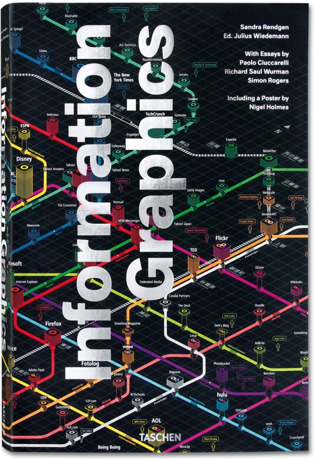
Graphical representation of information are in every case an abstract representation. Often to represent a point of view or a standpoint is required and depending on this the representation is biased. In Picturing the Uncertain World: How to Understand, Communicate, and Control Uncertainty through Graphical Display published by Princeton University Press, Howard Wainer is looking at the phenomenon of information display of statistical data and the possible complications.

The book is less about graphics than numbers, although graphics do play an important role. Similar to Dona M. Wong’s Guide to Information Graphics and also like Tufte’s Books The Visual Display of Information and Envisioning Information the correct representation is at the heart of the text. However, Wainer focuses more on the conditions and the explanations than the design.

Wainer is a longtime expert in statistical graphics who works as a research scientist for the National Board of Medical Examiners and as an adjunct professor of statistics at the Wharton School of the University of Pennsylvania.

The examples are discussed in detail in order to really get the reader to understand the points Wainer is to make. This has the advantage that for a number of the examples the reader also comes to finally understand the actual meaning of the graph probably well known to him. The book draws from a great range of examples including Charls Joseph Minard’s plot of Napoleons Russian Campaign, Florence Nightingale’s Diagram of Mortality and William Playfair’s Wheat Prices graph to name a few.

The book is written in a very accessble language and takes time to explain the details as well as linking it with current facts and events that enlighten the presented problem further. Definitely a great read for data enthusiasts.

Picturing the Uncertain World Book cover
Image taken from Borders / Picturing the Uncertain World, book cover.

Wainer, H., 2009. Picturing the Uncertain World: How to Understand, Communicate, and Control Uncertainty through Graphical Display, Princeton, N.J.: Princeton University Press.

Bell, D.A. & de-Shalit, A., 2011. The Spirit of Cities: Why the Identity of a City Matters in a Global Age, Princeton, N.J.: Princeton University Press.

Spuybroek, L., 2011. The Sympathy of Things: Ruskin and the Ecology of Design, Rotterdam: V2_Publishing.

Tumber, C., 2011. Small, Gritty, and Green: The Promise of America’s Smaller Industrial Cities in a Low-Carbon World, Boston, MA: MIT Press.

Continue reading »
1 2 3 4