Visualising Disabled Freedom Pass trips on the London Underground
Disabled Freedom Pass Card journeys on the London Underground from Gareth Simons on Vimeo.
This…
Continue reading »The latest outputs from researchers, alumni and friends at the UCL Centre for Advanced Spatial Analysis (CASA).

Disabled Freedom Pass Card journeys on the London Underground from Gareth Simons on Vimeo.
This…
Continue reading »Disabled Freedom Pass Card journeys on the London Underground from Gareth Simons on Vimeo.
This…
Continue reading »Disabled Freedom Pass Card journeys on the London Underground from Gareth Simons on Vimeo.
This…
Continue reading »Disabled Freedom Pass Card journeys on the London Underground from Gareth Simons on Vimeo.
This…
Continue reading » |
| The Roman Road network 410AC, as a floating layer over contemporary London in 3D. |
The London Evolution Animation (LEA) was developed by The Bartlett Centre for Advanced Spatial Analysis (UCL), as a partnership project between English Heritage, The Centre for Smart Infrastructure and Construction (University of Cambridge)/Dr Kiril Stanilov and Museum of London Archaeology (MOLA) (with the Mapping London and Locating London’s Past projects), and was initiated and directed by Polly Hudson (PHD).

The exhibition is found online in Polly’s Hudson Almost Lost online and its a great showcase of London’s historic wealth. Further information on the Animation, a historical overview and on the production of the video can also be found in Polly’s Hudson website.
List of References:
A. Paolo Masucci, Kiril Stanilov and Michael Batty (2013) The growth of London’s street network in its dual representation http://www.bartlett.ucl.ac.uk/casa/publications/working-paper-189
CASA UCL: http://www.bartlett.ucl.ac.uk/casa
MOLA: http://www.museumoflondonarchaeology.org.uk/NewsProjects/Current-News/LondonEvolutionAnimation.htm
Cambridge: http://www-smartinfrastructure.eng.cam.ac.uk/
English Heritage: http://www.english-heritage.org.uk/
Continue reading »The Roman Road network 410AC, as a floating layer over contemporary London in 3D. How did London become what it is today? How did it evolve and why? It is widely known that London is a historical city. One that has been inhabited for over 1500 yea…
Continue reading »
|
| The Roman Road network 410AC, as a floating layer over contemporary London in 3D. |
The London Evolution Animation (LEA) was developed by The Bartlett Centre for Advanced Spatial Analysis (UCL), as a partnership project between English Heritage, The Centre for Smart Infrastructure and Construction (University of Cambridge)/Dr Kiril Stanilov and Museum of London Archaeology (MOLA) (with the Mapping London and Locating London’s Past projects), and was initiated and directed by Polly Hudson (PHD).
The exhibition is found online in Polly’s Hudson Almost Lost online and its a great showcase of London’s historic wealth. Further information on the Animation, a historical overview and on the production of the video can also be found in Polly’s Hudson website.
List of References:
A. Paolo Masucci, Kiril Stanilov and Michael Batty (2013) The growth of London’s street network in its dual representation http://www.bartlett.ucl.ac.uk/casa/publications/working-paper-189
CASA UCL: http://www.bartlett.ucl.ac.uk/casa
MOLA: http://www.museumoflondonarchaeology.org.uk/NewsProjects/Current-News/LondonEvolutionAnimation.htm
Cambridge: http://www-smartinfrastructure.eng.cam.ac.uk/
English Heritage: http://www.english-heritage.org.uk/
Continue reading »Here at The Bartlett Centre for Advanced Spatial Analysis we run a Davis Vantage Pro 2 unit with Solar and UV sensors from a rooftop on Tottenham Court Road. The current output is via our live ‘Weather Dials‘ page, which is all singing and dancing, complete with graphs and updates every…

Wireless in the world from Timo on Vimeo.

The globe tweeter visualizes real-time twits on a 3D globe project by Cedric Pinson (code development), Design by Guillaume Lecollinet, Node.js hacking Johan Euprhosine.
Downtrib, screened at Fulldome UK 2012.
Continue reading »The Washington Post recently released a front-page article claiming that “The federal government wants to create super WiFi networks across the nation…Cities support the idea because the networks would lower costs for schools and businesses…
Continue reading »
Wireless in the world from Timo on Vimeo.
The globe tweeter visualizes real-time twits on a 3D globe project by Cedric Pinson (code development), Design by Guillaume Lecollinet, Node.js hacking Johan Euprhosine.
Downtrib, screened at Fulldome UK 2012.
Continue reading »

 |
| The museum of Unlimited Growth – Le Corbusier 1929 |
 |
| The infinite museum is a showcase for a range of visualization techniques such as images, videos, 3d objects and 3d animations. |
 |
| The application explores the possibilities of modular construction |
 |
| The application doesn’t rely on a pre-built structure, instead it dynamically creates a map of rooms whose topology is a result of player options and pre-defined exhibit relationships. |
 |
| The 6 rooms of the infinite museum |
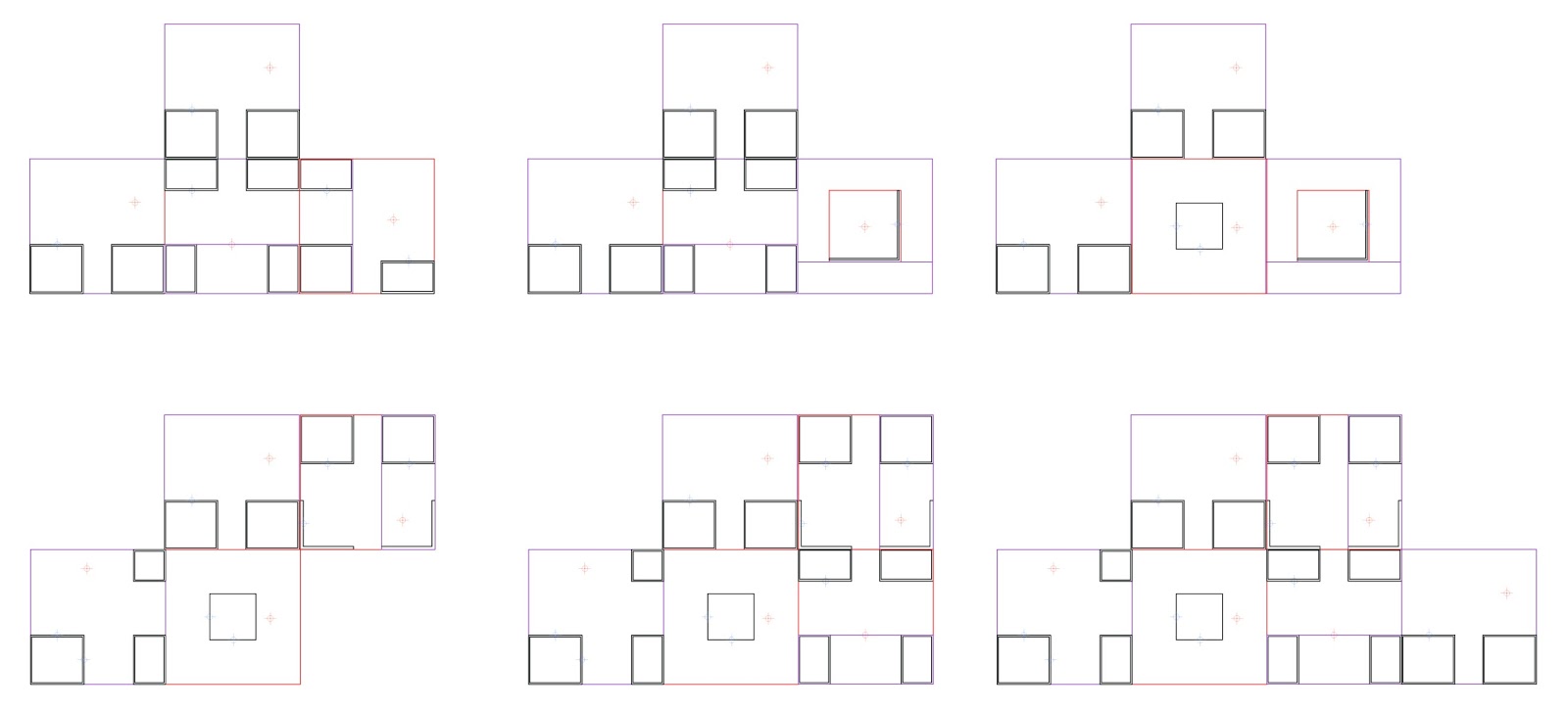 |
| The generation of different spaces is illustrated above using random formations. |
This blogpost contains extracts from our group essay.
Team Members, visit their blogs at:
Martin Dittus COVSPC
Ian Morton visual metro
Mohammad Masum Spatial Urban
Flora Roumpani En-topia
In the 2011-2012 MRes of Advanced Spatial Analysis and Visualization we worked on some fascinating topics and new year is always a good time to re-cap. The Infinite museum is the result of an interdisciplinary collaboration with Martin D…
Continue reading »
|
| The museum of Unlimited Growth – Le Corbusier 1929 |
|
| The infinite museum is a showcase for a range of visualization techniques such as images, videos, 3d objects and 3d animations. |
|
| The application explores the possibilities of modular construction |
|
| The application doesn’t rely on a pre-built structure, instead it dynamically creates a map of rooms whose topology is a result of player options and pre-defined exhibit relationships. |
|
| The 6 rooms of the infinite museum |
|
| The generation of different spaces is illustrated above using random formations. |
This blogpost contains extracts from our group essay.
Team Members, visit their blogs at:
Martin Dittus COVSPC
Ian Morton visual metro
Mohammad Masum Spatial Urban
Flora Roumpani En-topia
As regular readers will know we recently held a one day conference here at CASA entitled Smart Cities, Bridging the Physical and Digital. As part of the conference Steven Gray and George MacKerron built various exhibition pieces, in…
Continue reading »The next assignment in the Visualization course of the MRes Advanced Spatial Analysis and Visualisation in CASA, was relevant to “Agent based modelling”. In this project the idea is to create a tool which loads the pixels …
Continue reading »The next assignment in the Visualization course of the MRes Advanced Spatial Analysis and Visualisation in CASA, was relevant to “Agent based modelling”. In this project the idea is to create a tool which loads the pixels …
Continue reading »The next assignment in the Visualization course of the MRes Advanced Spatial Analysis and Visualisation in CASA, was relevant to “Agent based modelling”. In this project the idea is to create a tool which loads the pixels …
Continue reading »In the MRes of Advanced Spatial Analysis and Visualisation in CASA, we are exploring various techniques that are relevant to urban modelling and visualisations, such as Cellular Automata (CA), Agents etc. These a…
Continue reading »In the MRes of Advanced Spatial Analysis and Visualisation in CASA, we are exploring various techniques that are relevant to urban modelling and visualisations, such as Cellular Automata (CA), Agents etc. These a…
Continue reading »In the MRes of Advanced Spatial Analysis and Visualisation in CASA, we are exploring various techniques that are relevant to urban modelling and visualisations, such as Cellular Automata (CA), Agents etc. These a…
Continue reading »
“Take a cycle, ride it where you like, then return it, ready for the next person. Available 24 hours a day, all year round. It’s self-service and there’s no booking. Just turn up and go.” Barclays Cycle Hire is certainly popular in London. Every time a…
Continue reading »
“Take a cycle, ride it where you like, then return it, ready for the next person. Available 24 hours a day, all year round. It’s self-service and there’s no booking. Just turn up and go.” Barclays Cycle Hire is certainly popular in London. Every time a…
Continue reading »“Take a cycle, ride it where you like, then return it, ready for the next person. Available 24 hours a day, all year round. It’s self-service and there’s no booking. Just turn up and go.” Barclays Cycle Hire is certainly popular in London. Every time a…
Continue reading »Over the past few weeks we have been exploring exploring new methods and techniques for visualising data. Developed as part our Masters course in Advanced Spatial Analysis and Visualisation we are now looking into issues of scale, realtime renderi…
Continue reading »Over the past few weeks we have been exploring exploring new methods and techniques for visualising data. Developed as part our Masters course in Advanced Spatial Analysis and Visualisation we are now looking into issues of scale, realtime renderi…
Continue reading »Readers will know that as part of the MRes in Advanced Spatial Analysis and Visualisation, here in CASA, we are exploring new methods and techniques for visualising data. As part of the course we are looking at collecting data from the Twitte…
Continue reading »Readers will know that as part of the MRes in Advanced Spatial Analysis and Visualisation, here in CASA, we are exploring new methods and techniques for visualising data. As part of the course we are looking at collecting data from the Twitte…
Continue reading »Doug Fritz of the Google Data Arts Team shared a couple of lines about the project: ”Thanks to WebGL, we’re able to display thousands of moving points at high frame rates by using the user’s graphics processing unit (GPU) for 3D computations. Each state of the globe has its own geometry and we morph between them with a vertex shader, saving precious CPU resources. Additionally, to make the globe look nice, we took advantage of the possibilities of GLSL and created two fragment shaders, one to simulate the atmosphere and another to simulate frontal illumination of the planet”. So, here is what some Java script, and the latest technologies in open source (including WebGL and Html5!) can produce.
Latitude / longitude data spikes
Color gradients, based on data value or type
Mouse wheel to zoom
More features are under development…
‘The WebGL Globe is an open platform for geographic data visualization. We encourage you to copy the code, add your own data, and create your own.’ – Chrome ExperimentsIt’s simple, it’s free, it’s open. The Google Data Arts Team has created a very inte…
Continue reading »Doug Fritz of the Google Data Arts Team shared a couple of lines about the project: ”Thanks to WebGL, we’re able to display thousands of moving points at high frame rates by using the user’s graphics processing unit (GPU) for 3D computations. Each state of the globe has its own geometry and we morph between them with a vertex shader, saving precious CPU resources. Additionally, to make the globe look nice, we took advantage of the possibilities of GLSL and created two fragment shaders, one to simulate the atmosphere and another to simulate frontal illumination of the planet”. So, here is what some Java script, and the latest technologies in open source (including WebGL and Html5!) can produce.
Latitude / longitude data spikes
Color gradients, based on data value or type
Mouse wheel to zoom
More features are under development…
The movie below is a visualisation of office and retail space in London. Using data kindly supplied by the Economics Unit at the Greater London Authority, Duncan Smith a PhD student here at CASA has calculated the amount of retail and office in London per 500 metre grid square: Duncan…