7 brilliant leadership lessons I learned this year – Business Insider – Business Insider
7 brilliant leadership lessons I learned this year – Business Insider Business Insider
Continue reading »The latest outputs from researchers, alumni and friends at the UCL Centre for Advanced Spatial Analysis (CASA).
7 brilliant leadership lessons I learned this year – Business Insider Business Insider
Continue reading »7 brilliant leadership lessons I learned this year Business InsiderSecrets to hiring, being a great boss, and achieving your goals.
Continue reading »CityMetric |
This amazing map shows how urbanisation has accelerated since 1950
CityMetric Duncan Smith, at UCL’s Centre for Advanced Spatial Analysis, has come up with a clever map to help us visualise all this. Drawing on UN data from 1950, 1990 and 2015, and projections for 2030, his map uses circles of different colours to represent the … |
CityMetric |
This amazing map shows how urbanisation has accelerated since 1950
CityMetric David Smith, at UCL’s Centre for Advanced Spatial Analysis, has come up with a clever map to help us visualise all this. Drawing on UN data from 1950, 1990 and 2015, and projections for 2030, his map uses circles of different colours to represent the … |
This amazing map shows how urbanisation has accelerated since 1950 | CityMetric CityMetric
Continue reading »This amazing map shows how urbanisation has accelerated since 1950 CityMetricTimes change. A hundred years ago London, New York and Paris were the biggest cities in the world. Today, all three retain cultural and economic might – but …
Continue reading »Duccio PIOVANI | Research Associate | PhD | University College London, London | UCL | Center for Advanced Spatial … ResearchGate
Continue reading »
How we ended up exploring a church through the windscreen of an X-Wing
CityMetric David Smith, at UCL’s Centre for Advanced Spatial Analysis, has come up with a clever map to help us visualise all this. Drawing on UN data from 1950, 1990 and 2015, and projections for 2030, his map uses circles of different colours to represent the … |
CityMetric |
Can you identify these places from a medieval map?
CityMetric David Smith, at UCL’s Centre for Advanced Spatial Analysis, has come up with a clever map to help us visualise all this. Drawing on UN data from 1950, 1990 and 2015, and projections for 2030, his map uses circles of different colours to represent the … |
CityMetric |
It’s Christmas, so here are 11 beautiful isochrone maps showing travel times …
CityMetric David Smith, at UCL’s Centre for Advanced Spatial Analysis, has come up with a clever map to help us visualise all this. Drawing on UN data from 1950, 1990 and 2015, and projections for 2030, his map uses circles of different colours to represent the … |
As part of the Israeli Geographical Association meeting in Jerusalem, I was asked to give a half day workshop on “Citizen Science: theory, practice and policy (with case studies from UK & Germany)”. The workshop learning objectives: Knowledge of the field of citizen science and current trends that influence it Understand the principles and practical … Continue reading Citizen Science: theory, practice & policy
SmellyMaps reveals the “olfactory footprint of London” – the streets which are dominated by traffic fumes, the animal smells emanating out from London Zoo, and the influence of parks and greenspaces on London’s scent experience. Streets are measured for four smell groupings – emissions (coloured red on the map), nature (green), food (blue) and animals […]
Continue reading »CityMetric |
Manchester tops league table for having cars parked on pavements
CityMetric David Smith, at UCL’s Centre for Advanced Spatial Analysis, has come up with a clever map to help us visualise all this. Drawing on UN data from 1950, 1990 and 2015, and projections for 2030, his map uses circles of different colours to represent the … |
CityMetric |
This is why loads of business closures can be good for a city
CityMetric David Smith, at UCL’s Centre for Advanced Spatial Analysis, has come up with a clever map to help us visualise all this. Drawing on UN data from 1950, 1990 and 2015, and projections for 2030, his map uses circles of different colours to represent the … |
To celebrate one year since the release of London: The Information Capital by Mapping London co-editor James Cheshire and graphic designer Oliver Uberti, and the book recently winning the BCS Award, the authors have released a number of new excepts from the book. Here we feature “What Lies Beneath”, a map of the tunnelled sections […]
Continue reading »I’ve been making a lot of use of PostgreSQL and PostGIS for working with geo-data over the past year and, having finally gotten over my hatred of the non-standard administrative commands, I am seriously impressed with what this setup makes … Continue reading →
Continue reading »CityMetric |
USA! USA! Or – where are the biggest cities in the United States of America?
CityMetric David Smith, at UCL’s Centre for Advanced Spatial Analysis, has come up with a clever map to help us visualise all this. Drawing on UN data from 1950, 1990 and 2015, and projections for 2030, his map uses circles of different colours to represent the … |
Here’s an interesting graph, which combines data on total journeys per day on London’s bicycle sharing system (currently called “Santander Cycles”) from the London Data Store, with counts of available bicycles per day to hire, from my own research database. The system launched in summer 2010 and I started tracking the numbers almost from the … Continue reading London’s Bikeshare Needs A Redistribution of Stations →
Continue reading »One of the best datasets for understanding the explosive growth of cities across the world in the last 75 years in the UN World Urbanisation Prospects research, which records individual city populations from 1950 to 2014, and includes predicted populations up to 2030. I have been meaning to create an interactive map of this fascinating data for…
I’ve had the very great pleasure over the last year and a half of collaborating with Gustavo Romanillos, a PhD student based in Madrid, who has been working with a team there in Madrid Cycle Track to carry out some … Continue reading →
I presented a talk on geodemographic mapping, at a visual methods workshop “In/Visibility and Difference” which took place in Berlin at Bard College (formerly the European College of Liberal Arts). The workshop was organised by the TransformIG project at Humboldt University in Berlin, which was also the venue for the keynote part of the meeting. … Continue reading In/Visibility and Difference – Visual Methods Workshop in Berlin →
Continue reading »CityMetric |
1 Undershaft – and a selection of other skyscrapers that are not in any way …
CityMetric David Smith, at UCL’s Centre for Advanced Spatial Analysis, has come up with a clever map to help us visualise all this. Drawing on UN data from 1950, 1990 and 2015, and projections for 2030, his map uses circles of different colours to represent the … |
The IndependentA mathematical formula reveals the secret to lasting relationshipsThe IndependentFry, who works at the UCL Centre for Advanced Spatial Analysis in London, explains in her 2014 TED Talk and recently released book, "The Mathematics of…
Continue reading »The Independent |
A mathematical formula reveals the secret to lasting relationships
The Independent Fry, who works at the UCL Centre for Advanced Spatial Analysis in London, explains in her 2014 TED Talk and recently released book, “The Mathematics of Love,” that the best predictor of long-lasting relationships is how positive and negative a couple … |
A mathematical formula reveals the secret to lasting relationships The Independent
Continue reading »A mathematical formula reveals the secret to lasting relationships The IndependentIf you’re fortunate enough to find someone you want to settle down with forever, the next question is: How do you achieve happily ever after? According to …
Continue reading »Research has to be ‘written up’. To some, writing comes easily – though I suspect this is on the basis of learning through experience. To many, especially research students at the time of thesis writing, it seems like a mountain … Continue reading →
Continue reading »CityMetric |
Google’s self-driving cars might have robotic arms. To make them less confusing
CityMetric David Smith, at UCL’s Centre for Advanced Spatial Analysis, has come up with a clever map to help us visualise all this. Drawing on UN data from 1950, 1990 and 2015, and projections for 2030, his map uses circles of different colours to represent the … Ready for the Road – YouTubeYouTube Google patent reveals how its self-driving cars may communicate with pedestriansWashington Post Cop pulls over Google self-driving car, finds no driver to ticketCNN |
CityMetric |
London could be getting a whole new set of pedestrian bridges
CityMetric David Smith, at UCL’s Centre for Advanced Spatial Analysis, has come up with a clever map to help us visualise all this. Drawing on UN data from 1950, 1990 and 2015, and projections for 2030, his map uses circles of different colours to represent the … |
Journals and conferences are certainly proliferating. I receive e-mails weekly inviting me to submit papers to new journals and daily inviting me to sign up for conferences. These are virtually all related to commercial profit-making enterprises rather than from, say, … Continue reading →
Continue reading »The idea of ‘DNA’ has become a commonplace metaphor. The real DNA is the genetic code that underpins the development of organisms. I find the idea useful in thinking about the development of – the evolution of – cities. This … Continue reading →
Continue reading »CityMetric |
Britain’s South West Trains is using its adverts to troll a rival train company
CityMetric David Smith, at UCL’s Centre for Advanced Spatial Analysis, has come up with a clever map to help us visualise all this. Drawing on UN data from 1950, 1990 and 2015, and projections for 2030, his map uses circles of different colours to represent the … |
Every year, for the last few years, Mapping London editors Oliver and James have been invited to create and submit an artwork for 10×10 London, a charity art auction organised by Article 25, the architectural development charity (originally called Architects for Aid). Being neither artists or architects, it is very flattering that we have been […]
Continue reading »CheDonna.it |
La formula matematica che vi regalerà il successo in amore
CheDonna.it A spiegare infatti i rischi dell’algoritmo di Gale-Shapley arriva il nuovo libro di Hannah Fry, docente all’UCL Centre for Advanced Spatial Analysis di Londra. La celebre matematica dimostra attraverso un semplice esempio come decisiva per il successo … |
CityMetric |
Where are the world’s most violent cities?
CityMetric David Smith, at UCL’s Centre for Advanced Spatial Analysis, has come up with a clever map to help us visualise all this. Drawing on UN data from 1950, 1990 and 2015, and projections for 2030, his map uses circles of different colours to represent the … |
A picture of the second CBD in Sao Paulo rapidly developing as a major financial-retailing centre in Itaim Bibi some 10 kms south west of the established centre at Paulista. Our ESRC project with the University of Sao Paulo and INPE … Continue reading →
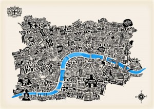
Continue reading »Mapping London stumbled upon this lovely cartographic art-piece of London, created by illustrator Josie Shenoy, at her stall at the South Bank Christmas Market (almost underneath the southern end of the Hungerford Bridge that goes across to Charing Cross, near Foyles’s South Bank outpost). It’s called River Thames and is available as a print and […]
Continue reading »CityMetric |
Patents granted: Where are Britain’s most inventive cities?
CityMetric Duncan Smith, at UCL’s Centre for Advanced Spatial Analysis, has come up with a clever map to help us visualise all this. Drawing on UN data from 1950, 1990 and 2015, and projections for 2030, his map uses circles of different colours to represent the … |