Modern London Maps
Ever thought we should be a book? Well, Modern London Maps, while unrelated to Mapping London, is probably quite close to the book that we
Continue reading »The latest outputs from researchers, alumni and friends at the UCL Centre for Advanced Spatial Analysis (CASA).

Ever thought we should be a book? Well, Modern London Maps, while unrelated to Mapping London, is probably quite close to the book that we
Continue reading »The Map House, a wonderful gallery in Knightsbridge in central London which is itself over 100 years old, has just launched a month-long exhibition specifically
Continue reading »The FT published an article called “An Indian restaurant crawl along London’s Elizabeth Line” which came illustrated with this rather nice map that shows the
Continue reading »We featured TrainTracker, a live circuit board map of where the trains are on the London Underground – with lights representing the train locations – back in 2020. Now, the organisation has taken the concept onwards and produced individual …
Continue reading »Just in time for Christmas, here’s a central London alternative tube map that has been made by ICON Printing, a custom apparel design firm. It highlights shops near the marked stations that have known strong environmental, sustainable and sociall…
Continue reading »Central London has long been a spatial challenge for tourists and others unfamiliar with it. It’s very big, and most of it isn’t built on an easily understandable grid pattern. Quirks and kinks in streets built back in Roman times, persist …
Continue reading »The London Greenground Map, by designer Helen Ilus (Hi Design), takes its inspiration from the famous tube map to create a network of walking routes, with parks as “stations” in and around the capital. The map was first created a couple of …
Continue reading »After nearly a year and a half when much of London has been staying away from its central business district, there’s a big push to get people back into the middle of town. The Mayor of London and Visit London have this week launched Let’s D…
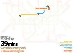
Continue reading »People in London generally know what tube zone they live “in”. There are no defined zones as such, zones are simply classifications assigned to each tube and railway station in, so it is likely people label their “zone” based on…
Continue reading »Route Plan Roll is the creation of Dermot Hanney – his concept is to marry a map of safe London road cycle routes, with proper infrastructure, with the “tube map” which famously simplifies the London Underground network into straight …
Continue reading »Missing travelling on the London Underground? Now, you can see the trains running, live, on this custom-made circuit board showing thetube network. An array of lights, one for each tube and DLR station, uses open data from Transport for London to show …
Continue reading »One of London’s hardest challenge, the Circle Line Pub Crawl, got even harder a few years ago when Transport for London reconfigured the line to have a “tail” extending down to Hammersmith. Now, there are 35 tube stations and correspo…
Continue reading »This creation by Artur D, a volunteer at the London Transport Museum, is a faithful transplantion of the original c.1933 H.C. “Harry” Beck London tube map, the first to show the network as a diagram with rigid lines and corners – to t…
Continue reading »An eye-opening version the Tube Map for central London was published by the FT today (& on Twitter). The graphic, created by Steven Bernard of the FT Data team, is based on “PM 2.5” air pollution particulate matter readings, measured by…
Continue reading »The public may not be able to visit Tottenham Court Road station’s Crossrail concourse or platforms yet, thanks to the well-publicised delay across the wider project, but the station was one of the most complete in the central section, a year ago…
Continue reading »The weather’s lovely at the moment – the last thing you want to do is spend that time deep down in the bowels on London, on the deep tube network, surely? Or maybe at least, how about alighting one stop early and walking the last bit? But h…
Continue reading »
From conference facility organisers PowWowNow comes this map/infographic showing the worst tube stations in central London for stress. They’ve produced a simple index of tube station stress by combining minutes of station-specific delays for tube trains, with the total numbers of people entering/exiting the station, and counting negative/mixed social media (mainly Twitter) posts. All three […]
Continue reading »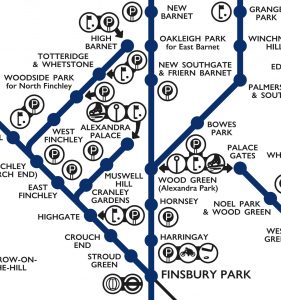
This lovely schematic diagram was first created in 1939 by George Dow. It shows the three LNER (London and North Eastern Railway) north London networks – radiating out from the Marylebone, King’s Cross, and Liverpool Street/Fenchurch Street London terminii, in a single map. Unusually, the map includes a series of pictograms, illustrating nearby facilities, leisure […]
Continue reading »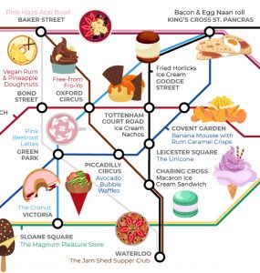
You’ve done the Circle Line Pub Crawl. Now try the Circle Line Food Crawl. Or use this special “Food Tube Map”, produced by Wren Kitchens (they write about it here), to visit unusual gastronomic experiences anywhere inside the Zone 1 area marked out by the Circle Line. The 25 restaurants and eateries included in this […]
Continue reading »TfL is keen to get people travelling on the tube when it’s not so busy, and also beyond Zone 1. With this in mind, they’ve commissioned these line maps, in conjunction with Time Out magazine. Each line (except the Waterloo and City) gets one, with the most interesting sections of each line converted into a […]
Continue reading »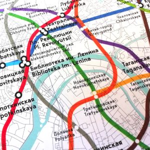
A lot of Londoners are currently focused on the World Cup in Russia at the moment, so Mapping London is taking a look eastwards, thanks to the latest boutique map created by productive cartographers Blue Crow Media. The map is essentially a Moscow version of their London Underground Architecture & Design Map and features the […]
Continue reading »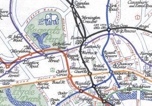
The Tube Map is a design classic – the straight lines, even spacing and lack of unnecessary above-ground detail has become a hall-mark of metro maps across the world, since it was first drawn by H.C. Beck in the 1930s. Today, the printed versions of London’s tube map include a specific acknowledgement of the creator […]
Continue reading »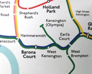
I have to confess, there was a sharp intake of breathe when this map was unwrapped here at Mapping London towers. We are a big fan of tube maps (we even have a special page just for them) and we know you are too, so discovering a new one is always a bit of a […]
Continue reading »
The Corporate Archives division of Transport for London recently held a short internal exhibition at their headquarters at Palestra, called “Mapping London” and showcasing new and old maps of London’s transport from the archive. Amongst the highlights included this Lego historic tube map. The Lego is modern but the map was one of the last […]
Continue reading »

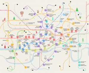
We do like arty tube maps here at Mapping London and Travelzoo have obliged with this rather pretty map of 50 free things to do in this summer in London, attaching the attractions to tube stations, with the key elaborating on the station names and walking distance to the place of interest. With London’s size […]
Continue reading »
Caught short on the tube? TfL publishes all sorts of maps of the London Underground network, including this map of toilet facilities at stations. This is particularly useful as no TfL train, of any kind, has toilets on board, including the new Crossrail trains now starting to appear on the TfL Rail line. As well […]
Continue reading »
A new flagship Lego store opened in London a few months back, in Leicester Square. Since the launch, there has been an almost continuous queue to get into the shop, let alone to buy anything. This is mainly because of the amazing Lego sculptures that adorn the shop. To one side is full-size section of […]
Continue reading »
There’s a tube strike on today, with many tube stations expected to be closed. The inner city and central London are likely to be hardest hit, with stations closed in most in Zone 1 and all inside the Circle Line’s loop. Usefully, TfL recently published this map, which shows the central part of the Tube […]
Continue reading »
Here’s a rather nice map combining the famously colourful and diagrammatic tube map with Christmas tree lights, to create an infographic, “The London Christmas Map”, showing the Christmassy events happening in London. You can see a full version of the map, including a key and listings for each event and how far it is from […]
Continue reading »
Tubermap is an extremely easy and quick way to find the fastest route between any two stations the TfL tube/train networks in London (London Underground, London Overground, DLR, London Tram, TfL Rail and Cable Car). Just click your start and end station, and the fastest route is instantly shown, along with transfer stations and the […]
Continue reading »
TubeHeartbeat visualises one of Transport for London’s most interesting and detailed open dataset, RODS. This has data on the approximate weekday volume of passengers between each pair of stations on the network, and entering/exiting the stations, at 15-minute intervals. Mapping this, as TubeHeartbeat does, shows a distinctive pulse, or heartbeat, as commuters surge in and […]
Continue reading »
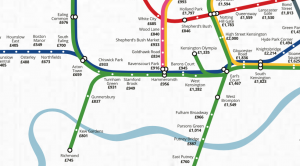
The tube map is a useful base for data maps of London, because most people (north of the river, at least) tend to think of the city’s layout in terms of the tube map – generally, you know what your nearest tube station is. We’ve used the idea before to show maps of life expectancy, […]
Continue reading »
Network Rail, who own most of London’s “heavy rail” track, have created this graphic showing where in London they are improving the rail network (short answer: most of it). The graphic is part of an interactive that you can view here. It’s slightly buggy and a few years out of date (e.g. no Lea Bridge […]
Continue reading »
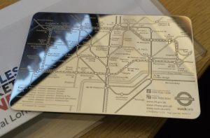
The tube map is almost certainly London’s most widely produced and collected map, with many millions of the pocket version being issued for free every year by TfL from London’s 270+ tube stations. But how about having one that’s made of steel? Well, now you can thanks to Suck UK, who have produced an officially […]
Continue reading »
We’ve featured Crossrail’s official construction map before, when it was showing the progress of the various TBMs (tunnel boring machines) drilling through London, but with the tunnels themselves now burrowed, it’s received a welcome update – if you zoom right in, you can now see the shape and extent of the underground stations. And they […]
Continue reading »
So London’s myriad of suburban commuter rail services, many of which are south of the River Thames and so act as the equivalent of the largely north-of-the-river tube network, may in the future come under the control of Transport for London, the main transit authority for the city. It makes a lot of sense – […]
Continue reading »
To celebrate one year since the release of London: The Information Capital by Mapping London co-editor James Cheshire and graphic designer Oliver Uberti, and the book recently winning the BCS Award, the authors have released a number of new excepts from the book. Here we feature “What Lies Beneath”, a map of the tunnelled sections […]
Continue reading »
Today, the London Transport Museum unveils a new permanent gallery in its space in Covent Garden, called “London by Design“. The gallery includes a number of maps which have not been exhibited before, including this lovely map of the “Baker Street & Waterloo Railway (of which the Bakerloo Line‘s name is a portmanteau) which first […]
Continue reading »
View the full map as a lovely vector PDF The Transport for London (TfL) tube map, with its straight lines, 45-degree rounded corners and simple, clear cartography, is a design classic. The map dispenses with other features such as parks, roads and urban extents – because you don’t need those if you are getting from […]
Continue reading »