
Latest Posts
PGRG DISSERTATION PRIZES 2012
Tweet “Joanna Stillwell Undergraduate Dissertation Prize” This prize is named in memory of the daughter of Professor John Stillwell of the University of Leeds. Joanna, who was a geography graduate from the University of Sheffield, died in 2004. The Population Geography Research Group has set up three prizes (£100 for first prize; £50 for second […]
Continue reading »NYC’s Bike Share Approaches
New York City last week released a preliminary map showing the proposed sites for the launch of its bike sharing scheme, now named Citi Bike (with Citigroup being the lead sponsor along with Mastercard). Citigroup’s sponsorship is crucial for the … Continue reading →
Continue reading »Data Hub Shows Weather, News & Transport Info For Major UK Cities – PSFK
CityDashboard includes a live feed and a map detailing what’s happening in eight cities across Britain.See it on Scoop.it, via Spatial Analysis
Continue reading »Data Hub Shows Weather, News & Transport Info For Major UK Cities
CityDashboard aggregates real-time data for cities around the UK and presents the information on a webpage and map. The project was created by the Centre for Advanced Spatial Analysis at University College London. The dashboard of live feeds displays a…
Continue reading »To Understand Is To Perceive Patterns
Jason Silva’s wonderful demonstration of patterns and order across many evolving spatial systems is what our science of cities is all about: flows, interactions, dynamics, self-similiarity, hierarchy and of course fractals. Take a look. These patterns swirl around all our … Continue reading →
Continue reading »Social Forces Model with Human participants on the BBC
The BBC’s science series ‘Bang goes the Theory’ recently had an episode on crowd behaviour. It shows a fascinating way of getting plenty of research out there into the public eye, using very short clips of research taking place based on certain themes….
Continue reading »The London Transport Network in Realtime
Last Saturday, 5 May 2012, saw the FA Cup Final and various Olympics preparation events taking place in London, so I couldn’t help wondering was was going to happen to the transport system. The ANTS project (Adaptive Networks for complex Transport Systems) that I’ve been working on is designed as a toolkit for collecting transport … Read more →
Continue reading »Will Dean’s Ideas Factory: Everything you wanted to know about your city
This column previously covered a neat experiment that was using open data for London’s air quality to point out automatically areas of iffy air quality on Twitter.See it on Scoop.it, via Spatial Analysis
Continue reading »ESRI CityEngine, Lumion, and SketchUp – The Ultimate City Toolkit?
Over the last few weeks we have been looking at ESRI’s CityEngine and how it can be used to create rapid urban scenes. As we noted it moves GIS visualisation a step forward while at the same time bringing procedural city modelling into the ma…
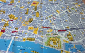
Continue reading »See London from a pigeon’s eye view – Now. Here. This. – Time Out London
See it on Scoop.it, via Spatial Analysis
Continue reading »WhereCampEU 2012
I was at the third WhereCampEU “unconference” which took place in Amsterdam over the last weekend of April, following previous editions in London and Berlin which I was also at. The meeting was an ideal opportunity for me to feature … Continue reading →
Continue reading »Mapping City Flows as Blood
Blood is everywhere when it comes to describing cities. We have arterial roads, pulsing transport flows, and cities with different metabolisms. Thanks to great new datasets and visualisation software the analogy of cities with pulsing flows is being increasingly utilised for explanatory mapping. For example the work of UCL CASA’s Jon Reades above depicts the London Underground network …
Continue reading »Pulse of the City (reboot)
As I get to better grips with the full richness of the Oyster data set and the complexity of the TfL network it’s gradually getting easier to build better visualisations. One of the ones that I’ve wanted to revisit for quite some time was my original ‘pulse of the city’ animation (you can see it […]
Continue reading »
A Week in the Life of London’s Public Transit System
I’ve been meaning to post this for ages but have had a great deal on my plate (more posts and visualisations to follow in the next week I hope) so this has kept slipping, together with the six or seven other ‘draft’ posts I’ve got going. Anyway, this visualisation shows average entries at each and every Underground, […]
Continue reading »Spindlytext: write in the sky with the Google Earth API
I’ve just released Spindlytext on Github. It’s the library that powers the live data display in Pigeon Sim, by creating KML linestrings in the shape of letters. It looks like this:
Continue reading »New Olympic Park Map
We featured the first official Olympic Park map at the […]
Continue reading »Modal Council Tax Bands in England
Here’s a map of England, overlaid on it is a choropleth map showing the modal (i.e most common) council tax band within each Census Output Area (OA) in England, based on March 2011 data released by the Office of National … Continue reading →
Continue reading »Modelling Movement in the City: The Influence of Individuals
‘Modelling Movement in the City: The Influence of Individuals’ was the title of a talk I gave at the AGILE conference in Avignon, France last week. For the conference I actually initially prepared a poster that never ended up seeing the light of d…
Read more →
Book – Information Graphics
Information graphics are the subject to a brand new Taschen publication Information Graphics that is bringing complicated data made understandable through brilliant designs to a strong coffee table near you. The book is colourful with strong visual guidance, large, very large and heavy, some 480 pages heavy. As this outline shows, its a bold publication that doesn’t hide behind all the various examples of graphic design, but provides a tasteful framework to showcase the many awesome examples of data narratives.
Image taken from aestheticsofjoy by Stephanie Posavec / Writing without words exploring possibilities to visually represent text.
Of course info graphics are currently trending and one of the most talked and specially passed around topic, not only online but more recently also in the media. All the large media houses have a special information design group and the publication showcases a number of these examples. In this context the book is not the first such collection of good designed information, but certainly one of the boldest in a positive sense.
The publication is edited by Julius Wiedemann und features contributions by Sandra Rendgen, Richard Saul Wurman, Simon Rogers from the Guardian Data Blog and Paolo Ciuccarelli. This is a very interesting team Taschen has put together for this publication with, whilst still being information specialists, covering a broad spectrum of perspectives and expertise.


Image taken from dynamicdiagrams by NYT / Interactive visualisation showing the changes in election results over the period 2006-2010. Find the interactive version at NYT
Where other publications, for examples Data Flow by Gestalten, Otto Neurat by NAi or indeed Edward Tufte focus on the context of the graphics, the theoretical background of narrating information as well as the actual teaching of how to present information the Taschen publication is a showcase. It is foremost about showing great examples from a variety of sources on how to visualise data sets graphically in mainly 2D. There are a few web based, animated or interactive examples too though. This takes into account that complexity showing in these graphics is continually rising.


Image by Torgeir Husevaag / Escape Routes, 2010-2011. A series of drawing studying possibilities of spatial movement under given time constraints. On the left the map and on the right a detail of some of the blue shaded location sixth path details
Showcasing such a large collection of examples is tricky in that the ordering system as to how the examples are organised becomes very prominent and therefore important. Here the editor has decided to go with a very low number of groups to arrange the info graphics. Where other publications make an exercise out of inventing a whole new system to clarify and characterise the examples this one takes the simple approach. This both refreshingly straight forward and annoyingly rough. What do the chosen terms Location, Time, Category and Hierarchy actually describe, or more importantly how are they distinguished?
The questions remain unanswered however, this does not stand in the way to enjoy the great quality and variety this collection shows. Its a book to brows, jump and flip, a publication you will keep in reach for a long time and always go back to to enjoy or indeed recharge your design batteries.
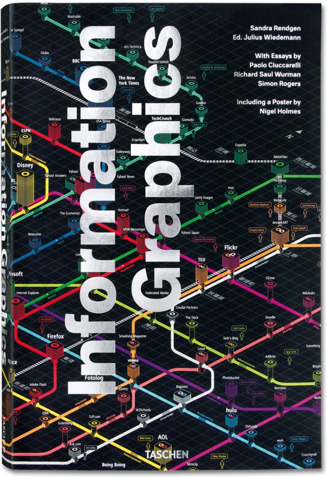
Image by Taschen / Book cover Information Graphics.
Rendgen, S., 2012. Information Graphics J. Wiedemann, ed., Köln: Taschen GmbH.
Book – Information Graphics
Information graphics are the subject to a brand new Taschen publication Information Graphics that is bringing complicated data made understandable through brilliant designs to a strong coffee table near you. The book is colourful with strong visual guidance, large, very large and heavy, some 480 pages heavy. As this outline shows, its a bold publication that doesn’t hide behind all the various examples of graphic design, but provides a tasteful framework to showcase the many awesome examples of data narratives.
Image taken from aestheticsofjoy by Stephanie Posavec / Writing without words exploring possibilities to visually represent text.
Of course info graphics are currently trending and one of the most talked and specially passed around topic, not only online but more recently also in the media. All the large media houses have a special information design group and the publication showcases a number of these examples. In this context the book is not the first such collection of good designed information, but certainly one of the boldest in a positive sense.
The publication is edited by Julius Wiedemann und features contributions by Sandra Rendgen, Richard Saul Wurman, Simon Rogers from the Guardian Data Blog and Paolo Ciuccarelli. This is a very interesting team Taschen has put together for this publication with, whilst still being information specialists, covering a broad spectrum of perspectives and expertise.
Image taken from dynamicdiagrams by NYT / Interactive visualisation showing the changes in election results over the period 2006-2010. Find the interactive version at NYT
Where other publications, for examples Data Flow by Gestalten, Otto Neurat by NAi or indeed Edward Tufte focus on the context of the graphics, the theoretical background of narrating information as well as the actual teaching of how to present information the Taschen publication is a showcase. It is foremost about showing great examples from a variety of sources on how to visualise data sets graphically in mainly 2D. There are a few web based, animated or interactive examples too though. This takes into account that complexity showing in these graphics is continually rising.
Image by Torgeir Husevaag / Escape Routes, 2010-2011. A series of drawing studying possibilities of spatial movement under given time constraints. On the left the map and on the right a detail of some of the blue shaded location sixth path details
Showcasing such a large collection of examples is tricky in that the ordering system as to how the examples are organised becomes very prominent and therefore important. Here the editor has decided to go with a very low number of groups to arrange the info graphics. Where other publications make an exercise out of inventing a whole new system to clarify and characterise the examples this one takes the simple approach. This both refreshingly straight forward and annoyingly rough. What do the chosen terms Location, Time, Category and Hierarchy actually describe, or more importantly how are they distinguished?
The questions remain unanswered however, this does not stand in the way to enjoy the great quality and variety this collection shows. Its a book to brows, jump and flip, a publication you will keep in reach for a long time and always go back to to enjoy or indeed recharge your design batteries.
Image by Taschen / Book cover Information Graphics.
Rendgen, S., 2012. Information Graphics J. Wiedemann, ed., Köln: Taschen GmbH.
A Beautiful Visualization
Click the map to start the wind flowing* Many years ago, Waldo Tobler provided the inspiration for mapping and modelling flows as potentials, possibly following Ravenstein, developing the simple concept of an ‘interaction wind’. His insight continues and now with … Continue reading →
Continue reading »Financial Footprints: Transactions in Real Time
Material and people flows in cities show atoms are bonded together but money and information flows have much greater resonance. The great challenge is not only to build good economic flow models but first to observe and measure them. Pioneering … Continue reading →
Continue reading »The London Data Table
The London Data Table was one of my personal favourites from the exhibition accompanying the CASA “Smart Cities” conference which took place at the University of London last Friday. The concept was thought up by Steven Gray and it consists … Continue reading →
Continue reading »The London Data Table
As regular readers will know we recently held a one day conference here at CASA entitled Smart Cities, Bridging the Physical and Digital. As part of the conference Steven Gray and George MacKerron built various exhibition pieces, in…
Continue reading »How to build a London Data Table
We recently held a one day conference here at CASA called Smart Cities. For the conference we built various exhibition pieces and my contribution to the conference was the London Data Table, a projection table the shape of Greater London. The table had various visualisation projected onto the surface; from live aircraft positions, live traffic […]
Continue reading »Urban analysis specialists launch the City Dashboard, a hub for real-time data on major UK cities
Nice write up of CityDB See it on Scoop.it, via Spatial Analysis
Continue reading »Sensing the City: Mapping London’s Population Flows
I recently had the pleasure of presenting at the first Data Visualisation London Meetup event where I spoke about some of work we do at UCL CASA. A fair chunk of the slides were movies so I thought it best to stick them in a blog post. If you like what you see you can …
Continue reading »A pigeon’s-eye view of the city of London
Scroll down for articleSee it on Scoop.it, via Spatial Analysis
Continue reading »Citydashboard.org: A Live View of City Data
Introducing Citydashboard.org: A Live View of City Data – here at the Centre for Advanced Spatial Analysis, University College London, we have just made live our latest in a series of services examining live data feeds – CityDashBoard. The system pulls in data from a variety feeds, developing our view that the next trend in…
(Visited 3,059 times, 1 visits today)
Continue reading » Introducing Citydashboard.org: A Live View of City Data
Here at the Centre for Advanced Spatial Analysis, University College London, we have just made live our latest in a series of services examining live data feeds – CityDashBoard. The system pulls in data from a variety feeds, de…
Continue reading »CASA Smart Cities Conference Report
Last Friday (April 20th) over 350 members of the public attended our Smart Cities ‘Bridging Physical and Digital’ open day and conference at Senate House, London. The full day of talks, accompanied by the Smart Cities exhibition, was aimed at openi…
Continue reading »City Dashboard Gives Realtime Info About London – Londonist
City Dashboard Gives Realtime Info About London LondonistEver wondered how much radiation there is in London?
Continue reading »Focus on the positive
On Monday, UCL public engagement played host to a new type of event, funded by EPSRC and titled Focus On The Positive. The idea is beautifully simple – six academics […]
Continue reading »SimTable and fires
To quote from the site “The SimTable takes sandtable exercise to the next level by making sandtables real. The SimTable is a 3D interactive fire simulator, bringing sandtable exercises to life.” Below is a Los Alamos National Lab video demonstrating th…
Continue reading »SimTable and fires
To quote from the site “The SimTable takes sandtable exercise to the next level by making sandtables real. The SimTable is a 3D interactive fire simulator, bringing sandtable exercises to life.” Below is a Los Alamos National Lab video demonstrating th…
Continue reading »On Colour Ramps and City Dashboards
Here are the colour ramps I am using for numeric measures in the recently launched CityDashboard (which by the way now has a new URL – http://citydashboard.org/): The colours have been designed to be clearly distinguishable from the white text … Continue reading →
Continue reading »