Mapping London: Inspiration from 4 Map Enthusiasts
You’ve read the blog, maybe you’ve read the book, now come and hear from the creators. A very special evening of talks will take place
Continue reading »The latest outputs from researchers, alumni and friends at the UCL Centre for Advanced Spatial Analysis (CASA).

You’ve read the blog, maybe you’ve read the book, now come and hear from the creators. A very special evening of talks will take place
Continue reading »Ever thought we should be a book? Well, Modern London Maps, while unrelated to Mapping London, is probably quite close to the book that we
Continue reading »The season for giving and receiving approaches once again. Here’s Mapping London’s guide to the best gifts for that London, or cartographical, enthusiast in your life: London Poverty Maps (Our Review / Buy on Amazon)This hardback book is an…
Continue reading »The A to Z is a bit of an institution when it comes to London maps. It, along with the Tube Map, is probably the most famous and well known London map, and certainly the most famous atlas. We’ve reviewed a historic A-Z map of London before, but n…
Continue reading »I’ve mentioned in the previous posts about the introduction and conclusions chapters in the book “Citizen Science: Innovation in Open Science, Society and Policy” and the chapter about citizen science in universities. The final chapter in the book that I would like to highlight is my chapter “participatory citizen science“. As Rick Bonney pointed to me, on the face … Continue reading New publication: Participatory citizen science
Continue reading »In addition to the introduction and conclusion chapters in the book “Citizen Science: Innovation in Open Science, Society and Policy“, I have contributed to content chapters that are at the body of the book. Daniel Wyler, from the University of Zurich, led on the writing of the chapter “Integrating citizen science into university” and I … Continue reading New publication: Integrating citizen science into university
Continue reading »The previous post described the opening chapter of “Citizen Science: Innovation in Open Policy, Science and Society“, which apart from the first 7 pages, is following a fairly standard pattern of introduction chapters – an overview of the sections and explaining the logic behind organising the chapters and the order that they appear, and description … Continue reading New publication: Citizen science to foster innovation in open science, society and policy
Continue reading »As part of the editorial team of the book “Citizen Science: Innovation in Open Policy, Science and Society“, I have contributed by working with the authors of chapters, organising the orders of the chapters, managing the peer review process, and so on. In addition, I was involved in the writing to 4 chapters out of … Continue reading New publication: Innovation in open science, society and policy – setting the agenda for citizen science
Continue reading »Routledge published ‘Sustainable Cities in Asia’ last September.The book was edited by Federico Caprotti, Associate Professor in Human Geography at the University of Exeter, and Li Yu, Reader in Planning at Cardiff University.It contains 23 chapters th…
Continue reading »Routledge published ‘Sustainable Cities in Asia’ last September.The book was edited by Federico Caprotti, Associate Professor in Human Geography at the University of Exeter, and Li Yu, Reader in Planning at Cardiff University.It contains 23 chapters th…
Continue reading »Routledge published ‘Sustainable Cities in Asia’ last September.The book was edited by Federico Caprotti, Associate Professor in Human Geography at the University of Exeter, and Li Yu, Reader in Planning at Cardiff University.It contains 23 chapters th…
Continue reading »London has seen a boom in inner-city developments over the past five to ten years. Large areas have been transformed, become densified in many ways and existing development has been replaced to make way for huge investments. Along it came a number of landscape projects to design pleasing outdoor spaces.
London is comparably green for its size with many streets tree-lined and many public parks. However, the everyday location in this bustling city is still dominated by hard surfaces. Greenery is rare and often not maintained. Especially with the government’s ongoing austerity programmes, the local councils struggle to keep up maintenance.
To distinguish themselves investors invest big in the design of the surroundings of their buildings. It underlines the quality to justify sky-high rents. The public is invited in to generate footfall for rented spaces. Where previously private property was fenced off, investors have discovered the potential of beautiful spaces. It seems a win-win situation, the public gets more greened spaces, the local councils get well maintained outdoor spaces and the investors can secure their investment.
The numerous places that have sprung up across London are now documented in a new JOVIS publication Landscape Observer: London by Vladimir Guculak. The book acts as a guide, but also a repository of not just a handful, but some 89 projects. Ranging from large-scale projects like Kings Cross redevelopment in central London to the Cutty Sark Gardens in Greenwich and other smaller projects.

Image own / Title page of the pubication Landscape Observer: London, by Vladimir Guculak, 2017.
Each project is in detail documented with photographs by the author, a landscape architect himself, with additional information about location, size, year, designer, nearest public transport and accessibility information. Each chapter is proceeded by a map that helps locate each open space in the context of the city.
It is a beautifully designed publication complete with artwork by the author. With the photographic documentation, the publication gives an overview of the project and a number of detail shots to highlight specific areas and in some cases construction details. Along the photos, the author does give a brief listing of plants included, materials used and other special features such a street furniture and lighting.
Image taken from London Fieldwork / Spontaneous City in the Tree of Heaven
It also features a personal favourite the Duncan Terrace Gardens (p.18). With a very inspiring artwork by London Fieldwork Spontaneous City in the Tree of Heaven. Or the nice-to-be-in-the-summer-with-kids Diana, Princess of Wales Memorial Fountain in Hyde Park.
The weather is always extremely sunny throughout this publication and everything is documented in bloom with green lush leaves. It might seem a good idea to show summer, but landscaping has to work 12 months a year not only three or four. This is especially true for English weather and seasons. Colourful autumn leaves are as beautiful if not more so and stormy or rainy conditions can make for dramatically romantic scenes. So not why not make use of it?
However, there are some more important problems with this publication. And it’s not that something like the John Lewis Rain Garden (p.81) designed by the prominent designer (Nigel Dunnett) of the 2012 Olympic Parc in Stratford (now Queen Elizabeth Olympic Parc) features as a model “public space”. The main problem is the nonchalant attitude towards public space.
Public space is one of the most important principles to an accessible and shared city that is open to everyone. It is highly political and can be linked to the concept of the city-state in ancient Greece with the Agora, the foundation of democracy. See for example Sennett, Richard, 1998. The Spaces of Democracy, 1998 Raoul Wallenberg Lecture or Henry Lefebvre, 1974 (1991 e). The Production of Space, Blackwell. p.237-241. We don’t need to launch into a manifesto for the open city here, others have done so much more thoroughly. Nevertheless, the open and shared spaces are fundamental to living together in an open democratic city.
The problem with public spaces is the creeping rise of POPS or pseudo-public spaces. These spaces look and feel like public spaces but are in fact private spaces. They are on privately owned land and therefore are governed by a very different set of rules. Rules that are made up by the private owner and rarely publicly shared. The fact that one can access a street, a square or a riverside does not for a long shot make it public space.
The Guarding has recently run a couple of stories on the rise of pseudo-public spaces in London and together with GiGL put together a database of such spaces in the UK and especially London. The Guardian has put together a quick guide to POPs here, listing important points such as “…appear to be public but are actually owned and controlled by developers and corporations.” or “…“Pops” – are not subject to ordinary local authority bylaws but rather governed by restrictions drawn up the landowner and usually enforced by private security companies”, noting “…public access to pseudo-public spaces remains at the discretion of landowners” and “…alter them at will. They are not obliged to make these rules public.”
Image taken from the Guardian / Map shwing the pseudo-public spaces around central London. The data has been put together in colaboration between the Guardian and GiGL and is available as open data.

Image taken from the Guardian / View of Canary Square, Kings Cross with square and fountain and the UAL in the background.
One of the most prominent areas of these new breeds of urban spaces is the area around Kings Cross with Granary Square, Wharf Road Gardens, Gasholder Park and more. It has become over the past two or so years a very popular meeting place with new restaurants, soon to be open shopping, housing and the UAL at the centre of it. It is a very cleverly disguised pseudo-public space with the university at the centre, a very large square with a sort of public program and fountain as well as access to the Regents Canal, Kings Cross and St. Pancras station.
All of these are listed in the discussed publication as examples and many more such as St Pancras Square and Regents Place to list a few. Interestingly the author does make a reference to what he calls “political activists” presumably campaigning for public spaces. Examples listed on other news sites such as BigThink list some of the implications:
In 2011, Occupy protesters were removed from Paternoster Square, outside the London Stock Exchange, on the grounds that they were trespassing on private land owned by the Mitsubishi Estate Company.
In Pancras Square, part of King’s Cross Estate, lying down on the grass is okay, but not sleeping. One homeless man told the Guardian that as soon as he shuts his eyes, he is accosted by security guards.
Taking pictures is becoming increasingly problematic, with photographers being informed by security guards that they are on private land, and their activity is subject to prior permission – even in what looks like public space, such as Tower Place, adjacent to the Tower of London.
Public drinking is considered sufficient reason for removal from certain Pops.
A lot of data has been put together by GiGL and the Guardian on sites in London and has been published as open data here.
This implicates the publication and the approach to some extent. It raises serious questions about the use of terminology or the understanding put forward of public and space. But it does not question the intention of the author. It was put together from a practitioners point of view, probably aimed at peers. Focusing on materials and practices, but then was opened to a wider audience, as hinted in the foreword.
Image own / Spread of the pubication Landscape Observer: London, by Vladimir Guculak, 2017.
Not just, but especially as professionals in urban planning, landscape architecture, architecture, public officials and other roles involved in the planning and maintenance of public spaces, we have to be extremely careful and precise with the terminology to ensure and preserve these fundamentally important features of an open and accessible city, our open society and ultimately democracy are not undermined.
Never the less it is one of the most comprehensive collections of recent landscape architecture projects in the centre of London and as such a valuable contribution, even if vague regarding terminology and location mapping. Extensive preview available on the publisher JOVIS’ website
Image own / Cover of the pubication Landscape Observer: London, by Vladimir Guculak, 2017.
Continue reading »London has seen a boom in inner-city developments over the past five to ten years. Large areas have been transformed, become densified in many ways and existing development has been replaced to make way for huge investments. Along it came a number of …
Continue reading »London has seen a boom in inner-city developments over the past five to ten years. Large areas have been transformed, become densified in many ways and existing development has been replaced to make way for huge investments. Along it came a number of …
Continue reading »Hot on the heels of the Routledge Handbook of Environmental Justice is the Routledge Handbook of Mapping and Cartography. The handbook was edited by Alex Kent (Canterbury Christ Church University) who is currently the President of the British Cartographic Society and Editor of The Cartographic Journal; and Peter Vujakovic (also from Canterbury Christ Church University) who edited The Cartographic … Continue reading Chapter in Routledge Handbook of Mapping and Cartography – VGI and Beyond: From Data to Mapping![]()
Today, Caren Cooper new book Citizen Science: How Ordinary People are Changing the Face of Discovery is going on sale in the UK. The book has been out in the USA for about a year, and it is a good point to review it. The library of citizen science books is growing – there are the more … Continue reading Caren Cooper’s Citizen Science: How Ordinary People are Changing the Face of Discovery![]()
The book ‘Understanding Spatial Media‘ came out earlier this year. The project is the result of joint effort of the editors Rob Kitchin (NUI Maynooth, Ireland), Tracey P. Lauriault (Carleton University, Canada), and Matthew W. Wilson (University of Kentucky, USA). The book is filling the need to review and explain what happened in the part 20 years, with the increase use … Continue reading Chapter in ‘Understanding Spatial Media’ on VGI & Citizen Science![]()
This map created by illustrator Mike Hall (who we’ve featured before) for Penguin Books, shows the locations in London that featured in John le Carré’s George Smiley spy novels. This is a lovely map, drawn from scratch and using a distinctive yellow/green and pastel blue pastel colour palette that evokes classic literary works and hand-printed […]
Continue reading »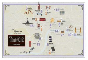
Time Out London, in conjunction with official Harry Potter portal Pottermore, created this lovely map showing 18 places in central London that have featured in the Harry Potter books and films. From Platform 9 3/4 at King’s Cross station, to the Knight Bus crossing Lambeth Bridge, the map allows you to construct your own Harry […]
Continue reading »The Citizen Science Association conference is held at the River Center in St Paul, Minnesota on 17th to 20th May. This post and the following ones are notes that were taken during the meeting in the sessions that I’ve attended. Wednesday was dedicated to workshops, and I joined the Citizen Science at College level workshop. Organised by Thomas … Continue reading Citizen Science 2017 – workshops day and opening panel![]()


Curiocity is a weighty tome, written by Henry Eliot and Matt Lloyd-Rose and published recently by Particular Books. The book follows on from a short, alphabetically organised series of pocket maps, some of which that we featured (C) a few years ago (D). This is a book which certainly delivers on its back-cover promise to […]
Continue reading »
The book ‘Suburban Urbanities: Suburbs and the Life of the High Street‘ is launched today. It’s open access and free for you to download and read. The book is edited by Laura Vaughan, who led two research projects in which I was involved as co-investigator. First, ‘Towards Successful Suburban Town Centres‘ (2006-2009) and then ‘Adaptable … Continue reading Suburban Urbanities: Suburbs and the Life of the High Street![]()
I am pleased announce that London: The Information Capi […]
Continue reading »
 |
| The book cover of ‘Cities of Tomorrow: An Intellectual History of Urban Planning and Design in the Twentieth Century’ |
Yesterday I was surprised when I searched some new journal articles through UCL library’s E-Journal service. Volume85, Number 5, 2014 of Town Planning Review that was published just some days ago includes a new paper of Professor Peter Hall. Unfortunately, it is still unable to look through the UCL service, ‘And one fine morning -’: reflections on a double centenary, the paper can arouse the glad to read his words as well as the grief losing a great urbanist who passed away on 30 July 2014.
I, had trained as an architectural designer, started to have an interest in urban studies after reading one of his tremendous books ‘Cities of Tomorrow: An Intellectual History of Urban Planning and Design in the Twentieth Century.’ The book carefully and attractively introduced the history of modern cities from the 19th century to the end of the 20th century and it unveiled hidden stories that had built on the characteristics of each city step by step. The most interesting point what I found in this book, his vision for the city is not heading for built forms, but alternative society as Ebenezer Howard pursued. And it was entirely enough to bring the young student to London.
After I have entered The Bartlett, UCL, I had the opportunity to audit his seminar class for masters’ students. Every week, students groups analysed urban problems of particular cities in the world and studied how urban policies have intervened in the problems. When I listened his comments in the class, I could imagine Kung-Fu masters who simply overwhelmed many fighters in the movie what I watched long years ago . He looked like he knew everything about cities, and he was thoroughly conversant with geographical, economic and social issues from European cities to Sydney, Singapore and Global South.
I have made the list of his recent books.
| The Planning Imagination: Peter Hall and the Study of Urban and Regional Planning |
Good Cities,Better Lives: How Europe Discovered the Lost Art of Urbanism
The book cover of ‘Cities of Tomorrow: An Intellectual History of Urban Planning and Design in the Twentieth Century’Yesterday I was surprised when I searched some new journal articles through UCL library’s E-Journal service. Volume85, Number 5, 2014 …
Continue reading »The ornament is returning slowly to the architectural discourse. It has not really been absent though merely denied, but it is returning as a more prominent topic now.
A key text is Adolf Loos’ Ornament and crime (Ornament und Verbrechen) (1908) that was widely interpreted as at the easement of ornament in architecture. More recent interpretations (for example Gleiter, 2012) however is more differentiated. Already the title in which Loos uses and hints at this. Nevertheless ornament was denied a role in modernist architecture and is still a minefield for architects today.
![]() Image taken from designboom / A proposed project spelling out the letters ‘BE’ for buildings in Brussels by JDS in 2007.
Image taken from designboom / A proposed project spelling out the letters ‘BE’ for buildings in Brussels by JDS in 2007.
The way for the reintroduction of ornament has been paved by technology interestingly enough. In the late 80ies and especially the 90ies CAD tools have presented the tools to begin to design with patterns including options to manipulate the pattern based on conditions. This has also the been linked to production and printed glass or pierce metals facades or even brickwork layer by robots (Bearth & Deplazes with Gramazio & Kohler, 2006).
This has been accompanied by theoretical writings, exhibitions and journals. For examples the exhibition at the SAM Re-Sampling Ornament in 2008. The architecture journals ARCH+ (1995/2002), l’architecture d’aujourd’hui (2001) or AD primers, Ornament: the politics of architecture and subjectivity (2013) for example have published on ornament during this early phase. Authors who have contributed to the now re-emerging discussion on ornament include Jörg H. Gleiter ((orig. German, 2002. Die Rückkehr des Verdrängten)), Michael Dürfeld (The Ornament and the Architectural Form (orig. in German, 2008. Das Ornamentale und die architektonische Form)) or Farshid Moussavi (The Function of Form, 2008).
The new possibilities in design and production using new technologies have allowed to re-imagine the relationship between design, production and product. Whereas at the time Loos wrote Architecture and Crime the industrialisation introduced the production of exact replicas into the thousands of one single product, the new technologies based around computers allow for a trance dent workflow and individually adapted and styled objects whilst still machine and mass produced. Hence the conditions have fundamentally changed.
What can be observed is, though very slow moving, a shift from an understanding of ornament as decoration to an interpretation of ornament as process in the sense of structure and narrative.
A special take on this is presented by Michiel van Raaij in his new publication Building as Ornament. Whilst van Raaij focuses on iconographic architecture he proposes building as ornament as a term to frame part of this discussion in a new way implying links to a theoretical discussion with references to a long tradition.
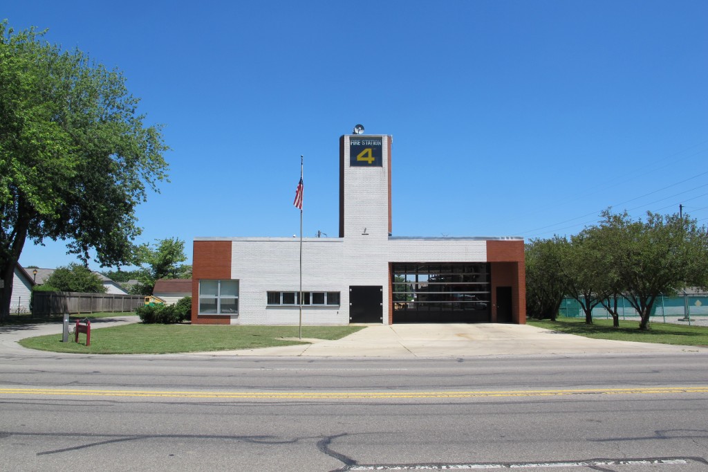 Image taken from 52weeks / The Fire Station 4 in Columbus by Venturi Scott Brown and Associates in 1968.
Van Raaij’s idea is to try and focus on the story the architect tries to tell through an iconic building. He argues that “Iconography is the use of images from outside architecture in architecture” and that the focus of the book is on “iconography that explains the function, social status, organisation, load-bearing structure and/or context of the building”. He makes the link to ornament using the narrative in the sense of explaining something.
The book brings together over 100 examples to illustrate this notion. This ranges from the Yokohama International Port Perminal by FOA, 2004, to the Bird’s Nest Stadium by Herzog de Meuron in 2008 or the People’s Building in Shanghai by BIG, 2004.
Whilst the book does not offer a theoretical framework for the introduced terminology or a broader discussion on the theoretical dimension of such a ‘new’ aspect of ornament in architecture, it presents a conversation. The publication is on one had a collection of projects that fit the description iconographic architecture and it is on the other hand a collection of interviews in which the author van Raaij discusses iconographic architecture with architects and architectural historians.
 Image taken from architecture.com / The Signal Box in Basel, Switzerland by Herzog de Meuron in 1994.
The interview partners are, in order of appearance: Auke van der Would, Charles Jencks, Denise Scott Brown, Adriaan Geuze, Michiel Riedijk, Alejandro Zaero-Polo, Ben van Berkel, Steven Holl, Winy Maas and Bjarke Ingels.
All of the interview partners of course have a different angle on the topic and in some conversations the focus is more on icons, narratives, construction or material. Some do specifically discuss ornament as in the recently emerging debate, so for examples the interview with Denise Scott Brown where she discusses aspects of the design for Fire Station 4 in Columbus. She emphasises the very same topics of structure and narrative the ornament discussion is moving towards. Other interviews do however not even touch ornament.
There is loads of material and a very interesting discussion around icons in architecture and iconographic architecture to be found in this book. This is clearly the focus of van Raaij’s work and his personal interest. He has been running a blog on iconic buildings for a long time and he knows the projects in this field. The real contribution of this book is definitely to hear the architects, as described by van Raaij as the Generation OMA, to talk about icons and iconographic design processes in architecture. There are some very personal statements in these discussions that shed light on some of the famous icons this current generation of architects have developed. It demonstrates that there is more to the discussion of iconic architecture than it just being a land mark put up by an architect to make a bold statement.
Through out the book the terms ornament and icon/iconographic architecture are used interchangeably. And it turns out that ornament only plays a small role setting the stage in this nai010 publishers book. Even though one could have expected quite some potential in this take on ornaments, not as a complete explanation, but as a special case of ornament on the level of the building. More contextual material would be needed to define a clear standpoint.
However, the chosen title, it has to be said, is very cleverly chosen. It is catchy, provides a lot of historical context, touches the nerve (both of time and architects still hating ornaments, as they have been told to do in architecture school?) and it is simple enough to be self-explanatory whilst allowing room for imagination. Nevertheless for the reader who is looking for the specific topic on ornament it might mean to be disappointed, but not without discovering an interesting collection of personal discussions on iconic architecture.
![]() Image taken from designboom / Book cover.
Image taken from designboom / Book cover.
Van Raaij, M., 2014. Building as Ornament. nai010 publishers, Rotterdam.
Continue reading »The ornament is returning slowly to the architectural discourse. It has not really been absent though merely denied, but it is returning as a more prominent topic now.
A key text is Adolf Loos’ Ornament and crime (Ornament und Verbrechen) (1908) that was widely interpreted as at the easement of ornament in architecture. More recent interpretations (for example Gleiter, 2012) however is more differentiated. Already the title in which Loos uses and hints at this. Nevertheless ornament was denied a role in modernist architecture and is still a minefield for architects today.
![]() Image taken from designboom / A proposed project spelling out the letters ‘BE’ for buildings in Brussels by JDS in 2007.
Image taken from designboom / A proposed project spelling out the letters ‘BE’ for buildings in Brussels by JDS in 2007.
The way for the reintroduction of ornament has been paved by technology interestingly enough. In the late 80ies and especially the 90ies CAD tools have presented the tools to begin to design with patterns including options to manipulate the pattern based on conditions. This has also the been linked to production and printed glass or pierce metals facades or even brickwork layer by robots (Bearth & Deplazes with Gramazio & Kohler, 2006).
This has been accompanied by theoretical writings, exhibitions and journals. For examples the exhibition at the SAM Re-Sampling Ornament in 2008. The architecture journals ARCH+ (1995/2002), l’architecture d’aujourd’hui (2001) or AD primers, Ornament: the politics of architecture and subjectivity (2013) for example have published on ornament during this early phase. Authors who have contributed to the now re-emerging discussion on ornament include Jörg H. Gleiter ((orig. German, 2002. Die Rückkehr des Verdrängten)), Michael Dürfeld (The Ornament and the Architectural Form (orig. in German, 2008. Das Ornamentale und die architektonische Form)) or Farshid Moussavi (The Function of Form, 2008).
The new possibilities in design and production using new technologies have allowed to re-imagine the relationship between design, production and product. Whereas at the time Loos wrote Architecture and Crime the industrialisation introduced the production of exact replicas into the thousands of one single product, the new technologies based around computers allow for a trance dent workflow and individually adapted and styled objects whilst still machine and mass produced. Hence the conditions have fundamentally changed.
What can be observed is, though very slow moving, a shift from an understanding of ornament as decoration to an interpretation of ornament as process in the sense of structure and narrative.
A special take on this is presented by Michiel van Raaij in his new publication Building as Ornament. Whilst van Raaij focuses on iconographic architecture he proposes building as ornament as a term to frame part of this discussion in a new way implying links to a theoretical discussion with references to a long tradition.
 Image taken from 52weeks / The Fire Station 4 in Columbus by Venturi Scott Brown and Associates in 1968.
Van Raaij’s idea is to try and focus on the story the architect tries to tell through an iconic building. He argues that “Iconography is the use of images from outside architecture in architecture” and that the focus of the book is on “iconography that explains the function, social status, organisation, load-bearing structure and/or context of the building”. He makes the link to ornament using the narrative in the sense of explaining something.
The book brings together over 100 examples to illustrate this notion. This ranges from the Yokohama International Port Perminal by FOA, 2004, to the Bird’s Nest Stadium by Herzog de Meuron in 2008 or the People’s Building in Shanghai by BIG, 2004.
Whilst the book does not offer a theoretical framework for the introduced terminology or a broader discussion on the theoretical dimension of such a ‘new’ aspect of ornament in architecture, it presents a conversation. The publication is on one had a collection of projects that fit the description iconographic architecture and it is on the other hand a collection of interviews in which the author van Raaij discusses iconographic architecture with architects and architectural historians.
 Image taken from architecture.com / The Signal Box in Basel, Switzerland by Herzog de Meuron in 1994.
The interview partners are, in order of appearance: Auke van der Would, Charles Jencks, Denise Scott Brown, Adriaan Geuze, Michiel Riedijk, Alejandro Zaero-Polo, Ben van Berkel, Steven Holl, Winy Maas and Bjarke Ingels.
All of the interview partners of course have a different angle on the topic and in some conversations the focus is more on icons, narratives, construction or material. Some do specifically discuss ornament as in the recently emerging debate, so for examples the interview with Denise Scott Brown where she discusses aspects of the design for Fire Station 4 in Columbus. She emphasises the very same topics of structure and narrative the ornament discussion is moving towards. Other interviews do however not even touch ornament.
There is loads of material and a very interesting discussion around icons in architecture and iconographic architecture to be found in this book. This is clearly the focus of van Raaij’s work and his personal interest. He has been running a blog on iconic buildings for a long time and he knows the projects in this field. The real contribution of this book is definitely to hear the architects, as described by van Raaij as the Generation OMA, to talk about icons and iconographic design processes in architecture. There are some very personal statements in these discussions that shed light on some of the famous icons this current generation of architects have developed. It demonstrates that there is more to the discussion of iconic architecture than it just being a land mark put up by an architect to make a bold statement.
Through out the book the terms ornament and icon/iconographic architecture are used interchangeably. And it turns out that ornament only plays a small role setting the stage in this nai010 publishers book. Even though one could have expected quite some potential in this take on ornaments, not as a complete explanation, but as a special case of ornament on the level of the building. More contextual material would be needed to define a clear standpoint.
However, the chosen title, it has to be said, is very cleverly chosen. It is catchy, provides a lot of historical context, touches the nerve (both of time and architects still hating ornaments, as they have been told to do in architecture school?) and it is simple enough to be self-explanatory whilst allowing room for imagination. Nevertheless for the reader who is looking for the specific topic on ornament it might mean to be disappointed, but not without discovering an interesting collection of personal discussions on iconic architecture.
![]() Image taken from designboom / Book cover.
Image taken from designboom / Book cover.
Van Raaij, M., 2014. Building as Ornament. nai010 publishers, Rotterdam.
Continue reading »The ornament is returning slowly to the architectural discourse. It has not really been absent though merely denied, but it is returning as a more prominent topic now. A key text is Adolf Loos’ Ornament and crime (Ornament und Verbrechen) (1908) that…
Continue reading »
A very special figure in the architectural history of the Netherlands has finally a architectural monograph dedicated to his work in a new international edition: Hugh Maaskant. Architect of Progres. It is not just the architect Maaskant himself, but …
Continue reading »
A very special figure in the architectural history of the Netherlands has finally a architectural monograph dedicated to his work in a new international edition: Hugh Maaskant. Architect of Progres. It is not just the architect Maaskant himself, but …
Continue reading »
A very special figure in the architectural history of the Netherlands has finally a architectural monograph dedicated to his work in a new international edition: Hugh Maaskant. Architect of Progres. It is not just the architect Maaskant himself, but …
Continue reading »A very special figure in the architectural history of the Netherlands has finally a architectural monograph dedicated to his work in a new international edition: Hugh Maaskant. Architect of Progres. It is not just the architect Maaskant himself, but …
Continue reading »
What does science look like? This might evoke black and white images of the cities and sixties showing male scientists in white lab coats bent over a table where some assistant has layed out various tools and models. Materials are steel, chrome, glass and colourful plastic. Shown in the background is probably a black board with some formulas and equations written on.
But what does science really look like, today? In a new Lars Müller Publishers publication Andri Pol shows the reader some inside glimpse of one of the biggest scientific research labs in the world. In Inside CERN: European Organization for Nuclear Research he has been documenting work and live in and around CERN, the European Organisation for Nuclear Research.
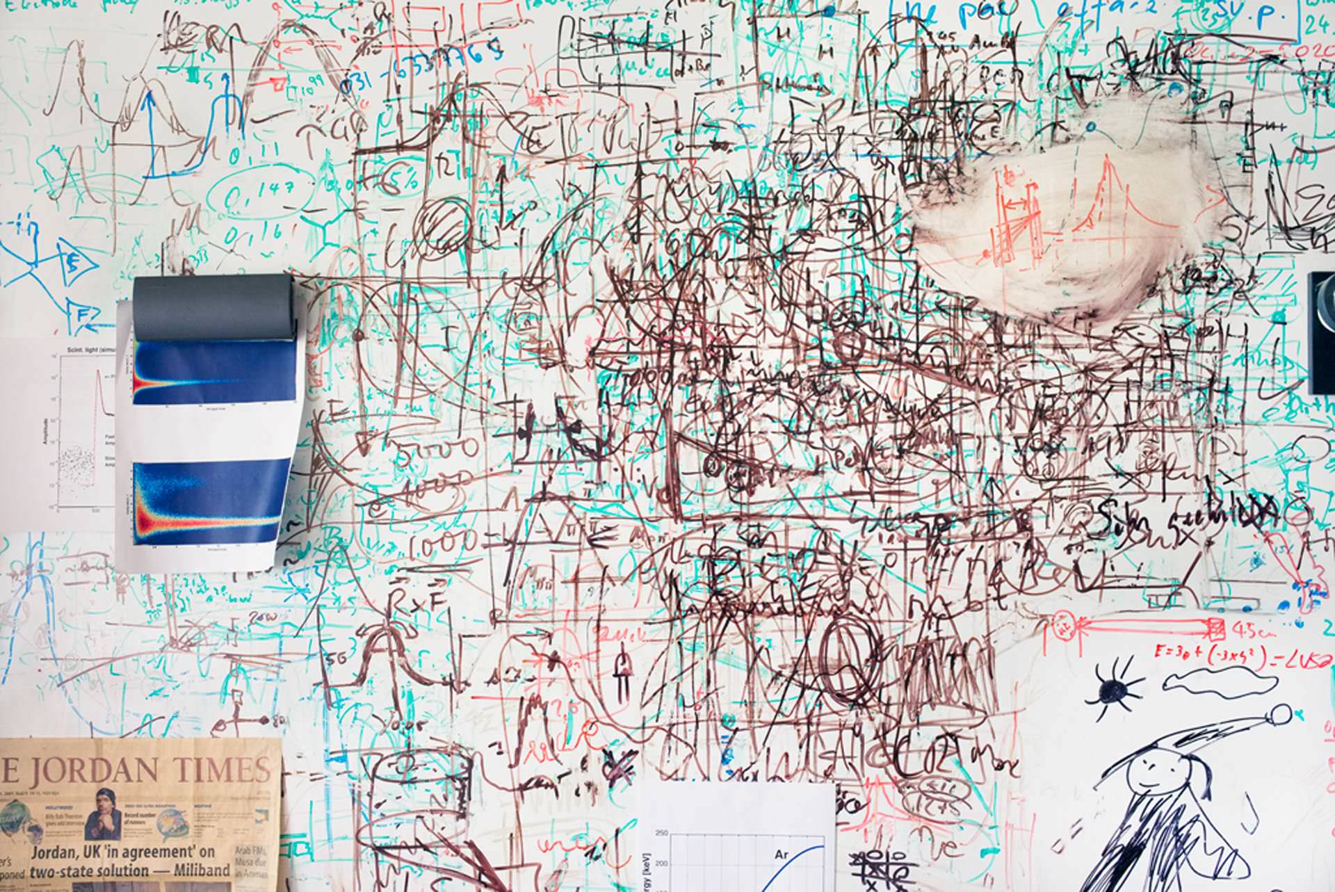 Image taken from uncubemagazine / ‘layered equations’ p.233.
Andri Pol is a Swiss freelance photographer with a specific focus on the everyday. This is also how he portraits the places, labs, offices, scientists and atmospheres at CERN, with great curiosity and respect.
There are no pretty pictures to be found in this documentation and there are no glorious moments. Its all about the effort, the struggle and the dedication. Flipping though the pages only unveils a great range of colours and oddly chosen angles or frames. The book does not work that way. The photographs are actually rather complex compositions with a lot of depth each with not just one but often a number of aspects.
Whilst there is a lot of equipment and machines visible there is an emphasis on the people who are involved at CERN in some way. Being this the scientists, indeed sometimes in white overcoats and blue shoe protectors, technical staff or students. People from all over the world come together at CERN working in teams. This is often shown, science is discussion and exchange.
The documentation portraits also the atmosphere at CERN. Beside the highly technical installations there is very little shiny and new infrastructure. In fact most of the facilities seem to be rather pragmatic and often improvised. It is clear the focus is somewhere else. This place is not about design and style, but about customablilty, flexibility and improvisation. That does not mean that self expression is absence. On the contrary the numerous portraits of individualised desks, doors, books and computers themselves tell a story.
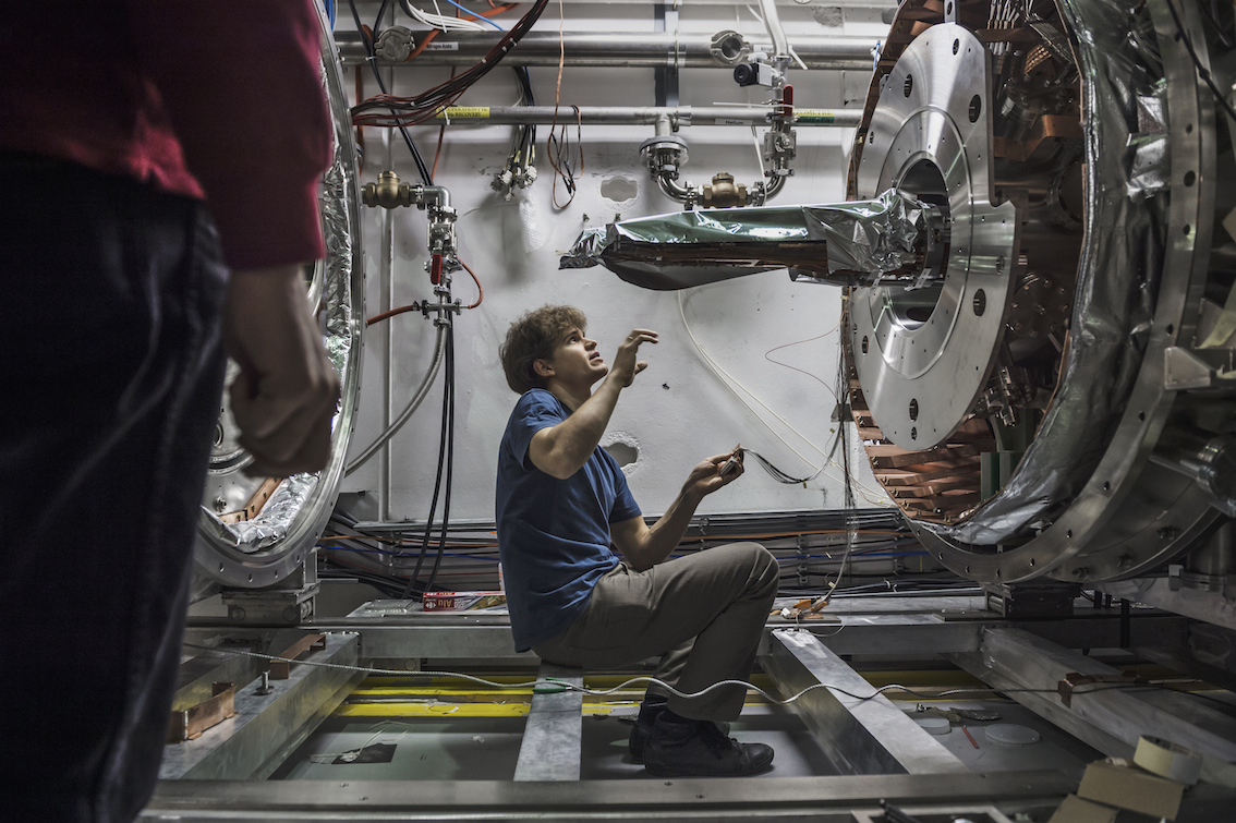 Image taken from klatmagazine / ‘calibrate’ p.243.
Only on the last few pages the photographs stet to show some of the machinery of the actual Large Hadron Collider (LHC), photographs that look similar to what is usually circulated in the meadia. By that point the reader is already so deep immersed in the atmosphere at CERN that is seems to be most natural thing to walk past this monster of infrastructure that doesn’t even fit on a photograph. In many ways all the other photographs tell a much more telling tale of the LHC than the tons of steel, cable and concrete.
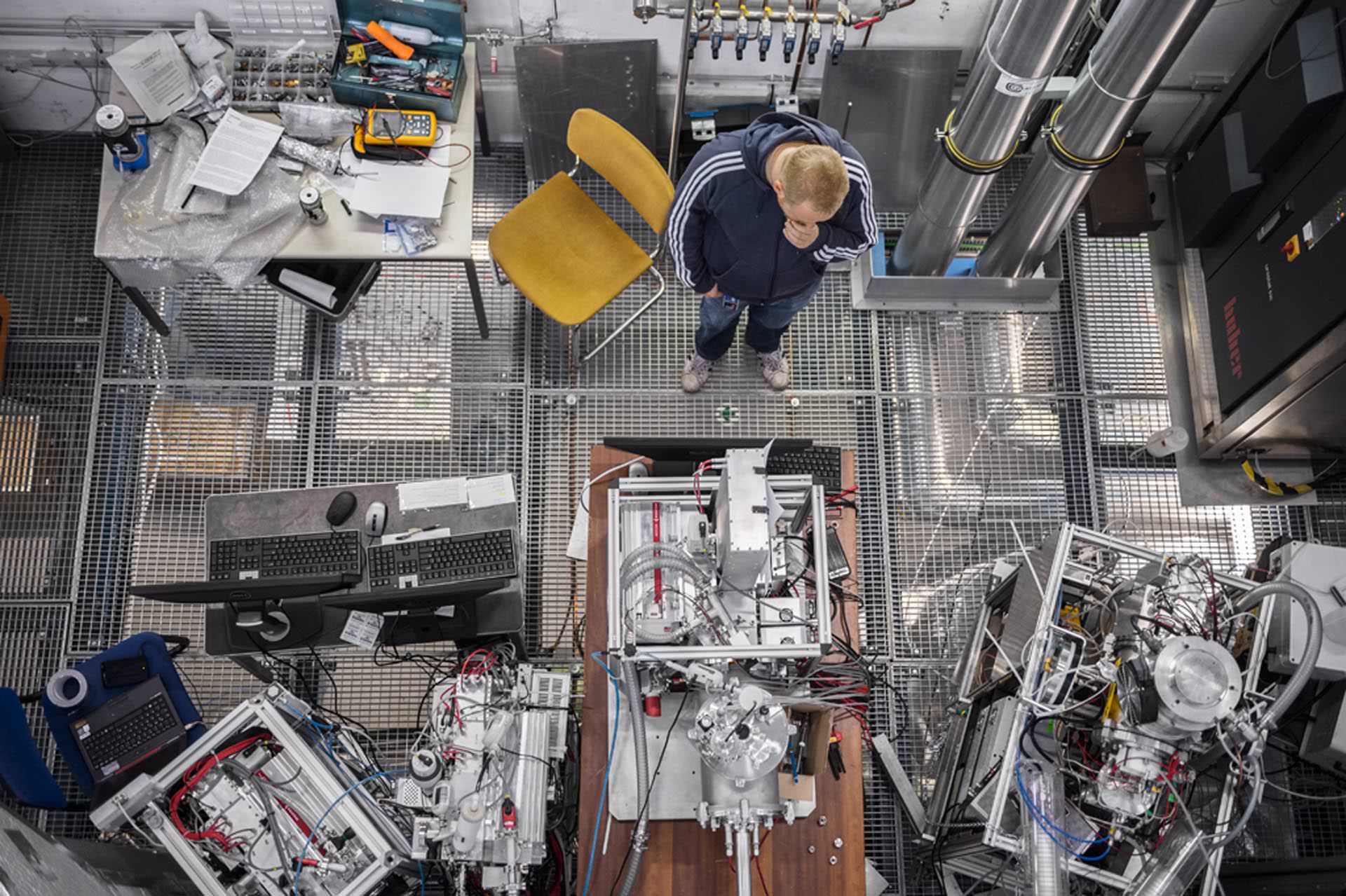 Image taken from uncubemagazine / ‘thinking’ p.249.
This being a Lars Müller Publisher publication it does not come as a surprise that this is a very beautifully made book. A lot of care has gone into the design of the book and the selection of the photographs. Even though it is mainly a picture book a real narrative is being told here something that captivates the reader. This book certainly tells a very different story about science today. It is of course documenting science in a unique biotope of research and collaboration creating a special place between Switzerland and France. But what it shows is the fascination and dedication of the individuals working in this field and manages to transport this.
If this is not quite yet enough. Google has collaborated with cern and it features on Street View. Try this link to go on a virtual walk around CERN and the LHC.
 Image taken from amazon.com / Book cover. More details also available on the book website at insidecern.com.
Pol, A., 2011. Inside CERN: European Organization for Nuclear Research. Lars Muller Publishers, Zürich.
Continue reading »
What does science look like? This might evoke black and white images of the cities and sixties showing male scientists in white lab coats bent over a table where some assistant has layed out various tools and models. Materials are steel, chrome, glass and colourful plastic. Shown in the background is probably a black board with some formulas and equations written on.
But what does science really look like, today? In a new Lars Müller Publishers publication Andri Pol shows the reader some inside glimpse of one of the biggest scientific research labs in the world. In Inside CERN: European Organization for Nuclear Research he has been documenting work and live in and around CERN, the European Organisation for Nuclear Research.
 Image taken from uncubemagazine / ‘layered equations’ p.233.
Andri Pol is a Swiss freelance photographer with a specific focus on the everyday. This is also how he portraits the places, labs, offices, scientists and atmospheres at CERN, with great curiosity and respect.
There are no pretty pictures to be found in this documentation and there are no glorious moments. Its all about the effort, the struggle and the dedication. Flipping though the pages only unveils a great range of colours and oddly chosen angles or frames. The book does not work that way. The photographs are actually rather complex compositions with a lot of depth each with not just one but often a number of aspects.
Whilst there is a lot of equipment and machines visible there is an emphasis on the people who are involved at CERN in some way. Being this the scientists, indeed sometimes in white overcoats and blue shoe protectors, technical staff or students. People from all over the world come together at CERN working in teams. This is often shown, science is discussion and exchange.
The documentation portraits also the atmosphere at CERN. Beside the highly technical installations there is very little shiny and new infrastructure. In fact most of the facilities seem to be rather pragmatic and often improvised. It is clear the focus is somewhere else. This place is not about design and style, but about customablilty, flexibility and improvisation. That does not mean that self expression is absence. On the contrary the numerous portraits of individualised desks, doors, books and computers themselves tell a story.
 Image taken from klatmagazine / ‘calibrate’ p.243.
Only on the last few pages the photographs stet to show some of the machinery of the actual Large Hadron Collider (LHC), photographs that look similar to what is usually circulated in the meadia. By that point the reader is already so deep immersed in the atmosphere at CERN that is seems to be most natural thing to walk past this monster of infrastructure that doesn’t even fit on a photograph. In many ways all the other photographs tell a much more telling tale of the LHC than the tons of steel, cable and concrete.
 Image taken from uncubemagazine / ‘thinking’ p.249.
This being a Lars Müller Publisher publication it does not come as a surprise that this is a very beautifully made book. A lot of care has gone into the design of the book and the selection of the photographs. Even though it is mainly a picture book a real narrative is being told here something that captivates the reader. This book certainly tells a very different story about science today. It is of course documenting science in a unique biotope of research and collaboration creating a special place between Switzerland and France. But what it shows is the fascination and dedication of the individuals working in this field and manages to transport this.
If this is not quite yet enough. Google has collaborated with cern and it features on Street View. Try this link to go on a virtual walk around CERN and the LHC.
 Image taken from amazon.com / Book cover. More details also available on the book website at insidecern.com.
Pol, A., 2011. Inside CERN: European Organization for Nuclear Research. Lars Muller Publishers, Zürich.
Continue reading »
What does science look like? This might evoke black and white images of the cities and sixties showing male scientists in white lab coats bent over a table where some assistant has layed out various tools and models. Materials are steel, chrome, glass and colourful plastic. Shown in the background is probably a black board with some formulas and equations written on.
But what does science really look like, today? In a new Lars Müller Publishers publication Andri Pol shows the reader some inside glimpse of one of the biggest scientific research labs in the world. In Inside CERN: European Organization for Nuclear Research he has been documenting work and live in and around CERN, the European Organisation for Nuclear Research.
 Image taken from uncubemagazine / ‘layered equations’ p.233.
Andri Pol is a Swiss freelance photographer with a specific focus on the everyday. This is also how he portraits the places, labs, offices, scientists and atmospheres at CERN, with great curiosity and respect.
There are no pretty pictures to be found in this documentation and there are no glorious moments. Its all about the effort, the struggle and the dedication. Flipping though the pages only unveils a great range of colours and oddly chosen angles or frames. The book does not work that way. The photographs are actually rather complex compositions with a lot of depth each with not just one but often a number of aspects.
Whilst there is a lot of equipment and machines visible there is an emphasis on the people who are involved at CERN in some way. Being this the scientists, indeed sometimes in white overcoats and blue shoe protectors, technical staff or students. People from all over the world come together at CERN working in teams. This is often shown, science is discussion and exchange.
The documentation portraits also the atmosphere at CERN. Beside the highly technical installations there is very little shiny and new infrastructure. In fact most of the facilities seem to be rather pragmatic and often improvised. It is clear the focus is somewhere else. This place is not about design and style, but about customablilty, flexibility and improvisation. That does not mean that self expression is absence. On the contrary the numerous portraits of individualised desks, doors, books and computers themselves tell a story.
 Image taken from klatmagazine / ‘calibrate’ p.243.
Only on the last few pages the photographs stet to show some of the machinery of the actual Large Hadron Collider (LHC), photographs that look similar to what is usually circulated in the meadia. By that point the reader is already so deep immersed in the atmosphere at CERN that is seems to be most natural thing to walk past this monster of infrastructure that doesn’t even fit on a photograph. In many ways all the other photographs tell a much more telling tale of the LHC than the tons of steel, cable and concrete.
 Image taken from uncubemagazine / ‘thinking’ p.249.
This being a Lars Müller Publisher publication it does not come as a surprise that this is a very beautifully made book. A lot of care has gone into the design of the book and the selection of the photographs. Even though it is mainly a picture book a real narrative is being told here something that captivates the reader. This book certainly tells a very different story about science today. It is of course documenting science in a unique biotope of research and collaboration creating a special place between Switzerland and France. But what it shows is the fascination and dedication of the individuals working in this field and manages to transport this.
If this is not quite yet enough. Google has collaborated with cern and it features on Street View. Try this link to go on a virtual walk around CERN and the LHC.
 Image taken from amazon.com / Book cover. More details also available on the book website at insidecern.com.
Pol, A., 2011. Inside CERN: European Organization for Nuclear Research. Lars Muller Publishers, Zürich.
Continue reading »
What does science look like? This might evoke black and white images of the cities and sixties showing male scientists in white lab coats bent over a table where some assistant has layed out various tools and models. Materials are steel, chrome, glass and colourful plastic. Shown in the background is probably a black board with some formulas and equations written on.
But what does science really look like, today? In a new Lars Müller Publishers publication Andri Pol shows the reader some inside glimpse of one of the biggest scientific research labs in the world. In Inside CERN: European Organization for Nuclear Research he has been documenting work and live in and around CERN, the European Organisation for Nuclear Research.
 Image taken from uncubemagazine / ‘layered equations’ p.233.
Andri Pol is a Swiss freelance photographer with a specific focus on the everyday. This is also how he portraits the places, labs, offices, scientists and atmospheres at CERN, with great curiosity and respect.
There are no pretty pictures to be found in this documentation and there are no glorious moments. Its all about the effort, the struggle and the dedication. Flipping though the pages only unveils a great range of colours and oddly chosen angles or frames. The book does not work that way. The photographs are actually rather complex compositions with a lot of depth each with not just one but often a number of aspects.
Whilst there is a lot of equipment and machines visible there is an emphasis on the people who are involved at CERN in some way. Being this the scientists, indeed sometimes in white overcoats and blue shoe protectors, technical staff or students. People from all over the world come together at CERN working in teams. This is often shown, science is discussion and exchange.
The documentation portraits also the atmosphere at CERN. Beside the highly technical installations there is very little shiny and new infrastructure. In fact most of the facilities seem to be rather pragmatic and often improvised. It is clear the focus is somewhere else. This place is not about design and style, but about customablilty, flexibility and improvisation. That does not mean that self expression is absence. On the contrary the numerous portraits of individualised desks, doors, books and computers themselves tell a story.
 Image taken from klatmagazine / ‘calibrate’ p.243.
Only on the last few pages the photographs stet to show some of the machinery of the actual Large Hadron Collider (LHC), photographs that look similar to what is usually circulated in the meadia. By that point the reader is already so deep immersed in the atmosphere at CERN that is seems to be most natural thing to walk past this monster of infrastructure that doesn’t even fit on a photograph. In many ways all the other photographs tell a much more telling tale of the LHC than the tons of steel, cable and concrete.
 Image taken from uncubemagazine / ‘thinking’ p.249.
This being a Lars Müller Publisher publication it does not come as a surprise that this is a very beautifully made book. A lot of care has gone into the design of the book and the selection of the photographs. Even though it is mainly a picture book a real narrative is being told here something that captivates the reader. This book certainly tells a very different story about science today. It is of course documenting science in a unique biotope of research and collaboration creating a special place between Switzerland and France. But what it shows is the fascination and dedication of the individuals working in this field and manages to transport this.
If this is not quite yet enough. Google has collaborated with cern and it features on Street View. Try this link to go on a virtual walk around CERN and the LHC.
 Image taken from amazon.com / Book cover. More details also available on the book website at insidecern.com.
Pol, A., 2011. Inside CERN: European Organization for Nuclear Research. Lars Muller Publishers, Zürich.
Continue reading »What does science look like? This might evoke black and white images of the cities and sixties showing male scientists in white lab coats bent over a table where some assistant has layed out various tools and models. Materials are steel, chrome, glass …
Continue reading »
 |
| Image 1. The book cover of ‘Designing Cities: Basics, Principles, Projects’ |
The book is structured along three parts,
1) General principles of urban design
2) Practical techniques for designing cities with relative examples
| Image 2. The sample page of Chpter 2. Page 18 and 19 |
| Image 3. The sample page of Chpter 2. Page 20 and 21 |
| Image 4. Good project images are helpful to understand the intention of the author. Page 40 and 41 |
| Image 5. Sample pages. Page 74 and 75 |
| Image 6. Sample pages. Page 110 and 111 |
| Image 7. Sample pages. Page 276 and 277 |
| Image 8. Sample pages. Page 280 and 281 |
Designing Cities: Basics, Principles, ProjectsHardcover: 356 pages
Publisher: Birkhauser Verlag AG (25 July 2013)
Language: English
ISBN-10: 3034613253
ISBN-13: 978-3034613255
Product Dimensions: 24.4 x 17.5 x 3 cm
Amazon UK http://bit.ly/KRenmV
Continue reading »