New Book – Gilded City: Tour Medieval and Renaissance London

Have you ever wondered how London began? Or how London grew to become such an influential world city for business, politics and culture? You might be interested in Gilded City, a new book coming out this July. Gilded City tells the story of London by touring its most fascinating historic districts and buildings, and describing … Continue reading New Book – Gilded City: Tour Medieval and Renaissance London

Continue reading »

Moscow Metro Architecture & Design Map

A lot of Londoners are currently focused on the World Cup in Russia at the moment, so Mapping London is taking a look eastwards, thanks to the latest boutique map created by productive cartographers Blue Crow Media. The map is essentially a Moscow version of their London Underground Architecture & Design Map and features the […]

Continue reading »

Tate Modern Switch House: a New Perspective on London

High rise developments are often exclusive private spaces, as attested by the current glut of luxury flats, hotels and offices rising across Inner London. Even recent developments advertising their public space credentials have come up short, with for example the Shard’s fantastic views costing £25 entry fee, or the Walkie-Talkie’s ‘skygarden’ amounting to an expensive restaurant and some pot plants. … Continue reading Tate Modern Switch House: a New Perspective on London

Continue reading »

Brutalist London Map

For fans all all things concrete comes this map of London’s most famous Brutalist buildings. Created by Blue Crow Media (see also their craft beer and cycling maps, it is the first in a new series of map-based guides to London architecture, focusing on the modern 1950s/60s “raw” concrete-heavy designs by Le Corbusier and others […]

Continue reading »

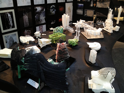
Free Range exhibition & Welsh School of Architecture Exhibition


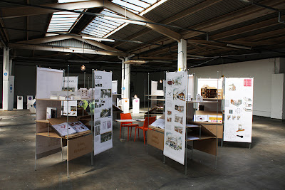
Image1.Free range Exhibition place. The image was taken by Networking City


FREE Range exhibition had opened its door at Truman Brewery on Brick Lane where is a cultural headquarter of London. This exhibition was for undergraduate courses of fashion, design, photography & media, fine art and interior & architecture over the UK. It was started in 2001 and has been getting a reputation for one of famous cultural event in London. In this year, fashion courses kicked off their exhibition from May 31and interior & architecture courses ran its show from June 11 to 15. Twenty five universities across the country, including Glasgow, Dundee, LCC, Westminster and Manchester, set up their own booths and unfolded their ideas, talents and capacities. The universities might want to get a chance to show off their students into the largest market London in this disastrous recession.

Image2.Free range Exhibition place. The image was taken by Networking City


Image3.Free range Exhibition place. The image was taken by Networking City

Image4.Free range Exhibition place. The image was taken by Networking City


Image5.Free range Exhibition place. The image was taken by Networking City


Image6.Free range Exhibition place. The image was taken by Networking City


Image7.Free range Exhibition place. The image was taken by Networking City


 The works of Welsh School of Architecture (WSA), Cardiff University was awesome and highly recommended from many architects who work in London. Although it is hard to compare directly to other universities because WSA exhibition consisted by the projects of masters’ students while others were bachelors’, seven units of WSA might not fall behind other schools in London. In fact, WSA was ranked as the second best department in GuardianUniversity Guide 2014 and they marked the same position with AA School in the list of the UK best architectureschool surveyed by Architects’ Journal.


Image8.WSA Exhibition place. The image was taken by Networking City


Image9.WSA Exhibition place. The image was taken by Networking City


Image10.WSA Exhibition place. The image was taken by Networking City


Image11.WSA Exhibition place. The image was taken by Networking City


Image12.WSA Exhibition place. The image was taken by Networking City


Image13.WSA Exhibition place. The image was taken by Networking City


Image14.WSA Exhibition place. The image was taken by Networking City

 When it comes to me, the works of ‘Unit 7: Infrastructural Urbanism’, which explore reorganizing local identity in the process of changing urban industries, were particularly impressive. Usually, when we proceed urban design projects, we start first to overview macro urban structures, its development history, and regional issues and so on. Then, we reach the level of urban and architecture design what should make balances between abstract urban policy & specific physical design, macro urban patterns & micro human behaviours and economic feasibility & public value by design quality. At this point, lots of conflicts would be emerging, and it should be hard to reach agreeable point. Furthermore, when the work frame is changed such as from urban design to architecture design, logical connections between different types and scales of works would be weakened. We can say it as ‘logical jumping’. Networking City understands Unit 7 admitted the jumping could be appeared, however; they might try to know what the jumping would be there and how they could minimize the jumping at each development phase.

Elizabeth Venning’s work, Supportive infrastructures: Affordances between the DVLA and its locality at different scales, which examines new possibility of massive district of DVLA (Driver and Vehicle Licensing Authority) in Swansea City, well shows the characteristics of this unit. She investigates the way of redefining the physical and social relationship between DVLA area and local people through transforming and reorganizing some DVLA’s buildings and its programmes. In order to provide an effective strategy, she finds that there are six different levels including National scale, Regional scale and Household Scale behind the integrated complexity and each level has relevant policies, rules and orders that impact on the site. All policies, rules and orders at each level are analysed by Venning, and inter-relationship between levels and response plan are proposed with building plans in detail. 

If you want to know more about Welsh School of Architecture and their exhibition, please visit this link.


Image15. Elizabeth Venning’s work. The image was taken by Networking City
 
Image16. Venning’s diagram shows six different systems of the site. The image was taken by Networking City


Image17. Models and panels of WSA. The image was taken by Networking City


Continue reading »

SHOW RCA 2013


Image1. The entrance of the exhibition (The image is taken by Networking City)
 

The architecture students’ works of Royal College of Art revealed at their annual exhibition ‘Show RCA 2013’ from June 20 to June 30. Except fashion design which already opened its show on May 29, there are two exhibition areas where are Kensington and Battersea for 10 departments of RCA. The department of Architecture has its own exhibition place in Battersea with Applied art, Fine art, Photography and so on.

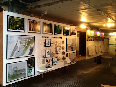
The exhibition place looked an old warehouse, therefore, the weird tension between rough feeling of the old building and innovative works of the students generates a marvelous atmosphere.


Image 2. The exhibition place of RCA (The image is taken by Networking City)


As I looked around six studios’ works, it was coming to me that the works of RCA students are pushing beyond the realm of architecture with the imaginary and creativeness of the students rather than being sustained in it. Some students show very architectural drawings, some works might suit to consider as fine art or sculpture, and it would be possible to meet some works at the exhibition of video art.

Image 3. The exhibition place of RCA (The image is taken by Networking City)
 
Image 4. The exhibition place of RCA (The image is taken by Networking City)
 
Image 5. The exhibition place of RCA (The image is taken by Networking City)
 
Image 6. The exhibition place of RCA (The image is taken by Networking City)


Like the exhibition of The Bartlett which this blog introduced before, (http://networkingcity.blogspot.kr/2013/06/bartlett-summer-show-2013.html)

this exhibition gave an opportunity to clearly understand that architectural thoughts can be shown with multiple media including videos, 3d displays and installations which were set up in the exhibition place as the works and rooms for watching videos.

 
Image 7. The exhibition place of RCA (The image is taken by Networking City)
 
Image 8. The exhibition place of RCA (The image is taken by Networking City)
 
Image 9. The exhibition place of RCA (The image is taken by Networking City)
 
Image 10. The exhibition place of RCA (The image is taken by Networking City)
 
Image 11. The exhibition place of RCA (The image is taken by Networking City)
 
Image 12. The exhibition place of RCA (The image is taken by Networking City)
 

Alexander Turner (http://alexander-r-a-turner.tumblr.com) suggests the simple and strong ‘wall’ for East Sussex against indiscreet urban sprawl. This plan of housing and public space for 2000 inhabitants, which might fall under the influence of Dogma (http://www.dogma.name/index.html), is outstanding among many works.  
 
Image 13. The work of Alexander Turner (The image is taken by Networking City)
 
Environmental issue is spotlighted here again. One student provides an interesting idea to purify air pollution of London by transforming BT tower into a filtering facility in the worst polluted area in London. This work was introduced on Dezeen last week and has been paid attention from international readers.  http://www.dezeen.com/2013/06/24/synthetechecology-by-chang-yeob-lee/


Image 14. The work of Changyeob Lee (The image is taken by Networking City)
 
In fact, it was more impressive when we visited other exhibition areas after the department of architecture. The quality level of the works of fine art, photography and sculpture students is easily over the normal level of masters’ students, therefore, it would not be strange if we meet these works at museums in London with professional artworks. In addition, buildings and working facilities for students look very nice to do something creative.     

 
Image 15. The exhibition of Applied Art (The image is taken by Networking City)
 

Image 16. The exhibition of Sculpture (The image is taken by Networking City)
 

Image 17. The exhibition of Fine art (The image is taken by Networking City)


Echo Morgan’s works (http://echomorgan.com/), which were displayed in the area of printmaking, are distinctive to provide multiple and complex faces that can be variously interpreted. She intended to show the vital force of vulnerable human body when a fragile woman’s body is accompanied with brutal metal balls. Furthermore, the photo, which captured the scene of a tree with the same metal balls in ruined industrial landscape, is planned to illustrate the vulnerability and vitality of nature as well as the coupling of the human body and nature. When it comes to me, the metal balls, which were firstly close to the sight, underline the human body and the ruined landscape, which are actually the background of the photos, therefore, the tension between figure and background creates the enormous power for being these photos lively.  

 
Image 18. The work of Echo Morgan (The image is taken from Echo Morgan’s website)
 
Image 19. The work of Echo Morgan (The image is taken from Echo Morgan’s website)
 
 
Image 20. The work of Echo Morgan (The image is taken from Echo Morgan’s website)


Continue reading »

Book – Contagious Architecture

Computers have changed the architectural process fundamentally. In most areas the practice has embraced the possibilities of the software tool and has alongside the technology transformed not just the way architecture is produced but foremost the way architecture is thought.

Whilst CAD offers flexibility and speed, 3D software visualises models and simulation tools are employed to help with strategic design decisions, its the algorithm used in parametric design where the computer code actually becomes part of the process of designing.

A new The MIT Press publication by Luciana Parisi. Parisi is senior lecturer at the centre for cultural studies at Goldsmith, University of London. She publishes a comprehensive and thought provoking discussion of the practice and the thinking of parametric design in the field of architecture. However in this text Parisi does not just simply present the software logic and practice. Instead, as she states right at the beginning:

“Algorithms do not simply govern the procedural logic of computers: more generally, they have become the objects of a new programming culture. The imperative of information processing has turned culture into a lab of generative forms that are driven by open-ended rules.”

A definition of Algorithms is provided in the notes of the book referring to David Berlinski, ” an algorithm is a finite procedure, written in a fixed symbolic vocabulary, governed by precise instructions, moving in discrete steps, 1, 2, 3, whose execution requires no insight, cleverness, intuition, intelligence, or perspicuity, and that sooner or later comes to an end.” (Berlinsky, D. (2000). The Advent of the Algorithm: The Ideas that Rule the World. New York: Harcourt.)

Whilst the book is heavy on theory a few examples are provided. All examples are carefully chosen and do not at all make up a showcase. They illustrate specific points of discussion in the text and at the same time serve are points of reference to push the thinking forward.

Image taken from archdaily.com / Kokkugia, Taipei Performing Arts Centre, 2008. Roland Snooks + Robert Stuart-Smith. The competition was won by OMA.

Image taken from corpora.hu / DoubleNegatives Architecture (dNA) Yamaguchi Centre for the Arts and Media, 2007. Sota Ichikawa.

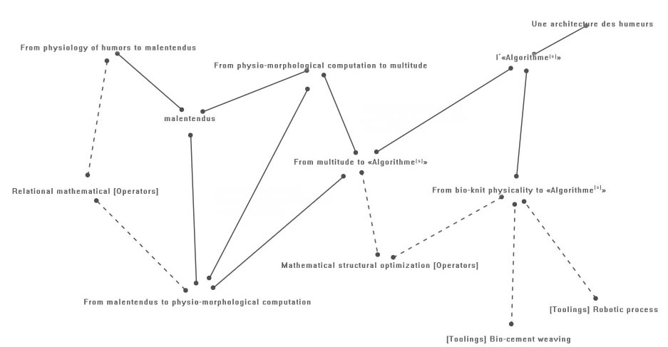
Image taken from new-territories.com / R(&)Sie(n), Une Architecture des humeurs, 2010-2011.

What is most interesting about the concepts of algorithmic architecture discussed in this book is the fact that from the very beginning time and space are folded into one and remain present aspects of the process at any time. Whilst the use of digital tools in architecture has transformed the practice in many ways, the continuous presence of time and space as one in architectural theory is probably the most fundamental. This transforms the way architecture is thought of from a physical object to a transformative process.

This is a very specialist book and runs deep on the theory of parametric architecture and algorithm based design. It is however not just for architects and experts who work with algorithms themselves, but is definitely interesting experts from a range of fields including theoretical works. The way Parisi pushed the thinking ahead creates successfully a niche in timespace for parametric design to develop an identity.

Image taken from the MIT Press / Book cover.

Parisi, L., 2013. Contagious architecture: computation, aesthetics, and space, Cambridge MA: The MIT Press.

Continue reading »

Bartlett Summer Show 2013


The School of Architecture, The Bartlett at University College London opened their annual exhibition ‘The Bartlett Summer Show 2013’ on June 21. In this year, around 500 students participated in the exhibition and there are hundreds of drawings, architectural models, videos and installation works in Slade Galleries where the exhibition place is.


Image1. University College London (The image is taken by Networking City)
 

Image2. Barteltt Exhibition place (The image is taken by Networking City)

 
Image3. Barteltt Exhibition place (The image is taken by Networking City)

 
Image4. Barteltt Exhibition place (The image is taken by Networking City)

 
Image5. Barteltt Exhibition place (The image is taken by Networking City)

 
Image6. Barteltt Exhibition place (The image is taken by Networking City)

 
Image7. Barteltt Exhibition place (The image is taken by Networking City)

 
Image8. Barteltt Exhibition place (The image is taken by Networking City)


More than previous years, lots of students and units try to show their ideas by using not only models and drawings but also multi-media tools and installations. And it could be understood that the focus of the school is shifting to the architectural-urban reactions against complex social aspects of contemporary cities from the traditional architectural studies. For example, the impacts of social media on cities, Environmental problems in the near future and the revisiting urban contexts by modern artists’ views.


Image9. Barteltt Exhibition place (The image is taken by Networking City)

Image10. Barteltt Exhibition place (The image is taken by Networking City)

Image11. Barteltt Exhibition place (The image is taken by Networking City)

 
Among many great works, the works of Diploma unit 22 and Diploma unit 10 were mightily impressive to me. In the case of Diploma unit 22, they understood the volumes of architecture and cities as the formation of multiple layers of flat surface, and studied the meaning and the possibility of the layers and the gap between layers.   


Image12.The work of Diploma unit 22 (The image is taken by Networking City)

Image13.The work of Diploma unit 22 (The image is taken by Networking City)

Image14.The work of Diploma unit 22 (The image is taken by Networking City)
Image15.The work of Diploma unit 22 (The image is taken by Networking City)
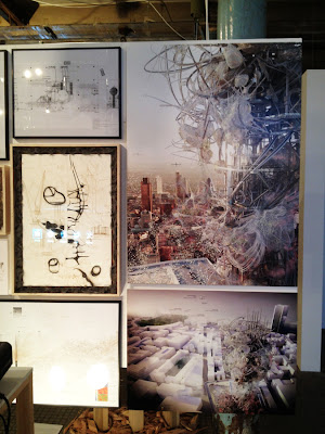
Diploma unit 10 rethink the relationship between human and nature based on environmental problem, which is getting serious, and imagine new urban contexts adapting to the thoughts of previous architects and artists with the title of ‘Imaginarium of urban ecologies’. Particularly, the drawings of this unit are outstanding and exceptional. These made an exclamation by in detail, in depth, imaginative and implicative lines. I’m especially interested in European Union: The Gardens of Fantastica, the work of Steven McCloy who conceptualise new Paris with the view of Surrealism.  If you want to see more images of Steven McCloy, please visit the blog http://stevenmccloy.blogspot.co.uk/
 

Image16. The work of Steven McCloy (The image is taken by Networking City)

Image17. The work of Steven McCloy (The image is taken by Networking City)

Image18. The work of Steven McCloy (The image is taken by Networking City)

The Bartlett exhibition will continue to June 29, 2013.
In this week, AA School and RCA open their annual exhibitions as well. Networking City is going to the exhibition and will update the posts for them soon.

Continue reading »

Review: Basics Landscape Architecture 01: Urban Design

Cover page of Basics Landscape Architecture 01: Urban Design
When I was an architectural student for my bachelor, nobody told me and taught me about urban theory and urban design. And it became the main reason why I started to learn urban studies in London after some years. 
When I attended the first design class for designing house and small building in the school, professors pushed us to consider the meanings of architecture and home, the difference between public space and private space, the characteristics of users, design methods and so on. Several good references were introduced as well.
However, the next semester after the house design, still I had not enough to finalize one mass or one building, I was thrown into ‘urban’ and had to design the building in the context of urban and urban itself.   
In the beginning, it was very exciting to make something new in large and complex area by myself. But, in an instant, I realized it is really difficult to distinguish what I have to consider, how I analyze urban aspects, how the aspects could be led to design materials and what urban really is. Nobody told me and it was hard to find something what exactly explains the way of urban design. Furthermore, the embarrassment by jumping into large scale from small level was tantamount to facing a great wall.
At that time, I was thinking that ‘Is there any readable book to show the guideline of urban design?’. I believe other people who studied or have been studying urban design at the department of architecture might suffer similar experience with me.


Basics Landscape Architecture 01: Urban Design from AVA Publishing should be a good reference for people who have the same problem what I had before. This book is composed of six chapters: What is Urban Design?, Context, Measure, Movement, Community and Culture, Projects and Processes. Each chapter provides the meaning of the title, summarizes main issues and spreads out relevant examples.
Like other basic series of AVA Publishing, it provides general knowledge of urban design with core issues, key individuals and good design examples for beginner, rather than deep-abundant thought for broader discussion. 
In fact, many elements of the contents are complicated and vague to define each meaning and suggest compatible cases; therefore, the frantic effort of the authors which translates to comfortable language would be respectable.


Page 20-21: Evolution of urban form


For example, this book sums up urban growth as a chain of events : clusters of dwellings – City walls – Sprawl – massive growth in the industrial age – new urban forms (even it would be too simplified), and the authors argue that recent urban growth should be focused on not physical land expansion but social facts such as international migration. 
 
The best point of this book is to excite curiosity of readers and stimulate finding key issues, individuals and cities. In my case, I took an interest again in grid system which is the oldest method of urban design. Grid system has been developed since Ancient Greece and was intensely used by Roman Empire. It was not just a tool for construction of new city but a symbol of their domination over nature as well as imperial power. Personally, I have been interested in the grid structure of cities such as Barcelona, New york and some Korean modern cities. After reading the part of the grid, ‘The City Shaped: Urban Patterns and Meanings Through History’ was borrowed from library and unfolded additional texts.    


Page 143: Structure-Barcelona Grid


Also, the book mentions how urban elements can be developed as the main design concept and how it leads the project. The last chapter of the book, Projects and Processes, introduces five basic elements of urban design: Structure, Line, Point, Beyond and Green, and briefly provides some examples. In the case of Line, the authors insist that lines in urban projects occasionally represent the movements in urban areas. Complex urban scenarios and expanding urban movements in cities can be organized by infusing conscious lines into the projects such as the cases of Barcelona, New York and Hong Kong.


Page 148-149: Case Study-High Line


Page 150-151: Case Study-Euralille


Total 170 pages with many images is not a big burden as the first step of urban design, so the book is recommendable for students who just started studying urban design such as 3rd year or intermediate course students.  
Basics Landscape Architecture 01: Urban Design

Paperback: 184 pages
Publisher: Ava Publishing (Oct 2009)
Language: English
ISBN-10: 2940411123
ISBN-13: 978-2940411122
Product Dimensions: 16 x 1.7 x 23 cm


Continue reading »

Evelyn Grace Academy by Zaha Hadid Architects – Alternative way to consider the future of our school


Image is taken from Zaha Hadid Architects / The main entrance of Evelyn Grace Academy

Last September, during Open City event in London, Evelyn Grace Academy in Brixton was included in the list of the event and it was a nice opportunity to visit recent Zaha’s work. Hundreds of people came to the school and agreed it is an unusual architecture and special experience. After the visiting, it was thought that writing an article about Evelyn Grace Academy would be worth to understand new trend of education buildings in UK and Zaha’s approach for the type of architecture. Therefore, when Korean Institute of Educational Facilities asked to contribute an article about recent UK education building, it was easy to decide topic of the article.

Through the article, there are three main arguments to look deeply at Evelyn Grace Academy. Firstly, from the point of urban policy, this building should be understood as a flagship project in a devastated urban area and as an education led urban regeneration. ARK Schools, an education charity and the founder of the school, believes that education is an important method to cut the cycle of poverty. This charity supports to increase education quality in impoverished areas and has set up 11 schools in UK. Evelyn Grace Academy has been planned for not only a stunning shape of architecture in old affordable housing areas but also finding a possibility to overcome poverty and inequality in Brixton that had no secondary school.


Image by Networking City / Social housing in Brixton


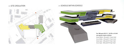
Secondly, as considering the internal relationships, this school needs to be examined as a small society, furthermore, as a city. Although school (especially university) generally has been understood as a city because lots of students and staffs stay in, Evelyn Grace Academy which has four schools in the building is much more complex and complicate than other schools. Definitely, there should be more delicate considerations to make discreet management system and adequate collaboration between the schools from the early stage of the building design. As a result of the considerations, the corridors of this building, wider than normal school corridors, play a role like streets in small town by variation of visual effects, diverse volumes of internal space and good connection with internal and external space, and it leads more social activities of students.


Image by Networking City / Inside corridor of Evelyn Grace Academy


Image by Networking City / Spatial Experience in Evelyn Grace Academy


Lastly, Evelyn Grace Academy is a good example to show how architects fight against the common ideas of ‘school’, one of the most quantificational and standardized architectural type, within limited budget and area with keeping their design ideas and its final quality. There are many regulations and basic standards for the school building like suitable class size, noise and so on. The architects had have to consider how dynamic form and space make a cool relationship with standardized room size, basic class unit and needed clear functionality. Z shape of Evelyn Grace Academy, which is very unusual among school projects, was suggested for complex programs and effective using the site rather than Zaha’s design tendency. (Interview with Lars Teichmann, Project Architect) Architects generally do not want to make Z shape because it is hard to solve functional problems in the plan even though it is a private house. But in this project, Z shape of the building makes a clear distinctive point in contrast to other school projects and the herald symbol showing the change of the most deprived area in the UK.


Image is taken from Zaha Hadid Architects / Site circulation and Composition


Some people have a cynical view for Zaha’s works. I was one of them.

However, after visiting Evelyn Grace Academy, when her project is seen on website or magazine, the project attracts me more than before.


Continue reading »

Book – Infrastructure as Architecture

Infrastructure projects have grown into an important role in the public realm taking more and more responsibility in a social context. Over the past arguably hundred years more and more emphasis has be put in to infrastructure, being it transport services and facilities.

As a modernists take on the city technology was to be placed as the driving force behind planning and this of course shall also include infrastructural project. In fact especially here technology could be implemented with the help of additional arguments. Today, infrastructure is running as flag ship projects in many cases being put forward as statements both public and design wise.

Infrastructure as architecture
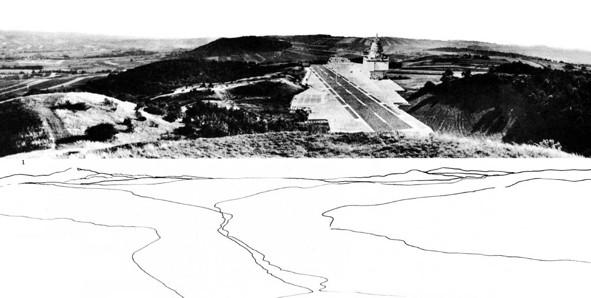
Image taken from dpr-barcelona / Hans Hollein Aircraft carrier city in landscape, project. Aerial perspective.

The Jovis publication Infrastructure as Architecture: Designing Composite Networks, edited by Katrina Stoll and Scott Lloyd takes a detailed look at this position infrastructure has grown into and how architecture relates to it, thus implying that design has to learn from both in order to support a new take on projects.

The publication discusses the matter in essays organised in five topics. These are: Infrastructure Economy, Infrastructure Ecology, Infrastructure Culture, Infrastructure Politics and Infrastructure Space/Networks. Contributors include for example Dana Cuff from UCLA, LateralOffice, UrbanLAB, Alexander D’Hooghe and MVRDV.

The essays cover a range of topics and reach from the presentation of practical projects, built and planned to theoretical essays of the discussion. Thus there is a wealth of different views that are, as the editors argue: ‘providing a framework for understanding the union of infrastructure and architecture’.

Of course it is on one hand a secret claim to but architects in the position to take on and reclaim design agency over infrastructure projects, but more importantly to discuss the dualities of presence and identity of building projects regardless of their function.

It is superbly interesting how this publication argues for a new take on infrastructure and how the argumentation might actually be point out what practice has already incorporated. Whilst the discussions around the relationships infrastructure is bedded into in the urban system is not new, there is a new approach being argued for. Modernists have taken it on at the beginning of the last century and in the 60s the Smithsons and Team X proposed a new take. More and more it grew into a systemic approach and whilst before it was always one or the other it is now being argued for as both, one and the other.

Appleyard and Lynch in A view from the Road already note that the road is producing scenery for the driver and the passengers it is at the same time dominating the landscape as a static bulky object. Alexander D’Hoogh is especially arguing for this in his essay contribution o the publication: The Objectification of Infrastructure: The cultural project of suburban infrastructure design.
This dualism of producing and being is the new aspect in this publication, but probably could in fact reach beyond. Testing this against current trends might revel a deeper interest of our times in this dualism and the fact that problems could have more than one state.

Infrastructure as architecture
Image taken from jonathandsolomon.com / Book cover. A preview of the publication is available from Jovis HERE. The Essay by Jonathan Solomon is available HERE.

Stoll, K. & Lloyd, S., 2010. Infrastructure as Architecture: Designing Composite Networks, Berlin: Jovis Verlag.

Continue reading »

Book – Housing Design

Housing design is the one field of architecture arguably being the most accepted core activity of architects. Building houses is architecture as such. The recent NAi publisher book Housing Design: A Manual by Bernhard Leupen and Harald Mooij is published in a second English edition. It picks up on the is core and very traditional architecture activity of building a house and presents designs across a wide range of types in a cultural context.

HousingDesign04
Image by urbanTick / Book spread showing the chapter introductino nad a summary of the discussed elements.Housing Design – A Manual.

The new publication is a revised English-Language edition and is based on the first Dutch edition published as Het ontwerpen van woningen in 2008. The new edition is extended in its content and, being translated to English, definitely open up to a wider audience worldwide.

In a series of eight chapters the publication develops a clear presentation of housing projects, of both built and some unbuilt examples. The chapters organise the projects in several categories. Other than most books on the same subject however, Housing Design does not try to press the examples into descriptive categories. The authors have chosen to group them into programatic categories characterising the process and the context rather than the project itself.

HousingDesign05
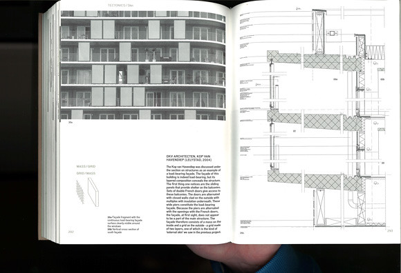
Image by urbanTick / Book spread Housing Design – A Manual. The example here is by DKV Architects, Kop van Havendiep (Lelystad, 2004) with detailed sectional drawing.

With this the presentation is more relaxed and less arbitrary in a range of different contexts. Where the descriptive categories often seem out of place the here used programatic categories support the reading of each examples in a wider context.

This is at the same time where the specific strength of this publication lies. It is not just a design manual, but a design reader. The examples are not just standing on their own as a separate entity. Each project is set in a wider context linking it in with a theoretical and practical background.

The book is therefore also great reading material. It is by no means a picture book or a flip book, but presents a systematical approach to the presentation of a range of housing projects in the context of architecture history and practice. In this the publication goes into great detail with the presentation and answering of problems drawing from a great source of architectural history examples. Under the subtitle belly for examples, the problem of the underside of a house if rised on piloties or has an underpass is discussed using Le Corbusier’s Unité d’habitation and MVRDV’s WOZOCO as examples. Similar the topic scenery and the design of interior spaces draws on Haussmann and Adolf Loos’s Haus Moller and Das Prinzip der Bekleidung (The Principle of Cladding).

HousingDesign06
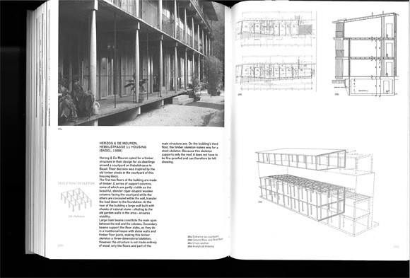
Image by urbanTick / Book spread Housing Design – A Manual. The example here is by Herzog de Meuron, Hebelstrasse 11 Housing (Basel 1988) as an example of a skeleton construction.

Each chapter starts with a theoretical introduction and presents a series of examples. Each with photo plans and drawings. Often this includes construction drawings such as sections. This allows the publication to go in to a lot of detail beyond just the floor layout, discussing construction problems in line with design and questions of aesthetics.

The book concludes in the chapter The Design Process in which three examples are presented as case studies. The discussed aspects are ‘applied’ or revisited as to how they accompany the different design stages of a project. With this the authors demonstrate that housing design is not simply about finding the right typology and developing a floor plan layout. They make the point very clear that architecture and specifically housing design is a contextual process.

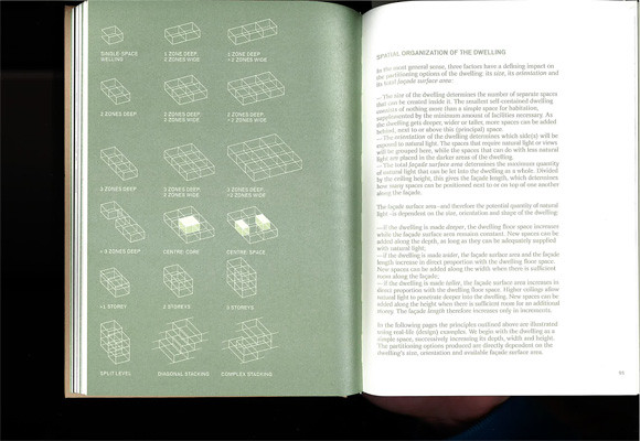
HousingDesign02
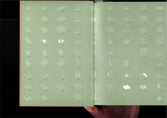
Image by urbanTick / Book endsheet showing the different elements and parts of a house that are discussed in details. There are storys, core space, gallery, staircase, street infill and diagonal stacking amongst many others. The pictograms summarise the characteristics of each element very neatly and allow for quick reference and finding.Housing Design – A Manual.

It is a very beautiful publications. It feels good to touch and it is in its design quite complexe without overloading. Actually it looks plain, but with its use of metallic colours and specific fonts for different types of text it is rather playful in a supporting kind of way. The photographs are all black and white and so are the plans and drawings. Despite this no information the information is very clear and readable.

To summ up, this is definitely one of the great publications on housing design and worth having, not only if you are a first year undergrad architecture student. In fact it might be even too complicated for beginners. It might be even more insightful and interesting if you already know about architecture. With its many references and examples across architecture history it is a great reference as well as reading book.

HousingDesign01
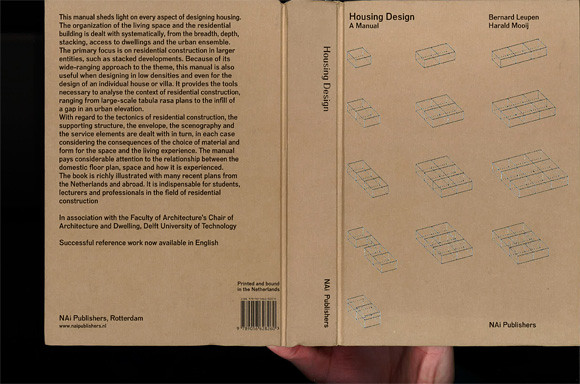
Image by urbanTick / Book cover Housing Design – A Manual.

Mooij, H. & Leupen, B., 2011. Housing Design – A Manual, Rotterdam: NAI Publishers.

Continue reading »

Book – Designing for Civil Defense

The Cold War years are usually presented in terms of the military force and an ever expanding resource of military equipment. This of course includes foremost the nuclear weapons both sides the West lead by the U.S. and the NATO and the Communist East lead by Russia.

Architecture however, played an important role in cicvil defence and the preparation for a potential third world war. There was far less attention payed to the fact that all nations had programs running to prepare their societies for the case of escalation. Tensions there were enough.

Nuclear war was the ultimate danger and with images and evidence form Hiroshima and Nagasaki preparation was part of civil defence programs also in the U.S. In a new book Fallout Shelter: Designing for Civil Defence in the Cold War published by University of Minnesota Press, David Monteyne presents these U.S. programs from an architectural perspective. This detailed investigation ranges from the propaganda to built examples and examines closely the role of the architect as the middle man between government and civil society implementing a plan that is further reaching than simply the provision of shelter. Find Fallout Shelter: Designing for Civil Defence in the Cold War for great prices with these Amazon Promo Codes.

DIY shelter
Image taken from etsy / DIY fallout shelter for your back garden.

As Monteyne points out in his introduction it effectively is a contract between citizens and government exchanging provision for shelter and quality of live for cooperative behaviour. He refers to Foucaults biopower as a political relationship. Essentially building shelters was and in some cases still is, as we’ll discuss further on, the physical implementation of goals and powers of the welfare state.

The book explores in seven chapters the background, the planning, the implementation and the potential influence of shelter provision programs in the U.S. The programs were mostly about information and education but of course also aiming to build shelter provision. For this the architects were a key alley and the American Institute of Architects (AIA) launched a series of design competitions together with the Office for Civil Defense (OCD). The aim was to promote good planning and preparation for shelter provision. A series of designs were presented as winners, both built and as projects.

In the last chapter Monteyner goes a step further and applies his observations and investigations as an interpretation of an architectural style. He goes as far as arguing that this focus on shelter and bunker design has effectively led to an specific style, not a new one, but Brutalism?! Well thats something new and of course he has some evidence, the famous Boston City Hall. The basic argument is that Brutalist architecture looks a bit like bunk architecture so the origin of Brutalism is to be found in these government programs during the early Cold War times having shaped a whole generations concusses.
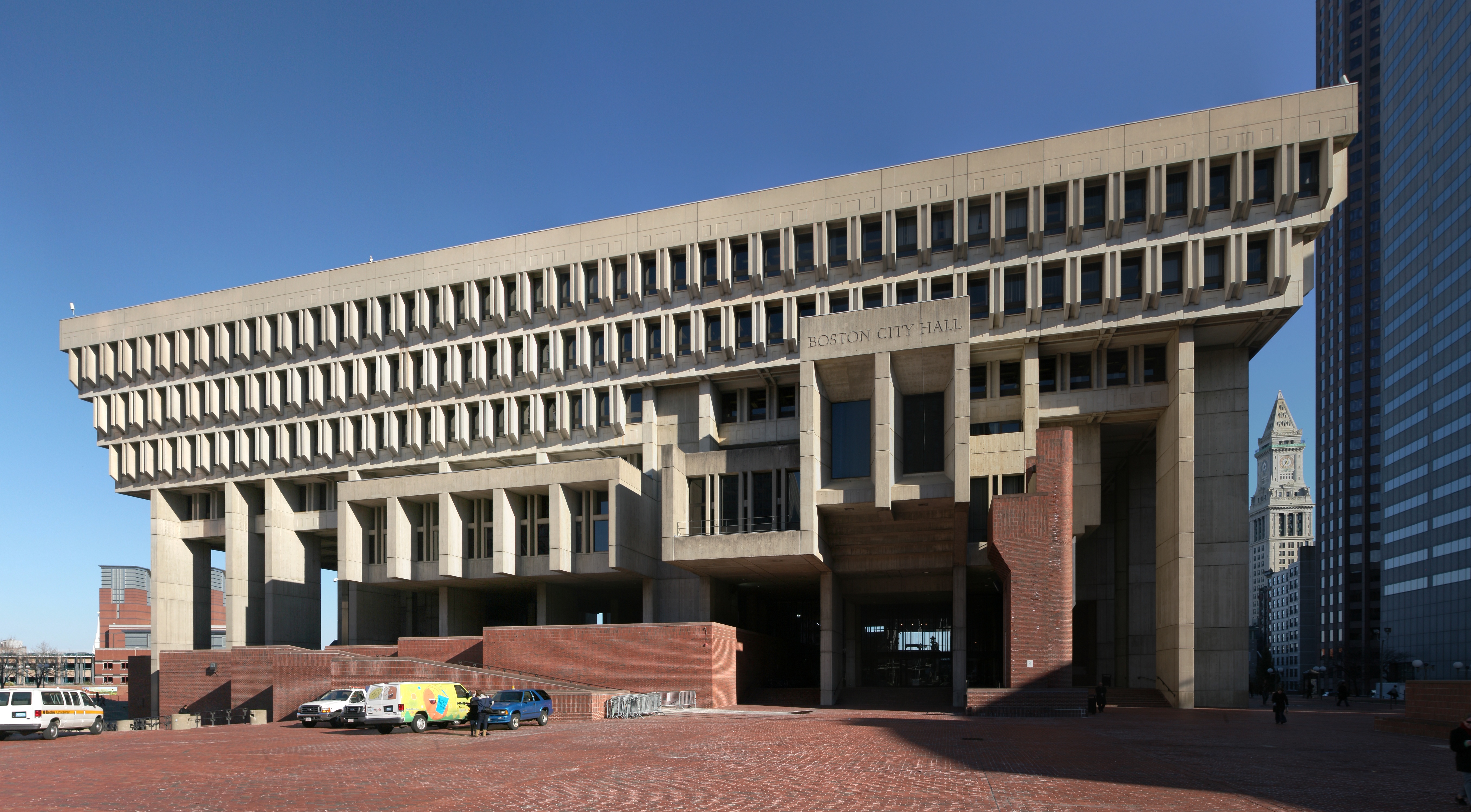
Boston City Hall
http://en.wikipedia.org/wiki/Brutalism
Image taken from Wikipedia / The Boston City Hall that serves as an example as to how bunker design has lead to the Brutalism movement.

Boston City Hall is at this point is the famous and widely debated example in the U.S. and serves well since it has implemented to some extend the requirements for fallout shelter. Interestingly the term Burtalism however is claimed to be coined by the Smithsons from the United Kingdom based on Le Corbusier in the context of CIAM. So not really an American connection there and all in all a bit too early for these programs that were run in the fifties and sixties mainly.

Reading the shelter guides these cold war programs produced and the resulting designs one can not help but smile. It amazing how naive the designs are and how improvised. For example there are guides on how to build a wooden shelter in your backyard and even the Boston City Hall project, the famous bunker style building has implemented shelter space on the eights floor?

It seemed to work and to some degree the American officials seemed to gain some sense of preparednes from these exercises. To everyone else these plans must immediately seem strange. If all you need to withstand a nuclear war is to build the entrance of a house not in line with the corridor to prevent fallout from penetrating deep into the house we ar all save.

American architecture is not generally well known for going deep underground and if possible basements are avoided at any cost. Very much so in terms of shelter and fall protection provision. Not even these programs have seriously considered building bunker underground, as the Boston City Hall projects demonstrates. Shelter can happily be provided on the eighth floor?!

The way this infrastructure of bunkers and shelters is described in the publication does echo practices for example in Switzerland. The small country in the heart of Europe is well known for its specific bunker infrastructure. On the military end this infrastructure was designed to guarantee the independence creating a réduit in the alps. On the civil side planning for large scale shelter infrastructure started a early as the 1930s. These efforts were geared towards the provision of shelter everyone in the country. Doring the 1980s this was achieved, making Switzerland arguably the leading provider of shelters.

It is a general requirement in Switzerland to built a shelter as part of every housing project ranging from a single family house to an entire block. Depending on the size of the project and number of inhabitants the shelter has to provide a certain capacity. Currently there are, according to the Swiss Federal Office for Civil Protection FOCP, about 360’000 individual shelters built as part of buildings and in addition some 2300 communal shelters. Hereby a shelter in general is a sort of mini bunker in the basement of every building constructed after 1963.

shelter details section
Image taken from Kanton Schwyz / Detailed section drawing showing the emergency exit from a standard single family house shelter space. Requirements including distances and dimensioning are based on standards applicable through out Switzerland. Note also the shown solution in case of high ground water.

There are clear guide lines for the construction of the shelter, the provisions and the equipment necessary. Every opening has to have a massive concrete door to completely seal the space. There is ventilation equipment required, designed to withstand gas and fall out. In addition there are simple bunk bed constructions and basic facilities such as dry toilets required.

Larger buildings such as community centres provide shelter for a larger number of people ranging from 30 to a few hundred. All are real bunkers constructed in full concrete, at least 25 cm in thickness with completely sealable openings, basic infrastructure equipment, toilets, beds and cooking facilities.

In addition infrastructure projects sometimes have been used to extend capacity of shelter place capacity. For examples the highway tunnel ‘Sonnenbergtunnel‘ in Luzern was build with the capacity to transform into a massive bunker if required. It would have provided places for about 20’000 people. This includes sanitary facilities including a small hospital unit, large kitchens, ventilation infrastructure and bunk beds and so on. In case of emergency each tunnel entrance would be closed with a specially designed massive concrete gates to seal the entrance. The entire length of the tunnel be used for cubicles with bunk beds. It was calculated for 1m2 of floorspace per person.

Sonnenberg tunnel gates
Image taken from Luzernerzeitung / The large gates of the Sonnenbergtunnel shelter in Switzerland were last closed in 1987. The gate is constructed on sight and is curved to withstand great pressure.

Sonnenberg tunnel is since 2005 no longer in operation as a shelter unit. It can still be visited with a guided tour though. The city of Luzern has in connection to the complete renovation of the highway A2 developed a new Civil Defence concept and provides the capacity in shelter places elsewhere. However, through out switzerland a number of other such invisible underground civi defence infrastructure buildings are still being maintained in order to provide shelter in case of war or nuclear fall out.

Switzerland has in many ways optimised and multiplied the implementation of shelter provision for the civil population. Reading it under the aspects David Monteyne presents in the introduction to his publication the outreach of the state to discipline the population to good behaviour in exchange for welfare did work and still works very well. It can be argued that the Swiss population and the architects as the implementers of these outreach programs cooperate well. However, the implementation of the shelter infrastructure is taken much more serious in its mechanics in Switzerland than according to Monteyne it was in the US. And from a Swiss perspective to speak of a specific bunker style (believed to be brutalism) to emerge from the state requirements for shelter seems absurd. This is mainly dueto the fact that Swiss planners have always decided that shelter or bunker facilities only really make sense if they are implemented in the basement and never tried to somehow fit it in above ground. As such the shelter has never been visible and therefore did not influence the ascetics of the aboveground appearance necessarily.
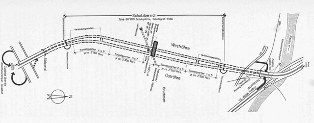
Die Zivilschutzanlage Sonnenbergtunnel in Luzern
Details taken from: Heierli, W., Jundt, L. & Kessler, E., 1976. Die Zivilschutzanlage Sonnenbergtunnel in Luzern. Schweizerische Bauzeitung, 94(46), pp.689-699.
/ Map of the Sonnenberg highway tunnel near Luzern in Switzerland showing the location of the built shelter. The bunke was designed to provided space for 20’000 civilians in the case of war. Constructed between 1971 and 1976. The shelter was finally closed in 2005.
Details taken from: Heierli, W., Jundt, L. & Kessler, E., 1976. Die Zivilschutzanlage Sonnenbergtunnel in Luzern. Schweizerische Bauzeitung, 94(46), pp.689-699.

Building shelters underground could be an explanation why the required provision of shelter had and still has a much higher acceptance through out the civil population. Without it being constantly present in the everyday environment it is much more a background infrastructure than an style and other functions are not overloaded by the required provision of shelter but extended.

Nevertheless the book presents a very distinct characteristic of the last century and the period between 1950 and 1980. Whether it lead to a distinct architectural style can be debated. What is of specific interest is to compare the different approaches to the provision of shelter as well as what these approaches tell about how the civil society deals with chaos and order, the manipulation of the collective and the individual and the role of planning and architecture in a wider society context.

Fallout shelter design Book cover
Image taken from amazon / Book cover.

Monteyne, D., 2011. Fallout Shelter: Designing for Civil Defense in the Cold War, University of Minnesota Press.

Continue reading »

Book – Designing for Civil Defense

The Cold War years are usually presented in terms of the military force and an ever expanding resource of military equipment. This of course includes foremost the nuclear weapons both sides the West lead by the U.S. and the NATO and the Communist East lead by Russia.

Architecture however, played an important role in cicvil defence and the preparation for a potential third world war. There was far less attention payed to the fact that all nations had programs running to prepare their societies for the case of escalation. Tensions there were enough.

Nuclear war was the ultimate danger and with images and evidence form Hiroshima and Nagasaki preparation was part of civil defence programs also in the U.S. In a new book Fallout Shelter: Designing for Civil Defence in the Cold War published by University of Minnesota Press, David Monteyne presents these U.S. programs from an architectural perspective. This detailed investigation ranges from the propaganda to built examples and examines closely the role of the architect as the middle man between government and civil society implementing a plan that is further reaching than simply the provision of shelter. Find Fallout Shelter: Designing for Civil Defence in the Cold War for great prices with these Amazon Promo Codes.

DIY shelter
Image taken from etsy / DIY fallout shelter for your back garden.

As Monteyne points out in his introduction it effectively is a contract between citizens and government exchanging provision for shelter and quality of live for cooperative behaviour. He refers to Foucaults biopower as a political relationship. Essentially building shelters was and in some cases still is, as we’ll discuss further on, the physical implementation of goals and powers of the welfare state.

The book explores in seven chapters the background, the planning, the implementation and the potential influence of shelter provision programs in the U.S. The programs were mostly about information and education but of course also aiming to build shelter provision. For this the architects were a key alley and the American Institute of Architects (AIA) launched a series of design competitions together with the Office for Civil Defense (OCD). The aim was to promote good planning and preparation for shelter provision. A series of designs were presented as winners, both built and as projects.

In the last chapter Monteyner goes a step further and applies his observations and investigations as an interpretation of an architectural style. He goes as far as arguing that this focus on shelter and bunker design has effectively led to an specific style, not a new one, but Brutalism?! Well thats something new and of course he has some evidence, the famous Boston City Hall. The basic argument is that Brutalist architecture looks a bit like bunk architecture so the origin of Brutalism is to be found in these government programs during the early Cold War times having shaped a whole generations concusses.

Boston City Hall
http://en.wikipedia.org/wiki/Brutalism
Image taken from Wikipedia / The Boston City Hall that serves as an example as to how bunker design has lead to the Brutalism movement.

Boston City Hall is at this point is the famous and widely debated example in the U.S. and serves well since it has implemented to some extend the requirements for fallout shelter. Interestingly the term Burtalism however is claimed to be coined by the Smithsons from the United Kingdom based on Le Corbusier in the context of CIAM. So not really an American connection there and all in all a bit too early for these programs that were run in the fifties and sixties mainly.

Reading the shelter guides these cold war programs produced and the resulting designs one can not help but smile. It amazing how naive the designs are and how improvised. For example there are guides on how to build a wooden shelter in your backyard and even the Boston City Hall project, the famous bunker style building has implemented shelter space on the eights floor?

It seemed to work and to some degree the American officials seemed to gain some sense of preparednes from these exercises. To everyone else these plans must immediately seem strange. If all you need to withstand a nuclear war is to build the entrance of a house not in line with the corridor to prevent fallout from penetrating deep into the house we ar all save.

American architecture is not generally well known for going deep underground and if possible basements are avoided at any cost. Very much so in terms of shelter and fall protection provision. Not even these programs have seriously considered building bunker underground, as the Boston City Hall projects demonstrates. Shelter can happily be provided on the eighth floor?!

The way this infrastructure of bunkers and shelters is described in the publication does echo practices for example in Switzerland. The small country in the heart of Europe is well known for its specific bunker infrastructure. On the military end this infrastructure was designed to guarantee the independence creating a réduit in the alps. On the civil side planning for large scale shelter infrastructure started a early as the 1930s. These efforts were geared towards the provision of shelter everyone in the country. Doring the 1980s this was achieved, making Switzerland arguably the leading provider of shelters.

It is a general requirement in Switzerland to built a shelter as part of every housing project ranging from a single family house to an entire block. Depending on the size of the project and number of inhabitants the shelter has to provide a certain capacity. Currently there are, according to the Swiss Federal Office for Civil Protection FOCP, about 360’000 individual shelters built as part of buildings and in addition some 2300 communal shelters. Hereby a shelter in general is a sort of mini bunker in the basement of every building constructed after 1963.

shelter details section
Image taken from Kanton Schwyz / Detailed section drawing showing the emergency exit from a standard single family house shelter space. Requirements including distances and dimensioning are based on standards applicable through out Switzerland. Note also the shown solution in case of high ground water.

There are clear guide lines for the construction of the shelter, the provisions and the equipment necessary. Every opening has to have a massive concrete door to completely seal the space. There is ventilation equipment required, designed to withstand gas and fall out. In addition there are simple bunk bed constructions and basic facilities such as dry toilets required.

Larger buildings such as community centres provide shelter for a larger number of people ranging from 30 to a few hundred. All are real bunkers constructed in full concrete, at least 25 cm in thickness with completely sealable openings, basic infrastructure equipment, toilets, beds and cooking facilities.

In addition infrastructure projects sometimes have been used to extend capacity of shelter place capacity. For examples the highway tunnel ‘Sonnenbergtunnel‘ in Luzern was build with the capacity to transform into a massive bunker if required. It would have provided places for about 20’000 people. This includes sanitary facilities including a small hospital unit, large kitchens, ventilation infrastructure and bunk beds and so on. In case of emergency each tunnel entrance would be closed with a specially designed massive concrete gates to seal the entrance. The entire length of the tunnel be used for cubicles with bunk beds. It was calculated for 1m2 of floorspace per person.

Sonnenberg tunnel gates
Image taken from Luzernerzeitung / The large gates of the Sonnenbergtunnel shelter in Switzerland were last closed in 1987. The gate is constructed on sight and is curved to withstand great pressure.

Sonnenberg tunnel is since 2005 no longer in operation as a shelter unit. It can still be visited with a guided tour though. The city of Luzern has in connection to the complete renovation of the highway A2 developed a new Civil Defence concept and provides the capacity in shelter places elsewhere. However, through out switzerland a number of other such invisible underground civi defence infrastructure buildings are still being maintained in order to provide shelter in case of war or nuclear fall out.

Switzerland has in many ways optimised and multiplied the implementation of shelter provision for the civil population. Reading it under the aspects David Monteyne presents in the introduction to his publication the outreach of the state to discipline the population to good behaviour in exchange for welfare did work and still works very well. It can be argued that the Swiss population and the architects as the implementers of these outreach programs cooperate well. However, the implementation of the shelter infrastructure is taken much more serious in its mechanics in Switzerland than according to Monteyne it was in the US. And from a Swiss perspective to speak of a specific bunker style (believed to be brutalism) to emerge from the state requirements for shelter seems absurd. This is mainly dueto the fact that Swiss planners have always decided that shelter or bunker facilities only really make sense if they are implemented in the basement and never tried to somehow fit it in above ground. As such the shelter has never been visible and therefore did not influence the ascetics of the aboveground appearance necessarily.

Die Zivilschutzanlage Sonnenbergtunnel in Luzern
Details taken from: Heierli, W., Jundt, L. & Kessler, E., 1976. Die Zivilschutzanlage Sonnenbergtunnel in Luzern. Schweizerische Bauzeitung, 94(46), pp.689-699.
/ Map of the Sonnenberg highway tunnel near Luzern in Switzerland showing the location of the built shelter. The bunke was designed to provided space for 20’000 civilians in the case of war. Constructed between 1971 and 1976. The shelter was finally closed in 2005.
Details taken from: Heierli, W., Jundt, L. & Kessler, E., 1976. Die Zivilschutzanlage Sonnenbergtunnel in Luzern. Schweizerische Bauzeitung, 94(46), pp.689-699.

Building shelters underground could be an explanation why the required provision of shelter had and still has a much higher acceptance through out the civil population. Without it being constantly present in the everyday environment it is much more a background infrastructure than an style and other functions are not overloaded by the required provision of shelter but extended.

Nevertheless the book presents a very distinct characteristic of the last century and the period between 1950 and 1980. Whether it lead to a distinct architectural style can be debated. What is of specific interest is to compare the different approaches to the provision of shelter as well as what these approaches tell about how the civil society deals with chaos and order, the manipulation of the collective and the individual and the role of planning and architecture in a wider society context.

Fallout shelter design Book cover
Image taken from amazon / Book cover.

Monteyne, D., 2011. Fallout Shelter: Designing for Civil Defense in the Cold War, University of Minnesota Press.

Continue reading »

1 2 3