Tuesday Teaser 13th March
Sorry for the lack of Tuesday Teaser last week, it’s because I was too busy living it up here. Back in full swing now, I promise. And to show you…
Continue reading »The latest outputs from researchers, alumni and friends at the UCL Centre for Advanced Spatial Analysis (CASA).

Sorry for the lack of Tuesday Teaser last week, it’s because I was too busy living it up here. Back in full swing now, I promise. And to show you…
Continue reading » I’ve just completed a lecture at the UCL Energy Institute on agent-based modelling and thought, hey – maybe some of my blog readership would be interested in this!
Please find the PDF below – it should be quite straightforward, although without the w…
As planned, Tower Hamlets (east London) and Shepherd’s Bush (west London) saw a big expansion of bike share docking stations, overnight last Wednesday night. There’s also been some incremental additions to the existing zone, and a build-out of Camden Town … Continue reading →
Continue reading »Infrastructure projects have grown into an important role in the public realm taking more and more responsibility in a social context. Over the past arguably hundred years more and more emphasis has be put in to infrastructure, being it transport services and facilities.
As a modernists take on the city technology was to be placed as the driving force behind planning and this of course shall also include infrastructural project. In fact especially here technology could be implemented with the help of additional arguments. Today, infrastructure is running as flag ship projects in many cases being put forward as statements both public and design wise.
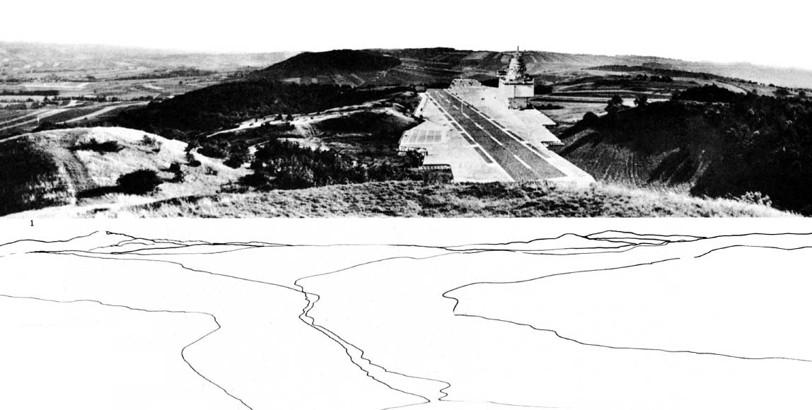
Image taken from dpr-barcelona / Hans Hollein Aircraft carrier city in landscape, project. Aerial perspective.
The Jovis publication Infrastructure as Architecture: Designing Composite Networks, edited by Katrina Stoll and Scott Lloyd takes a detailed look at this position infrastructure has grown into and how architecture relates to it, thus implying that design has to learn from both in order to support a new take on projects.
The publication discusses the matter in essays organised in five topics. These are: Infrastructure Economy, Infrastructure Ecology, Infrastructure Culture, Infrastructure Politics and Infrastructure Space/Networks. Contributors include for example Dana Cuff from UCLA, LateralOffice, UrbanLAB, Alexander D’Hooghe and MVRDV.
The essays cover a range of topics and reach from the presentation of practical projects, built and planned to theoretical essays of the discussion. Thus there is a wealth of different views that are, as the editors argue: ‘providing a framework for understanding the union of infrastructure and architecture’.
Of course it is on one hand a secret claim to but architects in the position to take on and reclaim design agency over infrastructure projects, but more importantly to discuss the dualities of presence and identity of building projects regardless of their function.
It is superbly interesting how this publication argues for a new take on infrastructure and how the argumentation might actually be point out what practice has already incorporated. Whilst the discussions around the relationships infrastructure is bedded into in the urban system is not new, there is a new approach being argued for. Modernists have taken it on at the beginning of the last century and in the 60s the Smithsons and Team X proposed a new take. More and more it grew into a systemic approach and whilst before it was always one or the other it is now being argued for as both, one and the other.
Appleyard and Lynch in A view from the Road already note that the road is producing scenery for the driver and the passengers it is at the same time dominating the landscape as a static bulky object. Alexander D’Hoogh is especially arguing for this in his essay contribution o the publication: The Objectification of Infrastructure: The cultural project of suburban infrastructure design.
This dualism of producing and being is the new aspect in this publication, but probably could in fact reach beyond. Testing this against current trends might revel a deeper interest of our times in this dualism and the fact that problems could have more than one state.

Image taken from jonathandsolomon.com / Book cover. A preview of the publication is available from Jovis HERE. The Essay by Jonathan Solomon is available HERE.
Stoll, K. & Lloyd, S., 2010. Infrastructure as Architecture: Designing Composite Networks, Berlin: Jovis Verlag.
Infrastructure projects have grown into an important role in the public realm taking more and more responsibility in a social context. Over the past arguably hundred years more and more emphasis has be put in to infrastructure, being it transport services and facilities.
As a modernists take on the city technology was to be placed as the driving force behind planning and this of course shall also include infrastructural project. In fact especially here technology could be implemented with the help of additional arguments. Today, infrastructure is running as flag ship projects in many cases being put forward as statements both public and design wise.
Image taken from dpr-barcelona / Hans Hollein Aircraft carrier city in landscape, project. Aerial perspective.
The Jovis publication Infrastructure as Architecture: Designing Composite Networks, edited by Katrina Stoll and Scott Lloyd takes a detailed look at this position infrastructure has grown into and how architecture relates to it, thus implying that design has to learn from both in order to support a new take on projects.
The publication discusses the matter in essays organised in five topics. These are: Infrastructure Economy, Infrastructure Ecology, Infrastructure Culture, Infrastructure Politics and Infrastructure Space/Networks. Contributors include for example Dana Cuff from UCLA, LateralOffice, UrbanLAB, Alexander D’Hooghe and MVRDV.
The essays cover a range of topics and reach from the presentation of practical projects, built and planned to theoretical essays of the discussion. Thus there is a wealth of different views that are, as the editors argue: ‘providing a framework for understanding the union of infrastructure and architecture’.
Of course it is on one hand a secret claim to but architects in the position to take on and reclaim design agency over infrastructure projects, but more importantly to discuss the dualities of presence and identity of building projects regardless of their function.
It is superbly interesting how this publication argues for a new take on infrastructure and how the argumentation might actually be point out what practice has already incorporated. Whilst the discussions around the relationships infrastructure is bedded into in the urban system is not new, there is a new approach being argued for. Modernists have taken it on at the beginning of the last century and in the 60s the Smithsons and Team X proposed a new take. More and more it grew into a systemic approach and whilst before it was always one or the other it is now being argued for as both, one and the other.
Appleyard and Lynch in A view from the Road already note that the road is producing scenery for the driver and the passengers it is at the same time dominating the landscape as a static bulky object. Alexander D’Hoogh is especially arguing for this in his essay contribution o the publication: The Objectification of Infrastructure: The cultural project of suburban infrastructure design.
This dualism of producing and being is the new aspect in this publication, but probably could in fact reach beyond. Testing this against current trends might revel a deeper interest of our times in this dualism and the fact that problems could have more than one state.
Image taken from jonathandsolomon.com / Book cover. A preview of the publication is available from Jovis HERE. The Essay by Jonathan Solomon is available HERE.
Stoll, K. & Lloyd, S., 2010. Infrastructure as Architecture: Designing Composite Networks, Berlin: Jovis Verlag.
TweetThe 2011 UK Census is estimated to cost in excess of £500m. This, together with concerns about timeliness, has led to the government investigating alternative approaches to acquiring information on the population. However, the census also provides a framework for considerable social analysis. It is thus vital that the impact of any replacement to the […]
Continue reading »I took a very pleasant urban ramble on Saturday, from Greenwich, east along the river and past the Thames Flood Barrier, under the Woolwich Foot Tunnel and then back west to Wapping (with a DLR trip through some of the … Continue reading →![]()
In the words of NASA – Many wonders are visible when flying over the Earth at night. A compilation of such visual spectacles was captured recently from the International Space Station (ISS) and set to rousing music. Passing below are white clouds…
Continue reading »In the words of NASA – Many wonders are visible when flying over the Earth at night. A compilation of such visual spectacles was captured recently from the International Space Station (ISS) and set to rousing music. Passing below are white clouds…
Continue reading »Tweet PopFest is an annual population studies conference for postgraduate students organised by fellow postgraduates. PopFest has been organised by various universities with the support of sponsors for nineteen years. The twentieth PopFest is to be held at Loughborough University from the 21st – 23rd June and will reflect on the past 20 years of […]
Continue reading »Oxfam’s Shelflife links goods with past using QR Codes BBC News
Continue reading »Oxfam’s Shelflife links goods with past using QR Codes BBC NewsOxfam is trying out a mobile phone scheme called Shelflife that lets customers find out the stories behind second-hand goods it sells. A Shelflife phone app links …
Continue reading »TweetREGISTRATION DEADLINE: 28th March 2012 Population Geography: Inter-Generational Patterns and Processes Third Biennial British-Irish Population Conference, Belfast, 18-19th April 2012 Hosted by Queen’s University Belfast under the auspices of the Population Geography Research Group of the RGS-IBG The conference programme along with further information, registration form and payment form can now be downloaded […]
Continue reading »Housing design is the one field of architecture arguably being the most accepted core activity of architects. Building houses is architecture as such. The recent NAi publisher book Housing Design: A Manual by Bernhard Leupen and Harald Mooij is published in a second English edition. It picks up on the is core and very traditional architecture activity of building a house and presents designs across a wide range of types in a cultural context.
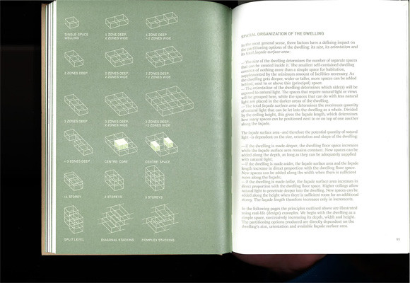
Image by urbanTick / Book spread showing the chapter introductino nad a summary of the discussed elements.Housing Design – A Manual.
The new publication is a revised English-Language edition and is based on the first Dutch edition published as Het ontwerpen van woningen in 2008. The new edition is extended in its content and, being translated to English, definitely open up to a wider audience worldwide.
In a series of eight chapters the publication develops a clear presentation of housing projects, of both built and some unbuilt examples. The chapters organise the projects in several categories. Other than most books on the same subject however, Housing Design does not try to press the examples into descriptive categories. The authors have chosen to group them into programatic categories characterising the process and the context rather than the project itself.
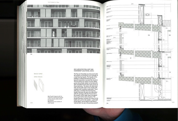
Image by urbanTick / Book spread Housing Design – A Manual. The example here is by DKV Architects, Kop van Havendiep (Lelystad, 2004) with detailed sectional drawing.
With this the presentation is more relaxed and less arbitrary in a range of different contexts. Where the descriptive categories often seem out of place the here used programatic categories support the reading of each examples in a wider context.
This is at the same time where the specific strength of this publication lies. It is not just a design manual, but a design reader. The examples are not just standing on their own as a separate entity. Each project is set in a wider context linking it in with a theoretical and practical background.
The book is therefore also great reading material. It is by no means a picture book or a flip book, but presents a systematical approach to the presentation of a range of housing projects in the context of architecture history and practice. In this the publication goes into great detail with the presentation and answering of problems drawing from a great source of architectural history examples. Under the subtitle belly for examples, the problem of the underside of a house if rised on piloties or has an underpass is discussed using Le Corbusier’s Unité d’habitation and MVRDV’s WOZOCO as examples. Similar the topic scenery and the design of interior spaces draws on Haussmann and Adolf Loos’s Haus Moller and Das Prinzip der Bekleidung (The Principle of Cladding).
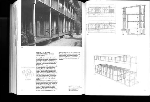
Image by urbanTick / Book spread Housing Design – A Manual. The example here is by Herzog de Meuron, Hebelstrasse 11 Housing (Basel 1988) as an example of a skeleton construction.
Each chapter starts with a theoretical introduction and presents a series of examples. Each with photo plans and drawings. Often this includes construction drawings such as sections. This allows the publication to go in to a lot of detail beyond just the floor layout, discussing construction problems in line with design and questions of aesthetics.
The book concludes in the chapter The Design Process in which three examples are presented as case studies. The discussed aspects are ‘applied’ or revisited as to how they accompany the different design stages of a project. With this the authors demonstrate that housing design is not simply about finding the right typology and developing a floor plan layout. They make the point very clear that architecture and specifically housing design is a contextual process.
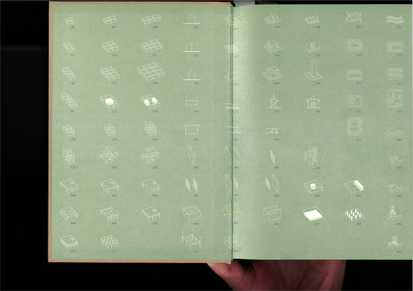
Image by urbanTick / Book endsheet showing the different elements and parts of a house that are discussed in details. There are storys, core space, gallery, staircase, street infill and diagonal stacking amongst many others. The pictograms summarise the characteristics of each element very neatly and allow for quick reference and finding.Housing Design – A Manual.
It is a very beautiful publications. It feels good to touch and it is in its design quite complexe without overloading. Actually it looks plain, but with its use of metallic colours and specific fonts for different types of text it is rather playful in a supporting kind of way. The photographs are all black and white and so are the plans and drawings. Despite this no information the information is very clear and readable.
To summ up, this is definitely one of the great publications on housing design and worth having, not only if you are a first year undergrad architecture student. In fact it might be even too complicated for beginners. It might be even more insightful and interesting if you already know about architecture. With its many references and examples across architecture history it is a great reference as well as reading book.
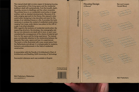
Image by urbanTick / Book cover Housing Design – A Manual.
Mooij, H. & Leupen, B., 2011. Housing Design – A Manual, Rotterdam: NAI Publishers.
Continue reading »Housing design is the one field of architecture arguably being the most accepted core activity of architects. Building houses is architecture as such. The recent NAi publisher book Housing Design: A Manual by Bernhard Leupen and Harald Mooij is published in a second English edition. It picks up on the is core and very traditional architecture activity of building a house and presents designs across a wide range of types in a cultural context.
Image by urbanTick / Book spread showing the chapter introductino nad a summary of the discussed elements.Housing Design – A Manual.
The new publication is a revised English-Language edition and is based on the first Dutch edition published as Het ontwerpen van woningen in 2008. The new edition is extended in its content and, being translated to English, definitely open up to a wider audience worldwide.
In a series of eight chapters the publication develops a clear presentation of housing projects, of both built and some unbuilt examples. The chapters organise the projects in several categories. Other than most books on the same subject however, Housing Design does not try to press the examples into descriptive categories. The authors have chosen to group them into programatic categories characterising the process and the context rather than the project itself.
Image by urbanTick / Book spread Housing Design – A Manual. The example here is by DKV Architects, Kop van Havendiep (Lelystad, 2004) with detailed sectional drawing.
With this the presentation is more relaxed and less arbitrary in a range of different contexts. Where the descriptive categories often seem out of place the here used programatic categories support the reading of each examples in a wider context.
This is at the same time where the specific strength of this publication lies. It is not just a design manual, but a design reader. The examples are not just standing on their own as a separate entity. Each project is set in a wider context linking it in with a theoretical and practical background.
The book is therefore also great reading material. It is by no means a picture book or a flip book, but presents a systematical approach to the presentation of a range of housing projects in the context of architecture history and practice. In this the publication goes into great detail with the presentation and answering of problems drawing from a great source of architectural history examples. Under the subtitle belly for examples, the problem of the underside of a house if rised on piloties or has an underpass is discussed using Le Corbusier’s Unité d’habitation and MVRDV’s WOZOCO as examples. Similar the topic scenery and the design of interior spaces draws on Haussmann and Adolf Loos’s Haus Moller and Das Prinzip der Bekleidung (The Principle of Cladding).
Image by urbanTick / Book spread Housing Design – A Manual. The example here is by Herzog de Meuron, Hebelstrasse 11 Housing (Basel 1988) as an example of a skeleton construction.
Each chapter starts with a theoretical introduction and presents a series of examples. Each with photo plans and drawings. Often this includes construction drawings such as sections. This allows the publication to go in to a lot of detail beyond just the floor layout, discussing construction problems in line with design and questions of aesthetics.
The book concludes in the chapter The Design Process in which three examples are presented as case studies. The discussed aspects are ‘applied’ or revisited as to how they accompany the different design stages of a project. With this the authors demonstrate that housing design is not simply about finding the right typology and developing a floor plan layout. They make the point very clear that architecture and specifically housing design is a contextual process.
Image by urbanTick / Book endsheet showing the different elements and parts of a house that are discussed in details. There are storys, core space, gallery, staircase, street infill and diagonal stacking amongst many others. The pictograms summarise the characteristics of each element very neatly and allow for quick reference and finding.Housing Design – A Manual.
It is a very beautiful publications. It feels good to touch and it is in its design quite complexe without overloading. Actually it looks plain, but with its use of metallic colours and specific fonts for different types of text it is rather playful in a supporting kind of way. The photographs are all black and white and so are the plans and drawings. Despite this no information the information is very clear and readable.
To summ up, this is definitely one of the great publications on housing design and worth having, not only if you are a first year undergrad architecture student. In fact it might be even too complicated for beginners. It might be even more insightful and interesting if you already know about architecture. With its many references and examples across architecture history it is a great reference as well as reading book.
Image by urbanTick / Book cover Housing Design – A Manual.
Mooij, H. & Leupen, B., 2011. Housing Design – A Manual, Rotterdam: NAI Publishers.
At the 2012 Annual Meeting of the Association of American Geographers, I presented during the session ‘Information Geographies: Online Power, Representation and Voice’, which was organised by Mark Graham (Oxford Internet Institute) and Matthew Zook (University of Kentucky). For an early morning session on a Saturday, the session was well attended – and the papers […]![]()
First published in 2010, I have only recently got round to reading Doug Saunders‘ excellent…
Continue reading »The London Citizen Cyberscience Summit ran in the middle of February, from 16th (Thursday) to 18th (Saturday). It marked the launch of the UCL Extreme Citizen Science (ExCiteS) group, while providing an opportunity for people who are interested in different aspects of citizen science to come together, discuss, share ideas, consider joint projects and learn […]![]()
The Royal Netherlands Academy of Arts and Sciences (KNAW) and the Netherlands Organisation for Scientific Research (NWO) are organising this seminar on 5th March 2012 starting at 9-30am at Trippenhuis, Kloveniersburgwal 29, the Netherlands. Mike Batty is talking about Complexity in Cities: Are Cities Becoming More and More Complex?, Martin Novak is talking about […]
Continue reading »The Barclays Cycle Hire bikesharing system (map) in London is due for a major expansion on 8 March. Overnight on the 7th, operators will be working flat out to add 2300 1700 1900 new bikes into 4800 3000 3400 new … Continue reading →
Continue reading »USEUM, the latest innovation out of CASA and Digital Humanities here at UCL, participated in Athens Startup Weekend hosted by Microsoft Hellas last weekend and won 1st prize.
From the official website of the competition:
“1st place …
Continue reading »USEUM, the latest innovation out of CASA and Digital Humanities here at UCL, participated in Athens Startup Weekend hosted by Microsoft Hellas last weekend and won 1st prize.
From the official website of the competition:
“1st place …
Continue reading »Last week I attended the Association of American Geographers Annual Conference and heard a talk by Robert Groves, Director of the US Census Bureau. Aside the impressiveness of the bureau’s work I was struck by how Groves conceived of visualisations as requiring either fast thinking or slow thinking. Fast thinking data visualisations offer a clear message without the need …
Continue reading »Geomedia Professional Suite of GIS Software. Richard Goodman, Intergraph. To download a PDF of the seminar please click here. Abstract. This presentation talks about the Geomedia Professional Suite of GIS Software, highlighting its features and giving examples and case studies…
Continue reading »Profs Mike Batty and Paul Longley have been asked to write a short report on Quantitative Geography, GIS and Cartography for the ESRC’s current ‘benchmarking review’ of UK human geography, undertaken in partnership with the RGS-IBG. They would very much welcome views and contributions from QMRG and GISRG members in seeking to answer the following […]
Continue reading »Eric Fischer produced this interesting data map of Lond […]
Continue reading » So, let’s say you want to meet up with your friends. You text – “Where are you?”. “We’re at the Bar Bar on 59th Street”, they reply. Now you need to look the place up, and navigate your way there.
Instead, why can’t your friend just…
I promised I would try and avoid general knowledge teasers, but I just really like this question – so I hope that you’ll forgive me, just this once. There are…
Continue reading »“Take a cycle, ride it where you like, then return it, ready for the next person. Available 24 hours a day, all year round. It’s self-service and there’s no booking. Just turn up and go.” Barclays Cycle Hire is certainly popular in London. Every time a…
Continue reading »
“Take a cycle, ride it where you like, then return it, ready for the next person. Available 24 hours a day, all year round. It’s self-service and there’s no booking. Just turn up and go.” Barclays Cycle Hire is certainly popular in London. Every time a…
Continue reading »
“Take a cycle, ride it where you like, then return it, ready for the next person. Available 24 hours a day, all year round. It’s self-service and there’s no booking. Just turn up and go.” Barclays Cycle Hire is certainly popular in London. Every time a…
Continue reading »I’ve recently been extracting some river geometries for major cities around the world. The data needs to be a list of latitude/longitude coordinates, representing the nodes on the shape for the river concerned. I’m sure there’s easier ways to do … Continue reading →
Continue reading »How exactly are we using light? Are we lighting what we need or are we lighting the surrounding plus everything else, wasting energy? Light has become a resource in our western societies that is being taken as a given available with the flick of a fing…
Continue reading »How exactly are we using light? Are we lighting what we need or are we lighting the surrounding plus everything else, wasting energy? Light has become a resource in our western societies that is being taken as a given available with the flick of a fing…
Continue reading »As reported on today’s BBC Technology, Oxfam has launched its new Shelflife system linking goods with the past using QRCodes.
Ever wished an object could tell its story? That’s the idea behind Oxfam’s
unique pilot scheme, Oxfam Shelfl…
As reported on today’s BBC Technology, Oxfam has launched its new Shelflife system linking goods with the past using QRCodes.
Ever wished an object could tell its story? That’s the idea behind Oxfam’s
unique pilot scheme, Oxfam Shelfl…