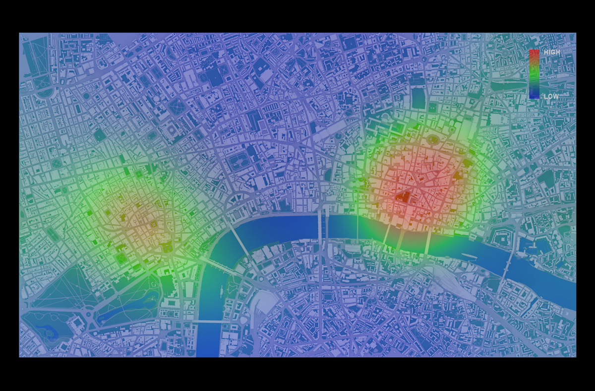
Mapping Protest in 3D with Twitter Data
As one part of my docotoral thesis, I have made the video that shows the relationship between ‘London End Austerity Now’ Protest on 20thJune 2015 and the Twitter acitivity on that day.
The latest outputs from researchers, alumni and friends at the UCL Centre for Advanced Spatial Analysis (CASA).
As one part of my docotoral thesis, I have made the video that shows the relationship between ‘London End Austerity Now’ Protest on 20thJune 2015 and the Twitter acitivity on that day.
As one part of my docotoral thesis, I have made the video that shows the relationship between ‘London End Austerity Now’ Protest on 20thJune 2015 and the Twitter acitivity on that day.The video gives you some details about the protest, the data and 3D …
Continue reading »![]() |
Image 1. The tweet density from 8am to 4pm on 20th June 2015, Central London
|
![]() |
Image 2. The density of Geo-Coded Tweets in the UK on 20th June, 2015 |
![]() |
Image 3. The plan view of Central London model
|
![]() |
Image 4. The perspective view of Central London model
|
![]() |
Image 5. The perspective view of Central London model (view from BT Tower)
|
![]() |
Image 6. The tweet density between 10am and 11am on 20th June 2015
|
![]() |
Image 7. The tweet density between 12pm and 1pm on 20th June 2015
|
![]() |
Image 8. The tweet density from 12am to 12pm
|
![]() |
Image 9. The tweet density from 12pm to Midnight
|
![]() |
Image 10. The tweet density in 3d between 10am and 11am on 20th June 2015
|
![]() |
Image 11. The tweet density in 3d between 12pm and 1pm on 20th June 2015
|
![]() |
Image 12. The tweet density in 3d from 12am to 8pm
|
![]() |
Image 13. The tweet density in 3d from 8am to 4pm
|
![]() |
Image 14. The tweet density from 4pm to Midnight
|
[3] Nicolas Belmonte, #interactive/Andes, http://twitter.github.io/interactive/andes/ (Strived on 15th August 2015)
[4] Andy Hudson-Smith, London’s Twitter Island – From ArcGIS to Max to Lumion, http://www.digitalurban.org/2012/01/londons-twitter-island-from-arcgis-to.html#comment-7314
(Strived on 15thAugust 2015)
![]() |
Image 1. The tweet density from 8am to 4pm on 20th June 2015, Central London
|
![]() |
Image 2. The density of Geo-Coded Tweets in the UK on 20th June, 2015 |
![]() |
Image 3. The plan view of Central London model
|
![]() |
Image 4. The perspective view of Central London model
|
![]() |
Image 5. The perspective view of Central London model (view from BT Tower)
|
![]() |
Image 6. The tweet density between 10am and 11am on 20th June 2015
|
![]() |
Image 7. The tweet density between 12pm and 1pm on 20th June 2015
|
![]() |
Image 8. The tweet density from 12am to 12pm
|
![]() |
Image 9. The tweet density from 12pm to Midnight
|
![]() |
Image 10. The tweet density in 3d between 10am and 11am on 20th June 2015
|
![]() |
Image 11. The tweet density in 3d between 12pm and 1pm on 20th June 2015
|
![]() |
Image 12. The tweet density in 3d from 12am to 8pm
|
![]() |
Image 13. The tweet density in 3d from 8am to 4pm
|
![]() |
Image 14. The tweet density from 4pm to Midnight
|
[3] Nicolas Belmonte, #interactive/Andes, http://twitter.github.io/interactive/andes/ (Strived on 15th August 2015)
[4] Andy Hudson-Smith, London’s Twitter Island – From ArcGIS to Max to Lumion, http://www.digitalurban.org/2012/01/londons-twitter-island-from-arcgis-to.html#comment-7314
(Strived on 15thAugust 2015)
Image 1. The tweet density from 8am to 4pm on 20th June 2015, Central London Twitter Mapping is increasingly useful method to link virtual activities and geographical space. Geo-tagged data attached to tweets containing the users’ location where the…
Continue reading »More and more I stumble across really cool datasets onl […]
Continue reading »The MRes course I direct, the ASAV (Advanced Spatial Analysis and Visualisation) has undergone some changes and emerged, butterfly-like, as the MRes in Spatial Data Science and Visualisation. Ta-da! The first thing to say is that the visualisation component is … Continue reading →
Building on yesterday’s post about my London affordability maps, here are the equivalent maps for the Manchester area (sorry Liverpool, I’ll get there!) from 1997 and 2012. It’s obviously a very different picture in terms of price, volume and distribution; these … Continue reading →
Continue reading »Last night I discovered how many of my friends watch C4’s Dispatches since quite a few of them texted me to say that they had seen me talking about property affordability on “The Great British Property Divide”. However, since Dispatches has to … Continue reading →
Continue reading »There have been many great interactive maps and graphic […]
Continue reading »One of the known problems with choropleth maps is that small zones, even if they contain very significant values, tend to get lost in amongst much larger zones. A current example is that the ridings in London are much smaller … Continue reading →
Continue reading »We’ve mentioned Google’s excellent aerial i […]
Continue reading »Last year I published the above graphic, which then got […]
Continue reading »I enjoy burgers and have a passion for maps and […]
Continue reading »This animation from Will Gallia shows over 500,000 indi […]
Continue reading »I am moving house soon so I want to get as many of my r […]
Continue reading »Household energy use is a key indicator for understanding urban sustainability and fuel poverty, and is a timely topic now that winter has arrived. The LuminoCity3D site maps domestic energy use in England and Wales at 1km2 scale using data from DECC. This map has also just been published as a featured graphic in Regional Studies Regional Science.…
This is a slightly edited cross post from Oliver O̵ […]
Continue reading »This has been cross-posted from a guest blog post I wro […]
Continue reading »We’d thought we’d put together a list of ou […]
Continue reading »This is one of the best 3D visualisations of a large sp […]
Continue reading »When I start an R class, one of my opening lines is nea […]
Continue reading »Back in June Oliver O’Brien and I launched an int […]
Continue reading »I am pleased announce that London: The Information Capi […]
Continue reading »A model of the global economy is, by its very nature, an unwieldy object to work with. There are 40 countries (we want more; that’s coming next) and the economy of each country is described by the economic activity of 35 sectors. Each sector in each country interacts with each other sector in each other […]
Continue reading »The algorithms required to build virtual worlds like Google Earth and World Wind are really fascinating, but building a virtual world containing real-time city data is something that hasn’t yet been fully explored. Following on from the Smart Cities presentation in Oxford two weeks ago, I’ve taken the agent-based London Underground simulation and made some …
Read more →
Today the Office for National Statistics released the l […]
Continue reading »Today the Office for National Statistics released the l […]
Continue reading »Google yesterday released their 3D map for much of inne […]
Continue reading »The Foursquare social network has always been very focu […]
Continue reading »As you can see from the image below, we spent three days at the NCRM Research Methods Festival in Oxford (#RMF14) last week. In addition to our presentations in the “Researching the City” session on the Wednesday morning, we were also running a Smart Cities exhibition throughout the festival showcasing how the research has been …
Read more →
UK cities have been undergoing significant change over the last decade, and the 2011 census data provides a great basis for tracking current urban structure. I’ve mapped population and employment density for all of England and Wales in 2011, using a 1km2 grid scale approach- The main themes that emerge are the dramatic intensification of London, high … Continue reading →
The MRes group visualisation projects are complete, and as predicted, rather impressive. This year the theme was “The Active City”, and students took this and ran with it in a variety of ways, whether viewing the activity of mobility-impaired users … Continue reading →
Last October I was fortunate enough to be awarded an ES […]
Continue reading »Last October I was fortunate enough to be awarded an ES […]
Continue reading »Anyone who’s done any work in the vicinity of network science or, more specifically, seen social scientists attempting network science, will have seen plenty of images such as this: Taken from Fagiolo and Mastrorillo (2013) or this: Taken from Adamic and Glance (2005) which add little scientific input, but merely dazzle the reader with the […]
Continue reading »Disabled Freedom Pass Card journeys on the London Underground from Gareth Simons on Vimeo.
This…
Continue reading »Disabled Freedom Pass Card journeys on the London Underground from Gareth Simons on Vimeo.
This…
Continue reading »