Applied Urban Modelling 2012
CASA researchers were out in force at the AUM 2012 meeting in Cambridge last week,…
Continue reading »The latest outputs from researchers, alumni and friends at the UCL Centre for Advanced Spatial Analysis (CASA).

CASA researchers were out in force at the AUM 2012 meeting in Cambridge last week,…
Continue reading »When creating agent-based models, one question is how many agents to include and where are they located. Often we create synthetic individuals or households based on census data however, this can be a rather time consuming task. So a recent proje…
Continue reading »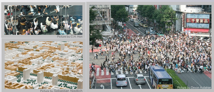
To quote from the call for papers:
In this workshop, we intend to address specific methodological and technological issues raised by the deployment of agents in rich environments such as virtual cities. We will welcome contributions tackling issues related to reactive agents, cognitive architectures, the capacity to scale up to handle thousands or hundreds of thousands of agents, the ability to simulate realistic group behaviors which might be judged non rational, etc., all in the context of urban agents. We will also welcome contributions showcasing original applications of agent and multi-agent technologies within urban simulations, be it for design, planning, education, training, or entertainment.
Workshop Chairs:
Important Dates:
Submission information:
Robin of geotheory.org and a student on our MRes in Advanced Spatial Analysis and Visualisation course here at CASA, University College London has created an interesting movie looking at data from openflights.org.
Created in Processing the c…
Continue reading »This year, and for the first time, the SLACTIONS Steering Committee has included a day devoted to Machinima in the conference program. The SLACTIONS 2012 Machinima Festival is a Machinima competition included on the SLACTIONS 2012 Research conference o…
Continue reading »Electronic Arts has released 4 short clips examining the simulation capability of the GlassBox Game Engine behind the forthcoming SimCity update.
Image: Traffic Density in the original SimCity release.
The mix of agent based modelling, e…
Continue reading »There is a surprisingly difficult task to solve with MySQL queries, which I’ve been spending some time trying to do – the Groupwise Maximum problem. This is the name for the type of query that I was trying, although in … Continue reading →
Continue reading »At night or in bad weather, elite military and security professionals are reliant on technology to find potential threats. Infrared and video cameras can not get enough pixels on target to cover wide areas. But radar coupled with a PTZ camera and you h…
Continue reading »Infographics are everywhere and a lot of development both in therms of technology and style has gone into the representation of information in the last few years. It is however an old topic and through out the past century aspects of graphics, design a…
Continue reading »The Gestalt Theory (Detailed article in the German Wikipedia) was developed in the early 20s of the last century or Tufte (earlier on urbanTick) wrote his much influential books in the 80s and 90s to name two.

Image taken from the189.com / Informotion project by Bryan Ku docuemnting the final game in the 122nd edition of the Wimbeldon Championship Men’s Final between tennis giants Rafael Nadal and Roger Federer. See the animated version HERE.
The reason for some more recent development in information design and especially and especially handling is connected to technological and practical changes, but also the increased availability of raw data and details to be turned into information graphics.
Often however the subject to the data is temporal or process based with need for background or lead in, change of place or frequent change of perspective. For these cases animated inforgraphics can be a great way to communicate knowledge. Besides who doesn’t like to look at motion pictures? It really fits in with the whole TV consuming sort of urban lifestyle.
Its pretty save to say, that for the first time the book Informotion: Animated Infographics by Gestalten bring together a selection of the best motion picture graphics communicating knowledge. All of the examples are very recent projects and most can be found on either vimeo or youtube of course. However the interesting bit on the book is the context the examples are being put in. The editors Tim Finke and Sebastian Manger put great emphasis on contextual details in a wider sense. Where publications like the recent Taschen Infographics are a mere selection of great examples the Informotion book includes the theoretical and practical aspects too.
This of course makes the book heavier to read, it’s also but not only to look at, but you get a lot more out of it for your practice. Besides inspiration the book provides a refresh and update on the graphic, visual and design theories as well as the technical details of animation production such as software, storyboards or size, resolution or format.

Image taken from binalogue.com / Images showing the page spread design. The example shown here is an animated infographic by binalogue showing the CANAL Isabel II water cycle. See video below for the original animation.
There is also one of the aNCL (animated New City Landscape) informmotion graphics included as anexample in the book (p.188-189). It is the animation produced in collaboration between urbanTick and Anders Johansson on the Twitter landscape in the area arond the city of Zuerich in Switzerland. The original post on the animation can be found here, the animation is below.
Of course there is something awkward about a printed book about animated examples. However the content lives up to the expectations and whilst the animations can not be shown in the book the story can still be told. Even more so that the examples are discussed in detail and help to illustrate the theoretical elements of the book. In this sense there is literally more to the book than just the pictures and lines of text there is actual information in there plus Gestalten have a website where readers can get additional info and links to the animations. The list of examples can be found HERE.

Image taken from Gestalten / Book cover.
Finke, T. & Manger, S. eds., 2012. Informotion: Animated Infographics, Berlin: Gestalten.
The Gestalt Theory (Detailed article in the German Wikipedia) was developed in the early 20s of the last century or Tufte (earlier on urbanTick) wrote his much influential books in the 80s and 90s to name two.
Image taken from the189.com / Informotion project by Bryan Ku docuemnting the final game in the 122nd edition of the Wimbeldon Championship Men’s Final between tennis giants Rafael Nadal and Roger Federer. See the animated version HERE.
The reason for some more recent development in information design and especially and especially handling is connected to technological and practical changes, but also the increased availability of raw data and details to be turned into information graphics.
Often however the subject to the data is temporal or process based with need for background or lead in, change of place or frequent change of perspective. For these cases animated inforgraphics can be a great way to communicate knowledge. Besides who doesn’t like to look at motion pictures? It really fits in with the whole TV consuming sort of urban lifestyle.
Its pretty save to say, that for the first time the book Informotion: Animated Infographics by Gestalten bring together a selection of the best motion picture graphics communicating knowledge. All of the examples are very recent projects and most can be found on either vimeo or youtube of course. However the interesting bit on the book is the context the examples are being put in. The editors Tim Finke and Sebastian Manger put great emphasis on contextual details in a wider sense. Where publications like the recent Taschen Infographics are a mere selection of great examples the Informotion book includes the theoretical and practical aspects too.
This of course makes the book heavier to read, it’s also but not only to look at, but you get a lot more out of it for your practice. Besides inspiration the book provides a refresh and update on the graphic, visual and design theories as well as the technical details of animation production such as software, storyboards or size, resolution or format.
Image taken from binalogue.com / Images showing the page spread design. The example shown here is an animated infographic by binalogue showing the CANAL Isabel II water cycle. See video below for the original animation.
There is also one of the aNCL (animated New City Landscape) informmotion graphics included as anexample in the book (p.188-189). It is the animation produced in collaboration between urbanTick and Anders Johansson on the Twitter landscape in the area arond the city of Zuerich in Switzerland. The original post on the animation can be found here, the animation is below.
Of course there is something awkward about a printed book about animated examples. However the content lives up to the expectations and whilst the animations can not be shown in the book the story can still be told. Even more so that the examples are discussed in detail and help to illustrate the theoretical elements of the book. In this sense there is literally more to the book than just the pictures and lines of text there is actual information in there plus Gestalten have a website where readers can get additional info and links to the animations. The list of examples can be found HERE.
Image taken from Gestalten / Book cover.
Finke, T. & Manger, S. eds., 2012. Informotion: Animated Infographics, Berlin: Gestalten.
As cities expand with multiple centres spread over massive regional hinterlands, the need to better…
Continue reading »Minecraft is a sandbox construction game involving players creating and destroying various types of blocks in a three dimensional environment. The player takes an avatar that can destroy or create blocks, forming fantastic structures, creations and art…
Continue reading »We like GIS here at digitalurban but obviously not as much as @josephkerski who has written a song all about his love for all things GIS:
Slightly (actually more than slightly) lost for words, but we applaud the enthusiasm….
Continue reading »The 3D-GIS in the Cloud App for iPad and Smartphones allows city data to be navigated in 3D. Mixing augmented reality and 3D visualisations the App extends the reach of GIS beyond the office and allows organisations to mak…
Continue reading »On our MRes in Advanced Spatial Analysis and Visualisation we are currently focused on Lumion and Unity for rapid urban or data visualisation. Yet our eyes are turning towards the possibilities offered by the CryEngine 3. With a 2013 release …
Continue reading »Regular readers will know that we have a bit of a ‘thing’ for the interiors of churches/chapels, timelapse imagery and high dynamic range photography, as such the movie below is one of our favourites:
The Chapel is a …
Continue reading »Below is a 3-minute journey through the last 250 years of our history, from the start of the Industrial Revolution to the Rio+20 Summit. The film charts the growth of humanity into a global force on an equivalent scale to major geological processes.
p…
Continue reading »the 3-way marriage between Lumion, Cityengine and Sketchup (or other 3d modelling software)is a powerful one. I think it benefits from the same things: the ease and speed to create beautiful things. A pity there aren’t many cga rulefiles available to use, I see you’re still using the 2010 standard template as are many people. The emphasis is too much on possibilities of the program and integration with other software instead of creating real usable content. Creating a rulefile yourself is imo still too hard.
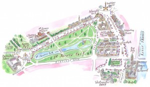
Continue reading »A major new exhibition on mapping the London Undergroun […]
Continue reading »This is me playing a song about bike data at a recent conference in Germany; I’m a songwriter, and a scientist, but I’m certainly not very young. During “I’m a Scientist, get me out of here” earlier this year, school-age … Continue reading →![]()
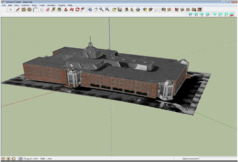 |
| Model of Johnson Center taken from Google SketchUp 3D Warehouse |
 |
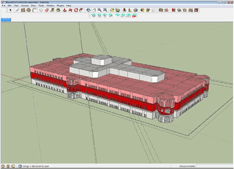
| Constructing a vector-based model of the Johnson Center internal structure |
 |
|
The SketchLife final rendering of the Johnson Center
|
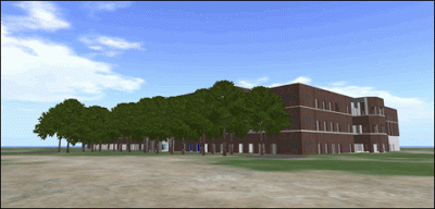 |
| External view “in world” of what we accomplished in building the Johnson Center |
 |
| An “in world” shot at ground level, on the 1st floor, viewing the atrium and clock tower in the Johnson Center |
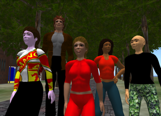 |
| CSS class photo “in-world” |
|
| Model of Johnson Center taken from Google SketchUp 3D Warehouse |
|
| Constructing a vector-based model of the Johnson Center internal structure |
|
|
The SketchLife final rendering of the Johnson Center
|
|
| External view “in world” of what we accomplished in building the Johnson Center |
|
| An “in world” shot at ground level, on the 1st floor, viewing the atrium and clock tower in the Johnson Center |
|
| CSS class photo “in-world” |
Now this is just excellent – it’s a roll of […]
Continue reading »This comment has been removed by a blog administrator.
Continue reading »An interesting movie is currently trending visualising the last thousand years of European history and conflict. Europe resembles a large game of Risk or Civilization. Such games typically end with a single large empire, whilst the dynamics of European history show the larger empires forming only fleetingly, soon to be dissolved by the re-emergence of […]
Continue reading »TweetRural areas are often viewed as isolated and stagnating areas and urban areas as their opposites. Against such a backdrop, this book seeks to unveil a set of dynamics that view rural areas as ‘translocal’ in the sense that they are ‘changing’ and ‘interconnected’. Social transformations take place in rural areas as the result of […]
Continue reading »Tweet“New Frontiers Groups (NFG)” (Austrian Academy of Sciences) The NFG programme aims at investigator driven innovative research in order to promote promising academic careers. Applicants must hold a doctoral degree which was conferred no more than 7 years prior to the submission deadline (15thJuly) and have the ability to lead an independent research group. Candidates with […]
Continue reading »QRator, the Museum focused ‘Internet of Things/Smart Places’ project developed jointly with us here at the Centre for Advanced Spatial Analysis, UCL Digital Humanities and UCL Museums, with funding from the UCL Public Engagement Unit , has won The Museums & Heritage Award for Innovation. Known as ‘The Oscars’ of the…
QRator, the Museum focused ‘Internet of Things/Smart Places’ project developed jointly with us here at the Centre for Advanced Spatial Analysis, UCL Digital Humanities and UCL Museums, with funding from the UCL Public Engagement Unit , has w…
Continue reading »Today our paper about the evolution of world city subway networks is published online in the Journal of the Royal Society Interface. We compare a dozen subway networks around the world in large cities using various graph theoretic network measures. … Continue reading →
Continue reading »Cities have always been the great spaces of commerce, trade and advertising; and recent decades…
Continue reading »Everybody needs to eat. Eating and sleeping are two of the very fundamental repetitive necessities of life. There is no going without it for longer periods of time. Food needs to be accessible on a regular basis continuously. This is as such already a …
Continue reading »Everybody needs to eat. Eating and sleeping are two of the very fundamental repetitive necessities of life. There is no going without it for longer periods of time. Food needs to be accessible on a regular basis continuously. This is as such already a …
Continue reading »Nice work guys. <br />this stuff looks nice. But real urban design, civil engineering, statutory and strategic planning work requires focus at the human scale. Humans are what it is all about. <br />The Urban Engine is all about getting down to street level user experience – cars, bikes and people – because that is where we live. <br />Feel free to contact us via www.u-c.com.au to have a go any time. We will send you a link.<br />We love City Engine, SketchUp and Max too – and it all fits into the same workflow. However, we tend to take real data from GIS / LIDAR / survey / CAD design and push that through as a context (via FBX) then start importing revitt / max / sketchup proposals into this base. This is what the Victorian Government now use on a daily basis in house for development assessment. We have also built a “2.5D” building volumetric tool to allow real simple forms to be made in about 12 seconds (easier than sketchup) – to be used live in meetings.<br />Cheers.<br />Dr Ben Guy
Continue reading »Taschen’s Information Graphics book is the most compreh […]
Continue reading »