Tweets vs Flickr Photos – Eric Fischer’s City Maps
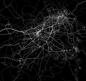
Eric Fischer produced this interesting data map of Lond […]
Continue reading »The latest outputs from researchers, alumni and friends at the UCL Centre for Advanced Spatial Analysis (CASA).

Eric Fischer produced this interesting data map of Lond […]
Continue reading »Finding ways to effectively map population data is a big issue in spatial data visualization. The standard practice uses choropleth maps that simply colour administrative units based on the combined characteristics of the people that live there (see below). These maps are popular with cartographers for a couple of reasons. You get a clear sense that the …
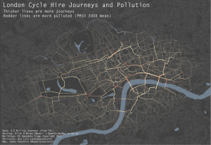
Continue reading »As a cyclist in London you can do your best to avoid left turning buses and dozy pedestrians. One thing you can’t really avoid though is pollution (although I accept cyclists probably aren’t much worse off than pedestrians and drivers in this respect). To illustrate this I have taken data for 3.2 million journeys from …
Continue reading »James previously featured a tube map made up of just na […]
Continue reading »I am giving a presentation to the MRes course at CASA, UCL today. There are two part to this lecture. The first part is covering the PhD research with a focus on the city and an overview of the methods of investigation that have been used. It is organi…
Continue reading »I am giving a presentation to the MRes course at CASA, UCL today. There are two part to this lecture. The first part is covering the PhD research with a focus on the city and an overview of the methods of investigation that have been used. It is organi…
Continue reading »In one of the more unusual invitations that I’ve received over the past few years, I was asked to speak about visualisation and open data at Transport Ticketing 2012, currently happening down in South Ken. Interestingly, in spite of …
Continue reading »Streetview Stereographic is a great website that takes Google Streetview pictures and turns them into stereographic images. These images look great, especially in urban environments and have previously taken a…
Continue reading »If I said a country was 1594719800 metres squared it would mean a lot less to you than if I said it was about the size of Greater London (so long as you know about how big Greater London is). For this reason the media tend to report the extent of a flood in …
Continue reading »Yesterday the government released data about the size of the central civil estate. The infographic shows this (green box) compared to well-known geographic features in Britain. The government press release stated that the data are a snapshot of the estate and shows that at 1 September 2011: the estate covered by this data is 16, 411, 676 …
Continue reading »I have been using R (a free statistics and graphics software package) now for the past four years or so and I have seen it become an increasingly powerful method of both analysing and visualising spatial data. Crucially, more and more people are writing accessible tutorials (see here) for beginners and intermediate users and the development …
Continue reading »One of the objectives of the COSMIC project is to “extend our current techniques of visualising complex spatial systems… [to] enable a wide range of stakeholders to be involved both in understanding such complexity and using it in policy analysis.” Normally, …
Continue reading »It would be a shame to end the year without a festive map! Jack Harrison (@jacksfeed) is studying for a research masters in “Advanced Spatial Analysis and Visualisation” at UCL. I teach on the course and it obviously hasn’t worked Jack hard enough this term as he has had time to slack off and produce …
Continue reading »Whilst social scientists approach cities from rational and technical perspectives, it’s often interesting to get…
Continue reading »NASA satellites are observing the wild fires around the world. From satellite images the occurrence and spreading of bush fires are clearly visible. In a summary of the fires over the last ten years The visualisations show fire observations made by the…
Continue reading »NASA satellites are observing the wild fires around the world. From satellite images the occurrence and spreading of bush fires are clearly visible. In a summary of the fires over the last ten years The visualisations show fire observations made by the…
Continue reading »As 2011 draws to a close it is worth reflecting on what, I think, has been a defining year for mapping and spatial analysis. Geographic data have become open, big, and widely available, leading to the production of new and interesting maps on an almost daily basis. The increasing utilisation of technology such as Google Fusion Tables has …
Continue reading »Project Geppetto from Autodesk attempts to make it it easy, fast, and fun to add crowds to 3ds Max scenes. It is part of Autodesk’s “People Power” concept, where the basic idea is to try to assemble all the components one needs to create, manage,…
Continue reading »Project Geppetto from Autodesk attempts to make it it easy, fast, and fun to add crowds to 3ds Max scenes. It is part of Autodesk’s “People Power” concept, where the basic idea is to try to assemble all the components one needs to create, manage,…
Continue reading »This is starting to become obsessive, but I can’t help wondering how many trains are running on the London Underground and where they all are. The Trackernet web service released by TfL allows you to see all the running boards for stations on a line, but doesn’t tell you where all the trains are. I did […]
Continue reading »Ever wondered why the suggestions on shopping websites such as amazon or ebay more often than not appeal to you? Most links are targeted and do related to recent activity linking activity and interest together. Amazon’s recommendations for products esp…
Continue reading »Ever wondered why the suggestions on shopping websites such as amazon or ebay more often than not appeal to you? Most links are targeted and do related to recent activity linking activity and interest together. Amazon’s recommendations for products esp…
Continue reading »Transport for London have just released their performance data (link here) for the London Underground network. It is in the form of a really detailed file that contains, amongst other things, the “Peak Operated Kilometres” and “Peak Passenger Journeys” for the past 6 years or so. If you total the distances covered by the Tube …
Continue reading »Mapping London Life is the title of the talk I gave at […]
Continue reading »The structure of large cities such as London is complex and endlessly fascinating. Effective visualisation…
Continue reading »This week I am giving a talk on some of the London maps that we produce in CASA. The hours of work I put in to such maps is minuscule compared to the amount of effort and time that the OpenStreetMap community have invested in producing a truly open (and often more accurate) map of London (and the …
Continue reading »In the previous three parts, I outlined the plan for getting geometry from MapTube via C Sharp into an FBX file using the C++ SDK provided by Autodesk. This final part shows data in a world map exported from MapTube and imported into 3DS Max. The above image shows the world countries 2010 outline from […]
Continue reading »Another day, another Twitter map- this time showing the global distribution of tweets that link to academic journal articles. I am always a bit skeptical of Twitter data (especially with location information) but as an academic seeking to publish in many of the journals that feature in people’s tweets I was prepared to make an …
Continue reading »In the first FBX exporter post I got to the point where the export of simple geometry from one of the Autodesk SDK examples could be loaded by the Quicktime plugin. This used the SDK as a multithreaded statically linked library which I used with one of the examples to create a plane object. The following […]
Continue reading »I’ve been looking at how to export the geographic information contained in a MapTube map into an art tool like 3DS Max or Maya. The reason for this is firstly to make it easier to produce high quality geographic presentations, but also, by employing a recognised art tool chain, we can also get the data […]
Continue reading »The spatial dimension of reading is an interesting aspect in so far as to how far it can actually become the main subject. A lot of narratives make extensive use of space and lace description and the location is often as important as the characters who…
Continue reading »I’ve been meaning to look at TfL’s Trackernet API for a while now. It works through a REST based web service which gives access to all the London Underground running boards on a line by line basis. You issue an http request of the form: http://cloud.tfl.gov.uk/TrackerNet/PredictionSummary/V and the result is an XML file containing train information for […]
Continue reading »This weekend from today the Alphaville Festival is under way providing a platform for digital media and art to be shown, discussed and explored across different venues in East London. It is the third year for this growing digital-media platform and thi…
Continue reading »