Eye on Earth (Day 2 – Morning) – moving to data supply

Eye on Earth (Day 2 – Morning) – moving to data supply The second day of Eye on Earth moved from data demand to supply . You can find my posts from day one, with the morning and the afternoon sessions. I have only partial notes on the plenary Data Revolution-data supply side, although I’ve posted separately the slides from … Continue reading Eye on Earth (Day 2 – Morning) – moving to data supply

Continue reading »

Eye on Earth Summit 2015 talk – Extreme Citizen Science – bridging local & global

Thanks to the organisers of the Eye on Earth Summit, I had an opportunity to share the current state of technological developments within the Extreme Citizen Science (ExCiteS) group with the audience of the summit: people who are interested in the way environmental information sharing can promote sustainability. The talk, for which the slides are … Continue reading Eye on Earth Summit 2015 talk – Extreme Citizen Science – bridging local & global

Continue reading »

Eye on Earth (Day 1 – afternoon) – policy making demand for data and knowledge for healthy living

The afternoon of the first day of Eye on Earth (see previous post for an opening ceremony and the morning sessions) had multiple tracks. I selected to attend Addressing policy making demand for data; dialogue between decision makers and providers The speakers were asked to address four points that address issues of data quality control and … Continue reading Eye on Earth (Day 1 – afternoon) – policy making demand for data and knowledge for healthy living

Continue reading »

Eye on Earth (Day 1 – afternoon)

The afternoon of the first day of Eye on Earth (see previous post for an opening ceremony and the morning sessions) had multiple tracks. I selected to attend Addressing policy making demand for data; dialogue between decision makers and providers The speakers were asked to address four points that address issues of data quality control and … Continue reading Eye on Earth (Day 1 – afternoon)

Continue reading »

Eye on Earth (day 1 – morning)

Four years after the first Eye on Earth Summit (see my reflections about the 2011 event here, and the Dublin meeting in 2013 here), the second summit is being held in Abu Dhabi. Eye on Earth is a meeting that is dedicated to the coordination of environmental information sharing at all scales so it can … Continue reading Eye on Earth (day 1 – morning)

Continue reading »

Eye on Earth (day 1 – morning) – opening and the need for data

Four years after the first Eye on Earth Summit (see my reflections about the 2011 event here, and the Dublin meeting in 2013 here), the second summit is being held in Abu Dhabi. Eye on Earth is a meeting that is dedicated to the coordination of environmental information sharing at all scales so it can … Continue reading Eye on Earth (day 1 – morning) – opening and the need for data

Continue reading »

New paper: The epistemology(s) of volunteered geographic information: a critique

Considering how long Reneé Sieber  (McGill University) and I know each other, and working in similar areas (participatory GIS, participatory geoweb, open data, socio-technical aspects of GIS, environmental information), I’m very pleased that a collaborative paper that we developed together is finally published. The paper ‘The epistemology(s) of volunteered geographic information: a critique‘ took some … Continue reading New paper: The epistemology(s) of volunteered geographic information: a critique

Continue reading »

Building Centre – from Mapping to Making

The London based Building Centre organised an evening event – from Mapping to Making –  which looked at the “radical evolution in the making and meaning of maps is influencing creative output. New approaches to data capture and integration – from drones to crowd-sourcing – suggest maps are changing their impact on our working life, … Continue reading Building Centre – from Mapping to Making

Continue reading »

Mapping London’s Twitter Activity in 3d

Image 1. The tweet density from 8am to 4pm on 20th June 2015, Central London


Twitter Mapping is increasingly useful method to link virtual activities and geographical space. Geo-tagged data attached to tweets containing the users’ location where they tweeted and it can visualise the locations of users on the map. Although the number of the geo-taggedtweets is a relatively small portion of all tweets, we can figure out the density, spatial patterns and other invisible relationships between online and offline.


Recently, studies with geo-tagged tweets have been developed to analyse the public response tospecific urban events, natural disasters and regional characteristics (Li et al., 2013) [1].  Furthermore, it is extending to traditional urban research topics, for example, revealing spatial segregation and inequality in cities (Shelton et al., 2015) [2].


Twitter mapping in 3D can augment 2d visualisation by providing built environment contexts and improved information. There are many examples of Twitter mapping in 3d such as A) #interactive/Andes [3] , B) London’s Twitter Island [4], C) Mapping London in real time, using Tweets [5]. A) and B) build up 3d mountains of the geo-tagged tweet on the map.  In the case of C), when the geo-tagged tweets are sent in the city, the heights of nearest buildings increase in the 3d model. These examples are creative and show different ways to view the integrated environments.

From a Networking City’s view, if we make a Twitter visualisation more tangible in a 3d urban model, it would help us to have a better understanding how urban environments are interconnected with the invisible media flow.


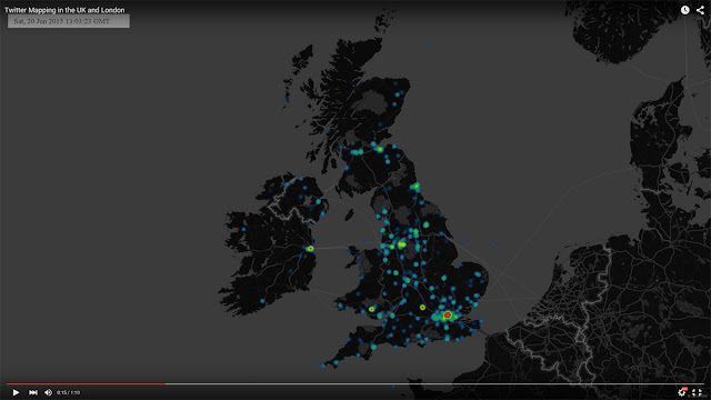
To make the visualisation, the Twitter data has been collected by using Big Data Toolkit developed by Steven Gray at CASA, UCL. All 53,750 geo-tagged tweets are collected on 20thJune, 2015 across the UK. As we can see from Table 1, the number of tweets was at the lowest point at 5am and reached to the highest point at 10pm with 3495 tweets. Moreover, Video 1 shows the location of the data in the UK and London on that day in real time.


Table 1. The Number of Geo-Coded Tweets in the UK on 20th June, 2015


https://www.youtube.com/watch?v=dg-2VlVfFaM


Video 1. The location of Geo-Coded Tweets in the UK on 20th June, 2015


When we calculate the density of the data, London, particularly Central London, contains the largest number of the tweets. (Image 2)


Image 2. The density of Geo-Coded Tweets in the UK on 20th June, 2015

In order to focus on the high density data, 6 km x 3.5 km area of Central London is chosen for the 3d model. Buildings, bridges, roads and other natural environments of the part of London have been set in the model based on OS Building Heights data[6]. Some Google 3d warehouse buildings are added to represent important landmark buildings like St.Pauls, London Eye and Tower Bridge as you can see from Image 3, Image 4 and Image 5.


Image 3. The plan view of Central London model

Image 4. The perspective view of Central London model

Image 5. The perspective view of Central London model (view from BT Tower)

The geo-tagged data set is divided into one hour periodsand distributed on the map to identify the tweet density in the area. Through this process, we can see how the density is changing depending on the time period. For example, the tweets are mainly concentrated around Piccadilly Circus and Trafalgar Square between 10am and 11am, but  there are two high-density areas between 12pm and 1pm (See Image 6, Image 7, Image 8 and Image 9)

Image 6. The tweet density between 10am and 11am on 20th June 2015

Image 7. The tweet density between 12pm and 1pm on 20th June 2015

Image 8. The tweet density from 12am to 12pm

Image 9. The tweet density from 12pm to Midnight


As we’ve seen above, the 2d mapping is useful to understand the relative density in one period such as which area is high and which area is low between 12pm and 1pm. However, we cannot understand the degree of intensity in the highest peak areas. It is believed that 3d mapping is needed at this stage. We can clearly see the density of the tweet data in each periodand the intensity of the tweet density across the time periods from Image 10 to Image 14.

West End area shows high density throughout the whole day but City area shows the peak only during lunch time. This pattern likely relates to the activities of office workers in City and leisure/tourist in West End.

Image 10. The tweet density in 3d between 10am and 11am on 20th June 2015

Image 11. The tweet density in 3d between 12pm and 1pm on 20th June 2015


Image 12. The tweet density in 3d from 12am to 8pm

Image 13. The tweet density in 3d from 8am to 4pm

Image 14. The tweet density from 4pm to Midnight


 ________________________________________

[1] Linna Li , Michael F. Goodchild & Bo Xu (2013) Spatial, temporal, and socioeconomic patterns in the use of Twitter and Flickr, Cartography and Geographic Information Science, 40:2, 61-77


[2] Taylor Shelton, Ate Poorthuis & Matthew Zook (2015) Social Media and the City: Rethinking Urban Socio-Spatial Inequality Using User-Generated Geographic Information, Landscape and Urban Planning (Forthcoming), http://papers.ssrn.com/abstract=2571757


[3] Nicolas Belmonte, #interactive/Andes,   http://twitter.github.io/interactive/andes/  (Strived on 15th August 2015)


[4] Andy Hudson-Smith, London’s Twitter Island – From ArcGIS to Max to Lumion, http://www.digitalurban.org/2012/01/londons-twitter-island-from-arcgis-to.html#comment-7314


(Strived on 15thAugust 2015)

 
[5] Stephan Hugel and Flora Roumpani, Mapping London in real time, using Tweets, https://www.youtube.com/watch?feature=player_embedded&v=3fk_qxGZWFQ (Strived on 15th August 2015)

[6] OS Building Heights-Digimap Home Page  http://digimap.edina.ac.uk/webhelp/os/data_information/os_products/os_building_heights.htm  (Strived on 15th August 2015)


Continue reading »

Mapping London’s Twitter Activity in 3d

Image 1. The tweet density from 8am to 4pm on 20th June 2015, Central London Twitter Mapping is increasingly useful method to link virtual activities and geographical space. Geo-tagged data attached to tweets containing the users’ location where the…

Continue reading »

Data and the City workshop (day 2)

The second day of the Data and City Workshop (here are the notes from day 1) started with the session Data Models and the City. Pouria Amirian started with Service Oriented Design and Polyglot Binding for Efficient Sharing and Analysing of Data in Cities. The starting point is that management of the city need data, and therefore … Continue reading Data and the City workshop (day 2)

Continue reading »

Esri survey123 tool – rapid prototyping geographical citizen science tool

There are several applications that allow creating forms rapidly – such as Open Data Kit (ODK) or EpiCollect. Now, there is another offering from Esri, in the form of Survey123 app – which is explained in the video below. Survey123 is integrated into ArcGIS Online, so you need an ArcGIS account to use it (you … Continue reading Esri survey123 tool – rapid prototyping geographical citizen science tool

Continue reading »

Call for papers – special issue of the Cartographic Journal on Participatory GIS

Call for papers on a special issue on past, present and future of Participatory GIS and Public Participation in GIS. In the 1990s, participatory GIS (PGIS) and Public Participation GIS (PPGIS) emerged as an approach and tool to make geospatial technologies more relevant and accessible to marginalized groups. The goal has been to integrate the qualitative … Continue reading Call for papers – special issue of the Cartographic Journal on Participatory GIS

Continue reading »

COST Energic Summer School on VGI and Citizen Science in Malta

COST Energic organised a second summer school that is dedicated to Volunteered Geographic Information (VGI) and citizen science. This time, the school was run by the Institute for Climate Change & Sustainable Development of the University of Malta. with almost 40 participants from across Europe and beyond (Brazil, New Zealand), and, of course, participants from … Continue reading COST Energic Summer School on VGI and Citizen Science in Malta

Continue reading »

COST ENERGIC meeting – Tallinn 21-22 May

The COST Energic network is progressing in its 3rd year. The previous post showed one output from the action – a video that describe the links between volunteered geographic information and indigenous knowledge. The people who came to the meeting represent the variety of interest in crwodsourced geographic information, from people with background in Geography, … Continue reading COST ENERGIC meeting – Tallinn 21-22 May

Continue reading »

VGI and indigenous knowledge – COST Energic Video

The COST Energic network has been running now for 3 years, and one of the outputs from the network is the video below, which explore a very valuable form of Volunteered Geographic Information (VGI). This is information that is coming from participatory projects between researchers and indigenous communities, and this short film provide examples from Bolivia, British Columbia, … Continue reading VGI and indigenous knowledge – COST Energic Video

Continue reading »

AAG 2015 – day 4 notes – Citizen Science & OpenStreetMap Studies

The last day of AAG 2015 is about citizen science and OpenStreetMap studies. The session Beyond motivation? Understanding enthusiasm in citizen science and volunteered geographic information was organised together with Hilary Geoghegan. We were interest to ‘explore and debate current research and practice moving beyond motivation, to consider the associated enthusiasm, materials and meanings of participating in citizen … Continue reading AAG 2015 – day 4 notes – Citizen Science & OpenStreetMap Studies

Continue reading »

AAG 2015 notes – day 3 – Civic Technology, Citizen Science, Crowdsourcing and mapping

The sessions today covered Civic technology, citizen science, and the new directions in mapping – Open Source/Crowdsourcing/Big Data First, Civic technology: governance, equity and inclusion considerations, with Pamela Robinson – Ryerson University (Chair) and Peter A. Johnson – University of Waterloo, Teresa Scassa – University of Ottawa and Jon Corbett – University of British Columbia-Okanagan. The Discussant is Betsy Donald – … Continue reading AAG 2015 notes – day 3 – Civic Technology, Citizen Science, Crowdsourcing and mapping

Continue reading »

AAG 2015 notes – day 2 – Public Participation GIS symposium

The second day was dedicated to reflections on Public Participation GIS or Participatory GIS. The day was organised by Rina Ghose and Bandana Karr with some comments from Renee Sieber and me at some stage. It turned out to be an excellent symposium. The following are my notes from the different talks during the day. Jon … Continue reading AAG 2015 notes – day 2 – Public Participation GIS symposium

Continue reading »

AAG 2015 notes – day 1

At 8:00 I’ve attended the Digital Connectivity, Inclusion, and Inequality at the World’s Economic Peripheries  session asking ‘what difference people expect better connectivity to make at the world’s economic peripheries’. I took notes from the presentations of Nancy Ettlinger, Dorothea Kleine and Lisa Poggiali. Nancy Ettlinger analysed crwodsourcing from governance perspective – using Foucauldian analysis. She looks at … Continue reading AAG 2015 notes – day 1

Continue reading »

GISRUK 2015 papers: participatory mapping in Nairobi and mobile apps for Earthquake and Fire

The GIS Research UK conferences (GISRUK) are the annual gathering of the GIScience research community in the UK. While I have missed the last two (including the current one in Leeds), I have contributed to two papers that are presented in the conference. The first, ‘Participatory mapping for transformation: multiple visual representation of foodscapes and environment … Continue reading GISRUK 2015 papers: participatory mapping in Nairobi and mobile apps for Earthquake and Fire

Continue reading »

New paper: Footprints in the sky – using student track logs in Google Earth to enhance learning

In 2011-2012, together with Richard Treves, I was awarded a Google Faculty Research Award, and we were lucky to work with Paolo Battino for about a year, exploring how to use Google Earth tours for educational aims. The details of the projects and some reports from the project are available on Richard’s blog, who was leading … Continue reading New paper: Footprints in the sky – using student track logs in Google Earth to enhance learning

Continue reading »

AAG sessions – Critical GIScience, GeoWeb and Citizen Science

The Association of American Geographers conference is just around the corner – between 21 and 24 April, held in Chicago. I’ve already marked some sessions that I think worth noting (and was involved in the organisation of several sessions, too). Here is a list of interesting sessions, following suggestion to do so by David O’Sullivan and … Continue reading AAG sessions – Critical GIScience, GeoWeb and Citizen Science

Continue reading »

UCGIS webinar [Geographic information | Citizen] Science: reciprocal opportunities

At the request of Diana Sinton, the Executive Director of the University Consortium for Geographic Information Science (UCGIS), I gave the seminar talk about the linkage between Geographic Information Science and Citizen Science. A detailed description of the talk and the slides are available here. The webinar announcement is at http://ucgis.org/ucgis-webinars/geographic-information-citizen-science-reciprocal-opportunities. The webinar was recorded, so … Continue reading UCGIS webinar [Geographic information | Citizen] Science: reciprocal opportunities

Continue reading »

OpenStreetMap in GIScience – Experiences, Research, and Applications

A new book out about OpenStreetMap and Geographic Information Science. The book, which was edited by Jamal Jokar Arsanjani, Alexander Zipf, Peter Mooney, Marco Helbich  is “OpenStreetMap in GISciene : Experiences, Research, and applications” contains 16 chapters on different aspects of OpenStreetMap in GIScience including 1) Data Management and Quality, 2) Social Context, 3) Network Modeling and … Continue reading OpenStreetMap in GIScience – Experiences, Research, and Applications

Continue reading »
1 4 5 6 7 8 11