London 3D Augmented Reality Map
CASA hosted a very successful Smart Cities event last Friday, including presentations from Carlo Ratti,…
Continue reading »The latest outputs from researchers, alumni and friends at the UCL Centre for Advanced Spatial Analysis (CASA).
CASA hosted a very successful Smart Cities event last Friday, including presentations from Carlo Ratti,…
Continue reading »Last year Eric Fischer produced a great map (see below) visualising the language communities of Twitter. The map, perhaps unsurprisingly, closely matches the geographic extents of the world’s major linguistic groups. On seeing these broad patterns I wondered how well they applied to the international communities living in London. The graphic above shows the spatial …
Continue reading »[Updated x2] Just a note to say that I will be presenting some of my work, at the CASA Smart Cities free one-day conference. Over 200 tickets have already gone, but there are, at the time of writing, a few … Continue reading →
Continue reading »I took a very pleasant urban ramble on Saturday, from Greenwich, east along the river and past the Thames Flood Barrier, under the Woolwich Foot Tunnel and then back west to Wapping (with a DLR trip through some of the … Continue reading →
The Barclays Cycle Hire bikesharing system (map) in London is due for a major expansion on 8 March. Overnight on the 7th, operators will be working flat out to add 2300 1700 1900 new bikes into 4800 3000 3400 new … Continue reading →
Continue reading »I presented at the CASA Seminar Series yesterday on the topic of business centre specialisation…
Continue reading »I’ve created a new visualisation, a dasymetric map of housing demographics which you can see here, which attempts to improve on the common thematic (a.k.a. choropleth) maps – a traditional example is shown below – where areas across the country … Continue reading →
Continue reading »Creating a new Output Area Classification.
Chris Gale, UCL Department of Geography.
To download a PDF of the seminar please click here.
To download a PowerPoint Slide Show of the seminar please click here.
Abstract.
The current Output Area Classif…
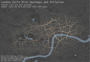
As a cyclist in London you can do your best to avoid left turning buses and dozy pedestrians. One thing you can’t really avoid though is pollution (although I accept cyclists probably aren’t much worse off than pedestrians and drivers in this respect). To illustrate this I have taken data for 3.2 million journeys from …
Continue reading »The above map (and this one) was produced using R and ggplot2 and serve to demonstrate just how sophisticated R visualisations can be. We are used to seeing similar maps produced with conventional GIS platforms or software such as Processing but I hadn’t yet seen one from the R community (feel free to suggest some …
Continue reading »Transport for London (TfL) take their colours extremely seriously – the London Underground, in particularly, uses colour extensively to brand each line, and the maps and liveries are very well known. The organisation has a colour guide to ensure that, … Continue reading →
Continue reading »GIS solutions for London’s Crossrail. Wayne Marsh, Crossrail. Abstract. Crossrail is the largest civil engineering project in Europe and the largest single addition to the London transport network in over 50 years. It has been designed to provide a new railway network for London and the South East and carry 200 million passengers a year. Within Crossrail, GIS is being used through the entire lifecycle of the project, including design, construction and maintenance, integrating and joining up data such as BIM and Asset Registries. At the heart of the GIS solution is an Oracle Spatial 11g server acting as the master repository and spatial analysis tool, glueing the information together. This talk will discuss how Crossrail arrived at this solution, how it is currently being used and how we plan to enhance it in the future. To download a PDF of the seminar please click here. In addition, here are some facts about Crossrail that @oobr tweeted during the seminar: – Crossrail is so vast that has its own coordinate reference system – London Survey Grid. British National Grid was not accurate enough. – Crossrail route has to weave through not just existing tube lines but also the post office […]
Continue reading »In one of the more unusual invitations that I’ve received over the past few years, I was asked to speak about visualisation and open data at Transport Ticketing 2012, currently happening down in South Ken. Interestingly, in spite of …
Continue reading »In a previous post I talked about the Index of Multiple Deprivation (IMD) in London, and how a “standard” representation only reflects the geographical reality of the land. By utilising a cartogram tool this potential issue can be overcome by rescaling each areal unit by its resident population, for the IMD I used mid-year population estimates available from the Office for National Statistics at Lower Layer Super Output Area (LSOA) level. To add a layer of context to the previous maps, I have constructed cartograms for London to illustrate the change in population between 2001 and 2009. I have used 2001 census data along with 2009 mid-year population estimates to calculate the percentage change for each of the 24,140 output areas (that contain on average 250 individuals nationally) that make up Greater London for the age ranges: 0-4, 5-14, 15-24, 25-44, 45-64 and 65 and over. To create the cartogram aspect of the maps I have used the total population of that particular age range in 2009 to rescale each areal unit. I have also produced the same population change maps using the “standard” representation of London to allow comparison with the cartograms. The results of this can be seen […]
Continue reading »Streetview Stereographic is a great website that takes Google Streetview pictures and turns them into stereographic images. These images look great, especially in urban environments and have previously taken a…
Continue reading »As part of the MRes in Advanced Spatial Analysis and Visualisation, here in CASA at The Bartlett, University College London, we are exploring new methods and techniques for visualising data. As part of the course we are looking at collecting data from …
Continue reading »If I said a country was 1594719800 metres squared it would mean a lot less to you than if I said it was about the size of Greater London (so long as you know about how big Greater London is). For this reason the media tend to report the extent of a flood in …
Continue reading »Whilst social scientists approach cities from rational and technical perspectives, it’s often interesting to get…
Continue reading »[Updated with new connections.] Ever thought what the tube network would look like if you took out the expensive Zone 1? Me neither, until this morning, when I was wondering if it was possible to utilise my current “Boris Bike” … Continue reading →
Continue reading »Transport for London have just released their performance data (link here) for the London Underground network. It is in the form of a really detailed file that contains, amongst other things, the “Peak Operated Kilometres” and “Peak Passenger Journeys” for the past 6 years or so. If you total the distances covered by the Tube …
Continue reading »I was at a talk last night organised by the Londonist – Magical Maps. It took place in the TAG Fine Arts‘ Air Gallery in Mayfair. TAG Fine Arts currently have an exhibition there – The Art of Mapping, and … Continue reading →
Continue reading »Mapping London Life is the title of the talk I gave at […]
Continue reading »The structure of large cities such as London is complex and endlessly fascinating. Effective visualisation…
Continue reading »Last week the government launched the Tech City map. It is not the first – there have been several previous maps, e.g. by the Guardian, of technology startups in the Old Street/Shoreditch area of London, but this is the highest … Continue reading →
Continue reading »This week I am giving a talk on some of the London maps that we produce in CASA. The hours of work I put in to such maps is minuscule compared to the amount of effort and time that the OpenStreetMap community have invested in producing a truly open (and often more accurate) map of London (and the …
Continue reading »Duncan Smith, a colleague of ours, has written a great […]
Continue reading »I have recently been enjoying Terry Farrell’s book “Shaping London: the patterns and forms that make the metropolis”. Farrell is one of the UK’s best known and respected urban planners, and his passion for place-making and urban culture shine through in this accessible discussion of the development of the capital. Rather than an analysis of […]
Continue reading »…when they were plotting this road in East London for Google Maps:
A quick look at the Google Maps aerial imagery confirms there’s something odd about that road kink:
Never fear, OSM is here:
Continue reading »With recent developments here in CASA we somehow managed to miss the addition of automated 3D models into Google Earth for London. The mix of hand made and we presume LiDAR derived models is stunning with resolution down to modelling the chimneys&…
Continue reading »A short yet somehow eye opening clip that should make anyone living in London wondering why this is not already part of our infrastructure:
Created by Hixon Design, a company providing green solutions for awkward spaces, we can see a f…
Continue reading »*This post has been cross-posted from the Mapping London blog.* A few months back I had the honour of being asked to approve the use of a couple of excerpts from my London Surname Map in The Times Atlas of London. The wait was finally over last week when I received my copy in the …
Continue reading »With a few notable exceptions such as Cambridge, cycling in UK cities is minimal compared…
Continue reading »Tweet I’m a sucker for alternative maps of the London Underground, and here’s a great one – the Twisted London Underground Map by Francisco Dans (see the original in high-resolution on Flickr) – it’s perhaps not going to be useful … Continue reading →
Continue reading »