Category: london
Cycling City Tensions
With a few notable exceptions such as Cambridge, cycling in UK cities is minimal compared…
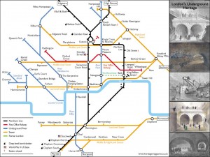
Continue reading »A Topologically Correct, Geographically Insane Tube Map
Tweet I’m a sucker for alternative maps of the London Underground, and here’s a great one – the Twisted London Underground Map by Francisco Dans (see the original in high-resolution on Flickr) – it’s perhaps not going to be useful … Continue reading →
Continue reading »High Rise Hangover
Swept up in the wave of the mid-2000′s property boom, planning authorities signed-off a series…
Continue reading »London aNCL
London was the first city we collected Twitter data for when we started to create the New City Landscape (NCL) project, monitoring location based Twitter activity in urban areas. This was back in May 2010 and since we have collected data for a lot more…
Continue reading »London Riots- the Unemployment Link
2011 is fast becoming one of the most tumultuous years in recent memory, with revolutions…
Continue reading »PhD Thesis: Polycentricity and Sustainable Urban Form in London
After four-and-half years of exploring, analysing, procrastinating, and writing, writing, writing, it’s finally done. Here’s the…
Continue reading »Mapping GCSE Scores
In the UK, August is exam results month for 16-18 year olds. Every year, photos of leaping teenagers clutching their results are accompanied by reports of record attainment rates, debates around how challenging modern exams are and, more so recently than ever, concerns for the number of sixth form and university places. Back in March …
Continue reading »London Riots Maps
Tweet James Cridland has created and is updating a map of verified reports of looting and rioting in London – and elsewhere. I much prefer this to another map which is automatically updated from postcoded tweets (similar to the UK … Continue reading →
Continue reading »Tech City ‘More than Doubled in Size’
Perhaps it’s careless wording by the Wall Street Journal, but Eric Van der Kleij appears to be claiming that: The number of start ups in the U.K.’s Tech City has more than doubled since the government-led initiative was launched last …
Continue reading »Olympics Progress – One year to go
It is now only One Year to Go! for the opening ceremony of the Olympic Summer Games 2012 here in London. The big event is moving closer by the day. Officials are eagerly pointing out that the planning and the preparation work is on schedule, very well …
Continue reading »Social Networks – GeoCom 2011
I am at GeoCom 2011 today. It takes place at UCL here in London from today (20 – 22 of July). The conference focuses on geo computation with focus on complexity and modeling. The keynote today was given by Professor Peter Nijkamp from Vrije Universitei…
Continue reading »Architecture – two London Summer Events
Is this time of year again, summer shows are on and London has a great tradition for architecture summer shows. Two events that are a highlight every year are the UCL Bartlett School of Architecture Summer Show and the Serpentine Gallery Summer Pavilio…
Continue reading »Sense and the City
The Sense and the City exhibition at the Transport Museum in Covent Garden opens today, and runs until March next year. It includes a number of transport visualisations contributed by the team at UCL CASA, including a themed version of … Continue reading →
Continue reading »CASA on TV
Pleased that a feature on spatial data visualisation at UCL CASA has appeared as a video on the BBC News website today. It includes some work I did with Martin Austwick on animating the bike share in London – I … Continue reading →
Continue reading »Exploring the Historical Determinants of Urban Growth Patterns through Cellular Automata
Kiril Stanilov has adapted RIKS METRONAMICA, an established cellular automata (CA) modelling system, to simulate the historical growth of a section of a large world city. The focus is on simulating change from the late 19th century until the modern …
Continue reading »London’s Rail System as a Network
As many of you know, for quite some time I’ve been wrestling with a massive data set from TfL — I make it that I have 120 million trip segments across 88 million identifiable journeys in the course of just …
Continue reading »Tweets in London
From the Mapping London blog: Many Twitter messages, or “tweets”, are sent with latitude/longitude information, allowing an insight into the places where the most amount of tweeting happens. For a magazine article, I produced the above map of London, with … Continue reading →
Continue reading »London Low Life – Historic Maps
AxisMaps offers a new online historic maps page to cover Londons past. It is a great resource overlaying about 30 maps dated between 1800 and 1900, on a digital current map based on open street map data. The service allows for interaction with to zoom …
Continue reading »Dock Monitor – Keeping an Eye on Boris Bike Docks
Transport for London have gradually been adding docking stations to the Barclays Cycle Hire network in central London – and occasionally they remove, rename or relocate the existing ones. TfL do now have a webpage which is manually updated with … Continue reading →
Continue reading »London Index of Multiple Deprivation Cartograms
On my previous post I talked about the Index of Multiple Deprivation (IMD) in a London only setting. A common trait with the maps I created and those you can find elsewhere is the use of LSOA boundaries that reflect the geographical reality of the lay of the land. When concentrating on London in particular this does have an impact on how you perceive deprivation. This is in part down to how Lower Layer Super Output Areas (LSOAs) are constructed. An LSOA by design has to contain at least 1,000 residents and 400 households, with a national average of around 1,500 residents. London of course does not just consist of the denser populated core, but also more rural areas on the outskirts. As the methodology dictates that each LSOA has to have at least 1,000 people in it, the geographical extent of LSOAs tends to be larger in these more rural areas. This means visually they will be more dominant than central areas and can give a “false” impression as to how much of London’s population live in either more or less deprived areas. In an attempt to try and address this visualisation problem I have used the Cartogram Geoprocessing […]
Continue reading »Your Life on a Map – Thanks to the iPhone
A recent discovery, revealed at the Where 2.0 conference, of a hidden file on iOS4 iPhones and iPads (and on computers that they are synchronised to) is proving to be rather interesting find. The file contains a couple of tables … Continue reading →
Continue reading »Early Views of Public Transit Usage in London
In fits and starts, over the past month I’ve been getting to grips with an exciting new Oyster Card data set from TfL and the wonderfully supportive Andrew Gaitskell, their resident Oyster Card data expert. For those few of you …
Continue reading »The London Index of Multiple Deprivation
The Index of Multiple Deprivation (IMD) is a measure of the “deprivation” of any given area. A combination of indicators covering a range of economic, social and housing issues, allow for a single deprivation score to be constructed, and these scores are then ranked. The data for the 32,482 Lower Layer Super Output Areas (LSOAs) that make up England was released in March 2011 for the 2010 IMD. This showed the rank of each LSOAs deprivation, ranging from 1 to 32,482. Fortunately due to a similar methodology being used to construct the 2010 IMD, it possible to compared it with the previous IMD released in 2007. Instead of focusing on a national scale I have re-ranked the data for London’s 4,765 LSOAs for both the 2007 and 2007 IMDs. Each of the 4,765 LSOAs have had their new ranks split into deciles, which is what is displayed on the maps below. This means there are roughly 476 LSOAs in each decile, or one tenth of all the areas in the dataset. Move your mouse over the picture, to swipe between the 2007 and 2010 London IMD. Show dividing line? I was inspired to use the “scrubber” technique by Oliver O’Brien, […]
Continue reading »London Rising
Rising water levels are a real concern for large areas around the world close to he sea. The treads posed by the water are many, with tsunami waves as recently occurred in Japan following the devastating earthquake or simple flooding due to a combinati…
Continue reading »Disposable Boris Bikes
A nice April Fools from Firebox – a disposable cardboard bike. The design bears more than a passing resemblance to the Bixi-designed bikes used for […]
Continue reading »Welcome to my blog!
TweetI didn’t want to leave a blank space while I am still constructing my first blog post, so I thought I would introduce myself and give you some idea of the work I am doing. My name is Chris Gale and I am in the first year of my PhD at University College London. The main theme of my PhD is to create better area classifications for the 2011 Census in partnership with the Office of National Statistics. An important part of this will be while a new classification methodology will focus on the 2011 Census, it will not be limited by it as other data sources will be used. I shall also be looking at new modes of dissemination that better utilise web technologies and new advances in GIS and geodemographics. Currently in-between lecturing a GIS course at Kingston University London and demonstrating on various courses at UCL I have been focusing my attention on OAC and London. I will go into more detail at a later date but I find this to be an interesting starting point for my research. This is mainly due to OAC classifying a large proportion of London as ‘Multi-cultural’, asking the question, can London be included within any national classification in […]
Continue reading »Changing Deprivation in London
Chris Gale, a fellow UCL Geographer, has produced these maps showing the change in deprivation scores in London between 2007 and 2010. They show a measure called the Index of…
Continue reading »Typographic London
Some of the most popular posts on spatialanalysis are about typographic maps. I thought it would be cool to put together some of my favourite’s for London. Click on each…
Continue reading »A City of Tweets
This is another great map animation from our friends in CASA. It is a year old now (almost to the day) but it remains one of the most engaging Twitter…
Continue reading »New Aerial Photos of Central London in Google Maps
Google Maps has today updated its aerial imagery for central London. The new imagery appears to be from sometime late last summer, and reveals the many new buildings and features that have appeared in the capital recently. Above is the … Continue reading →
Continue reading »Boris Bikes Flow Video – Now with Better Curves!
Dr Martin Austwick and I have produced an updated version of the animation of Barclays Cycle Hire bikes on a typical weekday: Martin has once again done some programming magic to show the River Thames, Hyde Park/Kensington Gardens and Regent’s … Continue reading →
Continue reading »Mapping London’s Population Change 1801-2030
Buried in the London Datastore are the population estimates for each of the London Boroughs between 2001 – 2030. They predict a declining population for most boroughs with the exception of a few to the east. I was surprised by this general decline and also the numbers involved- I expected larger changes from one year to …
Continue reading »London Cycle Flows: A Sociable Physics Animation
The animation below details the real-time behaviour of hire bikes in London on October 4th 2010, the day of a major tube strike, and the busiest day for the scheme to date. Departure times and journey durations are real; routing is calculated from OSM …
Continue reading »Brilliant Boris Bikes Animation
Some of us at CASA can’t get enough of the Barclay’s Cycle Hire data. We have had Ollie‘s hugely successful flow maps, journey time heat maps, and now the the Sociable Physicist himself, Martin Austwick has created this stunning animation of the bikes. The TFL data release contained the start point, end point, and duration for around …
Continue reading »London Bus Flows: An URBAGRAM Animation
Cities can be considered “flows of information, vehicles and people” (Sheller, 2007) transported along diverse urban networks. In the Flowprint of London below, the city’s extensive bus network is used to sketch an animated portrait of the living city,…
Continue reading »