London’s Exodus

londonexodus

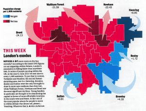
Time Out London, the venerable London free magazine, have spotted that everyone in London loves maps, and so have launched a regular London Mapped feature in their City Life section & blog. This week’s map is rather interesting and not one I’ve seen before. It shows ONS 2015 data on net migration between London’s boroughs […]

Continue reading »

O/D Map of London Commuting

This map shows the cross-borough London commuting flows in a different way to the conventional approach of drawing lines between the start and end of each commute (as shown here. It’s a large map of London boroughs, which each borough itself containing a small map of London. The intensity of the colour in each of […]

Continue reading »

TubeHeartbeat

tubeheartbeat2

TubeHeartbeat visualises one of Transport for London’s most interesting and detailed open dataset, RODS. This has data on the approximate weekday volume of passengers between each pair of stations on the network, and entering/exiting the stations, at 15-minute intervals. Mapping this, as TubeHeartbeat does, shows a distinctive pulse, or heartbeat, as commuters surge in and […]

Continue reading »

Data Maps with Force Layout

forcelondon_2

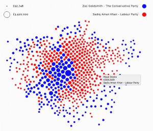
Alexander Brett has created this interactive map of London using the D3 visualisation framework and its “Force Layout” view. This places the data points (London ward centroids) at their geographic origin, and then applies a series of competing forces, as if the points are connected by a mesh of springs, to subtly adjust the locations […]

Continue reading »

A Semester with Urban Analytics

This past semester I gave a new class at GMU entitled “Urban Analytics”. In a nutshell the class was about introducing students to a broad interdisciplinary field that focuses on the use of data to study cities. More specifcally the emphasis of the cla…

Continue reading »

A Semester with Urban Analytics

This past semester I gave a new class at GMU entitled “Urban Analytics”. In a nutshell the class was about introducing students to a broad interdisciplinary field that focuses on the use of data to study cities. More specifcally the emphasis of the cla…

Continue reading »

Dear Data – My London

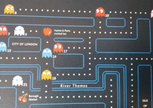
This is one of the many data visualisation and design postcards that Stefanie Posavec and Georgia Lupi sent each other of the course of a year. It’s a personal map of Stefanie’s London history – where she lived, studied and worked, her main commute and other routes. Everyone living in London will build up a […]

Continue reading »

How to make an economist

I’ve often asked myself, in self doubting moments and imposter-syndrome-rich night sweat events, what the difference is really between a person who says they are an economist and, well, just a person. Can I really lay any claim to be something other than the averagely well-informed news media-consuming citizen? Certainly a lot of what I covered in my MSc … Continue reading “How to make an economist”

Continue reading »

Dwelling Ages

The Valuation Office Agency publish some interesting open data sets from time-to-time. One that caught my eye recently was a breakdown of counts of residential buildings in each small area (LSOA, around 700 houses) by the decade that they were built in. The data is not perfect for mapping – pre-1900 is grouped together into […]

Continue reading »

SmellyMaps

SmellyMaps reveals the “olfactory footprint of London” – the streets which are dominated by traffic fumes, the animal smells emanating out from London Zoo, and the influence of parks and greenspaces on London’s scent experience. Streets are measured for four smell groupings – emissions (coloured red on the map), nature (green), food (blue) and animals […]

Continue reading »

Mapping Connected Places on London’s Public Transport Network

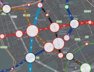
I haven’t written much on this blog about the work I’m currently doing at UCL CASA.  As a Research Associate working on the Mechanicity with Mike Batty, I’m tasked with drawing meaning out of a massive dataset of Oyster Card tap ins and tap outs across London’s public transport network.  The dataset covers every Oyster …
Read more

Continue reading »

Bridging the Qual/Quant Divide

I’ve been in my new post in the Geography department at King’s College London for nearly nine months now and — together with another new-ish colleague – have been asked to design a programme to teach quantitative research methods to students who often seem … Continue reading 

Continue reading »
1 2 3