Book – Informotion

Infographics are everywhere and a lot of development both in therms of technology and style has gone into the representation of information in the last few years. It is however an old topic and through out the past century aspects of graphics, design and technology in regards to the presentation of data and information were developed.

The Gestalt Theory (Detailed article in the German Wikipedia) was developed in the early 20s of the last century or Tufte (earlier on urbanTick) wrote his much influential books in the 80s and 90s to name two.

Image taken from the189.com / Informotion project by Bryan Ku docuemnting the final game in the 122nd edition of the Wimbeldon Championship Men’s Final between tennis giants Rafael Nadal and Roger Federer. See the animated version HERE.

The reason for some more recent development in information design and especially and especially handling is connected to technological and practical changes, but also the increased availability of raw data and details to be turned into information graphics.

Often however the subject to the data is temporal or process based with need for background or lead in, change of place or frequent change of perspective. For these cases animated inforgraphics can be a great way to communicate knowledge. Besides who doesn’t like to look at motion pictures? It really fits in with the whole TV consuming sort of urban lifestyle.

Its pretty save to say, that for the first time the book Informotion: Animated Infographics by Gestalten bring together a selection of the best motion picture graphics communicating knowledge. All of the examples are very recent projects and most can be found on either vimeo or youtube of course. However the interesting bit on the book is the context the examples are being put in. The editors Tim Finke and Sebastian Manger put great emphasis on contextual details in a wider sense. Where publications like the recent Taschen Infographics are a mere selection of great examples the Informotion book includes the theoretical and practical aspects too.

This of course makes the book heavier to read, it’s also but not only to look at, but you get a lot more out of it for your practice. Besides inspiration the book provides a refresh and update on the graphic, visual and design theories as well as the technical details of animation production such as software, storyboards or size, resolution or format.

Image taken from binalogue.com / Images showing the page spread design. The example shown here is an animated infographic by binalogue showing the CANAL Isabel II water cycle. See video below for the original animation.

There is also one of the aNCL (animated New City Landscape) informmotion graphics included as anexample in the book (p.188-189). It is the animation produced in collaboration between urbanTick and Anders Johansson on the Twitter landscape in the area arond the city of Zuerich in Switzerland. The original post on the animation can be found here, the animation is below.

Of course there is something awkward about a printed book about animated examples. However the content lives up to the expectations and whilst the animations can not be shown in the book the story can still be told. Even more so that the examples are discussed in detail and help to illustrate the theoretical elements of the book. In this sense there is literally more to the book than just the pictures and lines of text there is actual information in there plus Gestalten have a website where readers can get additional info and links to the animations. The list of examples can be found HERE.

Image taken from Gestalten / Book cover.

Finke, T. & Manger, S. eds., 2012. Informotion: Animated Infographics, Berlin: Gestalten.

Continue reading »

Book – Informotion

Infographics are everywhere and a lot of development both in therms of technology and style has gone into the representation of information in the last few years. It is however an old topic and through out the past century aspects of graphics, design and technology in regards to the presentation of data and information were developed.

The Gestalt Theory (Detailed article in the German Wikipedia) was developed in the early 20s of the last century or Tufte (earlier on urbanTick) wrote his much influential books in the 80s and 90s to name two.

Image taken from the189.com / Informotion project by Bryan Ku docuemnting the final game in the 122nd edition of the Wimbeldon Championship Men’s Final between tennis giants Rafael Nadal and Roger Federer. See the animated version HERE.

The reason for some more recent development in information design and especially and especially handling is connected to technological and practical changes, but also the increased availability of raw data and details to be turned into information graphics.

Often however the subject to the data is temporal or process based with need for background or lead in, change of place or frequent change of perspective. For these cases animated inforgraphics can be a great way to communicate knowledge. Besides who doesn’t like to look at motion pictures? It really fits in with the whole TV consuming sort of urban lifestyle.

Its pretty save to say, that for the first time the book Informotion: Animated Infographics by Gestalten bring together a selection of the best motion picture graphics communicating knowledge. All of the examples are very recent projects and most can be found on either vimeo or youtube of course. However the interesting bit on the book is the context the examples are being put in. The editors Tim Finke and Sebastian Manger put great emphasis on contextual details in a wider sense. Where publications like the recent Taschen Infographics are a mere selection of great examples the Informotion book includes the theoretical and practical aspects too.

This of course makes the book heavier to read, it’s also but not only to look at, but you get a lot more out of it for your practice. Besides inspiration the book provides a refresh and update on the graphic, visual and design theories as well as the technical details of animation production such as software, storyboards or size, resolution or format.

Image taken from binalogue.com / Images showing the page spread design. The example shown here is an animated infographic by binalogue showing the CANAL Isabel II water cycle. See video below for the original animation.

There is also one of the aNCL (animated New City Landscape) informmotion graphics included as anexample in the book (p.188-189). It is the animation produced in collaboration between urbanTick and Anders Johansson on the Twitter landscape in the area arond the city of Zuerich in Switzerland. The original post on the animation can be found here, the animation is below.

Of course there is something awkward about a printed book about animated examples. However the content lives up to the expectations and whilst the animations can not be shown in the book the story can still be told. Even more so that the examples are discussed in detail and help to illustrate the theoretical elements of the book. In this sense there is literally more to the book than just the pictures and lines of text there is actual information in there plus Gestalten have a website where readers can get additional info and links to the animations. The list of examples can be found HERE.

Image taken from Gestalten / Book cover.

Finke, T. & Manger, S. eds., 2012. Informotion: Animated Infographics, Berlin: Gestalten.

Continue reading »

Book – Information Graphics

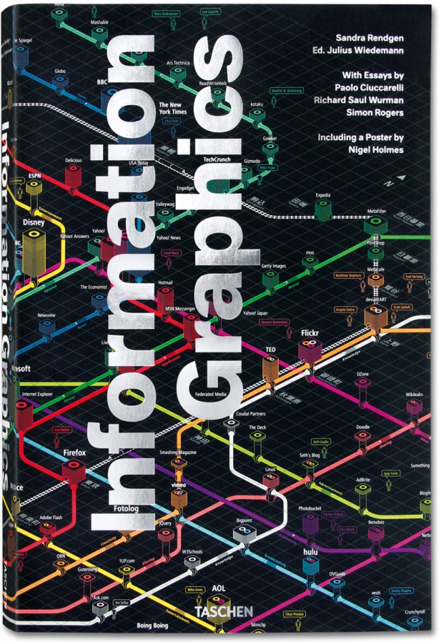
Information graphics are the subject to a brand new Taschen publication Information Graphics that is bringing complicated data made understandable through brilliant designs to a strong coffee table near you. The book is colourful with strong visual guidance, large, very large and heavy, some 480 pages heavy. As this outline shows, its a bold publication that doesn’t hide behind all the various examples of graphic design, but provides a tasteful framework to showcase the many awesome examples of data narratives.

Cover Information Graphics
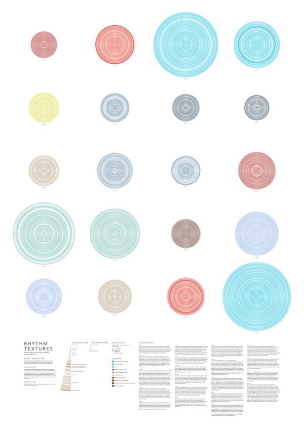
Image taken from aestheticsofjoy by Stephanie Posavec / Writing without words exploring possibilities to visually represent text.

Of course info graphics are currently trending and one of the most talked and specially passed around topic, not only online but more recently also in the media. All the large media houses have a special information design group and the publication showcases a number of these examples. In this context the book is not the first such collection of good designed information, but certainly one of the boldest in a positive sense.
The publication is edited by Julius Wiedemann und features contributions by Sandra Rendgen, Richard Saul Wurman, Simon Rogers from the Guardian Data Blog and Paolo Ciuccarelli. This is a very interesting team Taschen has put together for this publication with, whilst still being information specialists, covering a broad spectrum of perspectives and expertise.

NYT Historic Shift NYT Historic Shift
Image taken from dynamicdiagrams by NYT / Interactive visualisation showing the changes in election results over the period 2006-2010. Find the interactive version at NYT

Where other publications, for examples Data Flow by Gestalten, Otto Neurat by NAi or indeed Edward Tufte focus on the context of the graphics, the theoretical background of narrating information as well as the actual teaching of how to present information the Taschen publication is a showcase. It is foremost about showing great examples from a variety of sources on how to visualise data sets graphically in mainly 2D. There are a few web based, animated or interactive examples too though. This takes into account that complexity showing in these graphics is continually rising.

Husevaag Escape Routes Husevaag Escape Routes
Image by Torgeir Husevaag / Escape Routes, 2010-2011. A series of drawing studying possibilities of spatial movement under given time constraints. On the left the map and on the right a detail of some of the blue shaded location sixth path details

Showcasing such a large collection of examples is tricky in that the ordering system as to how the examples are organised becomes very prominent and therefore important. Here the editor has decided to go with a very low number of groups to arrange the info graphics. Where other publications make an exercise out of inventing a whole new system to clarify and characterise the examples this one takes the simple approach. This both refreshingly straight forward and annoyingly rough. What do the chosen terms Location, Time, Category and Hierarchy actually describe, or more importantly how are they distinguished?
The questions remain unanswered however, this does not stand in the way to enjoy the great quality and variety this collection shows. Its a book to brows, jump and flip, a publication you will keep in reach for a long time and always go back to to enjoy or indeed recharge your design batteries.

Cover Information Graphics
Image by Taschen / Book cover Information Graphics.

Rendgen, S., 2012. Information Graphics J. Wiedemann, ed., Köln: Taschen GmbH.

Continue reading »

The Power of Comparison: Just How Big Is It?

  If I said a country was 1594719800 metres squared it would mean a lot less to you than if I said it was about the size of Greater London (so long as you know about how big Greater London is). For this reason the media tend to report the extent of a flood in …

Continue reading »