Book – Information Graphics
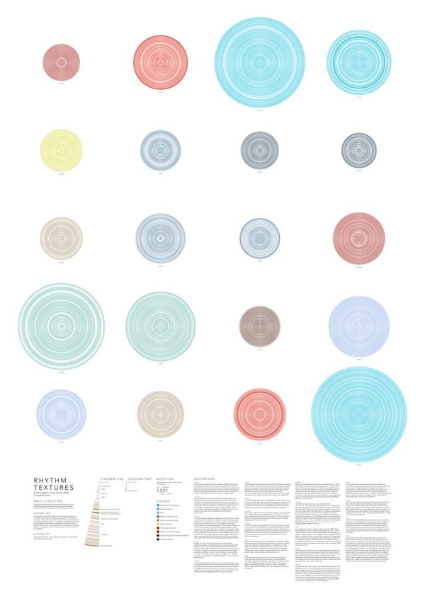
Image taken from aestheticsofjoy by Stephanie Posavec / Writing without words exploring possibilities to visually represent text.
Of course info graphics are currently trending and one of the most talked and specially passed around topic, not only online but more recently also in the media. All the large media houses have a special information design group and the publication showcases a number of these examples. In this context the book is not the first such collection of good designed information, but certainly one of the boldest in a positive sense.
The publication is edited by Julius Wiedemann und features contributions by Sandra Rendgen, Richard Saul Wurman, Simon Rogers from the Guardian Data Blog and Paolo Ciuccarelli. This is a very interesting team Taschen has put together for this publication with, whilst still being information specialists, covering a broad spectrum of perspectives and expertise.


Image taken from dynamicdiagrams by NYT / Interactive visualisation showing the changes in election results over the period 2006-2010. Find the interactive version at NYT
Where other publications, for examples Data Flow by Gestalten, Otto Neurat by NAi or indeed Edward Tufte focus on the context of the graphics, the theoretical background of narrating information as well as the actual teaching of how to present information the Taschen publication is a showcase. It is foremost about showing great examples from a variety of sources on how to visualise data sets graphically in mainly 2D. There are a few web based, animated or interactive examples too though. This takes into account that complexity showing in these graphics is continually rising.


Image by Torgeir Husevaag / Escape Routes, 2010-2011. A series of drawing studying possibilities of spatial movement under given time constraints. On the left the map and on the right a detail of some of the blue shaded location sixth path details
Showcasing such a large collection of examples is tricky in that the ordering system as to how the examples are organised becomes very prominent and therefore important. Here the editor has decided to go with a very low number of groups to arrange the info graphics. Where other publications make an exercise out of inventing a whole new system to clarify and characterise the examples this one takes the simple approach. This both refreshingly straight forward and annoyingly rough. What do the chosen terms Location, Time, Category and Hierarchy actually describe, or more importantly how are they distinguished?
The questions remain unanswered however, this does not stand in the way to enjoy the great quality and variety this collection shows. Its a book to brows, jump and flip, a publication you will keep in reach for a long time and always go back to to enjoy or indeed recharge your design batteries.
Image by Taschen / Book cover Information Graphics.
Rendgen, S., 2012. Information Graphics J. Wiedemann, ed., Köln: Taschen GmbH.