Book – Landscape Observer: London, on Pops and Democracy
London has seen a boom in inner-city developments over the past five to ten years. Large areas have been transformed, become densified in many ways and existing development has been replaced to make way for huge investments. Along it came a number of landscape projects to design pleasing outdoor spaces.
London is comparably green for its size with many streets tree-lined and many public parks. However, the everyday location in this bustling city is still dominated by hard surfaces. Greenery is rare and often not maintained. Especially with the government’s ongoing austerity programmes, the local councils struggle to keep up maintenance.
To distinguish themselves investors invest big in the design of the surroundings of their buildings. It underlines the quality to justify sky-high rents. The public is invited in to generate footfall for rented spaces. Where previously private property was fenced off, investors have discovered the potential of beautiful spaces. It seems a win-win situation, the public gets more greened spaces, the local councils get well maintained outdoor spaces and the investors can secure their investment.
The numerous places that have sprung up across London are now documented in a new JOVIS publication Landscape Observer: London by Vladimir Guculak. The book acts as a guide, but also a repository of not just a handful, but some 89 projects. Ranging from large-scale projects like Kings Cross redevelopment in central London to the Cutty Sark Gardens in Greenwich and other smaller projects.
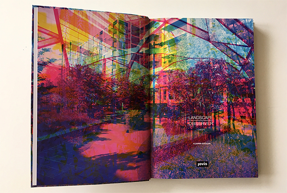
Image own / Title page of the pubication Landscape Observer: London, by Vladimir Guculak, 2017.
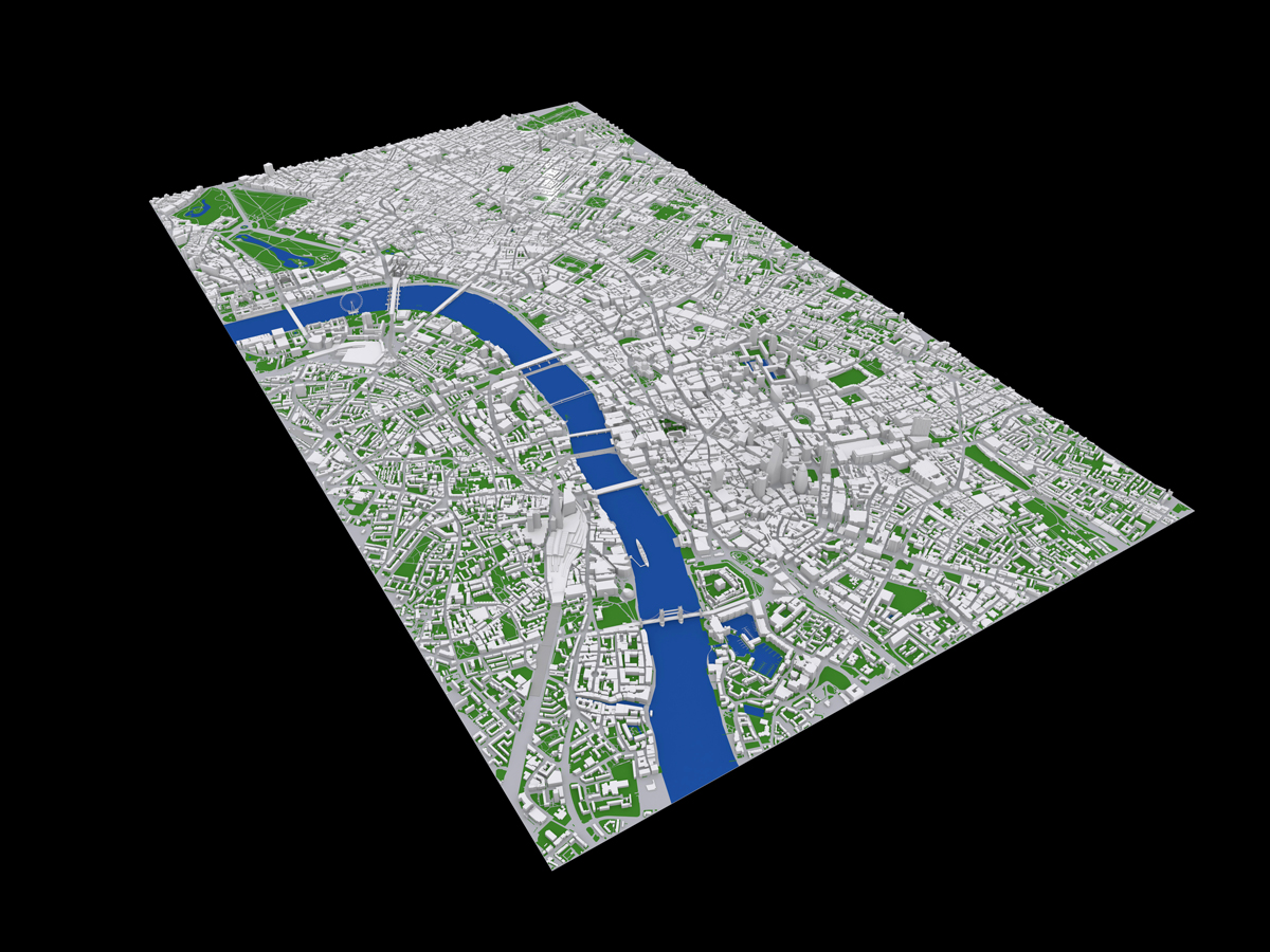
Each project is in detail documented with photographs by the author, a landscape architect himself, with additional information about location, size, year, designer, nearest public transport and accessibility information. Each chapter is proceeded by a map that helps locate each open space in the context of the city.
It is a beautifully designed publication complete with artwork by the author. With the photographic documentation, the publication gives an overview of the project and a number of detail shots to highlight specific areas and in some cases construction details. Along the photos, the author does give a brief listing of plants included, materials used and other special features such a street furniture and lighting.

Image taken from London Fieldwork / Spontaneous City in the Tree of Heaven
It also features a personal favourite the Duncan Terrace Gardens (p.18). With a very inspiring artwork by London Fieldwork Spontaneous City in the Tree of Heaven. Or the nice-to-be-in-the-summer-with-kids Diana, Princess of Wales Memorial Fountain in Hyde Park.
The weather is always extremely sunny throughout this publication and everything is documented in bloom with green lush leaves. It might seem a good idea to show summer, but landscaping has to work 12 months a year not only three or four. This is especially true for English weather and seasons. Colourful autumn leaves are as beautiful if not more so and stormy or rainy conditions can make for dramatically romantic scenes. So not why not make use of it?
However, there are some more important problems with this publication. And it’s not that something like the John Lewis Rain Garden (p.81) designed by the prominent designer (Nigel Dunnett) of the 2012 Olympic Parc in Stratford (now Queen Elizabeth Olympic Parc) features as a model “public space”. The main problem is the nonchalant attitude towards public space.
Public space is one of the most important principles to an accessible and shared city that is open to everyone. It is highly political and can be linked to the concept of the city-state in ancient Greece with the Agora, the foundation of democracy. See for example Sennett, Richard, 1998. The Spaces of Democracy, 1998 Raoul Wallenberg Lecture or Henry Lefebvre, 1974 (1991 e). The Production of Space, Blackwell. p.237-241. We don’t need to launch into a manifesto for the open city here, others have done so much more thoroughly. Nevertheless, the open and shared spaces are fundamental to living together in an open democratic city.
The problem with public spaces is the creeping rise of POPS or pseudo-public spaces. These spaces look and feel like public spaces but are in fact private spaces. They are on privately owned land and therefore are governed by a very different set of rules. Rules that are made up by the private owner and rarely publicly shared. The fact that one can access a street, a square or a riverside does not for a long shot make it public space.
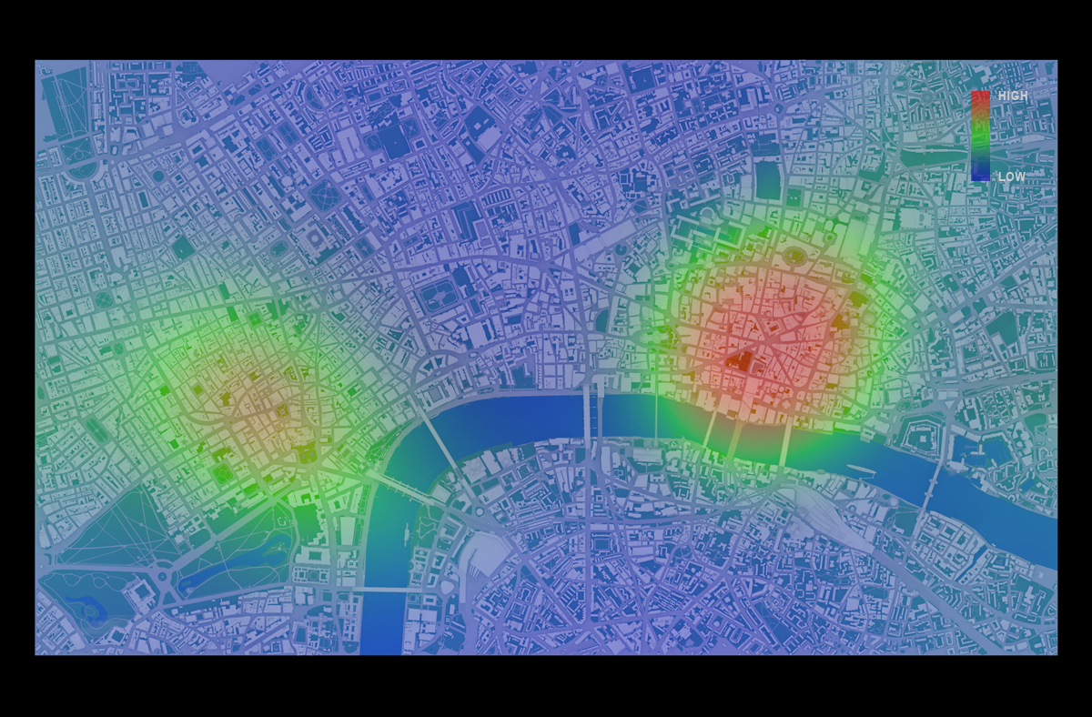
The Guarding has recently run a couple of stories on the rise of pseudo-public spaces in London and together with GiGL put together a database of such spaces in the UK and especially London. The Guardian has put together a quick guide to POPs here, listing important points such as “…appear to be public but are actually owned and controlled by developers and corporations.” or “…“Pops” – are not subject to ordinary local authority bylaws but rather governed by restrictions drawn up the landowner and usually enforced by private security companies”, noting “…public access to pseudo-public spaces remains at the discretion of landowners” and “…alter them at will. They are not obliged to make these rules public.”
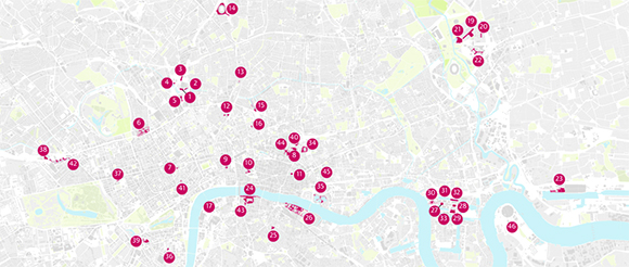
Image taken from the Guardian / Map shwing the pseudo-public spaces around central London. The data has been put together in colaboration between the Guardian and GiGL and is available as open data.

Image taken from the Guardian / View of Canary Square, Kings Cross with square and fountain and the UAL in the background.
One of the most prominent areas of these new breeds of urban spaces is the area around Kings Cross with Granary Square, Wharf Road Gardens, Gasholder Park and more. It has become over the past two or so years a very popular meeting place with new restaurants, soon to be open shopping, housing and the UAL at the centre of it. It is a very cleverly disguised pseudo-public space with the university at the centre, a very large square with a sort of public program and fountain as well as access to the Regents Canal, Kings Cross and St. Pancras station.
All of these are listed in the discussed publication as examples and many more such as St Pancras Square and Regents Place to list a few. Interestingly the author does make a reference to what he calls “political activists” presumably campaigning for public spaces. Examples listed on other news sites such as BigThink list some of the implications:
In 2011, Occupy protesters were removed from Paternoster Square, outside the London Stock Exchange, on the grounds that they were trespassing on private land owned by the Mitsubishi Estate Company.
In Pancras Square, part of King’s Cross Estate, lying down on the grass is okay, but not sleeping. One homeless man told the Guardian that as soon as he shuts his eyes, he is accosted by security guards.
Taking pictures is becoming increasingly problematic, with photographers being informed by security guards that they are on private land, and their activity is subject to prior permission – even in what looks like public space, such as Tower Place, adjacent to the Tower of London.
Public drinking is considered sufficient reason for removal from certain Pops.
A lot of data has been put together by GiGL and the Guardian on sites in London and has been published as open data here.
This implicates the publication and the approach to some extent. It raises serious questions about the use of terminology or the understanding put forward of public and space. But it does not question the intention of the author. It was put together from a practitioners point of view, probably aimed at peers. Focusing on materials and practices, but then was opened to a wider audience, as hinted in the foreword.

Image own / Spread of the pubication Landscape Observer: London, by Vladimir Guculak, 2017.
Not just, but especially as professionals in urban planning, landscape architecture, architecture, public officials and other roles involved in the planning and maintenance of public spaces, we have to be extremely careful and precise with the terminology to ensure and preserve these fundamentally important features of an open and accessible city, our open society and ultimately democracy are not undermined.
Never the less it is one of the most comprehensive collections of recent landscape architecture projects in the centre of London and as such a valuable contribution, even if vague regarding terminology and location mapping. Extensive preview available on the publisher JOVIS’ website

Image own / Cover of the pubication Landscape Observer: London, by Vladimir Guculak, 2017.
Continue reading »