Mapping City Flows as Blood

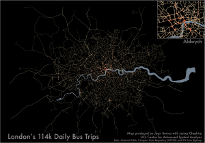
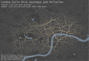
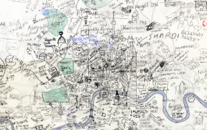
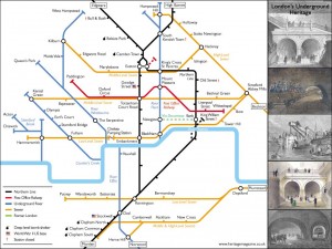
Blood is everywhere when it comes to describing cities. We have arterial roads, pulsing transport flows, and cities with different metabolisms. Thanks to great new datasets and visualisation software the analogy of cities with pulsing flows is being increasingly utilised for explanatory mapping. For example the work of UCL CASA’s Jon Reades above depicts the London Underground network …

Continue reading »

The Twitter Languages of London

Last year Eric Fischer produced a great map (see below) visualising the language communities of Twitter. The map, perhaps unsurprisingly, closely matches the geographic extents of the world’s major linguistic groups. On seeing these broad patterns I wondered how well they applied to the international communities living in London. The graphic above shows the spatial …

Continue reading »

Mapped: British, Spanish and Dutch Shipping 1750-1800

I recently stumbled upon a fascinating dataset which contains digitised information from the log books of ships (mostly from Britain, France, Spain and The Netherlands) sailing between 1750 and 1850. The creation of this dataset was completed as part of the Climatological Database for the World’s Oceans 1750-1850 (CLIWOC) project. The routes are plotted from the …

Continue reading »

Fast Thinking and Slow Thinking Visualisation

Last week I attended the Association of American Geographers Annual Conference and heard a talk by Robert Groves, Director of the US Census Bureau. Aside the impressiveness of the bureau’s work I was struck by how Groves conceived of visualisations as requiring either fast thinking or slow thinking. Fast thinking data visualisations offer a clear message without the need …

Continue reading »

ESRC Benchmarking For Quant. Geography and Cartography

Profs Mike Batty and Paul Longley have been asked to write a short report on Quantitative Geography, GIS and Cartography for the ESRC’s current ‘benchmarking review’ of UK human geography, undertaken in partnership with the RGS-IBG. They would very much welcome views and contributions from QMRG and GISRG members in seeking to answer the following […]

Continue reading »

Deceptive in their Beauty?

  Finding ways to effectively map population data is a big issue in spatial data visualization.  The standard practice uses choropleth maps that simply colour administrative units based on the combined characteristics of the people that live there (see below). These maps are popular with cartographers for a couple of reasons. You get a clear sense that the …

Continue reading »

London Cycle Hire and Pollution

As a cyclist in London you can do your best to avoid left turning buses and dozy pedestrians. One thing you can’t really avoid though is pollution (although I accept cyclists probably aren’t much worse off than pedestrians and drivers in this respect). To illustrate this I have taken data for 3.2 million journeys from …

Continue reading »

The Power of Comparison: Just How Big Is It?

  If I said a country was 1594719800 metres squared it would mean a lot less to you than if I said it was about the size of Greater London (so long as you know about how big Greater London is). For this reason the media tend to report the extent of a flood in …

Continue reading »

Coming of Age: R and Spatial Data Visualisation

I have been using R (a free statistics and graphics software package) now for the past four years or so and I have seen it become an increasingly powerful method of both analysing and visualising spatial data. Crucially, more and more people are writing accessible tutorials (see here) for beginners and intermediate users and the development …

Continue reading »

My Academic Research: What’s in a Name?

I have spent the last few years investigating the geography of family names (also called surnames). I work with the team who assembled the UCL Department of Geography Worldnames Database that contains the names and geographic locations of over 300 million people in nearly 30 countries (a few of these are yet to be added to the website). My research has …

Continue reading »

The Best of 2011

As 2011 draws to a close it is worth reflecting on what, I think, has been a defining year for mapping and spatial analysis. Geographic data have become open, big, and widely available, leading to the production of new and interesting maps on an almost daily basis. The increasing utilisation of technology such as Google Fusion Tables has …

Continue reading »

Just how far can the Tube take you?

Transport for London have just released their performance data (link here) for the London Underground network. It is in the form of a really detailed file that contains, amongst other things, the “Peak Operated Kilometres” and “Peak Passenger Journeys” for the past 6 years or so. If you total the distances covered by the Tube …

Continue reading »

Interview for the Global Lab Podcast

This week I feature on the 4th Episode of the Global Lab podcast. The podcast is a great new initiative led by Martin and Steve from CASA where they talk about cities, global connectivity and the impact of technology on people’s lives. Episode four features some horrendous physics jokes, Einstein’s Garden at the Green Man festival …

Continue reading »

QMRG Best Undergraduate Dissertation Prize 2011

We are pleased to announce that Tadas Nikonovas from the Department of Geography at Swansea University is the winner of this year’s QMRG Undergraduate Dissertation Prize. Tadas’ dissertation entitled “Artificial light emissions in Europe. Trends from a DMSP satellite fifteen year record” was applauded for its interesting and relevant topic, its use of complex quantitative […]

Continue reading »

Naming Rivers and Places

A map doing the rounds at the moment (thanks to a plug from flowingdata) is Derek Watkin’s brilliant map of “generic” terms for rivers in the United States (above).The map shows how different cultural and linguistic factors have influenced the naming of geographic features in the US. For example French settlers named the streams they encountered “bayous”.

Continue reading »

Improved Tree Maps with R

“Treemaps display hierarchical (tree-structured) data as a set of nested rectangles. Each branch of the tree is given a rectangle, which is then tiled with smaller rectangles representing sub-branches. A leaf node’s rectangle has an area proportional to a specified dimension on the data. Often the leaf nodes are colored to show a separate dimension of …

Continue reading »

Mapping GCSE Scores

In the UK, August is exam results month for 16-18 year olds. Every year, photos of leaping teenagers clutching their results are accompanied by reports of record attainment rates, debates around how challenging modern exams are and, more so recently than ever, concerns for the number of sixth form and university places. Back in March …

Continue reading »

England Riots: Offences Committed and Offenders Age

The Guardian have been keeping track of the magistrate cases and convictions resulting from the recent rioting in England. Using this data I have produced the “tree map” below. For each magistrate I have grouped each offence committed and represented it as a square. The size of the square represents the number of people who …

Continue reading »
1 4 5 6 7