Visualisation Projects by CASA Urban Spatial Science Students

Each year CASA master’s students demonstrate their spatial data visualisation skills with a group project. The theme this year was ‘Urban Futures’, and students have produced some very impressive and diverse work, experimenting with a range of visualisation tools and techniques. Click on the images below to visit the project websites. Urban Resilience ProjectsTwo groups … Continue reading Visualisation Projects by CASA Urban Spatial Science Students

Continue reading »

Measuring Comparative Public Transport Accessibility for GB Cities

While Greater London has a comprehensive transit network, this is not a fair representation of UK cities where underinvestment and privatisation has seen many bus, metro and rail networks stagnate in recent decades, falling well behind European and Asian peers. Improving public transport is an important aspect of addressing the UK’s high regional inequality and … Continue reading Measuring Comparative Public Transport Accessibility for GB Cities

Continue reading »

Can the Green Belt be Developed Sustainably to Ease London’s Housing Crisis?

The housing crisis in London has become increasingly severe in the last decade with much higher prices, rents, and largely static incomes, while housing development volumes have remained consistently below targets. Green Belt reform is often cited as a solution to boost development, though this has been off the agenda during the last 13 years … Continue reading Can the Green Belt be Developed Sustainably to Ease London’s Housing Crisis?

Continue reading »

World Population Density Map Update with GHSL 2023

The European Union JRC recently released a new 2023 update of the Global Human Settlement Layer (GHSL) data. This update has greatly improved the GHSL data, with a 10m scale built-up area dataset of the entire globe which has been used to create a 100m scale global population density layer. The level of detail for … Continue reading World Population Density Map Update with GHSL 2023

Continue reading »

Tracking Gentrification in London and Manchester Using the 2021 Census Occupational Class Data

The Office for National Statistics have started to publish the more detailed tables from the new 2021 census. Of particular interest for my research are the variables related to gentrification. In this post I look at the occupational class data (Standard Occupational Class) to identify areas of London and Manchester with the biggest social changes. … Continue reading Tracking Gentrification in London and Manchester Using the 2021 Census Occupational Class Data

Continue reading »

Pandemic Geographies and Challenges with the 2021 England & Wales Census Results

The Census is the most comprehensive demographic survey in the UK, providing detailed data for government and academics in many fields, from health and education, to planning and transport. The 2021 Census has a unique context, as the 2021 census day (21st March 2021) occurred when the UK was still in the 3rd national lockdown … Continue reading Pandemic Geographies and Challenges with the 2021 England & Wales Census Results

Continue reading »

New Book – Gilded City: Tour Medieval and Renaissance London

Have you ever wondered how London began? Or how London grew to become such an influential world city for business, politics and culture? You might be interested in Gilded City, a new book coming out this July. Gilded City tells the story of London by touring its most fascinating historic districts and buildings, and describing … Continue reading New Book – Gilded City: Tour Medieval and Renaissance London

Continue reading »

Global Visualisation Websites from CASA MSc students

Each year MSc students at CASA demonstrate their visualisation skills with a group project. The theme this year was ‘Global to Local’, and the class of 2022 has produced some particularly excellent work, experimenting with a range of visualisation tools and techniques. Sustainability VisualisationsSeveral groups interpreted the main theme in terms of sustainability and climate … Continue reading Global Visualisation Websites from CASA MSc students

Continue reading »

Roger Tomlinson’s PhD: The first in GIS

The late Roger Tomlinson is considered the “Father of Geographic Information Systems” and he completed his PhD in the UCL Department of Geography in 1974. Tomlinson pioneered digital mapping – every map created using a computer today still uses the principles he laid down in his thesis and its associated work creating the “The Canada Geographic […]

Continue reading »

Mapping 5,000 Years of City Growth

I recently stumbled upon a great dataset. It’s the first to provide comprehensive data for world city sizes as far back as 3700BC. The authors (Meredith Reba, Femke Reitsma & Karen Seto) write: How were cities distributed globally in the past? How many people lived in these cities? How did cities influence their local and regional […]

Continue reading »

The Full Stack: Tools & Processes for Urban Data Scientists

Recently, I was asked to give talks at both UCL’s CASA and the ETH Future Cities Lab in Singapore for students and staff new to ‘urban data science’ and the sorts of workflows involved in collecting, processing, analysing, and reporting on … Continue reading 

Continue reading »

7 Deadly Sins of (Academic) Data Visualisation

I was recently asked to deliver a days training on scientific data visualisation. I spent a while scanning through papers to pull out what I see as the “7 deadly sins” of academic data visualisation (there are probably many more) . These sins are rooted in a lack of time and training, an underestimation of the importance […]

Continue reading »

Graduate Mobility and Closing the Productivity Gap for UK Cities

There has been much discussion in recent years about the UK ‘productivity puzzle’: the shortfall in productivity between the UK and comparable EU states like Germany and France, with this gap widening in the last decade. One important perspective for understanding productivity relates to skills and education, and how well graduate skills are integrated with businesses and are helping … Continue reading Graduate Mobility and Closing the Productivity Gap for UK Cities

Continue reading »

Environment & Planning Featured Graphic: World City Populations Time-Series Map

The World City Populations Interactive Map is now available as a static map, and has been published as a Featured Graphic in Environment and Planning A. The EPA article includes details on the UN World Urbanization Prospects data, and the methods used to create the map. For a high resolution version of the static map, click below-

Continue reading »

New Paper- Online Interactive Mapping: Applications and Techniques for Socio-Economic Research

I have a new paper published in Computers Environment and Urban Systems- Online interactive thematic mapping: applications and techniques for socio-economic research. The paper reviews workflows for creating online thematic maps, and describes how several leading interactive mapping sites were created. The paper is open access so you can download the pdf for free. The paper…

Continue reading »

Mapping Protest in 3D with Twitter Data


As one part of my docotoral thesis, I have made the video that shows the relationship between ‘London End Austerity Now’ Protest on 20thJune 2015 and the Twitter acitivity on that day.

The video gives you some details about the protest, the data and 3D visualisation.
If the following YouTube video is not displayed on your device, please use this link. 


Continue reading »

Mapping Protest in 3D with Twitter Data

As one part of my docotoral thesis, I have made the video that shows the relationship between ‘London End Austerity Now’ Protest on 20thJune 2015 and the Twitter acitivity on that day.The video gives you some details about the protest, the data and 3D …

Continue reading »

Mapping Protest in 3D with Twitter Data


As one part of my docotoral thesis, I have made the video that shows the relationship between ‘London End Austerity Now’ Protest on 20thJune 2015 and the Twitter acitivity on that day.

The video gives you some details about the protest, the data and 3D visualisation.
If the following YouTube video is not displayed on your device, please use this link. 


Continue reading »

Building Centre – from Mapping to Making

The London based Building Centre organised an evening event – from Mapping to Making –  which looked at the “radical evolution in the making and meaning of maps is influencing creative output. New approaches to data capture and integration – from drones to crowd-sourcing – suggest maps are changing their impact on our working life, … Continue reading Building Centre – from Mapping to Making

Continue reading »

Mapping London’s Twitter Activity in 3d

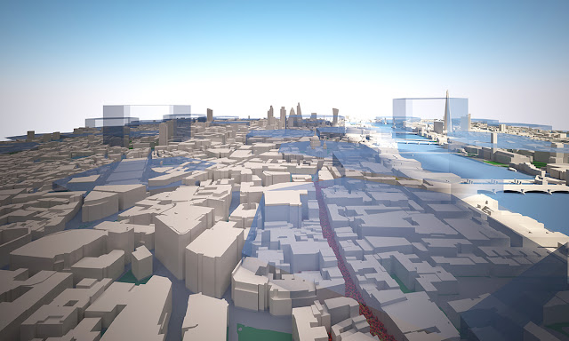
Image 1. The tweet density from 8am to 4pm on 20th June 2015, Central London


Twitter Mapping is increasingly useful method to link virtual activities and geographical space. Geo-tagged data attached to tweets containing the users’ location where they tweeted and it can visualise the locations of users on the map. Although the number of the geo-taggedtweets is a relatively small portion of all tweets, we can figure out the density, spatial patterns and other invisible relationships between online and offline.


Recently, studies with geo-tagged tweets have been developed to analyse the public response tospecific urban events, natural disasters and regional characteristics (Li et al., 2013) [1].  Furthermore, it is extending to traditional urban research topics, for example, revealing spatial segregation and inequality in cities (Shelton et al., 2015) [2].


Twitter mapping in 3D can augment 2d visualisation by providing built environment contexts and improved information. There are many examples of Twitter mapping in 3d such as A) #interactive/Andes [3] , B) London’s Twitter Island [4], C) Mapping London in real time, using Tweets [5]. A) and B) build up 3d mountains of the geo-tagged tweet on the map.  In the case of C), when the geo-tagged tweets are sent in the city, the heights of nearest buildings increase in the 3d model. These examples are creative and show different ways to view the integrated environments.

From a Networking City’s view, if we make a Twitter visualisation more tangible in a 3d urban model, it would help us to have a better understanding how urban environments are interconnected with the invisible media flow.


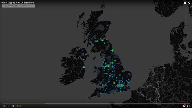
To make the visualisation, the Twitter data has been collected by using Big Data Toolkit developed by Steven Gray at CASA, UCL. All 53,750 geo-tagged tweets are collected on 20thJune, 2015 across the UK. As we can see from Table 1, the number of tweets was at the lowest point at 5am and reached to the highest point at 10pm with 3495 tweets. Moreover, Video 1 shows the location of the data in the UK and London on that day in real time.


Table 1. The Number of Geo-Coded Tweets in the UK on 20th June, 2015


https://www.youtube.com/watch?v=dg-2VlVfFaM


Video 1. The location of Geo-Coded Tweets in the UK on 20th June, 2015


When we calculate the density of the data, London, particularly Central London, contains the largest number of the tweets. (Image 2)


Image 2. The density of Geo-Coded Tweets in the UK on 20th June, 2015

In order to focus on the high density data, 6 km x 3.5 km area of Central London is chosen for the 3d model. Buildings, bridges, roads and other natural environments of the part of London have been set in the model based on OS Building Heights data[6]. Some Google 3d warehouse buildings are added to represent important landmark buildings like St.Pauls, London Eye and Tower Bridge as you can see from Image 3, Image 4 and Image 5.


Image 3. The plan view of Central London model

Image 4. The perspective view of Central London model

Image 5. The perspective view of Central London model (view from BT Tower)

The geo-tagged data set is divided into one hour periodsand distributed on the map to identify the tweet density in the area. Through this process, we can see how the density is changing depending on the time period. For example, the tweets are mainly concentrated around Piccadilly Circus and Trafalgar Square between 10am and 11am, but  there are two high-density areas between 12pm and 1pm (See Image 6, Image 7, Image 8 and Image 9)

Image 6. The tweet density between 10am and 11am on 20th June 2015

Image 7. The tweet density between 12pm and 1pm on 20th June 2015

Image 8. The tweet density from 12am to 12pm

Image 9. The tweet density from 12pm to Midnight


As we’ve seen above, the 2d mapping is useful to understand the relative density in one period such as which area is high and which area is low between 12pm and 1pm. However, we cannot understand the degree of intensity in the highest peak areas. It is believed that 3d mapping is needed at this stage. We can clearly see the density of the tweet data in each periodand the intensity of the tweet density across the time periods from Image 10 to Image 14.

West End area shows high density throughout the whole day but City area shows the peak only during lunch time. This pattern likely relates to the activities of office workers in City and leisure/tourist in West End.

Image 10. The tweet density in 3d between 10am and 11am on 20th June 2015

Image 11. The tweet density in 3d between 12pm and 1pm on 20th June 2015


Image 12. The tweet density in 3d from 12am to 8pm

Image 13. The tweet density in 3d from 8am to 4pm

Image 14. The tweet density from 4pm to Midnight


 ________________________________________

[1] Linna Li , Michael F. Goodchild & Bo Xu (2013) Spatial, temporal, and socioeconomic patterns in the use of Twitter and Flickr, Cartography and Geographic Information Science, 40:2, 61-77


[2] Taylor Shelton, Ate Poorthuis & Matthew Zook (2015) Social Media and the City: Rethinking Urban Socio-Spatial Inequality Using User-Generated Geographic Information, Landscape and Urban Planning (Forthcoming), http://papers.ssrn.com/abstract=2571757


[3] Nicolas Belmonte, #interactive/Andes,   http://twitter.github.io/interactive/andes/  (Strived on 15th August 2015)


[4] Andy Hudson-Smith, London’s Twitter Island – From ArcGIS to Max to Lumion, http://www.digitalurban.org/2012/01/londons-twitter-island-from-arcgis-to.html#comment-7314


(Strived on 15thAugust 2015)

 
[5] Stephan Hugel and Flora Roumpani, Mapping London in real time, using Tweets, https://www.youtube.com/watch?feature=player_embedded&v=3fk_qxGZWFQ (Strived on 15th August 2015)

[6] OS Building Heights-Digimap Home Page  http://digimap.edina.ac.uk/webhelp/os/data_information/os_products/os_building_heights.htm  (Strived on 15th August 2015)


Continue reading »

Mapping London’s Twitter Activity in 3d

Image 1. The tweet density from 8am to 4pm on 20th June 2015, Central London Twitter Mapping is increasingly useful method to link virtual activities and geographical space. Geo-tagged data attached to tweets containing the users’ location where the…

Continue reading »

Mapping London’s Twitter Activity in 3d

Image 1. The tweet density from 8am to 4pm on 20th June 2015, Central London


Twitter Mapping is increasingly useful method to link virtual activities and geographical space. Geo-tagged data attached to tweets containing the users’ location where they tweeted and it can visualise the locations of users on the map. Although the number of the geo-taggedtweets is a relatively small portion of all tweets, we can figure out the density, spatial patterns and other invisible relationships between online and offline.


Recently, studies with geo-tagged tweets have been developed to analyse the public response tospecific urban events, natural disasters and regional characteristics (Li et al., 2013) [1].  Furthermore, it is extending to traditional urban research topics, for example, revealing spatial segregation and inequality in cities (Shelton et al., 2015) [2].


Twitter mapping in 3D can augment 2d visualisation by providing built environment contexts and improved information. There are many examples of Twitter mapping in 3d such as A) #interactive/Andes [3] , B) London’s Twitter Island [4], C) Mapping London in real time, using Tweets [5]. A) and B) build up 3d mountains of the geo-tagged tweet on the map.  In the case of C), when the geo-tagged tweets are sent in the city, the heights of nearest buildings increase in the 3d model. These examples are creative and show different ways to view the integrated environments.

From a Networking City’s view, if we make a Twitter visualisation more tangible in a 3d urban model, it would help us to have a better understanding how urban environments are interconnected with the invisible media flow.


To make the visualisation, the Twitter data has been collected by using Big Data Toolkit developed by Steven Gray at CASA, UCL. All 53,750 geo-tagged tweets are collected on 20thJune, 2015 across the UK. As we can see from Table 1, the number of tweets was at the lowest point at 5am and reached to the highest point at 10pm with 3495 tweets. Moreover, Video 1 shows the location of the data in the UK and London on that day in real time.


Table 1. The Number of Geo-Coded Tweets in the UK on 20th June, 2015


https://www.youtube.com/watch?v=dg-2VlVfFaM


Video 1. The location of Geo-Coded Tweets in the UK on 20th June, 2015


When we calculate the density of the data, London, particularly Central London, contains the largest number of the tweets. (Image 2)


Image 2. The density of Geo-Coded Tweets in the UK on 20th June, 2015

In order to focus on the high density data, 6 km x 3.5 km area of Central London is chosen for the 3d model. Buildings, bridges, roads and other natural environments of the part of London have been set in the model based on OS Building Heights data[6]. Some Google 3d warehouse buildings are added to represent important landmark buildings like St.Pauls, London Eye and Tower Bridge as you can see from Image 3, Image 4 and Image 5.


Image 3. The plan view of Central London model

Image 4. The perspective view of Central London model

Image 5. The perspective view of Central London model (view from BT Tower)

The geo-tagged data set is divided into one hour periodsand distributed on the map to identify the tweet density in the area. Through this process, we can see how the density is changing depending on the time period. For example, the tweets are mainly concentrated around Piccadilly Circus and Trafalgar Square between 10am and 11am, but  there are two high-density areas between 12pm and 1pm (See Image 6, Image 7, Image 8 and Image 9)

Image 6. The tweet density between 10am and 11am on 20th June 2015

Image 7. The tweet density between 12pm and 1pm on 20th June 2015

Image 8. The tweet density from 12am to 12pm

Image 9. The tweet density from 12pm to Midnight


As we’ve seen above, the 2d mapping is useful to understand the relative density in one period such as which area is high and which area is low between 12pm and 1pm. However, we cannot understand the degree of intensity in the highest peak areas. It is believed that 3d mapping is needed at this stage. We can clearly see the density of the tweet data in each periodand the intensity of the tweet density across the time periods from Image 10 to Image 14.

West End area shows high density throughout the whole day but City area shows the peak only during lunch time. This pattern likely relates to the activities of office workers in City and leisure/tourist in West End.

Image 10. The tweet density in 3d between 10am and 11am on 20th June 2015

Image 11. The tweet density in 3d between 12pm and 1pm on 20th June 2015


Image 12. The tweet density in 3d from 12am to 8pm

Image 13. The tweet density in 3d from 8am to 4pm

Image 14. The tweet density from 4pm to Midnight


 ________________________________________

[1] Linna Li , Michael F. Goodchild & Bo Xu (2013) Spatial, temporal, and socioeconomic patterns in the use of Twitter and Flickr, Cartography and Geographic Information Science, 40:2, 61-77


[2] Taylor Shelton, Ate Poorthuis & Matthew Zook (2015) Social Media and the City: Rethinking Urban Socio-Spatial Inequality Using User-Generated Geographic Information, Landscape and Urban Planning (Forthcoming), http://papers.ssrn.com/abstract=2571757


[3] Nicolas Belmonte, #interactive/Andes,   http://twitter.github.io/interactive/andes/  (Strived on 15th August 2015)


[4] Andy Hudson-Smith, London’s Twitter Island – From ArcGIS to Max to Lumion, http://www.digitalurban.org/2012/01/londons-twitter-island-from-arcgis-to.html#comment-7314


(Strived on 15thAugust 2015)

 
[5] Stephan Hugel and Flora Roumpani, Mapping London in real time, using Tweets, https://www.youtube.com/watch?feature=player_embedded&v=3fk_qxGZWFQ (Strived on 15th August 2015)

[6] OS Building Heights-Digimap Home Page  http://digimap.edina.ac.uk/webhelp/os/data_information/os_products/os_building_heights.htm  (Strived on 15th August 2015)


Continue reading »

History of Telephony: Funded PhD Award with King’s College London, BT and the Science Museum Group

Applications are invited for an AHRC-funded doctoral student to join King’s College London, BT Archives, and the Science Museum Group in late September 2015 or early January 2016 to investigate the impact of the telephone landline network on British society … Continue reading 

Continue reading »

Happy 10th Birthday, OpenStreetMap!

Today, OpenStreetMap celebrates 10 years of operation as counted from the date of registration. I’ve heard about the project when it was in early stages, mostly because I knew Steve Coast when I was studying for my Ph.D. at UCL.  As a result, I was also able to secured the first ever research grant that focused […]

Continue reading »

GIS Course Note 02: Research Application, Software and Data Sources

The second lecture of GIS comprised mainly three parts, the examples of practical research by using GIS, GIS software and the way to gain relevant data for the research.  
In the beginning, Dr. Adam Dennett, the lecturer of CASA, informed the aim of the lecture to understand the basic elements of social science research using GIS and the diverse analytical approaches with it. He showed several example maps, which are related to population, crime, deprivation, health care, flooding, and education, and the way how to read economic, social and physical characteristics from the maps and its meaning in the projects. (Image 1)
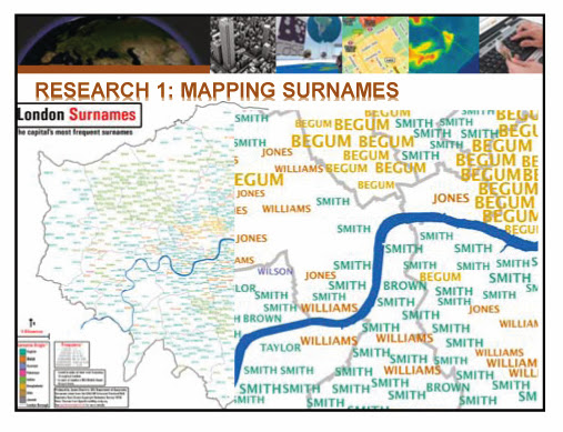


Image 1


And then, he moved to GIS software industry which has been significantly growing. As interest and the utilisation of GIS are increasing, GIS software market is expanding almost 10% every year and now it is used in all industries and public sectors such as business, public safety, military and education. The popular GIS tools: Arc GIS, MAP Info, Quantum GIS, Pythonand R, and specific points of each tool were introduced. Also, small description of GIS cloud and online GIS tools was following. (Image 2)
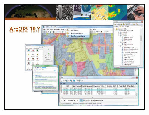
Image 2

In the last part, he said of various kinds of the data and the way of gathering the data which is the key element to proceed the research. Easily, we can classify the data according to the way of gathering. On the one hand, we can use the open data, which are provided by public sectors and other organisations. On the other hand, we need to collect the data through participation and measuring by ourselves. Some websites of the UK, which contain the open data or shapefiles, and the characteristics of each website were mentioned. As we can see Image 3, some other methods like WebScarping and Volunteered Geographic Information were shown as alternative ways to collect the data by ourselves, when the given data are unclear, and the goal of the research needs the specific data.
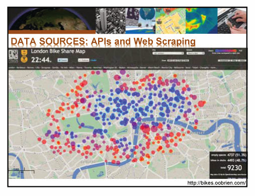
Image 3


The lecture was finished with the emphasis on caution when using the open data and the mapping with it. Much of the data are made with inadequate formats like pdf, or do not include any spatial reference, so we need to be careful to collect and use the data. When it came to the mapping with the data, he insisted that it is necessary to make analytical and meaningful maps rather than something fancy or colourful. In addition, it is essential to acknowledge that some errors could be made by way of ‘generalisation’ in the process of research, therefore, setting up the range and the level of the research will enrich the quality of it.
 
After one hour lecture, students had a training session that mapping population data on the map of London Borough with R. (Image 4)
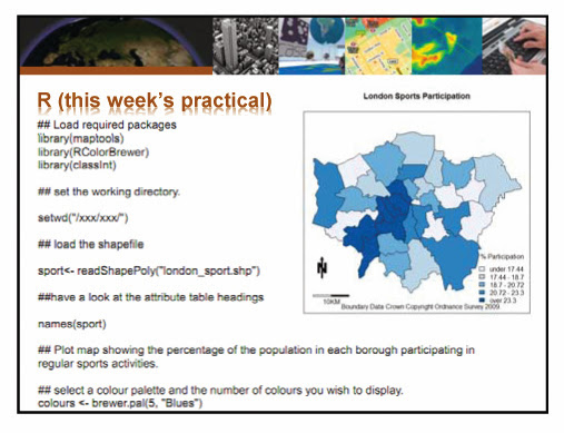
Image 4


Continue reading »

GIS Course Note 02: Research Application, Software and Data Sources

The second lecture of GIS comprised mainly three parts, the examples of practical research by using GIS, GIS software and the way to gain relevant data for the research.  
In the beginning, Dr. Adam Dennett, the lecturer of CASA, informed the aim of the lecture to understand the basic elements of social science research using GIS and the diverse analytical approaches with it. He showed several example maps, which are related to population, crime, deprivation, health care, flooding, and education, and the way how to read economic, social and physical characteristics from the maps and its meaning in the projects. (Image 1)


Image 1


And then, he moved to GIS software industry which has been significantly growing. As interest and the utilisation of GIS are increasing, GIS software market is expanding almost 10% every year and now it is used in all industries and public sectors such as business, public safety, military and education. The popular GIS tools: Arc GIS, MAP Info, Quantum GIS, Pythonand R, and specific points of each tool were introduced. Also, small description of GIS cloud and online GIS tools was following. (Image 2)

Image 2

In the last part, he said of various kinds of the data and the way of gathering the data which is the key element to proceed the research. Easily, we can classify the data according to the way of gathering. On the one hand, we can use the open data, which are provided by public sectors and other organisations. On the other hand, we need to collect the data through participation and measuring by ourselves. Some websites of the UK, which contain the open data or shapefiles, and the characteristics of each website were mentioned. As we can see Image 3, some other methods like WebScarping and Volunteered Geographic Information were shown as alternative ways to collect the data by ourselves, when the given data are unclear, and the goal of the research needs the specific data.

Image 3


The lecture was finished with the emphasis on caution when using the open data and the mapping with it. Much of the data are made with inadequate formats like pdf, or do not include any spatial reference, so we need to be careful to collect and use the data. When it came to the mapping with the data, he insisted that it is necessary to make analytical and meaningful maps rather than something fancy or colourful. In addition, it is essential to acknowledge that some errors could be made by way of ‘generalisation’ in the process of research, therefore, setting up the range and the level of the research will enrich the quality of it.
 
After one hour lecture, students had a training session that mapping population data on the map of London Borough with R. (Image 4)
Image 4


Continue reading »
1 2 3